Showing posts sorted by relevance for query call to action. Sort by date Show all posts

11/24/2020

Truvia: Postcard could be sweeter

I recently received this postcard introducing me to Truvia, a zero-calorie sweetener. 

Truvia Sweet Complete
Postcard front

Visually, this postcard makes Truvia seem like a compelling alternative to sugar. The picture on the front suggests this is something I could use when baking a cake, making a smoothie, or sweetening coffee. Plus, as a potential customer, the postcard offers me the opportunity to try out one of their products for free. 

Free is a great price for a new product. It is a proven way to get a potential new customer to go outside of their comfort zone, to try something new, and to experiment a bit. It's such a common sales practice that drug dealers reputedly offer the first hit of crack cocaine for free. Customers get addicted, and they pay for more drugs. A sugar-alternative zero-calorie sweetener shouldn't be treated like crack cocaine but, hey, the makers of Truvia certainly want me to be hooked. 
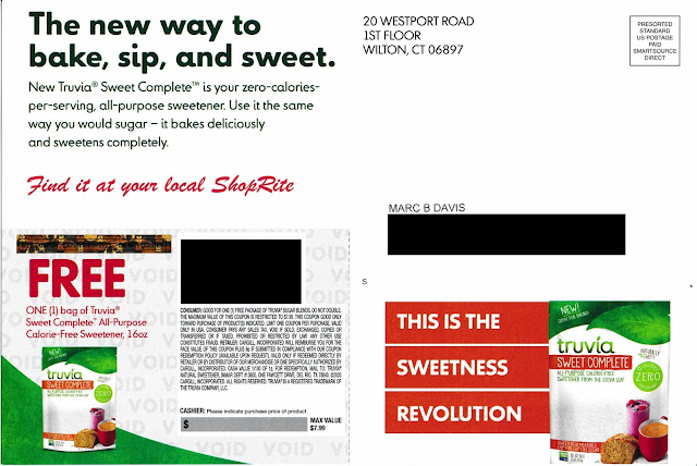
Truvia Sweet Complete Free Offer
Postcard address side

The address side of the postcard includes supporting copy: a well-written product explanation, a benefit statement, an explanation of how to use the product, and a coupon for a free 16-ounce bag. I'd say that's sweet (pun intended). 

The Call to Action is simply "Find it at your local ShopRite." Therein lies the rub (or, should we go with the pun, the 'topping'). From where I live in Queens, the nearest ShopRite is typically a 25 minute drive in traffic -- under 10 miles as the crow flies, but that crow doesn't have to worry about Big Apple traffic. So, no disrespect to ShopRite, but I won't shop there when there are 3 supermarkets and a Target within walking distance. 

So, would I give this call to action a Fail for Targeting? Not really. Presuming this was a national campaign, I can't fault the marketing manager for including someone located several miles from an eligible supermarket. It's pretty complex to design targeting criteria based on travel time to a supermarket chain.

However, I could give the call to action a Fail for Creative. The coupon is valid at any retail location that carries the product. It turns out that, according to the Where to Buy link on the Truvia web site, the advertised product is available at a nearby Foodtown. Rather than mentioning only ShopRite, the postcard should have mentioned their "Where to Buy" website, e.g. 

Visit www.truvia.com/where-to-buy for a store location near you
or
Use your free coupon at ShopRite,
or visit www.truvia.com/where-to-buy for other nearby locations

When a prospective customer can try your product for free with few hassles, that is like zero-calorie icing on the cake.

Lesson: 
Make coupon redemption easy for your customer by offering relevant redemption options.

12/16/2021

Athletic Greens: Landing page does not work out

For more than a decade, I've written about the four pillars of a successful direct marketing campaign: Targeting, Offer, Creative and Timing (TOCT). But there is something that binds these pillar together: Execution.

If you properly thought through your TOCT and planned your work, execution is working the plan. To execute successful, everything should work the way it should.

Which brings us to Athletic Greens. I recently received this self-mailer:
Athletic Greens
Cover panel

Athletic Greens
Address panel, with offer URL


Athletic Greens
Inside panel


Athletic Greens
Sales panels
Athletic Greens


Creatively, this is quite a good piece for the category. The paper stock is thick, making it stand out in the clutter of mail. The message are simple and straightforward. The Call to Action is to subscribe to receive dietary supplements by visiting www.athleticgreens.com/startag1 and taking advantage of an offer for new customers. When I tried it, the URL did not work. 
Athletic Greens
Non-functional landing page


Because the landing page was non-functional, this otherwise compelling self-mailer merits a Fail for Execution. If customers can't get the offer they were promised, why would they trust the product?

And it's not like a prospective customer can easily call to take advantage of the offer. The self-mailer lacks a phone number. Sure, there is one on a page buried in the web site (888-390-4029), but that is listed as "Customer Service." Are there no salespeople available? I believe this approach of mailing an offer without a phone number as a secondary call to action is pennywise and pound foolish. It may merit a Fail for Creative.

I received the self-mailer 10 days before Christmas, a time when people are thinking about indulging for the holidays, visiting family and friends, and end-of-year financial activities. A typical mailbox is full of charity solicitations, catalogs and holiday cards. Is this really a time to mail an offer related to personal self-improvement that attempts to motivate people to change their dietary habits? I think no, and that this could be a Fail for Timing

If I planned this campaign, I would have timed the maildrop with an in-home date three weeks later, e.g., the first week of January. I would have also tested the landing page before mailing.

Lessons:
  1. When you include a web address on your solicitation, make sure it works.
  2. When using snail mail to sell your product, don't assume people will go online to response. Include a phone number in your Call to Action.
  3. Carefully consider the impact of seasonality when timing your mailing.


10/06/2015

TurboTax: Tax Time Starts Very, Very Early

I received a solo letter package from TurboTax on September 30 – a time when Halloween candy is on the shelves at the supermarket. This appears to me to be very early. I have yet to think about what I’m getting my wife for the holidays much less filing my 2015 taxes, but I’m only a focus group of one. On an overall marketing basis, is this a Fail for Timing or is this a smart way for Intuit to get ahead of the volume of holiday catalogs in the mail to reach out to and insulate customers for repeat purchase history?  

Envelope Front
Envelope Back
Creatively, the solo mail package is clean. On the front envelope teaser, there is a clear call to action. The rear teaser has a reinforcement message with an implied savings offer. The inside letter communicates the TurboTax value proposition using several direct mail best practices: Johnson Box, bulleted clear call-outs of features and benefits, and a reinforced call to action. The accompanying brochure breaks down the products – differentiating them in a clear manner while reinforcing the overall and individual product propositions.

Em dashes are used in a few places in headline and body copy. These are often interruptive and can be a good replacement for a comma. But utilizing a triple-dash style with no space often gives the reader the feel of there being two sentences rather than a single broken sentence. Take this line adapted from the outer envelope rear teaser:
Get your biggest refund – guaranteed! 
The use of the shorter en dash with spaces before and after creates a better visual flow compared to:
Get your biggest refund—guaranteed! 
The latter may be closer to grammatical correctness, but this isn’t a college essay – it is a marketing communication. 

Letter front
It is odd that the first solicitation for the next tax year would be via snail mail, where there is a hard cost of printing and postage. Why not at least start with an email? Intuit has my email address, and it costs nearly nothing to send me a customized email noting my product choice from last year and offering an opportunity to get the same product this year.

The offer is nothing special. There is a vague “SAVE $10*” message in several places. The disclosure on the back of the brochure reads “* Savings and price comparison based on anticipated price increase 3/18/16.” That is not quite a compelling reason to make a purchase now, especially considering the fact that the money-back guarantee applies only within 60 days of purchase. If I make a purchase now, I will still be eating leftover Thanksgiving turkey when the guarantee expires. Not even Ned Flanders gets started on his taxes before the end of the yearThe lack of a bona fide customer value for immediate action merits this a Fail for Offer

Perhaps Intuit was trying to standardize the mailer and purchase process, but, in doing so, may have missed personalization opportunities. For example, I have used the Premier version of TurboTax every year for at least a decade. That would suggest that I have no interest in the Deluxe version this year, so about a quarter of the brochure’s content is irrelevant to me. Rather than explain a likely irrelevant lower tier product, perhaps the focus could have been on resale and upsale.
Back of letter


If you are going through the effort and expense to send a personalized solo mail package, consider having a personalized offer with personalized tracking such as a unique offer code or personalized URL, product recommendations based on prior purchases, and an offer that expires soon. This could allow the customer to not have to complete a long form when repurchasing your product online. Not only will this address the customer based on his/her purchase history and information, you have the opportunity to fully track customer interactions.

Lessons:

  1. Consider the Timing of your marketing communication relative to seasonal level of consumer interest as well as macro-marketing conditions.
  2. Direct mail may not be the best method to reach out to your existing customer base when there are lower-cost methods available.
  3. Consider how you use dashes in every sentence.
  4. Have an offer that compels immediate action.
  5. Use your database to personalize your marketing communications and customer interactions.
Brochure Cover

Brochure Back

Brochure interior
Brochure interior

10/10/2022

PenFed Credit Union: What's the Point(s)?

 A couple years ago, I wrote about a credit card solicitation I received from PenFed Credit Union. It took some serious sleuthing to understand why I would be eligible for membership. Since then, I've received a few others from PenFed, including this one for a PenFed Platinum Rewards Visa Signature Card.

I received this mailing as someone who isn't a PenFed member, isn't a member of the armed forces, and is someone who knows about PenFed only because of writing this blog. The letter includes a paragraph explaining that I need to become a member to get the credit card. So, it's probably safe to conclude that the mailer's target audience is who don't know much about PenFed.

Their recent solicitation is again pretty typical for a mid-tier credit card provider: window envelope; letter with Johnson Box; clear Call to Action; Schumer Box; brochure insert; and required credit prescreen opt-out notice. Let's break it down.

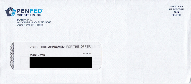
The window envelope is clearly branded. Unlike the one from two years ago, this one does not have a teaser

PenFed Credit Union Credit Card Offer Envelope

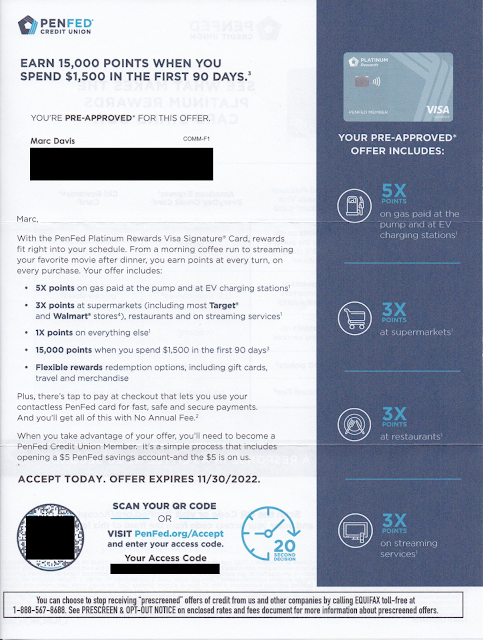
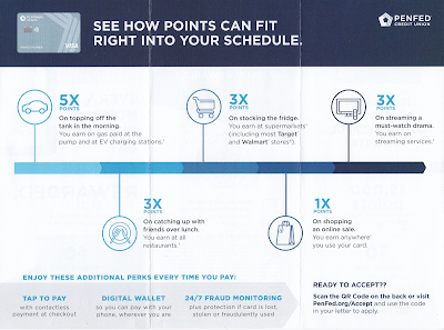
The personalized letter opens with a straightforward Johnson Box message: Earn 15,000 points when you spend $1,500 in the first 90 days. Nice. The letter opens by communicating a benefit that the rewards card works with my lifestyle. I can earn bonus points by doing what I do. I can get 5x points for filling my car's tank -- or even charging my EV, so forward-thinking! -- 3x points for food shopping or eating and doing other everyday stuff, and everyday 1x points for all those other purchases. The points accrual rates are reinforced in the right margin. 

PenFed Credit Union Credit Card Offer Letter

The letter closes with an explanation that I need to become a PenFed Credit Union member to get the credit card. It's a simple process, so all I need to do is scan the QR code or go to their website to get started.

The back of the letter reinforces points accrual and compares it to other credit card providers that offer points, then reinforces the Call to Action. 

PenFed Credit Union Credit Card Offer Letter

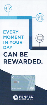
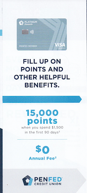
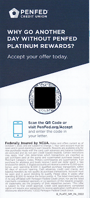
The points proposition is reinforced with a tri-fold brochure reinforcing points accrual rates. It also communicates some secondary perks such as Tap to Pay and Fraud Monitoring, but mainly it's about how all those points can really add up -- and the Call to Action is reinforced yet again.

Brochure Cover


Brochure inset

Brochure inside

Brochure back

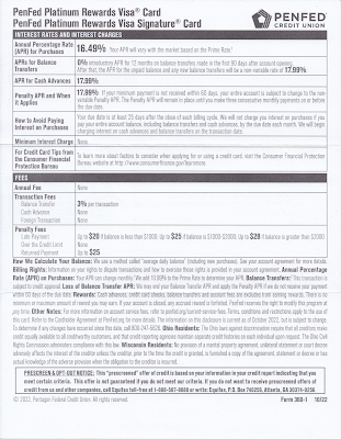
The letter package also includes the legally required Schumer Box and accompanying language disclosing the card product's terms.

Credit disclosures, including Schumer Box

 The back of the disclosures page is blank.
Back of credit disclosures page (blank page)

This isn't a quite a Fail for Creative; however, there are some improvement opportunities: 

  • Consider an enticement for the prospective customer to open the envelope. There should be an envelope teaser that would motivate the recipient to open the envelope. Given that the target audience is non-members (e.g. do not have a relationship with PenFed) this is more important than usual. (The "You're Pre-Approved" message in the standard size window is easily missed.)

  • Since the audience is non-member who don't know them, PenFed should introduce itself. Maybe PenFed has strong brand recognition within the military community; but, since I also received it, they are presumably also soliciting new customers who haven't served. Consider using the Who We Are content from the website and include it on the back of the required disclosures sheet, or squeeze a message in the letter or the brochure. 

  • Share the value of points. There is plenty of space allotted to points accrual, but nothing about how the points can be used. Explain if points can be used for travel, cash back, donations to the USO, or something I might enjoy. Also, the lack of quantification of value can be suspicious. Perhaps that 15,000-point intro bonus is worth less than the 10,000-point bonus with the compared-to American Express EveryDay Credit Card -- or perhaps it takes 20,000 points to get a shiny nickel. 

Lessons:

  1. Think about your target audience. If they are not current customers, help them get to know you.
  2. When soliciting prospective customers, include a conspicuous teaser message to give them a reason to open your envelope.
  3. Communicate benefits. Points are not a benefit. They are a vehicle of earnings toward a benefit. 
  4. Paper is expensive. Don't waste any. Leverage blank space to sell some more.

8/15/2010

Geico: Only a 15 minute list update could save Geico from a Fail

This direct mail package from Geico might be creatively complete.  From a promotional standpoint, it goes all out.  


The outer envelope includes an inviting benefit teaser on the front as well as a promotional teaser on the back. It leverages the fact that the recipient moved to a new location, and implies a financial benefit to the new zip code as well as a peak at a hundred dollar bill.

The front of the letter leverages Geico branding.  It includes not one but two Johnson Boxes as well as a side bar that clearly communicates savings benefits and call to action.
 
In the package, there are no fewer than seven calls to action to get an insurance quote.  Most of them talk to ease of the transaction, with copy points such as "a few minutes to do"; "trained professionals are there for you 24/7"; and "All you have to do is answer some simple questions ...".  Forget 15 minutes?  This is fast & easy!

The letter communicates savings benefits as well as a positive customer experience.  It includes a testimonial on the back, a sincere, signed close, and the all-important P.S. that reinforces benefits messaging and call to action.


Finally, the bottom of the letter included an immediate benefit for opening the envelope -- return address stickers with the Geico geeko. (I'm showing only one row because the stickers are so cool that I plan to use them.)
This package utilizes many direct mail best practices: envelope teaser, promotional copy, Johnson Box, side box, a feeling of sincerity, a signature, multiple calls to action, immediate benefits, strong benefit messages, focused P.S., and alignment with messaging from other communication channels.

So why the Fail?  For Timing.  Typically, consumers have 30 days to choose a new auto insurer after they move, however, I received the letter 3½ months after moving to a new zip code.  Geico could improve its success by updating the hot movers list it uses and mailing more frequently.

Although not worthy of a Fail, the testimonial on the back is a bit off the mark.  It represents a customer who chose Geico before she moved, while the package is addressed and messaged to potential customers who are in their new home.

Lesson: When you are targeting recent movers, be sure to reach them when they recently moved. 

1/31/2021

Amazon Music Unlimited: Improving the Pitch

 This letter from Amazon Music Unlimited merits a Fail for Creative for a combination of mistakes and missed improvement opportunities. 


Some positive elements of the solo letter package:
  • The letter is addressed to an Amazon Prime customer in a closed-face envelope with simple Amazon branding. This approach ensures a high open rate because Amazon and the customer have an ongoing business relationship, meaning the Prime customer will open the letter to see what it is about.
  • The front of the letter is easily scannable. The Johnson Box clearly communicates that the Prime customer would benefit from 3 months of free … something.
  • The sparse use of copy and generous use of white space help call out the benefits of Amazon Music Unlimited.
  • The letter opens with a personal salutation, addressed to the Amazon Prime customer.
  • The Call toAction on the front of the letter is easy to find.
Amazon Music Unlimited Offer Letter
Front of Letter
using Amazon Music Letterhead


However, there are opportunities to improve on this approach.

The letterhead is from “Amazon Music,” which is already free with Amazon Prime. The Johnson Box could communicate that the offer is for 3 months of Amazon Music Unlimited for free.

The opening sentence is not grammatically correct. It opens with “As a valued Amazon Prime member, we have a special offer for you:” This is an incorrect use of a dangling modifier. The opening phrase “as a valued Amazon Prime member” describes “you,” the customer -- not “we,” the company. The independent clause that begins with “we” does not match the opening phrase, which lacks a subject. While typical customers reading the letter might not remember grammar rules taught in high school, they might subconsciously notice that the sentence feels clunky, which detracts attention from the message. Keeping the message intact, a better opening would be:

“As a valued Amazon Prime member, you are eligible for a special offer:”
or, perhaps,
“As a valued Amazon Prime member, you can enjoy this special offer:” 

The complete value proposition of the low price is hidden in the Disclosure on the back. I would be forthright and mention upfront that the cost is under $8 a month after the third month.

The letter mentions the feature of being “ad free” a couple times (with varying use of hyphens). This could be brought up a level by messaging the benefit, i.e. “Listen to music non-stop, without interruptions.”

While the letter opens with a personal salutation, the closing is from “Amazon Music Team.” A truly sincere closing would be from Bob Bowen, Worldwide Head of Music, or even Jeff Bezos.

The letter includes supporting messages on the back. The front of the letter could use a message referring to the back of the letter to learn more.

Amazon Music Unlimited Marketing Letter
Back of letter

On the back of the letter, the Call to Action appears twice; however, it is easily lost. In one location, it is almost as small as the Disclosure copy. It could be larger and positioned below the Disclosure without being distracting.

The front of the letter mentions “Limited time only.” It fails to mention how limited the offer is. The offer expiration date is buried in the Disclosure on the back. The problem with this approach is two-fold:

  1. The implied need for immediate action is lost, because the customer doesn’t know by when to take action. In other words, it’s easy for the customer to say, “I’ll take care of this later,” then forget about it.

  2. If the offer truly expires on the offer expiration date, and the customer attempts to sign up after the offer expires, the customer will be unhappy from the experience of missing out on the promotion. That dissatisfied customer would view Amazon less positively -- perhaps taking out their frustration by shopping less or even cancelling their Prime membership.

Simple Envelope


Below is a rewrite of the front of the letter, with a bit more focus on product benefits. If Amazon likes the rewrite, I am willing to accept a personally signed thank-you letter.

Dear <Customer Name>,

Would you like to enjoy access to millions of songs, anytime, without interruption? Then here is an offer for Amazon Prime members like you: 3 months of Amazon Music Unlimited for FREE.

Sign up today to get unlimited access to more than 70 million songs. Listen ad-free from your home or mobile phone anytime with offline listening and unlimited skips. With so many new releases and thousands of playlists and stations available, we are sure to have your favorite tunes ready for your delight. In fact, with Amazon Music Unlimited, you can even control your music hands-free with Alexa, included in the Amazon Music mobile app and Amazon Echo devices.

BENEFITS OF AMAZON MUSIC UNLIMITED

Ö        Unlimited anytime access to more than 70 million tunes

Ö        Listen to music non-stop, without interruptions

Ö        Enjoy music anywhere, online or offline

Ö        Skip as much as you like 

Ö        Hands-free listening with Alexa

I’m so sure you’ll like Amazon Music Unlimited, I’m offering it to you for FREE for 3 months. After that, your subscription will renew for only $7.99 a month. You can cancel anytime.

This is a limited time offer, so visit amazon.com/trynow to sign up today.

Sincerely, 

[signature]

Bob Bowen

Worldwide Head of Music

P.S. This offer is good only through <expiration date>, so be sure to review the information on the back of this letter and visit amazon.com/trynow to sign up for Amazon Music Unlimited today.

Lessons:
  1. Use correct grammar.
  2. Your benefits sell your product, so communicate them.
  3. Ensure that your Call to Action is easy to find.
  4. If your offer has an expiration date, don’t bury it.
  5. A personalized letter should be personally signed.
  6. When your brand covers multiple products in a customer relationship, an experience with one product can impact the entire relationship.
  7. Don’t just ignore the back of the letter -- you can use both sides of a page to make your sale.

8/30/2020

Mr. Cooper: Sloppy letter

This letter from home loan provider Mr. Cooper merits multiple Fails for Creative.

Mr. Cooper home loan offer letter
"Pre-Approval" Letter


The letter opens with a headline reading "You're Pre-Approved* for a New Home Loan." Then, the first sentence after the salutation reads, "Whether you're bying a home or refinancing ...Those two bits of copy don't align, which can be confusing. If Mr. Cooper is offering a new home loan (as stated in the salutation), then why the quick change to refinancing in the sentence immediately following? If Mr. Cooper is offering pre-approval for a home refinancing, why not have a headline reading "You're Pre-Approved for a Home Loan" without suggesting the pre-approval is restricted to the purchase of a new home?

The letter's Call to Action is to contact Mr. Cooper's call center. These days, many call centers are open 24/7. Mr. Cooper's hours, however, are limited to 9-14 hours a day, Monday - Saturday. Fair enough. Home loan purchasing is not like auto insurance, where you might want Jake from State Farm to take care of you in the middle of the night. However, the call center hours are hard to find on the letter. They are located under the company's address, when they would be more appropriately positioned near the phone number the reader would call.

The letter contains several grammatical and formatting errors. Some examples:
  • There are three problems in this one sentence: "Call today to see if your could lower your monthly payment, payoff your home faster, pay less interest or other loan benefits.
    • The diction is incorrect in that a person does not place a phone call to "see" something. A person places a phone call to "hear" or "learn" something.(Had there not been other errors in the same sentence, I might have passed this off as a copywriter's creative style.)
    • The sentence lacks parallel structure in that the reference to "other loan benefits" lacks a verb.
    • The word "payoff" is improperly applied. As written, "payoff" refers to bribing someone. The sentence should have used the term "pay off," written out as two words.

  • In the line listing call center hours, there is an extraneous space at the front of the line.

  • For readability, that same line should include commas after the days of the week, e.g., "Mon - Thu, 7 am - 9 pm CT..."

  • In the opt-out box at the bottom of the letter, the word "pre-screen" is treated inconsistently -- once with a hyphen and twice without.
If potential customers see so many errors in a business's one-page letter, why would they believe the business is capable of properly handing a mortgage application or that the business could accurately prepare required documents for a home sale closing?

In other words, Mr. Cooper needs to clean up his act.

Lessons:
  1. The body copy of a marketing communication should support the headline.
  2. Include your call center hours in context.
  3. Proofread your communications for language and grammar. 
  4. Ensure your formatting is consistent and your letter is visually clean.

10/12/2020

Merrell: Well-timed offer lacks expiration clarity

A recent conversation at home went like this:

Me: "Hey, honey, did you say you needed new hiking shoes?"

Wife: "Eventually. Mine are starting to wear. Why?"

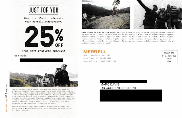
Me: "We got an offer in the mail from Merrell for 25% off footwear."

Merrell One Year Discount Offer

Merrell One Year Discount Offer - 25% Off

Wife: "Well, I do like Merrell, but I don't plan to use hiking shoes in the next few weeks. Maybe I should get replacements now with the discount. When does the coupon expire?"

Me: "It doesn't say."

Wife: "Really?"

Me: "I'll look closer." (Puts on reading glasses.) "It says it expires '30 days from postmark.'"

Wife: "When is that?"

Me: "I don't know. It's not postmarked."

Wife: "Well, whatever, I don't need new hiking shoes right away and I'm pretty busy right now."

This conversation outlines why the postcard merits a Fail for Creative

On September 13, 2019, I purchased a pair of Merrell Moab 2 hiking shoes. They are perfect for that outdoor hike around the lake, through a park or in the snow. The postcard arrived October 2, 2020, just a little over a year after I started wearing my previous purchase. So, the timing and messaging around my "Merrell anniversary" are spot on. Kudos to Merrell for Timing.

The postcard included a personalized coupon code for 25% savings; however, there is no mention in the headline regarding when the coupon code expires. I found some information in the disclosure.*

Merrell One Year Discount Offer - 25% Off
Postcard disclosure text

As I wrote in prior blog posts such as this one and this one, a Call to Action should include a clearly communicated offer expiration date. This is important: The right response window encourages immediacy of customer action; one that's faulty or unclearly defined, however, only encourages inertia.

With the Merrell postcard, the coupon code's expiration date is not only buried in the disclosure, it also references expiring "30 days from postmark"; however, there is no postmark. Postcards mailed Standard Rate are not postmarked by the USPS. So, how do customers know when the coupon code expires? They don't.

There are several ways to care for expiration date communication without jeopardizing the integrity of the message, diluting Merrell's branding or adding production costs. Here is one: Include an offer expiration date in the address section of the postcard. 

Merrell postcard mock-up, modified to add expiration date
Mock-up. I added the expiration date in the address panel

In the above mock-up, the coupon code expiration date is clearly communicated. The date is specific and reasonably prominent. The messaging complements the headline and supports immediate action. It can be inkjet- or laser-personalized using the same variable data method as the producing the coupon code and customer name and address. Depending on the postcard's production method, it could appear in spot color without incremental print expenses.

If Merrell adapts this approach, the only incremental edit would be to rephrase the disclosure to reference the expiration date in the address panel.

Lessons:

  1. Your call to action should include a clearly communicated, definitive offer expiration date.
  2. Postcards mailed Standard Rate are not postmarked.


* Many people mistakenly refer to small print associated with marketing communications as a disclaimer, when in fact it is a disclosure. According to dictionary.com, a ‘disclaimer’ is “the act of disclaiming; the renouncing, repudiating, or denying of a claim; disavowal” while a ‘disclosure’ is “the act or an instance of disclosing; exposure; revelation.” ‘Disclose’ is defined as “to make known; reveal or uncover” From a Marketing standpoint, a disclaimer is an admission that the headline is false – otherwise why renounce it? However, a disclosure provides secondary but relevant facts of an offer. So the only reason an offer or marketing communication would require a disclaimer is if it was misleading from the onset.


3/31/2020

Coronavirus Guidelines for America: Late and Hard to Read

I received a postcard with “PRESIDENT TRUMP’S CORONAVIRUS GUIDELINES FOR AMERICA.” It was dated March 16 and arrived in my New York City mailbox on March 28.

COVID-19
Coronavirus Guidelines
Mailed Standard Rate
Let’s look at this postcard from a direct mail marketing perspective. The primary objective of the postcard is to motivate people to take action to prevent getting the virus that causes COVID-19, while the secondary objective is to motivate readers to visit coronavirus.gov for more information. It merits a Fail for Creative for a few reasons.
  • White text on a black background is neither easy to print nor read, especially in italics at 9-point font size. 

COVID-10
If you can read the good hygiene tips, you don't need glasses.

  • The Call to Action to visit coronavirus.gov is visually lost.
    • On the address side, below a couple graphical icons, the website is suggested as a place to go for more information
    • On the copy side, it sits in the corner without a description of the site or a reason to visit it. It is in a good location relative to the layout of the postcard—and bold compared to most of the other content; however, the line starting “EVEN IF YOU ARE YOUNG,” with a blue background, is what draws a reader.

Perhaps the small postcard is trying to accomplish too much in too little space.

Lessons:
  1. If your copy is small, make sure you have proper color contrast.
  2. Make your call to action prominent.


[Edit: Removed commontary about postal rate used, as this was mailed EDDM.]

4/05/2020

Santander Bank: Creative Improvements, Lousy Timing


Last May, I wrote about a postcard I received from Santander Bank that merited a Fail forCreative because it promoted an incentive but lacked a conspicuous explanation of how to earn the incentive.

Santander Bank self-mailer
Cover panel
Santander Bank self-mailer
Address panel


Santander’s small roll-fold self-mailer that I received on April 2 here in New York City, however, includes elements lacking in last year’s postcard.

Santander Bank self-mailer
Offer Panels


This recent self-mailer includes a clear call to action. In fact, performing the desired action comes across as easy as 1, 2, 3.  The self-mailer includes a conspicuous explanation of what is required to enjoy the $300 incentive, with supplemental information in the disclosure. There is adequate space for benefits messaging, an easy-to-read Promotion Code, and the location of the nearest branch.

Santander Bank self-mailer
Promotion Code and Bank Branch Location


However, as I write this, the nearest branch listed on the postcard has been closed for two weeks because of the COVID-19 pandemic. More than two thousand people in New York City have succumbed to the virus. The Big Apple is in lockdown. Is this really when a consumer might consider switching the bank where their paycheck is deposited? Many consumers around here won’t even have a paycheck in a couple weeks; many others will be deceased.

So, this self-mailer is a Fail For Timing. At the very least, it can come across as callous. But should one blame Santander? It could be that the self-mailer was mailed before things got bad. When mailing Standard Rate, there is a lag time between maildrop and in-home date – sometimes a few business days, sometimes a few weeks. As we’ve seen, the world can change a lot in that short time.

Several years ago, I launched a direct mail campaign offering prospective customers around Philadelphia savings on their electricity supply costs. Unfortunately, Hurricane Sandy started up the East Coast after the maildrop. The mail reached the target market while the hurricane was disrupting power to many homes. Who knew?

Santander Bank self-mailer disclosure panel
Disclosures updated as of 2/29/20

The disclosure includes an as-of date of February 29, which suggests the self-mailer was printed in early March. If it was mailed prior to March 10, I would say"Who knew?" 

Or maybe the mail dropped closer to March 20, which means the bank knew about the pandemic hitting the United States but decided to mail anyway. If so, a decision should have been made to pull the mail rather than commit an unforced error because – even though the mail had been printed and personalized – the campaign could have been halted. Doing so would have meant postage money could be saved for a better timed mailing, and would have prevented bad optics.

Lessons:
  1. Your Call to Action should be conspicuous and easy to understand.
  2. Sometimes planned marketing efforts can be impacted by unforeseen events.
  3. There are occasions when you may need to pull mail at the last minute. Maintain the decision-making capability and flexibility to do so.