2/05/2019

Vanguard: Transition time is when?

This email from Vanguard merits a minor Fail for Creative.

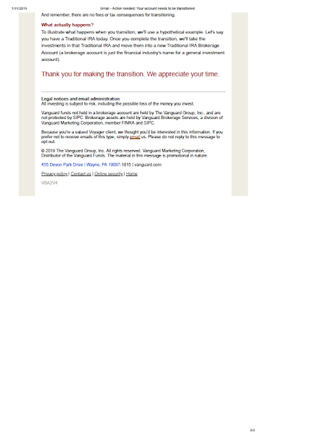
It appears that Vanguard is moving its investment platform from one system to another, and needs customers to take action to support the move. The email explains to the customer that a “3-step transition” is required, and doing so would take a “few minutes.” It includes four FAQs, but that’s all. The Call to Action is to “Transition Now” by clicking a button, which leads customers to the typical login page.
Vanguard

Vanguard
Vanguard email to customers 

This email was sent to consumers. While one can assume consumers who use Vanguard for investments have some savvy, because they avoid the high fees of other investment companies, that does not mean they are familiar or comfortable with technical terms like “transition.” The opening, in all-caps — “YOUR ACCOUNT NEEDS TO BE TRANSITIONED” — has a tonality of forcefulness that is generally not in the Vanguard communications style. To the uninformed, the fact that the account where one’s retirement savings is managed needs to be “TRANSITIONED” is scary.

There is some explanation regarding the rationale for the move, but why not position this transition as an upgrade from the onset? Sell the benefits upfront.

Furthermore, the request to the customer lacks any immediacy. The Call to Action should include a respond-by date. Internally, perhaps a decision was made not to include a date in the communication now because the IT folks have a year-long implementation plan. But even a soft request to take action by a specific date would help a customer decide to take action. Otherwise, the customer might ignore this or prioritize this task somewhere between, say, replacing the baking soda in the refrigerator and watching the last season of House of Cards.

Below is my attempt to rewrite the main message in a communications style I more typically see from Vanguard. It includes an upfront communication of customer benefit and a timely (but soft) call to action, but avoids using industry jargon and scary words.
Dear [Customer Name],
We have upgraded our platform for customers like you to make and follow your investments. This new, flexible platform will allow us to save money and make continuous service improvements, which will benefit you as we can lower our costs to serve you and improve your online experience.
Please help us move your account to the upgraded investment platform by completing 3 easy steps. It’s quick and easy—taking less than 5 minutes of your time. Just log into your account using the button below to get started.
If you could complete these 3 steps by February 28, 2019, that will help us help you. Thank you for your consideration and your time.
It would also be useful to label the FAQs below the Call to Action simply, “Frequently Asked Questions” and consider offering a separate page on the Vanguard site with additional FAQs. Doing so would boost customer confidence while reducing the expense of calls to their customer service center.

Lessons:
  1. Avoid industry jargon in customer communications.
  2. Any request for a customer to take action should include a date.

1/10/2019

National Emerald Club: Don't Nuke the Rabbit

My father once told me, “If you need to hunt a rabbit, you can use a bow and arrow or a hunting rifle. You don’t need a bazooka to hunt a rabbit - and certainly not a nuclear missile.” I later adapted that thought to a slogan of “Don’t Nuke the Rabbit.” This applies to marketing: Don’t Nuke the Rabbit in marketing communications. Take a sensible, simple approach to conveying your message.

National Rental Car could have taken that approach with the Subject Line of a recent marketing email.
National Rental Car
National Rental Car
Subject Line:
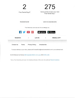
"Marc B, you're on the road to your first ONE TWO FREE reward"

The Subject Line from National Emerald Club is addressed to “Marc B.” While B is indeed my middle initial, neither I nor people I know use it when communicating with me. National knows that my first name is simply “Marc” (because the email was addressed to “Marc Davis”), so why add the middle initial? To me, it appears to be a distraction, so this would be a minor Fail for Creative.  

A second minor Fail for Creative appears in the Subject Line. The message refers to me being on my way to my “first” ONE TWO FREE Reward. This is a decent message, giving me a goal to which to aspire—namely, my first free award through this rental car promotion. However, I already have my first award. In fact, I have two awards. The body of the personalized email states that I already earned two free rental days and I am making progress toward my third free rental day.  

Rather than using a Subject Line that attempts to include my middle initial and referencing the first award, the Subject Line could have been these and have been as effective:

Marc, you're on the road to a ONE TWO FREE reward

Marc, you're on the road to your ONE TWO FREE reward

Personalizing an email Subject Line is believed to increase the likelihood of it being read.  That is a current take on what one of the great gurus of direct mail, Direct Marketing Association Hall of Fame writer Joan Throckmorton, once said in a marketing seminar (I’m paraphrasing a bit): “A person’s name is the most important word in the English language.” But we can discount that premise a bit with this particular email. It is from a rental car company to customers who opted in for a specific promotion, which means it is already timely and relevant to the reader. So, if National wanted to keep things simple, they could go with this non-personalized, simple, No-Nuked Rabbits Subject Line and have about the same level of effectiveness:
  
Your ONE TWO FREE reward is just down the road

Or this Subject Line would fit within National’s brand identity:

Drive on! Your ONE TWO FREE reward is just down the road

Lessons:
  1. Be careful using a middle initial when personalizing communications.
  2. While trying to optimize personalization in your communication is worthwhile, you should also keep your execution simple.


12/19/2018

Delta Airlines: LGA, Delays, and Holidays


This email from Delta Airlines is a minor Fail for Creative.  

The Subject Line reads “Easier Holiday Travel to LGA.” As a New York City resident, I’m already aware that, with the construction going on at LaGuardia Airport, traffic is so bad at times that people will leave their taxis and walk the last quarter-mile to their terminal. My first thought was that the email will remind me to allow extra time to get to LGA from anywhere in New York City.


But then I noticed that the Subject Line is not about traveling from LGA; it is about traveling to LGA, which implies the email is about what to do when going to LGA from out of town. That might be relevant to me if I had a reservation to fly into LGA — perhaps returning home — or recently flew into LGA on Delta. However, I have not traveled recently on Delta to or from LGA, nor do I have a future reservation that involves LGA. But I frequently fly Delta to and from JFK International Airport.

The email itself makes no mention of the specific dynamics at LGA, such as the long lines in security, crazy traffic, and leaky ceilings. (There is a reason former Vice President Joe Biden said that being in LGA is like a being in “some third-world country.”) The closest mention of local relevance would be the reminder to arrive two hours before my domestic flight.

Finally, the subsequent panel refers to JFK International, not LGA. Given this, my recent travel on Delta and future reservations on the airline — and the fact that the email refers to domestic travel when all flights out of LGA are domestic — perhaps the Subject Line was a mismatch.


Lesson: 
When personalizing an email, be sure your personalization is relevant and appropriate, and all of your content is aligned.

12/10/2018

Affinity Federal Credit Union: Missing the Point — er … Points

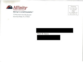
This self-mailer from Affinity Federal Credit Union merits a Fail for Creative for failing to fully explain their offer.
Outside of self-mailer


Affinity Federal Credit Union
Address Panel


During most of the year, purchases on the AffinityFederal Credit Union Pure Rewards Visa Card earn 1 point per dollar spent. Based on their redemption options, I estimate this equates to a rebate value of approximately 0.7%. Every year for the past several years, the credit card has proactively offered customers a simple points multiplier of double points or triple points for purchases in November and December to encourage purchase activity during the holiday shopping season. 

This year, the points multiplier appears to be vary based on the type of merchant. According to the self-mailer, purchases at “Bookstores, including Amazon.com” earn “5 Bonus Rewards Points,” while purchases at “Gas and Restaurants” earn “3 Bonus Rewards Points” and “Supermarket and Wholesale stores” earn “2 Bonus Rewards Points.”

Affinity Federal Credit Union Pure Rewards Points Fail for Creative
Interior of self-mailer


The language suggests the customer might earn 5 Bonus Rewards Points per purchase at Bookstores. What I believe the credit union is attempting (but failing) to explain is that some purchases earn 5 Bonus Rewards Points per dollar. Even the Disclosure copy fails to explain this as such. It reads:

*Bonus points are earned as follows: in additional to the standard points you earn (1 point per $1 spent or 2 points per $1 spent if you quality for EvenMore perks), you will receive 5 bonus points on bookstores, 3 bonus points on gas and restaurants, and 2 bonus points on supermarket and wholesale store purchases less returns during the promotional period …

It appears to me that, if a customer makes a $100 purchase at a bookstore, the customer will receive 105 points. If the intention is that the customer should receive 600 points for that purchase (6 total points per dollar spent), then the offer copy should read “5 Bonus Rewards per Dollar” and the Disclosure should read:

*Bonus points are earned as follows: In addition to the standard points you earn (1 point per $1 spent or 2 points per $1 spent if you quality for EvenMore perks), you will receive 5 bonus points per $1 spent on bookstores, 3 bonus points per $1 spent on gas and restaurants, and 2 bonus points per $1 spent on supermarket and wholesale store purchases less returns during the promotional period …

The communication of the bonus points offer appears sloppy in a couple other ways. First, Amazon.com is not a bookstore. According to Wikipedia, Amazon.com started selling items other than books in 1998. Rather than “Bookstores, including Amazon.com,” the category headline should read “Amazon.com and Bookstores.” 

The second category reads, "Gas and Restaurants" when it should read "Gas Stations and Restaurants" for clarity.  Otherwise, a person who purchases gas at CostCo would expect to receive 3 bonus points per dollar.  The third category reads, “Supermarket and Wholesale stores” when it should read “Supermarkets and Wholesale Stores.” 


Lessons:
  1. Explain your offer clearly and concisely in the body of your communication as well as in your supporting Disclosure.
  2. Be sure to have your marketing communication proofread for clarity and accuracy.
  3. Amazon.com is not a bookstore.


12/05/2018

Google Express: Holiday Giveaway a Bit Late and a Bit Off

This minor Fail for Creative and Timing is a lesson for all online marketers. 

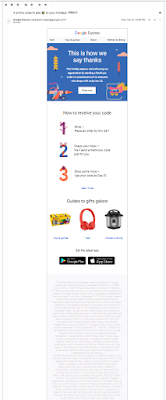
Google Express had a targeted promotion where customers who make an eligible purchase through their shopping portal between November 5 and November 25 would receive a “surprise” thank-you discount with a personalized promo code on November 27. Deep in the disclosure, the copy explains (in presumably intentionally hard-to-read, faded gray-over-gray type—a Fail for Creative) that, while most customers would receive a $10 discount, 100 customers would enjoy a $100 discount—and five lucky customers would get a $500 discount. I guess that is what makes it a surprise.
Holiday Promotion 2018
Google Express promotion solicitation email
with a long, hard-to-read disclosure


I made a qualifying purchase and, while I did not receive the discount code on November 27, I did receive it on December 1. It was four days late and for only $10, but that still beats a poke in the eye.  
Holiday promotion
Fulfillment email from Google Express

Two days later, I went to make a purchase using the promo code by clicking on the email button labeled “Shop Now,” with a sleeping fox on it. I was greeted with this landing page:
Holiday Promotion 2018
Shop Now landing page

The headline reads “Our thank-you offer has ended.” However, I had received my thank-you email—not with an “offer” but with the promised discount code. It appears to me that this web page was written to be displayed starting November 26, the day after the purchase eligibility period ended.  

If this was the appropriate landing page for the “Shop Now” button sent on December 1, it should reinforce the holiday discount. Or perhaps “Shop Now” was supposed to go to a different landing page. Either way, the lessons are the same.

Lessons:
  1. If you want your customers to understand your offer, don't disguise your disclosure content with poor color contrast.  If you don't want your customers to understand your offer, ask yourself why.
  2. Be timely in your fulfillment of an offer. It’s better to underpromise and overdeliver than overpromise and underdeliver.
  3. Ensure that all links in your customer emails are mapped to the correct landing page, and that your corresponding landing page is current and appropriate for your marketing campaign

Update 12/5
Google Express changed the 'Shop Now' link landing page to something even more confusing:
Shop Now landing page 12/5/18


12/02/2018

Jet.com: Flying in a Bit Late


Jet clearly has a large marketing budget. In addition to being exposed to NYC-centric TV commercials and subway billboards, I received three mail pieces from the company. This blog post is about the third one.


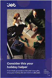
This multi-fold self-mailer arrived at my home on Saturday, November 24. While the front cover thematic is about giving gifts

jet.com holiday mailer front cover


 the thematic on the first fold-out is about Thanksgiving Dinner … 


and the last inside panel has a capture that reads, “Can’t wait for Black Friday? Preview our top deals at Jet.com/BlackFriday.” 
jet.com Black Friday reference


That makes this a Fail for Timing because it arrived after Black Friday. 

Timing mail arrival when mailing Standard Rate is not easy. Based on the postage indicia on the address panel, I know it mailed from Chicago. This was likely a saturation mailing that was drop shipped to the local post office—presumably on an SCF level. That not only reduces postage expenses but also helps with speed of delivery to the recipient’s address. But, even then, the local post office does not have any obligation related to speedy delivery. 

During the holiday season, postal volume spikes. On the day I received the Jet.com self-mailer, for example, in addition to normal marketing and personal mail, I received five catalogs and two other holiday-related marketing self-mailers. Jet may have attempted precise timing but was a couple postal days late. Perhaps they should consider mailing early—even if they are mailing often.


Lesson:
When timing the arrival of your mail, do it carefully. Consider the normal time delivery, then add extra time if mailing between mid-November and late December.

11/09/2018

Shake Shack: Offer with Bumble & "Deets"


This email from Shake Shack merits several Fails for Offer.


The offer stated in the body copy reads, “…grab a burger with your new connection + score the second burger on us.” That suggests that all I need to do to get a free burger is purchase one burger. However, the disclosure* below the offer reads that there is a minimum purchase of $10 using the app, specifically: “Minimum Shack App order of $10 for offer to apply.Where I live, that’s more than a burger. At my local Shake Shack in high-priced New York City, a Shack Burger costs $5.59, and a simple hamburger costs $4.89. So it would take a purchase of a Shack Burger, fries, and a soda ($11.13) for a customer to take advantage of the offer.

The steps involved in getting that second burger are complex – another Fail for Offer. A customer has to download an app called Bumble, swipe through something, find a profile that contains a promo code and “deets,” then redeem the offer using the promo code in the Shack App at a participating Shake Shack. That’s a lot of steps just to get a free burger. It’s not clear to me if a customer can get the free burger at the same time as purchasing a burger. If not, that’s a third Fail for Offer for not disclosing that the free burger is available only on a return visit.

There is a fourth Fail for Offer – offering only five days for a customer to take advantage of the offer.  So during the work week, a customer has to download an app, find a connection on the app, and arrange to go together to Shake Shack to follow the several vague steps in the email to obtain value.  

Bumble appears to be a dating app, but one wouldn’t know from the email from Shake Shack. It does not explain what the app is, nor does the landing page from the email link. It appears to me that the rationale for the offer is to encourage a friendly non-Tinder date by using the app to get a burger. That’s nice – but what are “deets” in this context? Sure, “deets” is often slang for “details”, but there is other slang used in the email.  Is “deets” in this context supposed to be a new short-hand combination of “dating” and “meeting”? I can’t find any mention of the term on Bumble’s website. According to Wikipedia, DEET is a type of toxin used to repel bugs. I certainly wouldn’t want any DEET on my Shack Burger! A cursory search in Urban Dictionary and the Online Slang Dictionary suggest it could refer to “details,” “gossip,” “stolen credit cards,” a racial derogatory term or to NSFW sexual acts best not described in an email from a family-friendly burger chain. The type of customer Bumble may want to target -- presumably young, urban, single professionals -- might know what “deets” means.  However, Shake Shack is sending these emails to a much wider group of customers -- presumably everyone with the app who has not yet opted-out from receiving emails -- which is why this use of slang might merit a Fail for Creative.  

Lessons:
  1. Explain your offer clearly in the body of an email. Don’t rely on a Disclosure to present the terms of an offer.
  2. Keep the process of redeeming an offer easy. Don’t make your customers jump through hoops for small rewards.
  3. Give your customers an adequate window to take advantage of your offer.
  4. If you don’t know your audience, be judicious in the use of slang.


* Many people mistakenly refer to the small print associated with marketing communications as a disclaimer when, in fact, it is a disclosure. According to dictionary.com, a “disclaimer is “the act of disclaiming; the renouncing, repudiating, or denying of a claim; disavowal” while a “disclosure is “the act or an instance of disclosing; exposure; revelation.” “Disclose is defined as “to make known; reveal or uncover.” From a marketing standpoint, a disclaimer is an admission that the headline is false – otherwise, why renounce it? However, a disclosure provides secondary but relevant facts of an offer. So the only reason an offer or marketing communication would require a disclaimer is if it were misleading from the onset.

10/29/2018

Jet.com: Cool mail, but lacking strong call to action


When I moved to New York City, I joke that I learned that as a New Yorker, I was obligated to greet people by saying either “How you doing?”, or “Up yours!” I typically prefer the former. I also learned how much convenience plays into how a New Yorker chooses where to do business – where to get a haircut, where to shop, etc. In some parts of the city, there are three TDBanks within 10 blocks because, well, that’s convenient. Who wants to cross a pair of busy intersections just to get $20 from an ATM?  Not a New Yorker.

So, even though most New Yorkers live within a mile of brick-and-mortar stores that have everything they need, they are still likely to purchase dry goods online. It goes back to convenience. After all, having a box arrive at your doorstep with your laundry detergent is easier than having to lug that weight home from the supermarket.

Enter jet.com. According to Wikipedia, the company was formed three years ago. Originally, the company had branded itself as the “biggest thing in shopping since shopping.” However, about two years ago, it was purchased outright by Walmart. Based on this CNN story and other articles found online, jet is being positioned as a site for higher-income urban millennials. Here in New York City, television advertising and subway billboard ads communicate the ability to purchase curated brands and city essentials in one place. That seems convenient. This ad, showing a New Yorker being gawked at by tourists, is locally-centric. The landing page is also themed around shopping while living in The Big Apple. On my first visit to their landing page, I am greeted with a serene, winter picture of the East River. 
Jet.com's NYC Landing page
 

Scrolling down, I find the opportunity to purchase kale and an iPad.
Below the fold on landing page


Which brings us to their self-mailer.
Front
Address panel

It is the second one I have received in as many weeks. Creatively, it is on-brand and on-message. It uses the same tagline and reflects the same sales proposition around the ability to purchase brands relevant to New Yorkers who are, presumably, like myself. And, while I’m not a millennial and I don’t know what Walmart defines as high-income, this is not a Fail for Targeting because, based on my zip code, I live in an area populated with people who fit that target market. 
First fold-out panel with small call to action

The call to action is subtle. One has to unfold the self-mailer partially but not completely to find the call to action to shop at jet.com. It’s not even to make a purchase – just to shop. It appears to me that this mailer is barely above branding piece, a supplement to the mass media advertising that conveys jet.com’s image and sales proposition. 
Next fold-out panel

Final fold-out panel. No call to action

Intuitively, I would think that if the purpose of this self-mailer were to bring traffic to the site and encourage near-term purchase activity, including of an incentive specific to the mailer would be useful -- even something minor but specific that might encourage immediacy. Maybe “$5 off your first purchase by 11/30/18” or “Free shipping on any size purchase with your first order in 2018.”  These would include a personalized promo code so it is not misused by people in the public domain and sales resulting from the mailing can be tracked. Jet.com’s check-out process already includes an input field for promo codes, so the infrastructure is in place. And doing so would not jeopardize the aspiring high-end brand image – after all, even Tiffany and Lexus have promotional offers from time to time. This looks like a Fail for Offer.

Perhaps there was a conscious decision to not include an incentive with consideration of the target market. Maybe the expense for a self-mailer is categorized by Wal-mart as merely brandingThere is a school of thought in marketing that millennials are not interested in discounts (such as in this article). However, some marketers have arrived at the conclusion that finding the best deals impact millennials’ shopping decisions. One should also consider that some recipients of these self-mailers are not millennials and are watching their dollars.

Maybe Jet’s management is trying to be as unlike Walmart as feasible. That’s understandable given the investment in jet.com’s new brand positioning. Nevertheless, I would at the very least execute an A/B test of Incentive vs No Incentive and include a useful means of tracking customers against the mailing list. 

My question to jet.com marketing leaders regarding the success of these mail campaigns is the same as how I would greet them here in New York: “How you doing?”

Lessons:
1. Consider an incentive and a timely call to action to encourage immediacy of purchase activity, if that is your marketing goal.
2. Including a unique tracking code is an excellent means of tracking response. 
3. Not sure what works?  Test your hypothesis.


10/20/2018

Celebrity Cruises: Will 209 emails convince me to set sail?


In April, I wrote about Celebrity Cruises sending me an email once a day, on average. Every day is a new special – or, perhaps, the same special as yesterday that bears repeating! Nearly every email contains a limited time offer, so I’d better “Act Now!”

I received 207 209 emails since returning from a March cruise, making Celebrity’s near spam-like email solicitations a sad Fail for List.  (I started this morning with 207 emails but received 2 more in the past hour.)

Let’s recognize that going on a 3- to 14-night cruise to exclusive destinations (pardon me for absorbing their sales language) is not entirely an impulse purchase decision. If it were, then Celebrity would have offers that last a day or two rather than a week. But, hey, I’m not a cruise industry marketing expert.

Celebrity isn’t the only cruise line that continually hits homes with marketing communications. Every month for at least four years, I’ve received a mailer from Norwegian Cruise Lines. Every monthly mailer tours a destination and rotating offers such as on-board high-end dining, excursion credit, friends and family tag along for free, in-cabin Wi-Fi, or the opportunity to binge-drink at sea – also known as “unlimited open bar.”

The distinction between Norwegian’s and Celebrity’s marketing is that Norwegian’s printed and mailed offers include an aspirational flair: You want to be on the beach in the Caribbean or watching whales off the shore of Alaska. In contrast, Celebrity’s special-offer-of-the-day emails tend to be more transactional in nature. To be fair, maybe some of the emails strive for a more emotional resonance, but, even as a marketing professional, I’m not going to review all 200+ of them to find out.

Lesson:
Test the frequency of communications with your customers to learn what is the most responsive. Sometimes less is more.

6/10/2018

MoMA: Failed Mail, But Is It Art?


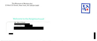
I moved to New York City last July. Last week, I received the below solicitation for membership from the Museum of Modern Art (MoMA). The Outer Envelope Teaser reads, “Welcome to the Neighborhood!” Inside is an offer of discounted membership “… available only for our new neighbors.” However, I moved to New York City last July.

Museum of Modern Art Solicitation
Inviting Outer Envelope
"Welcome to the Neighborhood!"


I can only speculate why I received a solicitation with this type of messaging after living here nearly a year. Did MoMA purchase a hot movers list that wasn’t so…hot? Did the mailer obtain my information several months ago but didn’t use it until now (e.g. a Fail for Timing)? If either of these is true, that is poor targeting (e.g., a Fail for List). Did MoMA know I moved more than 10 months ago but chose to position their solicitation as being for new residents? If so, that appears to me to be a Fail for Creative, because the messaging is not relevant.


Museum of Modern Art New York City
Front of letter

Museum of Modern Art New York City
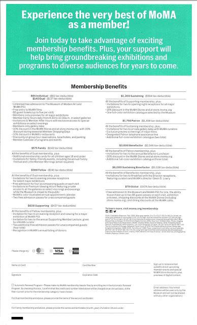
Back of letter includes many membership level options


Aside from that point, creative execution is quite good. The package includes many of the elements known to support optimizing response:
  • Outer Envelope. The outer envelope clearly identifiers the sender. It is stamped, which suggests a personal correspondence. The teaser “Welcome to the Neighborhood!” is in an inviting color.
  • Letter. In lieu of a typical Johnson Box, the letter tastefully displays what a new member might expect to enjoy at the MoMA. Displaying the organization name and return address on the side (as well as choosing a font that visually matches the MoMA brand identity) is inviting. The interior highlight colors match the outer envelope teaser. The copy describes the overall benefits of membership and is inviting. The letter is personally signed by a relevant individual, and it closes with a postscript that reinforces the offer. 
  • Buckslip. The buckslip insert clearly and simply reinforces basic membership benefits and includes a call to action.
    Museum of Modern Art Solicitation

    Museum of Modern Art Solicitation
    Buckslip insert
  • Personalized Response Form. The Membership Acceptance Statement already has the prospective member’s name and address. The form includes mention of to whom to make out a check and includes an option to pay the membership fee using a major credit card. 
  • Business Reply Envelope. The reply envelope is postage-paid, meaning the recipient won’t need to spend effort finding an envelope or a stamp. The FIM Bar and barcode will ensure smooth and fast response delivery.

Museum of Modern Art Solicitation
Standard Business Reply Envelope
Prepaid postage allows for easy return & fast delivery


This solicitation may also deserve a Fail for Offer, because there are too many and they are confusing. The front of the letter lists four membership options, while the back of the letter lists nine – with costs ranging from $70 to a whopping $6,000. If the people being solicited are new to the neighborhood, they are likely not ready to put down more than a couple hundred dollars on membership at a museum. They may also not be willing to take the time to understand the difference between the $70 “Global” membership listed on the back and the $70 “Individual” membership listed on the front. This forces the consumer to make a decision within a decision – to first make a decision whether to be a member and then to make a secondary decision regarding the type of member to be. Forcing the secondary decision risks prospective member frustration, which leads to delayed or no action on the primary decision.

It would be worthwhile to communicate only two to four entry-level options for new members, then take action to upsell them later when they call to join – or upon their first enjoyable visit to the museum.

In addition to caring for the Fails, there are a few minor optimizations I would consider with this type of solicitation:

  • Open the letter with the recipient’s name. Perhaps there wasn’t space with this design; but, if you are going to take the effort of having a personal-style letter solicitation, open with “Dear Marc Davis” – or, if the list source data allows, “Dear Marc.” 
  • Explain some elements a bit better. When communicating museum features and benefits, consider the fact that the intended recipient is new to New York City. For example, the back of the letter and the buckslip mention free admission to “MoMA PS1.” A new neighbor might confuse that with something related to a SonyPlayStation
  • Reinforce the promo code. To get the discount, the new member has to enter a promo code mentioned in the body of the letter. Someone simply scanning the letter, however, would be hard pressed to find it. It should be listed in the Acceptance Statement in #1 under “Four easy ways to join” and it could be reinforced in the postscript. 
  • Create a matching landing page. The current call to action mentions moma.org/join, which appears to be the standard page for new member enrollment. Unfortunately, that page has even more options than the letter – creating even more potential for confusing prospective members – and the page also doesn’t reference the new member discount. This means the recipient of the letter couldn’t use it to get the targeted discount. A matching landing page can have an inviting URL (i.e., moma.org/newneighbor), visually match the solicitation, and show only simplified, relevant membership levels at the offered price without forcing the new member to enter a promo code. In addition, quantifying page visits can support gauging overall prospective membership interest resulting from the solicitation. 
  • Avoid the zip+4 on the outer envelope return address. This bit of technical accuracy doesn’t help optimize mailing the package and detracts from the light, personal feeling of the solicitation. 
One needs creative skills to design the right type of communication for the target audience to mail at the best time. But is it art? Well, maybe – but the actions of measuring, testing, learning, and optimizing mean it is also math.

Maybe, one day, MoMA will have an exhibit featuring creative elements of successful direct mail, perhaps next to a Swatch Jellyfish watch or Macintosh classic desktop computer


Lessons:
  1. When choosing to communicate to prospective customers around life events, make sure your list source is accurate – and mail on a timely basis.
     
  2. When soliciting new customers to your program, offer few and simple options.

(Edited to correct hyperlinks.)