11/29/2015

Just Energy: Limited Offer for Unlimited Electricity with Failed Mail Limitations

Just Energy Unlimited electricity offer envelope
Outer Envelope with 'Limited Time' mention in the teaser
Sometimes brilliant ideas fail on execution. That might be the case with this solo letter package from Just Energy. Their offer of unlimited electricity is innovative and potentially compelling. For one price, you can get all you can eat, er, consume.  

Just Energy Unlimited PA landing page
404 error message on landing page /UnlimitedPA
But this direct mail marketing campaign merits some Fails for Creative. The largest Fail is for a non-functional landing page. As I write this, the website listed at the bottom of the letter has a 404 error message. A customer cannot sign up.

On the letter itself:
  • Just Energy overuses branding. The company name is mentioned several times, filling up the page when critical space could be used to message benefits and reinforce the call to action, which is hard to find at the bottom of the page.
  • Variable content is misaligned. The price, the green checkmarks, and the promo code all appear to be a bit higher on the page than they should be. This gives the appearance of a shoddy form letter, which makes the company seem less trustworthy. 
  • Much of the focus is on features but there is little focus on benefits.  
  • The box in the middle of the page mentions “JustGreen,” but there is no payoff of the term. I presume that JustGreen is a trade name or product name for renewable energy sourcing; however, this is not explained to the reader.
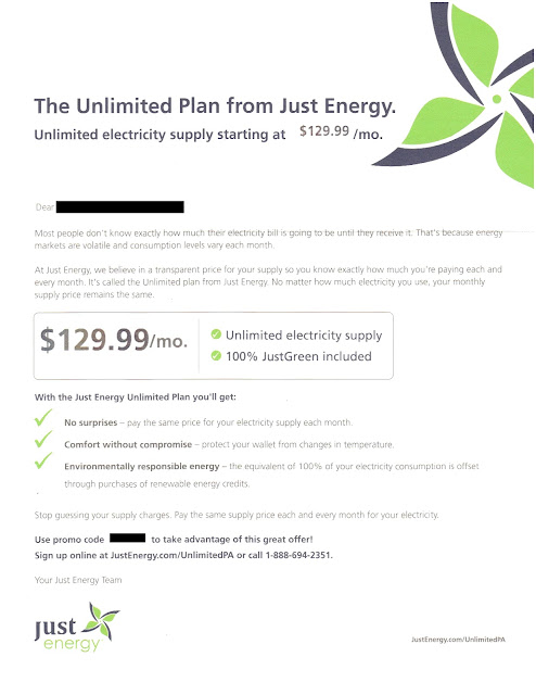
Just Energy Unlimited Electricity Offer Letter
Offer Letter Front
  • Some of the language is a bit heavy on industry jargon. For example, residential consumers understand energy “usage” but might not understand what “consumption” means.
  • Another product name, “Unlimited Plan,” is capitalized inconsistently. In the Johnson Box (and later in the letter) the term is proper-capped; however, in the second paragraph, only the word “Unlimited” is capitalized. 
  • The signatory is generic. Rather than closing with “Your Just Energy Team,” why not close with a signature from the CEO or Vice President of Customer Service? That would make the letter appear to be more sincere.
  • It is missing a respond-by date. The outer envelope headline asserts that this is a limited-time offer, but there is no mention of time-based limitations in the letter. From a direct marketing perspective, a respond-by date gives urgency to a marketing communication and therefore supports immediate consumer action. In the electricity supply industry, it also protects the seller. What if the cost of electricity shoots up and the monthly price of $129.99 cannot be supported? Someone responding to this mailer a month after receipt would be upset when told that the price is now $159.99 per month. 

Below the summary of lessons is how I would rewrite the letter, encompassing the given product with a focus on benefit statements while leveraging proven direct mail marketing elements. This copy would be reformatted and integrated with corporate branding elements for a smooth but not overwhelming balance of color.

Lessons: 
  1. Ensure that all back-end processes are in place supporting your campaign, especially your phone number and landing page.
  2. Make your offer letter look presentable.
  3. Use consumer-facing language.
  4. Focus on benefits.
  5. Include a respond-by date.
  6. Proofread.
-----------------

Offer Letter Rewrite


Enjoy unlimited electricity supply with a simple price
Sign up by xx/xx/xx to lock in your monthly bill for this winter
  • Unlimited Electricity Supply
  • 100% environmentally responsible
  • All for only $129.99 / month
  • Easy sign-up at JustEnergy.com/UnlimitedPA
Dear xx, 

Most people don’t know how big their electricity bill is going to be until they receive it.  That’s because energy costs and electricity usage change each month.  But you can stop worrying about that.

At Just Energy, we believe in being clear and straightforward. That’s why we created the Unlimited Plan. No matter how much electricity you use, your monthly supply price remains the same so you can have peace of mind knowing how much you pay each and every month.

With the Unlimited Plan from Just Energy you’ll enjoy:
 No Cost Surprises – Pay the same amount for your electricity supply each month.
 Comfort without Compromise – Turn up the electric heat because your wallet is protected from changes in temperature.
 Environmental Responsibility – We purchase renewable energy credits to offset 100% of your electricity usage.

Stop guessing about how much you’ll pay and breathe easy this winter.  Take advantage of this offer by xx/xx/xx.  Sign up at JustEnergy.com/UnlimitedPA.  Be sure to use promo code xxxx to benefit from this low fixed price! We look forward to having you as a customer.

Sincerely,
[signature]
Deborah Merril
Chief Executive Officer, Just Energy

P.S. Still unsure?  Call one of our friendly energy specialists at xxx-xxx-xxxx and mention promo code xxxx. They will be happy to answer your questions and help you sign up.


11/15/2015

PayPal: Still Shoddy After All These Years

Four years ago, I received a shoddy-looking letter from PayPal informing me that I had been preapproved for a PayPal credit account. I wrote about it in a previous blog post, expressing concerns about overall effectiveness and dilution of PayPal’s brand equity.

PayPal crap
Still Hard to scan + Still Hard to read
+ Still Hard to understand = Still Hard to believe
Last month, I received a similar mailing with a similar style -- blind outer envelope, full-justified copy, black-and-white printing that appears to have been printed on a faded mimeograph, and nearly the exact same copy. Even the first mention of the word “on-line” is hyphenated while the second mention of “on line” in the same paragraph is two words.

The only significant differences appear to be the brand name change from Bill Me Later to PayPal Credit and that PayPal VP Carolyn Groobey no longer associates herself with this solicitation. The signatory is an impersonal “PayPal Credit.”

I find it interesting that PayPal Credit has continually optimized their online tools -- including engaging responsive design and making many of their tools mobile friendly -- yet they continue to use the same shoddy, cheap direct mail solicitation. The quant in me would like to presume that PayPal has run extensive A/B tests and learned that this approach is the most effective. But the right side of my brain is yelling, “How can this cheap creative that looks like a bureaucratic form letter with typos and everything be effective? And how can PayPal allow its brand to be cheapened for so many years! How?!? Why?” 

Is there a lesson here? Perhaps this letter isn’t a Fail for Creative. Maybe the appearance of a poorly created form letter is optimally effective for reaching a credit-worthy (but credit-needy) target market. If so, this is my lesson learned. Or perhaps this is a low-end marketing program that falls under the radar at PayPal headquarters and the lesson is to review your creative content, keep it relevant, don’t let it look lousy, and test it from time to time.

Perhaps the lesson is that, even in the mobile age and at the most tech-forward of companies, there remains a use for direct mail marketing.

10/19/2015

GSN Games: Where Do I Put My Quarter?

This letter was sent by “Lindsey” – a manager at GSN Cash Games – to someone who played their games for a while. GSN offers versions of “Wheel of Fortune,” “The Price is Right,” and “Bejeweled Blitz” where players pay an entry fee to compete against other people and win cash prizes. The letter’s recipient played some games, but stopped over a year ago. 

GSN Cash Games sent the recipient periodic emails offering promotional bonuses for playing games again. He opened and read a few, but – after a while – he ignored the emails and condemned them to his Spam folder. With that in mind, a sincere “we missed you” letter of this type sent via snail mail makes sense. 

The letter from Lindsey is an attempt to win back a customer. It offers the reader an opportunity to reengage with their site and play some games. There is an offer of game credits, email addresses to write to with feedback, and even an easy way to restore a forgotten password. So, from a marketing standpoint, the List,Offer, and Timing make sense. 

While the creative tone appears to be appropriate to the target audience, this is still a Fail for Creative because the letter is missing a clear call to action. The reader is asked to “come back and play some games,” but the letter does not identify the Web site. The recipient had not visited the site in over a year and may not remember the URL. It could have been included in a few places in the letter while maintaining a sincere tone. Some examples:

“… it’s been a while since you visited www.xxxx.com and played a game with us.”

“Please come back to www.xxxx.com and play some games with us.”

“Log in at www.xxxx.com by midnight ET on …”


Lesson: Be sure your call to action is communicated clearly.

10/06/2015

TurboTax: Tax Time Starts Very, Very Early

I received a solo letter package from TurboTax on September 30 – a time when Halloween candy is on the shelves at the supermarket. This appears to me to be very early. I have yet to think about what I’m getting my wife for the holidays much less filing my 2015 taxes, but I’m only a focus group of one. On an overall marketing basis, is this a Fail for Timing or is this a smart way for Intuit to get ahead of the volume of holiday catalogs in the mail to reach out to and insulate customers for repeat purchase history?  

Envelope Front
Envelope Back
Creatively, the solo mail package is clean. On the front envelope teaser, there is a clear call to action. The rear teaser has a reinforcement message with an implied savings offer. The inside letter communicates the TurboTax value proposition using several direct mail best practices: Johnson Box, bulleted clear call-outs of features and benefits, and a reinforced call to action. The accompanying brochure breaks down the products – differentiating them in a clear manner while reinforcing the overall and individual product propositions.

Em dashes are used in a few places in headline and body copy. These are often interruptive and can be a good replacement for a comma. But utilizing a triple-dash style with no space often gives the reader the feel of there being two sentences rather than a single broken sentence. Take this line adapted from the outer envelope rear teaser:
Get your biggest refund – guaranteed! 
The use of the shorter en dash with spaces before and after creates a better visual flow compared to:
Get your biggest refund—guaranteed! 
The latter may be closer to grammatical correctness, but this isn’t a college essay – it is a marketing communication. 

Letter front
It is odd that the first solicitation for the next tax year would be via snail mail, where there is a hard cost of printing and postage. Why not at least start with an email? Intuit has my email address, and it costs nearly nothing to send me a customized email noting my product choice from last year and offering an opportunity to get the same product this year.

The offer is nothing special. There is a vague “SAVE $10*” message in several places. The disclosure on the back of the brochure reads “* Savings and price comparison based on anticipated price increase 3/18/16.” That is not quite a compelling reason to make a purchase now, especially considering the fact that the money-back guarantee applies only within 60 days of purchase. If I make a purchase now, I will still be eating leftover Thanksgiving turkey when the guarantee expires. Not even Ned Flanders gets started on his taxes before the end of the yearThe lack of a bona fide customer value for immediate action merits this a Fail for Offer

Perhaps Intuit was trying to standardize the mailer and purchase process, but, in doing so, may have missed personalization opportunities. For example, I have used the Premier version of TurboTax every year for at least a decade. That would suggest that I have no interest in the Deluxe version this year, so about a quarter of the brochure’s content is irrelevant to me. Rather than explain a likely irrelevant lower tier product, perhaps the focus could have been on resale and upsale.
Back of letter


If you are going through the effort and expense to send a personalized solo mail package, consider having a personalized offer with personalized tracking such as a unique offer code or personalized URL, product recommendations based on prior purchases, and an offer that expires soon. This could allow the customer to not have to complete a long form when repurchasing your product online. Not only will this address the customer based on his/her purchase history and information, you have the opportunity to fully track customer interactions.

Lessons:

  1. Consider the Timing of your marketing communication relative to seasonal level of consumer interest as well as macro-marketing conditions.
  2. Direct mail may not be the best method to reach out to your existing customer base when there are lower-cost methods available.
  3. Consider how you use dashes in every sentence.
  4. Have an offer that compels immediate action.
  5. Use your database to personalize your marketing communications and customer interactions.
Brochure Cover

Brochure Back

Brochure interior
Brochure interior

8/18/2015

CenturyLink sends great offer to ineligible cusotmer

This recent post on Consumerist about CenturyLink mailing an offer to an ineligible customer with prior issues is a reminder that all companies should have and maintain a Do Not Solicit list.  The list should include who request opt-out as well as unusual situations like Seth’s.  Use it for both email and snail mail. 

Lesson: Save yourself some embarrassment -- have a marketing opt-out list.  Maintain it and update it frequently.

7/20/2015

Basic Rules of Prospecting Are Important Everywhere, Even LinkedIn

LinkedIn offers salespeople the opportunity to find prospective customers and leverage their network as a sales funnel. Just as with the cold call, they get one chance to make a first impression. Unfortunately, the below example of a Fail for Creative provides lessons that apply to how not to make a first impression in a prospecting email.


  • The email is just plain long. It is not scannable, so a reader does not have a quick, clear understanding of the product proposition.
  • It uses a good deal of industry jargon. This is a tricky thing. For example: Perhaps I, as the recipient, know the meaning of 'REP' (retail electricity provider) commonly used in Texas, or perhaps I know us by the term ‘ESCO’ used more often in the northeast (energy service company). In actuality, my company is known in this state is an ‘EGS’ (electricity generation supplier).
  • My company name is incorrect near the end of the first paragraph. While I work at Talen Energy, the email mentions Champion Energy Services, one of my competitors.
  • It is overloaded with details that do not connect. For example, one sentence reads:
A not-for-profit 501(c)(3) organization, [REDACTED] has developed the first-of-its-kind research network, including more than 1,200 household participants and has generated the largest database of disaggregated residential energy use.  
What does the fact that the company is a not-for-profit have to do with what it developed? And why mention 501(c)(3) status when you’ve already mentioned it is not for profit? 
  • It does not ask for a meeting. There is a general statement about looking forward to learning more about Talen Energy, but not a specific request to meet. A better close would be, “When is a good time next week for us to discuss the potential to support your business needs?”
Lessons:

  1. When driving awareness or initial interest – regardless of the channel – keep your communication scannable for ease of reading and comprehension. Be succinct.
  2. If you do not know your customer, avoid industry jargon.
  3. Proofread everything.
  4. Close with a clear call to action.

4/25/2015

TruGreen: Is the Past the Future?


I currently live in a townhome in a managed community, which would make this solicitation from TruGreen an easy Fail for List. But the creative has some interesting elements.

Front of letter
On the front of the letter, the Johnson Box appears to have a general introduction sales message. If you read only that, you know the offer and the call to action. However, that darn asterisk suggests that there may be more to the offer than advertised. Looking on the back of the letter, we find in the disclosure: “Special price of $29.95 is for the first application only, for new residential EasyPay or PrePay customers only,” and so on. OK, fair enough. But I would not necessarily be a “new” customer. I am a prior customer — albeit at a prior address where I owned a house with a Texas-sized lawn

In fact, the first subhead and footer both ask that I “Come back to TruGreen now …” Perhaps I was targeted for this solicitation because of my prior customer status, which would make this mailing a win-back effort. Setting aside the fact that this is still a Fail for List — because I cannot purchase TruGreen’s services for my townhome — the offer is confusing. If I am a prior customer (e.g., not really “new”), am I still eligible?

Back of letter
I get the sense that the win-back messages were wedged into a new customer solicitation mailing. While there are two headline-level messages suggesting I “Come Back,” the body copy and outer envelope teaser suggest that I have never been a customer and am unfamiliar with the product. Perhaps this was a multi-cell mailing and the variable copy is in the spaces with the green background.

Aside from that, there are some creatively strong elements to the mailing. TruGreen’s message of “153 of your neighbors have TruGreen lawns” lends legitimacy to the product proposition (but, again, seems irrelevant to a former customer). Core messages are conveyed multiple times in the Johnson Box, side bar, sub-heads and the back of the letter. The use of color with emphasis on green and complementary lifestyle photos results in a pleasant resonance.
Outer Envelope


Lessons:
  1. Target customers who can purchase your product or service.
  2. When messaging a customer based on knowledge you have, ensure your messaging is consistent.


3/05/2015

Mytireshop.com: Online Company, Offline Fail

I originally flagged these two postcards I recently received on the same day from mytireshop.com because two of them arrived at the same address on the same day — one for someone who, to my knowledge, has never lived at the address. That would make it an easy Fail for List and an example of the importance of doing a list dedup; after all, if you are willing to address your mail to “Current Resident,” there is nothing to be gained from sending two pieces of mail to the same residence.
For me
Not for me 
Inspecting the postcards further, this appears to be example of how an online business fails in its use of offline media in other ways:
  • There is not a specific Call to Action. It appears the objective of the postcard is to motivate people to visit www.mytireshop.com. However, the message about the website is that it is “your Fast, Local Tire Source.” The call to action should be specific, i.e., “Shop Tires Online at mytireshop.com”, with supporting features and benefits messaging.
  • The URL is lost in the copy. It is the same weight as the rest of the copy, without a “www” preceding it, making it easy to get lost. It should have some distinction — at minimum an underline, different color, or italics. Having a “www” in front makes it clear that it is a website. Granted, the concept of having to explain that something is on the World Wide Web is a bit passé, but, perhaps, that is why there is a “www” in front of the same piece’s mention of www.generaltire.com. Which leads to …
  • There are multiple possible actions from the communication. If a customer visits the General Tire website, they receive general information about the brand, but not about mytireshop.com. So why have multiple URLs on the same communication? Here’s my speculation: General Tire was willing to co-fund the postcard to promote their brand. That’s fine, but the postcard suggests that mytireshop.com sells only General Tires. It would have been better for mytireshop.com — and the potential customer — for the postcard to explain that “mytireshop.com sells General Tires and other fine brands” or have a similar headline-level message. 
  • Benefitmessages are missing. The features messaged here are specific to the tire, the ability to install the same or next day, and that it is a “Faster, Local Tire Source.” (How is a company with a foreign-seeming toll-free phone number local?) The benefits that could be messaged but are not are Peace of Mind, Ease of Use, Joy, and so on. For example, “Install the same or next day” could be “Relax. Visit www.mytireshop.com today and enjoy your new tires tomorrow.”
  • There is no method of tracking success. Customers go through a sales funnel: Awareness, Interest, Consideration, Desire, Action. The business behind mytireshop.com could easily learn how many customers move from Awareness (receiving the postcard) to Interest (visiting their website) by using a personalized URL that tracks who visited the website — or, at the very least, a vanity landing page specific to the mailing to count site visits. Once online, both methods can be used, along with Google Analytics, to see how many people complete the sale process — and how. 
  • Mytireshop.com
    Postcard front - heavy on GT
  • The phone number is not mentioned as toll-free. While most people know that “800”, “888”, and “877” are toll-free phone numbers, many consumers do not yet recognize that “866”, “855” and “844” are also toll-free. Some people might counter this by explaining that most people use mobile phones with unlimited voice usage or pay regardless of the phone number; however, there are still people that call from landline phones. For those who prefer to call from home rather than visit the website, this piece should help get them from Awareness to Interest by reminding them that the call is free.

These are Fails for Creative and reminders to spend your marketing dollars wisely.

Lessons:
  1. When mailing to homes by address, dedup your list by address.
  2. Have a clear call to action that stands out.
  3. Include only one call to action and one URL on a communication.
  4. Communicate benefits.
  5. Establish and utilize a results tracking method.
  6. If your phone number is toll-free, message it as such.