12/18/2019

American Red Cross: Is a Blind Envelope Prudent?

You are one of the largest charities in the United States, with over $3 billion in annual expenses. According to Charity Navigator, only one other charity is followed more. When there is a natural disaster, you are there. Your logo is considered one of the most recognizable, one of the best in the world. So why are you hiding your logo?


Blind Outer Envelope
Red Cross Solicitation:
Front of Outer Envelope

That’s what I’m asking myself after receiving this charity solicitation from the American Red Cross. Every other charity solicitation I have received this holiday season included a message on the envelope -- what is known in industry jargon as a teaser. However, this Red Cross solicitation not only did not include a teaser, the envelope was completely blind. There is no indication that this is from the Red Cross, not even a return address.
Back of Outer Envelope
Is this a Fail for Creative? I don’t know. Intuitively, I think so. But I can’t be a focus group of one because I'm so enthusiastic about direct mail marketing, I open and read everything I receive (besides, the concept of being a focus group of one is dangerous). 

There are several schools of thought on whether teasers make sense. Some POVs from people with non-profit direct mail experience include this blog post suggesting that, because most teasers are simply not very good, a non-profit is better off without one. A similar POV from Mary Chalane suggests that, if a non-profit uses a teaser, it needs to be worthwhile. 
Donation Solicitation Letter front

Donation Solicitation Letter back
I agree with these opinions conceptually -- a bad teaser is worse than no teaser -- but couldn’t Red Cross creatively develop a good teaser? If not, shouldn’t Red Cross at least include its well-known, appreciated logo in the outer envelope return address area? 


BRE
Front of Business Reply Envelope
includes branding in color


Back of Business Reply Envelope

Perhaps Red Cross A/B tested the blind envelope against one with a teaser. Perhaps it tested against several teasers and an envelope displaying only their logo, and the blind envelope kept winning. If the test took place in the summer, perhaps it should try testing against a holiday-themed envelope in December when consumers’ hearts and checkbooks are more likely to be open.

My creative intuition could be right, or it could be wrong. The only way to know for sure is to test. Happy holidays.


Lessons:

  1. Know your strength of your brand.
  2. Maintain a Control package, but test against it at times relevant to your audience.

10/25/2019

Fiddler on the Roof: Don’t Fall – Dedup Your List


Selling tickets for an off-Broadway show is challenging. That’s why someone in charge of marketing and advertising a show often uses a mix of communication channels — television advertising, spot radio, ticket outlets like TKTS and TodayTix, and handing out flyers around Times Square.
Plus, direct mail. Why the multi-channel mix? One word: Tradition!
Self-Mailer front
Which brings me to this Fail for Targeting. A neighbor received two identical self-mailers for the new off-Broadway Yiddish production of Fiddler on the Roof on the same day. One self-mailer included her full name, including middle name, while the other included only her first and last name. However, both self-mailers have the same last name, apartment number, street address, and complete zip+4.
Inside panels
In the past, when the recipient had purchased Broadway tickets, she typically used her full name. Sometimes, however, she used only her first and last name. That’s probably why she received these two mailers—the marketing people for Fiddler on the Roof had rented different lists of people who are likely to purchase show tickets, merged them, and targeted them for a bulk mailing. The mistake here is in list hygiene — specifically, making sure your mailing list is clean but not duplicative.
Address side
Perhaps the mailing list manager had made a decision to allow for multiple people in the same home to receive the same mailer. Typically, that’s a cost-inefficient approach; however, the manager may have assumed that, if one person in the home turns out to be uninterested in the show, the other person might be. Even if that were the case, though, the first and last names on these mailers were identical. That indicates that both names are of the same person.
2 self-mailers to the same name & address
Executing a successful direct mail campaign as part of an omnichannel marketing mix involves understanding the dynamics of the channel. It is a balance of Targeting, Offer, Creative, and Timing. Having the right balance isn’t easy — but, then again, neither is being a Fiddler on the Roof.


Lesson: Practice proper list hygiene by removing duplicate names from your mailing and limiting your targeting to one mailer per address.

10/15/2019

Vanguard: Beefing Up Security, Beefing Up Customer Emails

Earlier this year, I wrote about an email from Vanguard to customers that included a few Creative Fails. It described some type of transition. This email is an improvement. It applies some best practices to motivate the reader to take action to motivate the reader to take action to set up 2FA, also known as two-factor authentication.


2-factor authentication
Vanguard Security Update email

The email opens in an emphatic tone. It speaks like a communication from Vanguard; that is, the tone fits their their brand identity of taking a stand for investors and treating them fairly.

The second paragraph contains the call to action. It cites a shared responsibility. It explains what is being requested and why.

The third paragraph includes a time-specific call to action. The response window is four weeks -- a bit long in internet time, but fair considering the actions involved.


The fourth paragraph explains (in plain English) what the reader needs to do. Although the call to action is to do something after logging into the Vanguard web site, there is no hyperlink to the login. We may reflexively consider this an error, but it is actually an email security best practice that guards against phishing attacks. 

Finally, there is a polite close reinforcing the cooperative nature of the call to action. 

There are a couple potential minor improvement opportunities. I would consider adding a valediction, along the lines of "Sincerely, Vanguard Customer Service" or perhaps a couple FAQs. But these are based on my intuition and outside understanding of the target market. In the best possible world, if timing allows, an A/B test could be executed to see which edits would result in improved response.

Lessons:
  1. When communicating with customers, your communications style should be aligned with your brand.
  2. Requests to your customers should be date specific.
  3. A/B test every communication as feasible.


9/24/2019

Simplisafe: The Story Is About Apartments. The Mail Is Not.

Many companies have a story connected to their foundation — often explaining what inspired the CEO to create the company. And, no, the inspiration is not, "To make a boatload of money." At SimpliSafe, the story begins with a robbery:
After his friends were robbed, Chad Laurans discovered a serious problem in the home security industry. No one was protecting renters. Alarm systems needed a ton of hardwiring and came with pricey long-term contracts that couldn’t be canceled. So Chad built something new.
This story about Chad Laurans's inspiration is quoted from SimpliSafe's page focused on apartments, located here. The same page includes a sales message referencing apartment protection:
Now SimpliSafe is the fastest growing home security company in the nation. SimpliSafe won’t lock you in a long-term contract and 24/7 professional monitoring is only $14.99 a month. Protect your apartment—the smart way.
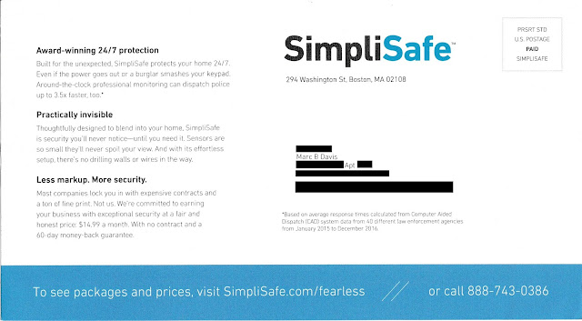
So it would appear that Mr. Laurans understands the needs of people who live in apartments for adequate security.  That brings us to a postcard mailed to apartment homes and what I believe is a Fail for Targeting and Creative.


SimpliSafe Solicitation - Sales Side
Lead Generation Postcard

I live in a co-op apartment building, which typically consists of units that resemble apartments. Although they are cooperatively owned (rather than rented out) by their residents, these are very similar to rental apartment units in that they are underserved by the legacy home security companies.

SimpliSafe Solicitation - Address Side
Lead Generation Postcard - Address Side


On their website, if one clicks on "Shop Now" either from the home page or the /fearless landing page mentioned on the postcard, the lead product is the most expensive one. Even the "Shop Now" link found on the apartment-focused page leads to several product bundles starting with The Haven for $489 that includes 14 pieces of security equipment including a freeze sensor.

Presuming this postcard is part of a national campaign, a version should have been created specifically for people living in apartments.* The apartment-versioned postcard could support Mr. Laurans’s story by mentioning the need for even small apartments to have physical protection. In addition to communicating a low monthly price, the postcard could focus its limited space to communicating safety, peace of mind, renters insurance discounts, and effortless set-up. The Call to Action would be to a visit a landing page that reinforces service benefits while leading with a product package best suited for apartments. This could be The FoundationThe Essentials, or a similar lower-priced package. After all, many renters don't need water or freeze sensors.

Apartment-centric page - mobile view

SimpliSafe may also want to consider the entire prospect user experience that results from using the postcard as a lead generation device. Above, for example is the Apartment-centric page as viewed on a Pixel 3a XL. Much of the type is too small to read on a mobile device. Other pages in the domain require a reader to scroll left and right — cumbersome on a laptop and an outright hassle on a mobile phone. Mobile use as a percentage of internet traffic continues to increase, even for people in their homes, and especially for young renters. SimpliSafe should consider creating mobile-friendly versions of their site or fully embrace responsive design.

If SimpliSafe's communications are optimized for target market relevancy, this company's story could have a happy ending. To paraphrase a SimpliSafe tagline, that would be "Direct Marketing. Done Right."

Retargeting. Done right.
SimpliSafe Retargeting Ad - laptop view 


Lessons:
  1. When your product has multiple target markets, segment your list selection and messaging to appeal to those target markets.
  2. Maintain messaging consistency and product recommendations relevant to your target market segment all the way through an online sale.
  3. Consider how your content appears on mobile devices.

*It could be that SimpliSafe is segmenting rental-style apartments in their list selection, and I received a piece designed for single-family homes because I live in an owner-occupied unit. Nonetheless, the presence of an apartment number in my address should have been a flag for list scrubbing, segmentation, or at least understanding the nature of co-op apartments.

9/18/2019

Shutterfly: Why They Call It "Snail Mail"

There are several ways a company like Shutterfly can promote sales to prior customers.
  • If the company has an app, it can push a notification to the customer's smartphone. However, notifications can be blocked or can be missed among more urgent notifications.
  • The company can send an email. The benefits of this approach include very low cost to send and precisely manageable timing. The downside is that emails can fall into a spam filter or can be easily missed or ignored by the customer.
  • The company can send a letter or postcard. The benefit of this approach is that mail gets noticed. A properly created direct mail communication is interruptive without being obtrusive. In other words, it gets noticed.  The downside is that one cannot guarantee when their mail will arrive in the customer's mailbox.
That's the case with this Shutterfly Labor Day Sale postcard. It merits a Fail for Timing because I received it on September 12 -- the day after the sale ended.  

Shutterfly's postcard arrived late
Postcard Front

In an ideal world, the postcard should arrive in home on August 28, the day the sale starts. Some retailers believe sales communications should arrive 1-2 days prior to the sale so a consumer can plan to make a purchase during the sale period; however, I believe this POV comes from an outdated brick-and-mortar way of thinking. When sending a communication with a call to action to go online or use an app, it appears to me that the marketing communication should arrive at a time when a customer can immediately take action and benefit from the offer.

Shutterfly sale
Postcard Back

The postcard size is 6" x 9", which the USPS classifies as Marketing Mail. Postage charges to send a postcard of this size are the same as for letters. However, instead of spending the extra money to send it via First Class Mail, Shutterfly sent it by Standard Rate, formerly known as Bulk Rate. This is the least expensive (but slowest) delivery method available. The cost difference between Standard Rate and First Class Mail for this type of postcard is typically 12-15 cents, depending on addressee density and other factors.

Postage Indicia - Standard Rate Postcard


Unfortunately, it took the USPS two weeks to deliver from northern California to New York City. Perhaps the postcard was put into the mail in California just prior to the sale. If so, Shutterfly could benefit from dropshipping. This is a method where an independent company ships your mail by truck to a postal network distribution center close to the recipient's location. So, rather than putting the postcard in the mail in Redwood City for the USPS to send to a network distribution center in California, then to a network distribution center in Colorado, then to a network distribution center in Missouri, then to a network distribution center in — well, you get the idea — the dropshipper puts the mail in a truck and drives it directly to a sectional center facility near New York City to be sorted for the local postal carrier to bring to homes in the Big Apple

It is also possible that this postcard was, in fact, dropshipped and sat in a local sectional center facility for about two weeks. After all, the USPS is not accountable for standard rate mail delays.

Lessons:
  1. Your mail should arrive at a time that is relevant to the offer and consumer interest.
  2. Dropshipping has an incremental cost, but it improves timing and costs less than First Class Mail. If you are going to invest in direct mail, optimize your delivery.


9/11/2019

Upstep: 9/11 Sale is an un-American, Tasteless Fail

At 8:09 am on September 11, 2001, American Airlines Flight 77 pulled back from the gate at Dulles International Airport. In the next 86 minutes, the plane was hijacked and flown into the Pentagon, killing all 64 people on board along with 125 Pentagon personnel.

Exactly 18 years from that moment, custom orthotic insole maker Upstep launches a sale. It sends emails to people on their marketing list promoting a "Patriot Day Flash Sale", complete with American imagery.

Upstep appears to be un-American
Upstep's 9/11 Patriot Day Flash Sale email

To refer to this email solicitation as merely a Fail for Creative and Timing is an understatement. 9/11 is a tragedy, not an excuse for a sale. The "flash" of the each of two planes being flown into the Twin Towers is seared in my memory as well as those millions of other Americans. This is not a time for a sales promotion -- this is a day for prayer and remembering our lost family, friends and First Responders.

The email footer states that Upstep is based on Madison Avenue in New York City; however, I cannot phantom how anyone who lived in NYC on 9/11/01 or today would consider, develop or approve this type of marketing communication.

Lesson:
Do not leverage 9/11 for your sales promotion. Just ... don't.


7/21/2019

Recycling in NYC: Use Positive Motivation & Clarity

I live in a co-op apartment building in New York City. The building is managed by an outside company that cares for functions such as heating, cleaning common areas, and trash disposal.

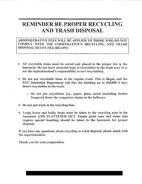
Our building maintenance crew is spending a disproportionate amount of time caring for recycling – sorting out trash that should have been recycled, separating items in the recycling bin that should be disposed as trash, and preparing recyclable items to be picked up. This issue has led the building management company to send the below letter to co-op residents.

New York City Recycling Notice
Recycling Notice


Thinking about this from a viewpoint of consumer motivation and marketing, the letter merits a Fail for Creative for tone and clarity.

Below is a rewrite of the letter.

/\/\/\/\/\/\/\/\/\/\/\/\

Proper Trash Disposal and Recycling Helps Everyone – Including You


We recently noticed that some people in your cooperative building are not properly disposing of trash and recyclables. While most residents are taking the right steps, a few are not following procedures. This is illegal and can be costly. If the NYC Sanitation Department detects recyclables in the trash, the building can be fined up to $10,000 – a fine that would have to be passed on to residents through maintenance fees.

Here’s a reminder of what, as residents of [REDACTED], you need to do:
  • Sort and place all your recyclable items in the proper bins in the basement. It is your responsibility to sort items, so please do not leave unsorted bags of recyclables in the trash area.
  • Place non-recyclable items in the compactor chutes in your floor’s hallway or in the trash cans in the basement.
  • Do not put recyclable items in the regular trash cans.
  • Never put recyclable items in the compactor chutes.
  • When you have a large box or bulky item, take it to the recycling area in the basement, dismantle it, and be sure to flatten it out.
  • When you have an empty paint can or item that requires special handling, take it to the basement recycling area for proper disposal.

Please keep in mind these items that are recyclable:

  • Paper of all types, including newspapers, magazines, flyers, mail, and restaurant menus
  • Glass, including all bottles
  • Plastic, including all bottles and containers
  • Metal, including clothes hangers
  • Cardboard, including small store boxes as well as shipping boxes from Amazon, Blue Apron, and similar companies.

If you have any questions about recycling or trash disposal, please speak with [REDACTED], your building superintendent. Thank you for helping to keep our costs down, follow city regulations, and support recycling in New York City.

/\/\/\/\/\/\/\/\/\/\/\/\

This rewrite captures the key messages of the original letter while applying some communication Best Practices.

  • Personalization. I included the name of the building and the name of the building's superintendent. (Ideally, I would include the name of the recipient. However, this type of letter is placed under every resident's door, making individual personalization impractical.)
  • Normative Messaging. In the opening paragraph, I mention that most residents are good people. They take the right steps. The implied message is to be good – like your neighbor.
  • Shared Responsibility. While the original letter mentions that the "building" could be fined $10,000, my rewrite reminds co-op residents that such a fine would personally impact them.
  • Clarity. My rewrite explains what can be recycled, and how, in carefully laid-out bullets rather than in brackets.
  • Positive Reinforcement. I thank residents not only for cooperation but also for helping to save money and support a good cause.
Consider these elements not only when selling something but also when explaining process, procedure, and product.


Lessons:
  1. When motivating consumer behavior, consider utilizing personalization, normative messaging, and a positive focus.
  2. When explaining recycling procedures, be clear about what can be recycled.

6/07/2019

The Citi Never Sleeps, or Stops Mailing

In February, I wrote about Citi sending solicitations to their credit card customers for their Citi Rewards+ Card at the same time as offers for their current credit card. This practice appears to be continuing.

In that February post, I mentioned someone who received an offer to trade in their current Citi card around the same time as receiving an activation offer. That was confusing to him. Since then, that person received the upgrade offer for the Rewards+ Card again, twice. All three mailers were the same self-mailer -- right down to the visuals and copy. I also received the same Rewards+ Card upgrade offer twice.

While it is a well-proven direct marketing best practice that reaching the same person with the same offer multiple times will result in incremental response, this technique is typically utilized by communicating variants of the same message. Benefits messaging might be rotated, or the second mail (or email) with the same offer would include a message that calls out “Second Notice,” “Time is Running Out,” or something similar that resonates with a heightened level of urgency. But sending the exact same mailer three times is, IMHO, a Fail for CreativeIt reminds me of the Urban Dictionary’s definition of “insanity,” which I prefer not to write out myself. My supposition is that the idea was to save money on creative by having one base version to mail -- and mail and mail.


The reason for my supposition is that I also received the exact same creative (only twice), as did my wife (only once). All the preprinted elements were the same. The only differences between her self-mailer and mine were in the variables regarding our respective current Citi cards and how they compared to the new Rewards+. I presume this to be Citi’s high-volume Control packageIf so, they really should consider A/B testing different layouts.

Not only that, but I and my wife also received concurrent bonus offers for using our current credit cards. Taking a step back here, let’s remember that the consumer credit card industry is mighty competitive. It’s not enough to convince a consumer to obtain your credit card. Once that consumer becomes your customer by applying for and being approved for your card, you need to motivate the customer to actually use your credit card. In industry jargon, that is known as “activation.” One way to accomplish this goal is by offering a bonus reward for use; another is to solicit the customer to accept a product upgrade. Fine -- but doing both at the same time merits Fails for Targeting and Timing.  

We both received upgrade offers and activation offers on the same day. In other words, we found four pieces of Citi mail waiting in our mailbox. 

Citi has business-to-customer relationships, but perhaps they should think about this like a personal relationship between two people who are casually dating. Using this analogy, Citi is having dinner with it's significant other.  While enjoying the salmon, Citi says both "I want to move in with you." and "It's ok to see other people."

Lessons:
1) If at first your targeted offer doesn’t succeed, you can try again -- but at least try something different.
2) Prioritize your business goals; then, prioritize your customer communication tactics.

Rewards+ Upgrade offer I received twice

Activation offer I received twice

My activation offer letter - front

My activation offer letter - back.
Not valid if I chose to switch to Rewards+


My wife’s upgrade mailer


My wife's upgrade mailer - inside.
Same base copy, different personalization.


Different product comparison table,
specific to current Citi card.

My wife's activation offer letter - front.
Same visuals as mine, with card-specific offer.

My wife’s activation offer letter - back.
Also not valid if she switches to Rewards+.

5/26/2019

Santander Bank: What To Do to get $300?

As competition in retail banking increases, brick-and-mortar banks continue to offer incentives in the form of bonuses to open an account. I recently wrote about TD Bank’s self-mailers. This one from Santander Bank is a simple postcard—in fact, it’s too simple. That’s why it merits a Fail for Creative.


Santander New Customer Postcard
Postcard Front
The front of the postcard prominently messages the opportunity to get a $300 bonus for moving to Santander Bank, but does not explain what that means. The only hint of an explanation is a small message to “See reverse for important information.”


Santander Bank New Customer Offer
Postcard Back


The back of the postcard communicates some of the benefits of banking with Santander and includes a Call to Action to visit a website or visit a nearby branch with the postcard. That’s nice, but what about that $300? What does a prospective customer need to do to get the bonus? The explanation is buried in the long Disclosure. (If you can read the explanation without visual support, you don’t need glasses.) While the 17-line Disclosure is concise, it is not clear to a casual reader. That lack of clarity is a Fail, because who wants to put on reading glasses just to figure out what hoops to jump through to get the bonus?

I’m not a lawyer, so this isn’t legal advice. As a marketer, however, I think the lack of clarity may not only be bad marketing, it may also be a violation of FTC regulations. Current regulations state
“When making ‘Free’ or similar offers all the terms, conditions and obligations upon which receipt and retention of the ‘Free’ item are contingent should be set forth clearly and conspicuously at the outset of the offer so as to leave no reasonable probability that the terms of the offer might be misunderstood.” 
While the terms of the offer to get the free $300 are clear, they are not conspicuous. The offer landing page explains the terms adequately; however, it refers the customer back to the postcard.

Top of landing page

Lesson:
When presenting an offer to a prospective customer, clearly and conspicuously explain what needs to be done to obtain that offer.


5/17/2019

Hertz: App Offer "Terms Apply" - What Are They?

Hertz has had a challenging time with their customer app. In fact, execution of their app redesign was so bad that, only a few weeks ago, Hertz sued their marketing partner Accenture (pdf here). So, when Hertz finally had a newly redesigned app ready for prime time, it made sense to promote it.

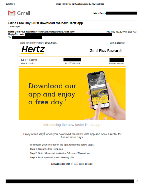
When promoting engagement of an app, offering an incentive for use is an effective tool. This week, Hertz is offering customers a free car rental day. I recently received the below email as a Hertz Gold Plus Rewards member.

Terms Apply


Terms Apply
Hertz new app promotional email with message that "Terms Apply"

According to the email, I can get a free rental day when I use the app. The headline message has an asterisk—or, in this case, a paragraph symbol (¶)—indicating there is a Disclosure on the page regarding the offer. Based on the corresponding paragraph symbol, the Disclosure reads simply, “¶ Offer ends 06/30/19. Taxes and fees excluded. Terms apply.”  

OK, so what are the terms?

I thought the landing page might perhaps have more information; however, it includes only the same Disclosure that “Terms Apply.”

Terms Apply
Landing page. Disclosure circled.

I thought there might be at least a link here to the terms that apply, but there is not. We know from the email that the offer is valid on rentals of 5 days or more and expires on June 30, 2019. The landing page includes the additional Disclosure that the offer is available only in the United States and Canada, but what else? Is it valid in Hawaii? At airport pick-ups? For Hertz Local Edition? Can I combine it with a free upgrade offer? Do AAA discounts or my CDP number combine with this offer? Do I need to reserve at least 7 days in advance?

These are details, but are relevant details that may or may not drive decision. By not sharing them and merely stating, “Terms apply”, this email and related web page merit a Fail for Creative.

I messaged Hertz via Facebook yesterday and asked what terms apply to this offer. They didn’t know. At their request, I shared the above email and landing page. They responded that they will research this. I received some follow-up questions, so they are still researching.

Update 5/17/19: Hertz communicated to me via Twitter:
Hello Marc. When on the app, you will stay on the home page, under the YouTube video, you will click on the promotion that states " App Exclusive", when you click that you will see at the top "Get a free day when you rent for five" and scroll up. It states the offer summary and the Terms and Conditions. If you are still having trouble, please reach back out for further assistance. We will gladly walk you through the steps. Thank you. -DR
This reinforces my point -- that terms are not upfront and hard to find. There is no reason both the email and landing page could have disclosed at least "Please review the offer in our new app for additional terms that apply."

Lesson:
When you present an offer, share the terms of the offer upfront. At the very least, know what they are.

2/22/2019

Uber: Too Little Urgency, Yet Too Little Time to Save

I recently wrote about an offer from TD Bank that lacked urgency because of a hard-to-find offer expiration date. This targeted offer I received yesterday from Uber also merits a Fail for Creative for missing the mark regarding urgency. It may also merit a Fail for Offer.


Uber sends an offer with a compressed, hidden response window
Email from Uber 2/21/19


The Subject Line is smartly personalized with my first name with an offer to “enjoy 50% off.” There appears at first glance to be a significant discount opportunity. The body of the email is also prominent in messaging 50% off not just my first ride, but my next 10 rides with Uber. However, down in the Disclosure, one would learn that the offer expires 2/25/19 at exactly 6:00:00 am. The email was sent on 2/21/19 at 6:54 am local time, which means that I, as a customer, have fewer than 96 hours to take advantage of this offer. (Or maybe I have 99 hours. Perhaps the offer expires 6:00:00 am Pacific Time while I live in the Eastern Time Zone.)


Let’s assume the offer is targeted based on my customer history with Uber. I used Uber’s service only twice in the past 18 months. So, perhaps this offer was targeted at me to encourage me to be a more active customer. If true, I don’t understand why Uber would target a basically inactive customer with an offer that would apply to as many as 10 rides in as few as 4 days. Is Uber expecting me to say, “Wow! Uber is cheap now! I’m going to skip the faster subway or not use my own car for four days?” It doesn’t make sense. If Uber wants me to try out their service again more than once or to prioritize it above Lyft or other services, why not expand the offer applicability window to at least a week?

If I were to write this, I would start with an upfront, clear, honest message with an adequate opportunity for customers to hail an Uber.  It would open with:

“Thank you for being an Uber customer. 

Enjoy 50% off your next 10 rides in the next 10 days.”  


Lessons:
  1. Include a clear, prominent respond-by date.
  2. Allow customers an adequate opportunity to respond to your offer.
  3. If your offer is specific to time of day, specify the applicable time zone.

2/20/2019

TD Bank: New Account Offer Missing Urgency

I recently wrote about an email from Vanguard that lacked a respond-by date -- and, therefore, lacked urgency. This self-mailer from TD Bank also lacks a clear respond-by date and thus merits a Fail for Creative.

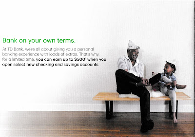
TD Bank New Customer Offer

TD Bank New Customer Offer
Outside of Self-Mailer

TD Bank New Customer Offer
First fold-out panel

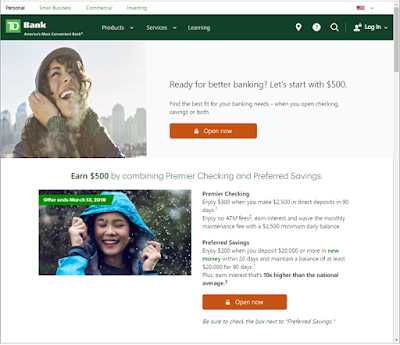
The folded self-mailer includes an offer of up to $500 if the customer opens a checking account and a savings account. The amount of free money is as low as $150 if the customer opens only one type of checking account, but that’s not chump change. The call to action is to open the banking accounts at a local banking branch, TD Store, or by visiting a special landing page. The landing page reinforces the offer with the same imagery as the self-mailer. That’s nice creative coordination.

TD Bank New Customer Offer

TD Bank New Customer Offer
Inside panels
However, the mailer buries the offer expiration date in the disclosure. The first line reads, “Offer valid from January 15, 2019, through March 13, 2019...” It is found in small, light gray type (e.g., not designed to be read). The only sense of urgency conveyed is in the call to action to “Get started today.”


TD Bank New Customer Offer
Only mention of offer expiration date
(I added the red circle)
The landing page includes mention of “Offer expires March 13, 2019” above the fold and in the pictures, making them hard to miss. That’s smart. However, the person who receives the mail needs to visit the website to be able to clearly see the offer expiration date.

TD Bank New Customer Offer
Offer landing page: td.com/Earn500

Lesson:
If you want customers to respond to your offer, include a clear, prominent respond-by date.