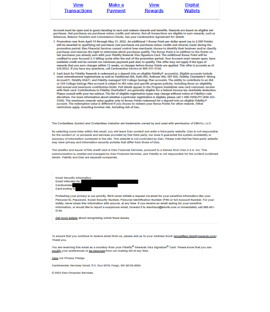
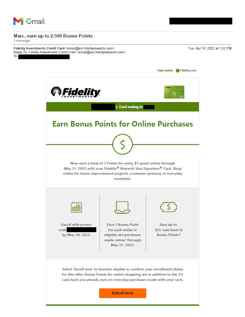
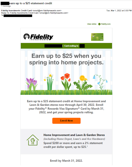
About six weeks later, Fidelity sent a new and better executed offer to the same person.
 |
The offer is straightforward and simple enough to explain to my mother: Earn 3 points, rather than 2, for every dollar spent online through May 31, 2022. Unlike with the previous email, there's no minimum spend level, and the email clearly explains the $25 incremental rebate cap using icons and simple language to support communication clarity. Below the three icons, the email reinforces the basic product benefit, specifically that the bonus is in addition to the 2% cash back already available for all credit card purchases.
On the other hand, the email still has one issue. To enroll in the offer, the recipient has to click on the "Enroll now" link in the email then enter a promo code (which may be unique to the recipience, so it's blacked out here as potential PII). The code is 13 digits, which is a lot to enter. In user experience jargon, the need for a customer to enter a long code adds traction to the enrollment process.
So, how could Fidelity Rewards improve this email even more? If the promo code is unique to the customer, perhaps Fidelity could offer1-click enrollment, as other companies do. If it is not unique, why make the promo code so complex? Fidelity could go with something easy to transpose, such as "OnlineBonus22."
Lessons:
- Your offer should be simple to explain.
- Don't forget to reinforce your basic product benefits.
- Take as much traction as you can out of customer enrollment -- the easier for customers, the better.


