I moved to New
York City last July. Last week, I received the below solicitation for
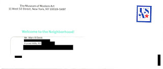
membership from the Museum of Modern Art (MoMA). The Outer Envelope Teaser
reads, “Welcome to the Neighborhood!” Inside is an offer of discounted
membership “… available only for our new neighbors.” However, I moved to New
York City last July.
 |
| Inviting Outer Envelope "Welcome to the Neighborhood!" |
I can only
speculate why I received a solicitation with this type of messaging after
living here nearly a year. Did MoMA purchase a hot movers list that wasn’t
so…hot? Did the mailer obtain my information several months ago but didn’t use
it until now (e.g. a Fail for Timing)? If either of these is true, that is poor targeting (e.g., a Fail for List). Did MoMA know I moved more than 10 months ago but chose to position
their solicitation as being for new residents? If so, that appears to me to be
a Fail for Creative, because the messaging is not relevant.
Aside from that
point, creative execution is quite good. The package includes many of the
elements known to support optimizing response:
- Outer Envelope. The outer envelope clearly identifiers the sender. It is stamped, which suggests a personal correspondence. The teaser “Welcome to the Neighborhood!” is in an inviting color.
- Letter. In lieu of a typical Johnson Box, the letter tastefully displays what a new member might expect to enjoy at the MoMA. Displaying the organization name and return address on the side (as well as choosing a font that visually matches the MoMA brand identity) is inviting. The interior highlight colors match the outer envelope teaser. The copy describes the overall benefits of membership and is inviting. The letter is personally signed by a relevant individual, and it closes with a postscript that reinforces the offer.
- Buckslip. The
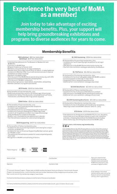
buckslip insert clearly and simply reinforces basic membership benefits and
includes a call to action.

Buckslip insert - Personalized Response Form. The Membership Acceptance Statement already has the prospective member’s name and address. The form includes mention of to whom to make out a check and includes an option to pay the membership fee using a major credit card.
- Business Reply Envelope. The reply envelope is postage-paid, meaning the recipient won’t need to spend effort finding an envelope or a stamp. The FIM Bar and barcode will ensure smooth and fast response delivery.
 |
| Standard Business Reply Envelope Prepaid postage allows for easy return & fast delivery |
This solicitation
may also deserve a Fail for Offer, because there are too many and they are
confusing. The front of the letter lists four membership options, while the
back of the letter lists nine – with costs ranging from $70 to a whopping
$6,000. If the people being solicited are new to the neighborhood, they are
likely not ready to put down more than a couple hundred dollars on membership
at a museum. They may also not be willing to take the time to understand the
difference between the $70 “Global” membership listed on the back and the $70
“Individual” membership listed on the front. This forces the consumer to make a
decision within a decision – to first make a decision whether to be a member
and then to make a secondary decision regarding the type of member to be.
Forcing the secondary decision risks prospective member frustration, which
leads to delayed or no action on the primary decision.
It would be worthwhile
to communicate only two to four entry-level options for new members, then take
action to upsell them later when they call to join – or upon their first
enjoyable visit to the museum.
In addition to
caring for the Fails, there are a few minor optimizations I would consider with
this type of solicitation:
- Open the letter with the recipient’s name. Perhaps there wasn’t space with this design; but, if you are going to take the effort of having a personal-style letter solicitation, open with “Dear Marc Davis” – or, if the list source data allows, “Dear Marc.”
- Explain some elements a bit better. When communicating museum features and benefits, consider the fact that the intended recipient is new to New York City. For example, the back of the letter and the buckslip mention free admission to “MoMA PS1.” A new neighbor might confuse that with something related to a SonyPlayStation.
- Reinforce the promo code. To get the discount, the new member has to enter a promo code mentioned in the body of the letter. Someone simply scanning the letter, however, would be hard pressed to find it. It should be listed in the Acceptance Statement in #1 under “Four easy ways to join” and it could be reinforced in the postscript.
- Create a matching landing page. The current call to action mentions moma.org/join, which appears to be the standard page for new member enrollment. Unfortunately, that page has even more options than the letter – creating even more potential for confusing prospective members – and the page also doesn’t reference the new member discount. This means the recipient of the letter couldn’t use it to get the targeted discount. A matching landing page can have an inviting URL (i.e., moma.org/newneighbor), visually match the solicitation, and show only simplified, relevant membership levels at the offered price without forcing the new member to enter a promo code. In addition, quantifying page visits can support gauging overall prospective membership interest resulting from the solicitation.
- Avoid the zip+4 on the outer envelope return address. This bit of technical accuracy doesn’t help optimize mailing the package and detracts from the light, personal feeling of the solicitation.
Maybe, one day,
MoMA will have an exhibit featuring creative elements of successful direct
mail, perhaps next to a Swatch Jellyfish watch or Macintosh classic desktop computer.
Lessons:
- When choosing
to communicate to prospective customers around life events, make sure your list
source is accurate – and mail on a timely basis.
- When soliciting new customers to your program, offer few and simple options.
(Edited to correct hyperlinks.)


