Showing posts sorted by date for query disclosure. Sort by relevance Show all posts

5/26/2019

Santander Bank: What To Do to get $300?

As competition in retail banking increases, brick-and-mortar banks continue to offer incentives in the form of bonuses to open an account. I recently wrote about TD Bank’s self-mailers. This one from Santander Bank is a simple postcard—in fact, it’s too simple. That’s why it merits a Fail for Creative.


Santander New Customer Postcard
Postcard Front
The front of the postcard prominently messages the opportunity to get a $300 bonus for moving to Santander Bank, but does not explain what that means. The only hint of an explanation is a small message to “See reverse for important information.”


Santander Bank New Customer Offer
Postcard Back


The back of the postcard communicates some of the benefits of banking with Santander and includes a Call to Action to visit a website or visit a nearby branch with the postcard. That’s nice, but what about that $300? What does a prospective customer need to do to get the bonus? The explanation is buried in the long Disclosure. (If you can read the explanation without visual support, you don’t need glasses.) While the 17-line Disclosure is concise, it is not clear to a casual reader. That lack of clarity is a Fail, because who wants to put on reading glasses just to figure out what hoops to jump through to get the bonus?

I’m not a lawyer, so this isn’t legal advice. As a marketer, however, I think the lack of clarity may not only be bad marketing, it may also be a violation of FTC regulations. Current regulations state
“When making ‘Free’ or similar offers all the terms, conditions and obligations upon which receipt and retention of the ‘Free’ item are contingent should be set forth clearly and conspicuously at the outset of the offer so as to leave no reasonable probability that the terms of the offer might be misunderstood.” 
While the terms of the offer to get the free $300 are clear, they are not conspicuous. The offer landing page explains the terms adequately; however, it refers the customer back to the postcard.

Top of landing page

Lesson:
When presenting an offer to a prospective customer, clearly and conspicuously explain what needs to be done to obtain that offer.

5/17/2019

Hertz: App Offer "Terms Apply" - What Are They?

Hertz has had a challenging time with their customer app. In fact, execution of their app redesign was so bad that, only a few weeks ago, Hertz sued their marketing partner Accenture (pdf here). So, when Hertz finally had a newly redesigned app ready for prime time, it made sense to promote it.

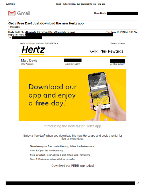
When promoting engagement of an app, offering an incentive for use is an effective tool. This week, Hertz is offering customers a free car rental day. I recently received the below email as a Hertz Gold Plus Rewards member.

Terms Apply


Terms Apply
Hertz new app promotional email with message that "Terms Apply"

According to the email, I can get a free rental day when I use the app. The headline message has an asterisk—or, in this case, a paragraph symbol (¶)—indicating there is a Disclosure on the page regarding the offer. Based on the corresponding paragraph symbol, the Disclosure reads simply, “¶ Offer ends 06/30/19. Taxes and fees excluded. Terms apply.”  

OK, so what are the terms?

I thought the landing page might perhaps have more information; however, it includes only the same Disclosure that “Terms Apply.”

Terms Apply
Landing page. Disclosure circled.

I thought there might be at least a link here to the terms that apply, but there is not. We know from the email that the offer is valid on rentals of 5 days or more and expires on June 30, 2019. The landing page includes the additional Disclosure that the offer is available only in the United States and Canada, but what else? Is it valid in Hawaii? At airport pick-ups? For Hertz Local Edition? Can I combine it with a free upgrade offer? Do AAA discounts or my CDP number combine with this offer? Do I need to reserve at least 7 days in advance?

These are details, but are relevant details that may or may not drive decision. By not sharing them and merely stating, “Terms apply”, this email and related web page merit a Fail for Creative.

I messaged Hertz via Facebook yesterday and asked what terms apply to this offer. They didn’t know. At their request, I shared the above email and landing page. They responded that they will research this. I received some follow-up questions, so they are still researching.

Update 5/17/19: Hertz communicated to me via Twitter:
Hello Marc. When on the app, you will stay on the home page, under the YouTube video, you will click on the promotion that states " App Exclusive", when you click that you will see at the top "Get a free day when you rent for five" and scroll up. It states the offer summary and the Terms and Conditions. If you are still having trouble, please reach back out for further assistance. We will gladly walk you through the steps. Thank you. -DR
This reinforces my point -- that terms are not upfront and hard to find. There is no reason both the email and landing page could have disclosed at least "Please review the offer in our new app for additional terms that apply."

Lesson:
When you present an offer, share the terms of the offer upfront. At the very least, know what they are.

2/22/2019

Uber: Too Little Urgency, Yet Too Little Time to Save

I recently wrote about an offer from TD Bank that lacked urgency because of a hard-to-find offer expiration date. This targeted offer I received yesterday from Uber also merits a Fail for Creative for missing the mark regarding urgency. It may also merit a Fail for Offer.


Uber sends an offer with a compressed, hidden response window
Email from Uber 2/21/19


The Subject Line is smartly personalized with my first name with an offer to “enjoy 50% off.” There appears at first glance to be a significant discount opportunity. The body of the email is also prominent in messaging 50% off not just my first ride, but my next 10 rides with Uber. However, down in the Disclosure, one would learn that the offer expires 2/25/19 at exactly 6:00:00 am. The email was sent on 2/21/19 at 6:54 am local time, which means that I, as a customer, have fewer than 96 hours to take advantage of this offer. (Or maybe I have 99 hours. Perhaps the offer expires 6:00:00 am Pacific Time while I live in the Eastern Time Zone.)


Let’s assume the offer is targeted based on my customer history with Uber. I used Uber’s service only twice in the past 18 months. So, perhaps this offer was targeted at me to encourage me to be a more active customer. If true, I don’t understand why Uber would target a basically inactive customer with an offer that would apply to as many as 10 rides in as few as 4 days. Is Uber expecting me to say, “Wow! Uber is cheap now! I’m going to skip the faster subway or not use my own car for four days?” It doesn’t make sense. If Uber wants me to try out their service again more than once or to prioritize it above Lyft or other services, why not expand the offer applicability window to at least a week?

If I were to write this, I would start with an upfront, clear, honest message with an adequate opportunity for customers to hail an Uber.  It would open with:

“Thank you for being an Uber customer. 

Enjoy 50% off your next 10 rides in the next 10 days.”  


Lessons:
  1. Include a clear, prominent respond-by date.
  2. Allow customers an adequate opportunity to respond to your offer.
  3. If your offer is specific to time of day, specify the applicable time zone.

2/20/2019

TD Bank: New Account Offer Missing Urgency

I recently wrote about an email from Vanguard that lacked a respond-by date -- and, therefore, lacked urgency. This self-mailer from TD Bank also lacks a clear respond-by date and thus merits a Fail for Creative.

TD Bank New Customer Offer

TD Bank New Customer Offer
Outside of Self-Mailer

TD Bank New Customer Offer
First fold-out panel

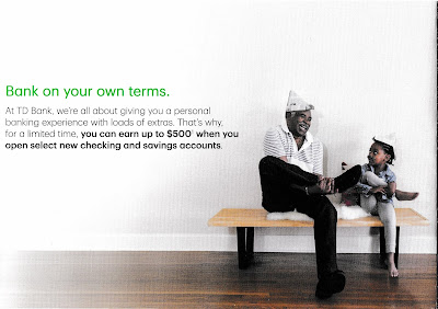
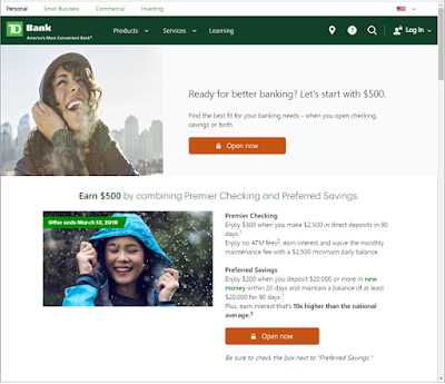
The folded self-mailer includes an offer of up to $500 if the customer opens a checking account and a savings account. The amount of free money is as low as $150 if the customer opens only one type of checking account, but that’s not chump change. The call to action is to open the banking accounts at a local banking branch, TD Store, or by visiting a special landing page. The landing page reinforces the offer with the same imagery as the self-mailer. That’s nice creative coordination.

TD Bank New Customer Offer

TD Bank New Customer Offer
Inside panels
However, the mailer buries the offer expiration date in the disclosure. The first line reads, “Offer valid from January 15, 2019, through March 13, 2019...” It is found in small, light gray type (e.g., not designed to be read). The only sense of urgency conveyed is in the call to action to “Get started today.”


TD Bank New Customer Offer
Only mention of offer expiration date
(I added the red circle)
The landing page includes mention of “Offer expires March 13, 2019” above the fold and in the pictures, making them hard to miss. That’s smart. However, the person who receives the mail needs to visit the website to be able to clearly see the offer expiration date.

TD Bank New Customer Offer
Offer landing page: td.com/Earn500

Lesson:
If you want customers to respond to your offer, include a clear, prominent respond-by date.

12/10/2018

Affinity Federal Credit Union: Missing the Point — er … Points

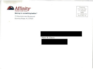
This self-mailer from Affinity Federal Credit Union merits a Fail for Creative for failing to fully explain their offer.
Outside of self-mailer


Affinity Federal Credit Union
Address Panel


During most of the year, purchases on the AffinityFederal Credit Union Pure Rewards Visa Card earn 1 point per dollar spent. Based on their redemption options, I estimate this equates to a rebate value of approximately 0.7%. Every year for the past several years, the credit card has proactively offered customers a simple points multiplier of double points or triple points for purchases in November and December to encourage purchase activity during the holiday shopping season. 

This year, the points multiplier appears to be vary based on the type of merchant. According to the self-mailer, purchases at “Bookstores, including Amazon.com” earn “5 Bonus Rewards Points,” while purchases at “Gas and Restaurants” earn “3 Bonus Rewards Points” and “Supermarket and Wholesale stores” earn “2 Bonus Rewards Points.”

Affinity Federal Credit Union Pure Rewards Points Fail for Creative
Interior of self-mailer


The language suggests the customer might earn 5 Bonus Rewards Points per purchase at Bookstores. What I believe the credit union is attempting (but failing) to explain is that some purchases earn 5 Bonus Rewards Points per dollar. Even the Disclosure copy fails to explain this as such. It reads:

*Bonus points are earned as follows: in additional to the standard points you earn (1 point per $1 spent or 2 points per $1 spent if you quality for EvenMore perks), you will receive 5 bonus points on bookstores, 3 bonus points on gas and restaurants, and 2 bonus points on supermarket and wholesale store purchases less returns during the promotional period …

It appears to me that, if a customer makes a $100 purchase at a bookstore, the customer will receive 105 points. If the intention is that the customer should receive 600 points for that purchase (6 total points per dollar spent), then the offer copy should read “5 Bonus Rewards per Dollar” and the Disclosure should read:

*Bonus points are earned as follows: In addition to the standard points you earn (1 point per $1 spent or 2 points per $1 spent if you quality for EvenMore perks), you will receive 5 bonus points per $1 spent on bookstores, 3 bonus points per $1 spent on gas and restaurants, and 2 bonus points per $1 spent on supermarket and wholesale store purchases less returns during the promotional period …

The communication of the bonus points offer appears sloppy in a couple other ways. First, Amazon.com is not a bookstore. According to Wikipedia, Amazon.com started selling items other than books in 1998. Rather than “Bookstores, including Amazon.com,” the category headline should read “Amazon.com and Bookstores.” 

The second category reads, "Gas and Restaurants" when it should read "Gas Stations and Restaurants" for clarity.  Otherwise, a person who purchases gas at CostCo would expect to receive 3 bonus points per dollar.  The third category reads, “Supermarket and Wholesale stores” when it should read “Supermarkets and Wholesale Stores.” 


Lessons:
  1. Explain your offer clearly and concisely in the body of your communication as well as in your supporting Disclosure.
  2. Be sure to have your marketing communication proofread for clarity and accuracy.
  3. Amazon.com is not a bookstore.


12/05/2018

Google Express: Holiday Giveaway a Bit Late and a Bit Off

This minor Fail for Creative and Timing is a lesson for all online marketers. 

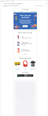
Google Express had a targeted promotion where customers who make an eligible purchase through their shopping portal between November 5 and November 25 would receive a “surprise” thank-you discount with a personalized promo code on November 27. Deep in the disclosure, the copy explains (in presumably intentionally hard-to-read, faded gray-over-gray type—a Fail for Creative) that, while most customers would receive a $10 discount, 100 customers would enjoy a $100 discount—and five lucky customers would get a $500 discount. I guess that is what makes it a surprise.
Holiday Promotion 2018
Google Express promotion solicitation email
with a long, hard-to-read disclosure


I made a qualifying purchase and, while I did not receive the discount code on November 27, I did receive it on December 1. It was four days late and for only $10, but that still beats a poke in the eye.  
Holiday promotion
Fulfillment email from Google Express

Two days later, I went to make a purchase using the promo code by clicking on the email button labeled “Shop Now,” with a sleeping fox on it. I was greeted with this landing page:
Holiday Promotion 2018
Shop Now landing page

The headline reads “Our thank-you offer has ended.” However, I had received my thank-you email—not with an “offer” but with the promised discount code. It appears to me that this web page was written to be displayed starting November 26, the day after the purchase eligibility period ended.  

If this was the appropriate landing page for the “Shop Now” button sent on December 1, it should reinforce the holiday discount. Or perhaps “Shop Now” was supposed to go to a different landing page. Either way, the lessons are the same.

Lessons:
  1. If you want your customers to understand your offer, don't disguise your disclosure content with poor color contrast.  If you don't want your customers to understand your offer, ask yourself why.
  2. Be timely in your fulfillment of an offer. It’s better to underpromise and overdeliver than overpromise and underdeliver.
  3. Ensure that all links in your customer emails are mapped to the correct landing page, and that your corresponding landing page is current and appropriate for your marketing campaign

Update 12/5
Google Express changed the 'Shop Now' link landing page to something even more confusing:
Shop Now landing page 12/5/18


11/09/2018

Shake Shack: Offer with Bumble & "Deets"


This email from Shake Shack merits several Fails for Offer.


The offer stated in the body copy reads, “…grab a burger with your new connection + score the second burger on us.” That suggests that all I need to do to get a free burger is purchase one burger. However, the disclosure* below the offer reads that there is a minimum purchase of $10 using the app, specifically: “Minimum Shack App order of $10 for offer to apply.Where I live, that’s more than a burger. At my local Shake Shack in high-priced New York City, a Shack Burger costs $5.59, and a simple hamburger costs $4.89. So it would take a purchase of a Shack Burger, fries, and a soda ($11.13) for a customer to take advantage of the offer.

The steps involved in getting that second burger are complex – another Fail for Offer. A customer has to download an app called Bumble, swipe through something, find a profile that contains a promo code and “deets,” then redeem the offer using the promo code in the Shack App at a participating Shake Shack. That’s a lot of steps just to get a free burger. It’s not clear to me if a customer can get the free burger at the same time as purchasing a burger. If not, that’s a third Fail for Offer for not disclosing that the free burger is available only on a return visit.

There is a fourth Fail for Offer – offering only five days for a customer to take advantage of the offer.  So during the work week, a customer has to download an app, find a connection on the app, and arrange to go together to Shake Shack to follow the several vague steps in the email to obtain value.  

Bumble appears to be a dating app, but one wouldn’t know from the email from Shake Shack. It does not explain what the app is, nor does the landing page from the email link. It appears to me that the rationale for the offer is to encourage a friendly non-Tinder date by using the app to get a burger. That’s nice – but what are “deets” in this context? Sure, “deets” is often slang for “details”, but there is other slang used in the email.  Is “deets” in this context supposed to be a new short-hand combination of “dating” and “meeting”? I can’t find any mention of the term on Bumble’s website. According to Wikipedia, DEET is a type of toxin used to repel bugs. I certainly wouldn’t want any DEET on my Shack Burger! A cursory search in Urban Dictionary and the Online Slang Dictionary suggest it could refer to “details,” “gossip,” “stolen credit cards,” a racial derogatory term or to NSFW sexual acts best not described in an email from a family-friendly burger chain. The type of customer Bumble may want to target -- presumably young, urban, single professionals -- might know what “deets” means.  However, Shake Shack is sending these emails to a much wider group of customers -- presumably everyone with the app who has not yet opted-out from receiving emails -- which is why this use of slang might merit a Fail for Creative.  

Lessons:
  1. Explain your offer clearly in the body of an email. Don’t rely on a Disclosure to present the terms of an offer.
  2. Keep the process of redeeming an offer easy. Don’t make your customers jump through hoops for small rewards.
  3. Give your customers an adequate window to take advantage of your offer.
  4. If you don’t know your audience, be judicious in the use of slang.


* Many people mistakenly refer to the small print associated with marketing communications as a disclaimer when, in fact, it is a disclosure. According to dictionary.com, a “disclaimer is “the act of disclaiming; the renouncing, repudiating, or denying of a claim; disavowal” while a “disclosure is “the act or an instance of disclosing; exposure; revelation.” “Disclose is defined as “to make known; reveal or uncover.” From a marketing standpoint, a disclaimer is an admission that the headline is false – otherwise, why renounce it? However, a disclosure provides secondary but relevant facts of an offer. So the only reason an offer or marketing communication would require a disclaimer is if it were misleading from the onset.

11/28/2017

Borgata: Cyber Monday was so yesterday

Many years from now, people will look back and ask "What was Cyber Monday?  Why buy gifts only on one particular day of the week?"  But, we're not there in 2017.  Not only do retailers leverage Cyber Monday as a sales opportunity, so do resorts.

Borgata
Sent on 11/28/17 (time stamp circled), touting special offers only on 11/27/17


This email from Borgata was sent mid-day on November 28, a day after Cyber Monday.  Not only does the email tout Cyber Monday deals, but it explicitly says in the disclosure below that the offers are valid only on November 27. 

This is a classic Fail for Timing.  It should have been sent on the morning of Cyber Monday, or even late in the day on Get Home From Thanksgiving Trip Sunday.

Lesson:
When you have a time-specific offer, even a short-term one, allow customers adequate time to respond.

10/06/2015

TurboTax: Tax Time Starts Very, Very Early

I received a solo letter package from TurboTax on September 30 – a time when Halloween candy is on the shelves at the supermarket. This appears to me to be very early. I have yet to think about what I’m getting my wife for the holidays much less filing my 2015 taxes, but I’m only a focus group of one. On an overall marketing basis, is this a Fail for Timing or is this a smart way for Intuit to get ahead of the volume of holiday catalogs in the mail to reach out to and insulate customers for repeat purchase history?  

Envelope Front
Envelope Back
Creatively, the solo mail package is clean. On the front envelope teaser, there is a clear call to action. The rear teaser has a reinforcement message with an implied savings offer. The inside letter communicates the TurboTax value proposition using several direct mail best practices: Johnson Box, bulleted clear call-outs of features and benefits, and a reinforced call to action. The accompanying brochure breaks down the products – differentiating them in a clear manner while reinforcing the overall and individual product propositions.

Em dashes are used in a few places in headline and body copy. These are often interruptive and can be a good replacement for a comma. But utilizing a triple-dash style with no space often gives the reader the feel of there being two sentences rather than a single broken sentence. Take this line adapted from the outer envelope rear teaser:
Get your biggest refund – guaranteed! 
The use of the shorter en dash with spaces before and after creates a better visual flow compared to:
Get your biggest refund—guaranteed! 
The latter may be closer to grammatical correctness, but this isn’t a college essay – it is a marketing communication. 

Letter front
It is odd that the first solicitation for the next tax year would be via snail mail, where there is a hard cost of printing and postage. Why not at least start with an email? Intuit has my email address, and it costs nearly nothing to send me a customized email noting my product choice from last year and offering an opportunity to get the same product this year.

The offer is nothing special. There is a vague “SAVE $10*” message in several places. The disclosure on the back of the brochure reads “* Savings and price comparison based on anticipated price increase 3/18/16.” That is not quite a compelling reason to make a purchase now, especially considering the fact that the money-back guarantee applies only within 60 days of purchase. If I make a purchase now, I will still be eating leftover Thanksgiving turkey when the guarantee expires. Not even Ned Flanders gets started on his taxes before the end of the yearThe lack of a bona fide customer value for immediate action merits this a Fail for Offer

Perhaps Intuit was trying to standardize the mailer and purchase process, but, in doing so, may have missed personalization opportunities. For example, I have used the Premier version of TurboTax every year for at least a decade. That would suggest that I have no interest in the Deluxe version this year, so about a quarter of the brochure’s content is irrelevant to me. Rather than explain a likely irrelevant lower tier product, perhaps the focus could have been on resale and upsale.
Back of letter


If you are going through the effort and expense to send a personalized solo mail package, consider having a personalized offer with personalized tracking such as a unique offer code or personalized URL, product recommendations based on prior purchases, and an offer that expires soon. This could allow the customer to not have to complete a long form when repurchasing your product online. Not only will this address the customer based on his/her purchase history and information, you have the opportunity to fully track customer interactions.

Lessons:

  1. Consider the Timing of your marketing communication relative to seasonal level of consumer interest as well as macro-marketing conditions.
  2. Direct mail may not be the best method to reach out to your existing customer base when there are lower-cost methods available.
  3. Consider how you use dashes in every sentence.
  4. Have an offer that compels immediate action.
  5. Use your database to personalize your marketing communications and customer interactions.
Brochure Cover

Brochure Back

Brochure interior
Brochure interior

4/25/2015

TruGreen: Is the Past the Future?


I currently live in a townhome in a managed community, which would make this solicitation from TruGreen an easy Fail for List. But the creative has some interesting elements.

Front of letter
On the front of the letter, the Johnson Box appears to have a general introduction sales message. If you read only that, you know the offer and the call to action. However, that darn asterisk suggests that there may be more to the offer than advertised. Looking on the back of the letter, we find in the disclosure: “Special price of $29.95 is for the first application only, for new residential EasyPay or PrePay customers only,” and so on. OK, fair enough. But I would not necessarily be a “new” customer. I am a prior customer — albeit at a prior address where I owned a house with a Texas-sized lawn

In fact, the first subhead and footer both ask that I “Come back to TruGreen now …” Perhaps I was targeted for this solicitation because of my prior customer status, which would make this mailing a win-back effort. Setting aside the fact that this is still a Fail for List — because I cannot purchase TruGreen’s services for my townhome — the offer is confusing. If I am a prior customer (e.g., not really “new”), am I still eligible?

Back of letter
I get the sense that the win-back messages were wedged into a new customer solicitation mailing. While there are two headline-level messages suggesting I “Come Back,” the body copy and outer envelope teaser suggest that I have never been a customer and am unfamiliar with the product. Perhaps this was a multi-cell mailing and the variable copy is in the spaces with the green background.

Aside from that, there are some creatively strong elements to the mailing. TruGreen’s message of “153 of your neighbors have TruGreen lawns” lends legitimacy to the product proposition (but, again, seems irrelevant to a former customer). Core messages are conveyed multiple times in the Johnson Box, side bar, sub-heads and the back of the letter. The use of color with emphasis on green and complementary lifestyle photos results in a pleasant resonance.
Outer Envelope


Lessons:
  1. Target customers who can purchase your product or service.
  2. When messaging a customer based on knowledge you have, ensure your messaging is consistent.


11/17/2014

Viridian Energy: Unreal Savings


"SAVE MORE THAN $1,200" but not for sure
This article from retailenergyx.com discusses a direct mail offer from Viridian Energy. It is the type of marketing solicitation that I consider a Fail for Creative for being misleading.  

A bit of context: National Grid is a utility in parts of New York, Rhode Island and Massachusetts. As the utility, they maintain the power lines and are the basic supplier provider for electricity. As described on their site, National Grid adjusts their prices every six months in Massachusetts using a regulated formula. As this chart shows, in the coming six months, their supply price will increase by 97% to reflect current and anticipated supply costs, and that price will last for six months. After that, it could decrease back to the historical averages, or not. The price for the next six months will be over 16¢/kWh, while the last time the price was above 12¢/kWh was in 2009.


Are these the questions you would ask?

The direct mail offer from Viridian Energy touts the National Grid rate increase to 16.18¢/kWh as a reason to switch to their rate of 11.99¢/kWh guaranteed for 36 months. This is where the misrepresentation starts. Headline-level copy in the sidebar touts “SAVE MORE THAN $1,200 OVER 3 YEARS!”* That type of claim assumes that the National Grid Basic Service Charge will not change during the 3-year comparison period – but it will change. The Basic Service Charge changes every six months. So the touted $1,200 savings may be nearly zero.

Yes, Viridian explains this a bit in their disclaimer*, and they even throw in the mutual fund prospectus favorite line “Past performance does not necessarily predict future results.” But they hide this in the disclaimer, suggesting it was a misleading claim. Most consumers will scan the claims in the Johnson Box, headlines, and sidebars to determine if they are interested. They will read the $1,200 savings message, not the disclaimer that notes lack of validity.

There are other relevant facts to this offer missing from the headline and body of the letter:
  • The so-called “clean electricity” is not completely clean. Their disclosure explains that it has 50% renewable energy in addition to state requirements. Nice, but that could still mean a sizable percentage of fossil fuel generation.
  • If a customer signs up for this 36-month offer and later decides to cancel – perhaps because the National Grid Basic Service Charge returns to normal rates in six months – there is a $50 early termination fee. That is not disclosed anywhere in the letter. Perhaps this might be excusable if the call to action were to get more information, but the call to action is to “make the smart choice,” i.e., sign up for the offer. At the very least, it could have been included in a disclosure.
Direct mail solicitations like these give the industry a bad name.

Lesson: Disclose the specifics of your offer and relevant comparisons in a clear, concise, communicative manner. If you have to use a disclaimer to explain why your claim is not fully valid, consider your moral values.

* Many people mistakenly refer to the small print associated with marketing communications as a disclaimer, when, in fact, much of it is a disclosure. According to dictionary.com, a ‘disclaimer’ is “the act of disclaiming; the renouncing, repudiating, or denying of a claim; disavowal,” while a ‘disclosure’ is “the act or an instance of disclosing; exposure; revelation.” ‘Disclose’ is defined as “to make known; reveal or uncover.” From a marketing standpoint, a disclaimer is an admission that the headline is false – otherwise, why renounce it? However, a disclosure provides secondary but relevant facts of an offer. So the only reason an offer or marketing communication would require a disclaimer is if it was misleading from the onset.