Showing posts with label COVID-19. Show all posts

6/09/2021

Charity Mail Deluge

When COVID hit last spring, I thanked God that I was fortunate enough to stay healthy and safe when so many people here in NYC were infected. I wanted to give back but, like many others too frightened to help in person, I chose to donate money. I donated to several charities, including some I had not given to before. That was April, 2020.

Then, starting in October, 2020, this happened:
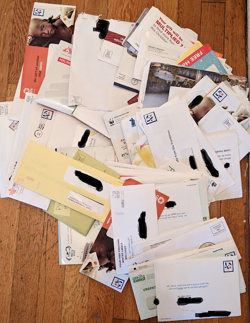
102 Charity Solicitations
102 mail fundraising solicitations
October - December 2020

I received 102 mailed fundraising solicitations from charities to which I had never donated. Most of them were related to feeding people -- in Africa, South America, and Manhattan. Others were for: environmental causes; providing medical care to people in faraway lands; building houses; preventing people from being born with disabilities; helping people born with physical disabilities, orphans, wounded veterans, Native American children, Native American senior citizens, "inner city children" who can't afford a Catholic education, and one that appeared to have something to do with housing recovering drug addicts in hotels.

Many of the classic direct mail fundraising techniques are included: blind envelopes, pictures of children near death; envelope teasers reading "URGENT NEED NOW", "EMERGENCY APPEAL" or simply "PLEASE"; envelopes a layperson might think had been hand-addressed and stamped; tear-jerking letters; promises that my donation would be matched by a mysterious benefactor; business reply envelopes; blessings by nuns; Christmas cards; a decade's supply of return address labels; pens; baby socks; and so on. If you have created or supported direct mail fundraising solicitations, you know these packages.

It appears to me that one or more of the charities that received money from me in spring 2020 chose to make some more money by including my name on a rentable mailing list. I was included on a Hot List of new donors or a timely "COVID Giving List" of sorts.

There is a part of me that feels negative about this experience. I could go into a rant about how the federal government subsidizes charities with lower postage rates, or how many of these organizations are charities in name only because they pour more money into soliciting donations than they do actually supporting their supposed cause. But, hey, that's the nature of the medium.

(Personally, I'm a bit disappointed at myself. I typically research charities, preferring to contribute to those that have low administrative costs and can demonstrate how they are effectively using the money given to them. I didn't fully vet the three that potentially had actualized additional funds from my proactive donation. That's my personal lesson today.)

I looked back at my donation history and narrowed down the list of charities that broke my heart to three. I won't name them here, but I know who they are and I know I will never donate to them again. That type of charity merits a type of Fail for List.

Direct response marketing guru Joan Throckmorton taught me something I wish I had recalled last year: When doing business with a new organization, consider using a fake middle initial. When you see that middle initial show up elsewhere, you know where it came from. So, that's my direct marketing lesson today.

OK, that and including baby socks in your fundraising solicitation is pretty crass.


Lesson:

If you want to see how information about your personal activity is shared and sold, use a fake middle initial. You have 25 of them to work with, so go at it.

4/05/2020

Santander Bank: Creative Improvements, Lousy Timing


Last May, I wrote about a postcard I received from Santander Bank that merited a Fail forCreative because it promoted an incentive but lacked a conspicuous explanation of how to earn the incentive.

Santander Bank self-mailer
Cover panel
Santander Bank self-mailer
Address panel


Santander’s small roll-fold self-mailer that I received on April 2 here in New York City, however, includes elements lacking in last year’s postcard.

Santander Bank self-mailer
Offer Panels


This recent self-mailer includes a clear call to action. In fact, performing the desired action comes across as easy as 1, 2, 3.  The self-mailer includes a conspicuous explanation of what is required to enjoy the $300 incentive, with supplemental information in the disclosure. There is adequate space for benefits messaging, an easy-to-read Promotion Code, and the location of the nearest branch.

Santander Bank self-mailer
Promotion Code and Bank Branch Location


However, as I write this, the nearest branch listed on the postcard has been closed for two weeks because of the COVID-19 pandemic. More than two thousand people in New York City have succumbed to the virus. The Big Apple is in lockdown. Is this really when a consumer might consider switching the bank where their paycheck is deposited? Many consumers around here won’t even have a paycheck in a couple weeks; many others will be deceased.

So, this self-mailer is a Fail For Timing. At the very least, it can come across as callous. But should one blame Santander? It could be that the self-mailer was mailed before things got bad. When mailing Standard Rate, there is a lag time between maildrop and in-home date – sometimes a few business days, sometimes a few weeks. As we’ve seen, the world can change a lot in that short time.

Several years ago, I launched a direct mail campaign offering prospective customers around Philadelphia savings on their electricity supply costs. Unfortunately, Hurricane Sandy started up the East Coast after the maildrop. The mail reached the target market while the hurricane was disrupting power to many homes. Who knew?

Santander Bank self-mailer disclosure panel
Disclosures updated as of 2/29/20

The disclosure includes an as-of date of February 29, which suggests the self-mailer was printed in early March. If it was mailed prior to March 10, I would say"Who knew?" 

Or maybe the mail dropped closer to March 20, which means the bank knew about the pandemic hitting the United States but decided to mail anyway. If so, a decision should have been made to pull the mail rather than commit an unforced error because – even though the mail had been printed and personalized – the campaign could have been halted. Doing so would have meant postage money could be saved for a better timed mailing, and would have prevented bad optics.

Lessons:
  1. Your Call to Action should be conspicuous and easy to understand.
  2. Sometimes planned marketing efforts can be impacted by unforeseen events.
  3. There are occasions when you may need to pull mail at the last minute. Maintain the decision-making capability and flexibility to do so.


3/31/2020

Coronavirus Guidelines for America: Late and Hard to Read

I received a postcard with “PRESIDENT TRUMP’S CORONAVIRUS GUIDELINES FOR AMERICA.” It was dated March 16 and arrived in my New York City mailbox on March 28.

COVID-19
Coronavirus Guidelines
Mailed Standard Rate
Let’s look at this postcard from a direct mail marketing perspective. The primary objective of the postcard is to motivate people to take action to prevent getting the virus that causes COVID-19, while the secondary objective is to motivate readers to visit coronavirus.gov for more information. It merits a Fail for Creative for a few reasons.
  • White text on a black background is neither easy to print nor read, especially in italics at 9-point font size. 

COVID-10
If you can read the good hygiene tips, you don't need glasses.

  • The Call to Action to visit coronavirus.gov is visually lost.
    • On the address side, below a couple graphical icons, the website is suggested as a place to go for more information
    • On the copy side, it sits in the corner without a description of the site or a reason to visit it. It is in a good location relative to the layout of the postcard—and bold compared to most of the other content; however, the line starting “EVEN IF YOU ARE YOUNG,” with a blue background, is what draws a reader.

Perhaps the small postcard is trying to accomplish too much in too little space.

Lessons:
  1. If your copy is small, make sure you have proper color contrast.
  2. Make your call to action prominent.


[Edit: Removed commontary about postal rate used, as this was mailed EDDM.]