Showing posts with label direct mail. Show all posts

12/04/2023

GE: UltraFast Postcard Fail

I recently received a postcard from GE that merits several Fails for Content. 

GE One And Done

The front shows an androgynous person in a high-end walk-in closet doing laundry. She is smirking at her laundry machine while either preparing to put towels in or recently having removed them. "This is not just laundry," cries the headline, "This is One & Done."

GE One & Done Wash & Dry

On the address side is a picture of two laundry machines -- presumably run by an app. There is very little copy on this side, only, "Wash + Dry with the UltraFast Combo," with a Call to Action to visit a specific appliance store.

As executed, this postcard has multiple Fails. Let's break down why it was a waste of money.

Confusing Audience

The front of the postcard shows someone in a combination utility room and expensive closet, with more athletic shoes than you can count. The room looks pretty expensive, like it is in the house of a one-percenter. It certainly doesn't look like this is a typical personal using a typical machine. So a typical consumer might look at the person and room and think they couldn't afford whatever the postcard is advertising.

Misleading Product

The address side shows not one, but two machines, visually suggesting that this is a washer-and-dryer combination set. It isn't, through, the picture is actually of two of the same one-piece washer/dryer appliances -- one has a stand. A typical consumer would have to look and think hard to recognize this, but they wouldn't bother. They'd likely look at the postcard fore about three seconds, then toss it.

Uncompelling Benefits, No Urgency

The communicated benefits appear to be the ability to wash and dry by using an app. Maybe that's enough to motivate a consumer to visit a website in the comfort of their own home, but it is not compelling enough to get a consumer to schlep to a store. After all, this is a low-interest category for a major purchase. Why not include an offer, such as $100 rebate for this $2,899 machine if the consumer brings in the postcard within 30 days? Even a modest incentive with a reasonable offer expiration date supports some action.

Incorrect Location

Finally, this postcard gets the store location wrong. The Hoing's Appliance location near me is in Forest Hills, not the Bronx physical address shown on the postcard. In fact, the web address on the postcard is for Forest Hills location, while the Bronx location has a different web address.


Lessons:
  1. Explain your product. Clearly communicate its benefits.
  2. Support your mail with online content to explain your product benefits.
  3. Give the customer a reason to take action soon.
  4. When directing a customer to a physical location, share the nearest location.
  5. Check every URL listed in your mail.

10/10/2022

PenFed Credit Union: What's the Point(s)?

 A couple years ago, I wrote about a credit card solicitation I received from PenFed Credit Union. It took some serious sleuthing to understand why I would be eligible for membership. Since then, I've received a few others from PenFed, including this one for a PenFed Platinum Rewards Visa Signature Card.

I received this mailing as someone who isn't a PenFed member, isn't a member of the armed forces, and is someone who knows about PenFed only because of writing this blog. The letter includes a paragraph explaining that I need to become a member to get the credit card. So, it's probably safe to conclude that the mailer's target audience is who don't know much about PenFed.

Their recent solicitation is again pretty typical for a mid-tier credit card provider: window envelope; letter with Johnson Box; clear Call to Action; Schumer Box; brochure insert; and required credit prescreen opt-out notice. Let's break it down.

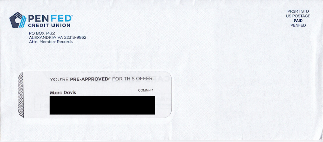
The window envelope is clearly branded. Unlike the one from two years ago, this one does not have a teaser

PenFed Credit Union Credit Card Offer Envelope

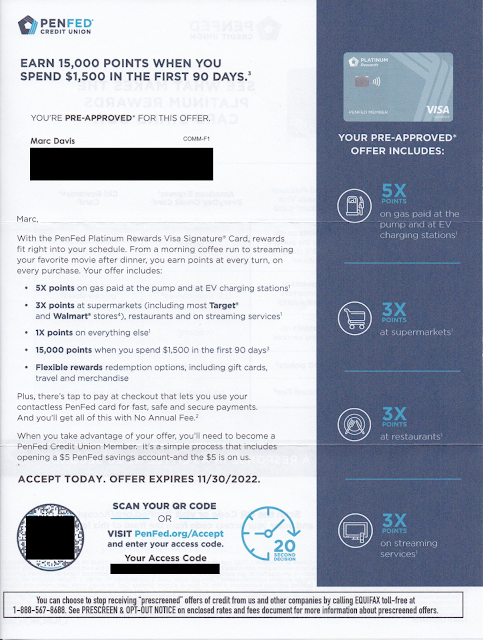
The personalized letter opens with a straightforward Johnson Box message: Earn 15,000 points when you spend $1,500 in the first 90 days. Nice. The letter opens by communicating a benefit that the rewards card works with my lifestyle. I can earn bonus points by doing what I do. I can get 5x points for filling my car's tank -- or even charging my EV, so forward-thinking! -- 3x points for food shopping or eating and doing other everyday stuff, and everyday 1x points for all those other purchases. The points accrual rates are reinforced in the right margin. 

PenFed Credit Union Credit Card Offer Letter

The letter closes with an explanation that I need to become a PenFed Credit Union member to get the credit card. It's a simple process, so all I need to do is scan the QR code or go to their website to get started.

The back of the letter reinforces points accrual and compares it to other credit card providers that offer points, then reinforces the Call to Action. 

PenFed Credit Union Credit Card Offer Letter

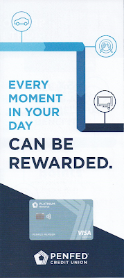
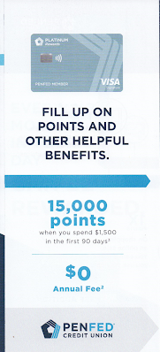
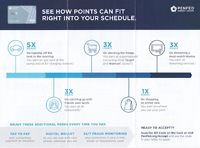
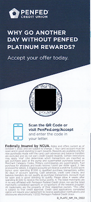
The points proposition is reinforced with a tri-fold brochure reinforcing points accrual rates. It also communicates some secondary perks such as Tap to Pay and Fraud Monitoring, but mainly it's about how all those points can really add up -- and the Call to Action is reinforced yet again.

Brochure Cover


Brochure inset

Brochure inside

Brochure back

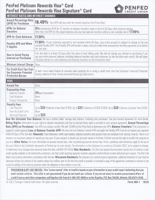
The letter package also includes the legally required Schumer Box and accompanying language disclosing the card product's terms.

Credit disclosures, including Schumer Box

 The back of the disclosures page is blank.
Back of credit disclosures page (blank page)

This isn't a quite a Fail for Creative; however, there are some improvement opportunities: 

  • Consider an enticement for the prospective customer to open the envelope. There should be an envelope teaser that would motivate the recipient to open the envelope. Given that the target audience is non-members (e.g. do not have a relationship with PenFed) this is more important than usual. (The "You're Pre-Approved" message in the standard size window is easily missed.)

  • Since the audience is non-member who don't know them, PenFed should introduce itself. Maybe PenFed has strong brand recognition within the military community; but, since I also received it, they are presumably also soliciting new customers who haven't served. Consider using the Who We Are content from the website and include it on the back of the required disclosures sheet, or squeeze a message in the letter or the brochure. 

  • Share the value of points. There is plenty of space allotted to points accrual, but nothing about how the points can be used. Explain if points can be used for travel, cash back, donations to the USO, or something I might enjoy. Also, the lack of quantification of value can be suspicious. Perhaps that 15,000-point intro bonus is worth less than the 10,000-point bonus with the compared-to American Express EveryDay Credit Card -- or perhaps it takes 20,000 points to get a shiny nickel. 

Lessons:

  1. Think about your target audience. If they are not current customers, help them get to know you.
  2. When soliciting prospective customers, include a conspicuous teaser message to give them a reason to open your envelope.
  3. Communicate benefits. Points are not a benefit. They are a vehicle of earnings toward a benefit. 
  4. Paper is expensive. Don't waste any. Leverage blank space to sell some more.

7/23/2022

Jockey: Late Recognition Of Getting In My Pants

After months of COVID lockdown and isolation, I was finally going to set foot outside of Queens. My wife and I arranged for a weekend getaway upstate at a bed-and-breakfast with plenty of ventilation, air filtration and outdoor seating. It was our anniversary and, pandemic or not, we wanted to make it special. 

We brought masks, gloves, sanitizer, and more sanitizer. I packed a rag and Lysol disinfectant just to give our room a once-over when we arrived. We brought packaged food in case the nearby restaurants were too busy. After confirming all the details and driving north for a few hours, I realized had I forgotten my mother's advice: Always pack clean underwear. Sorry, Mom!

I discovered a Jockey outlet store near our B&B. It had reopened from COVID lockdown the day before our trip. So, on our anniversary, we stopped at the store for a couple pairs of jockeys. The store manager, also wearing a mask and plastic gloves, understood that I wasn't familiar with the brand and helped me pick out something comfortable in my size. 

The manager apologized that not all price tags were up to date as the store was shorthanded and had just reopened. No worries, I said; just ring me up. She asked to put me on the email list with an offer of an instant discount on my in-store purchase. I agreed, providing my email address.

That was two years ago. I haven't purchased anything from Jockey since then. (The underwear is fine; I simply don't need any more.)

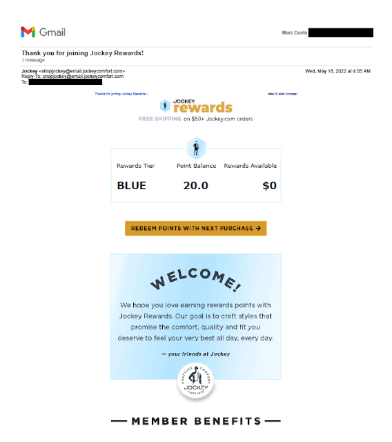
In May of this year, I received an email with a Subject Line of "Thank you for joining Jockey Rewards!

New Jockey Rewards

New Jockey Rewards

New Jockey Rewards
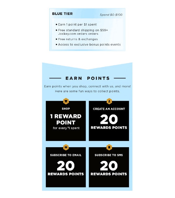
Jockey Rewards Introduction Email, May, 2022

The wording of that subject line makes it seem like I recently joined the Jockey Rewards program, which is not the case. Perhaps giving the manager my email address in that outlet store two years ago had enrolled me in an older version of the program and I had now been auto-enrolled in the current program. This supposition is based on the answer on the Jockey's reward program FAQ:

Jockey Rewards FAQ
First FAQ at jockey.com/rewards mentioning "new and improved rewards program"

So, the program is "new and improved." OK. Perhaps. But since I hadn't just joined the program, better subject lines would include:

Welcome to the new Jockey Rewards!

We've improved Jockey Rewards!

Other than the confusing subject line, the email is nicely done: on brand, communicative, friendly and persuasive. Overall, the email doesn't deserve a Fail for Creative. Perhaps it merits a C+.

Lesson:
Your subject line should be relevant to your customer.


3/06/2022

BCHP: A hard-to-find doctor for my non-existent child

When someone asks me if I have children, I sometimes joke, "None to my knowledge." In that context, when I receive a postcard asking me, "Looking for a pediatrician or pediatric specialist?" I have to wonder if someone knows something I don't.

Maybe I do have a child. Maybe my wife has a bun in the oven. Or maybe the reason I received this postcard is less dramatic  that the postcard from Boston Children's Health Physicians (BCHP) merits a Fail for Targeting.

Let's set aside for the moment the fact that I do not have any offspring and break down the postcard's content.

Boston Children's Heath Physicians
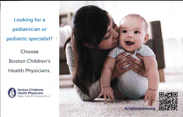
Mommy is happy with her healthy baby.

The front of the postcard simply suggests that I choose Bost Children's Health Physicians. It doesn't suggest why I choose one of their doctors. What makes their physicians desirable? To put it in marketing terms, what is BCHP's unique selling proposition?

BCHP Boston Children's Health Physicians
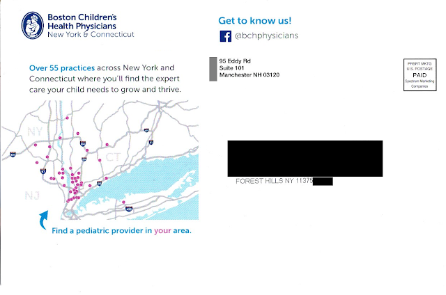
Where is Forest Hills, Queens?
Not in the area shown on the postcard.

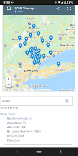
The address side of the postcard includes a minor sales message that supports the Call to Action – to “find the expert care your child needs to grow and thrive.” And the postcard displays a map that appears to show the locations of doctors. There is an arrow pointing to the map, reading, “Find a pediatric provider in your area” with emphasis on “your.” Quick takeaway: most of New York City doesn’t even appear on the map.

Maybe there is a provider near me, but how would I know? Rather than communicating how to find the provider – and placing it next to the Call to Action to do so – there is a bunch of white space below the map. The response method is on the other side of the postcard…well, sort of.

Buried on the bottom right corner of the picture of mom and her smiling baby is a URL leading to the Boston Children’s Health Physicians home page. Somewhere on that home page is information that supports the postcard’s messaging, but it isn’t easy to find. The QR code doesn’t lead to the same page as the URL; it leads directly to the practice locator page. And the placement of the QR code (within an image on the opposite side) is a Fail for Creative.

BCHP Boston Children's Health Physicians
BCHP locations not quite near Queens
Let’s get back to finding a provider in my area. I tried the QR code on my smartphone. It indicated that the nearest practice was in Bardonia, NY.

As the crow flies, the distance from Forest Hills, Queens, NY to Bardonia is about 27 miles. As the parent drives in traffic, however, it is two toll bridges and typically an hour drive or longer with a sick or tired child in the back seat. (That assumes the parent has a car. After all, this is New York City.) This long distance to a physician confirms that the postcard was poorly targeted geographically – another Fail for Targeting.

Returning to the caption below the map, what is a “pediatric provider?” Why use that kind of industry jargon when the front of the postcard uses “pediatrician” and “pediatric specialist” while the address side of the postcard cites having 55 “practices”? Why throw yet another term out there? I realize I’m not a parent but, if I were, wouldn’t I want to find a “doctor” for my child?

IMHO, this postcard does not really support Boston Children’s Health Physicians. It is poorly designed, written, and targeted.
 
Finally, unless there is a back-end method in place for tracking response to the individuals being mailed, this isn’t direct marketing – it’s mailed advertising.


Lessons:

  1. Vet your data sources to target matching demographics.
  2. Just being available is not enough. Even a medical practice needs a differentiator.
  3. The means of following through on a Call to Action should be located close to the Call to Action, and easy to find.
  4. Vet your physical targeting to people who can easily get to your physical business or medical practice.
  5. If your Call to Action includes a web site, don’t just list a home page. Use a direct URL that aligns with the Call to Action.
  6. Apply jargon consistently using terms your customers understand.
  7. Even a postcard for a medical practice should include some method of tracking results.


Edit 2/11/23: Removed reference to company that sent the mail per request of a person working at that company. 

12/16/2021

Athletic Greens: Landing page does not work out

For more than a decade, I've written about the four pillars of a successful direct marketing campaign: Targeting, Offer, Creative and Timing (TOCT). But there is something that binds these pillar together: Execution.

If you properly thought through your TOCT and planned your work, execution is working the plan. To execute successful, everything should work the way it should.

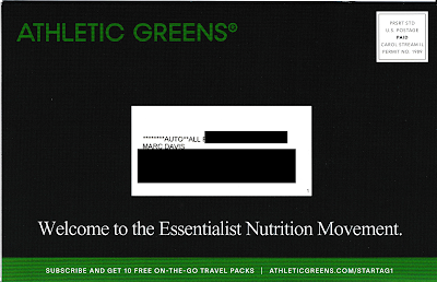
Which brings us to Athletic Greens. I recently received this self-mailer:
Athletic Greens
Cover panel

Athletic Greens
Address panel, with offer URL


Athletic Greens
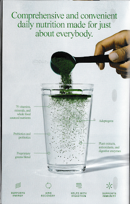
Inside panel


Athletic Greens
Sales panels
Athletic Greens


Creatively, this is quite a good piece for the category. The paper stock is thick, making it stand out in the clutter of mail. The message are simple and straightforward. The Call to Action is to subscribe to receive dietary supplements by visiting www.athleticgreens.com/startag1 and taking advantage of an offer for new customers. When I tried it, the URL did not work. 
Athletic Greens
Non-functional landing page


Because the landing page was non-functional, this otherwise compelling self-mailer merits a Fail for Execution. If customers can't get the offer they were promised, why would they trust the product?

And it's not like a prospective customer can easily call to take advantage of the offer. The self-mailer lacks a phone number. Sure, there is one on a page buried in the web site (888-390-4029), but that is listed as "Customer Service." Are there no salespeople available? I believe this approach of mailing an offer without a phone number as a secondary call to action is pennywise and pound foolish. It may merit a Fail for Creative.

I received the self-mailer 10 days before Christmas, a time when people are thinking about indulging for the holidays, visiting family and friends, and end-of-year financial activities. A typical mailbox is full of charity solicitations, catalogs and holiday cards. Is this really a time to mail an offer related to personal self-improvement that attempts to motivate people to change their dietary habits? I think no, and that this could be a Fail for Timing

If I planned this campaign, I would have timed the maildrop with an in-home date three weeks later, e.g., the first week of January. I would have also tested the landing page before mailing.

Lessons:
  1. When you include a web address on your solicitation, make sure it works.
  2. When using snail mail to sell your product, don't assume people will go online to response. Include a phone number in your Call to Action.
  3. Carefully consider the impact of seasonality when timing your mailing.


7/25/2021

Sorry, I’m late to ask for your vote

In New York City, our primary election for local offices took place on June 22, with early voting taking place June 12 through June 20.

Stringer should have been ready and in the mail before Day One

I received eight oversized postcards from political candidates between June 23 and July 6. A couple of them are shown here. 

This postcard arrived on 6 days after the election, e.g. it is trash

These are Fails for Timing. I want to say, "Sorry, New York City does not offer late voting."

Lesson:

When producing mail for a political candidate, mail early and mail often.

7/16/2021

Mr. Cooper Renovates His Mail

Last year, I wrote about a direct mail letter from Mr. Cooper offering a home mortgage. It was a Fail for Creative for several reasons. This letter avoids those mistakes and, in fact, applies some smart direct mail marketing tactics.

Mr. Cooper Mortgage Offer
Mr. Cooper
Invitation to Apply letter


The Johnson Box describes the sales proposition and includes a clear Call to Action. Below it, the headline "Buying a Home Soon? Here Are 3 Reasons to Prequalify with Mr. Cooper" supports the Johnson Box and teases a reason to take action. The body copy supports the headlines by communicating those three reasons to take action. 

The letter goes on to make reference to Mr. Cooper Real Estate Rewards and offers a brief statement that explains the benefit. It closes with a Call to Action to "Call today to prequalify," with an attempt to overcome inertia by explaining that it is fast, simple and totally free.

After the close, there is a modern twist on the classic P.S. with yet another Call to Action. It reiterates the action requested of the reader -- prequalify for a mortgage -- and how to do it -- call a phone number or visit a specific website. 

In the consumer financial industry, this type of letter is an "Invitation to Apply" for credit, while the letter I reviewed last year is considered an "Presentation of a Prequalified Offer." The later requires many disclosures such as a big box on the bottom of the front page with opt-out language. the result is that it is easier for an Invitation to Apply letter to appear clean. Still, that doesn't excuse the mistakes in Mr. Cooper's letter from last year.

Lessons:
  1. Have a clear Call to Action and offer. Communicate it multiple times to encourage action.
  2. Proofread your communications for language and grammar. 

6/09/2021

Charity Mail Deluge

When COVID hit last spring, I thanked God that I was fortunate enough to stay healthy and safe when so many people here in NYC were infected. I wanted to give back but, like many others too frightened to help in person, I chose to donate money. I donated to several charities, including some I had not given to before. That was April, 2020.

Then, starting in October, 2020, this happened:

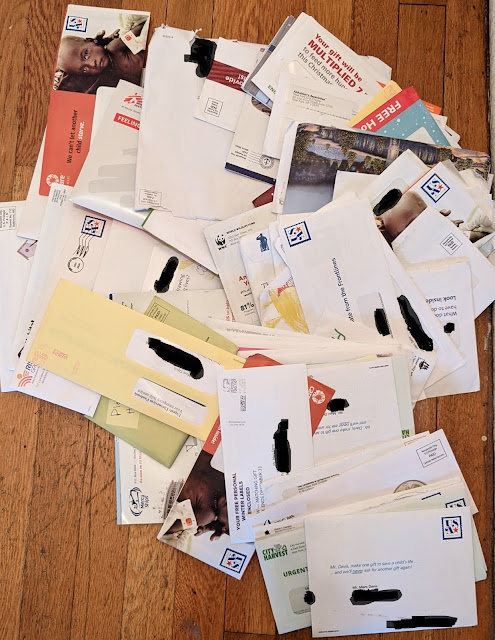
102 Charity Solicitations
102 mail fundraising solicitations
October - December 2020

I received 102 mailed fundraising solicitations from charities to which I had never donated. Most of them were related to feeding people -- in Africa, South America, and Manhattan. Others were for: environmental causes; providing medical care to people in faraway lands; building houses; preventing people from being born with disabilities; helping people born with physical disabilities, orphans, wounded veterans, Native American children, Native American senior citizens, "inner city children" who can't afford a Catholic education, and one that appeared to have something to do with housing recovering drug addicts in hotels.

Many of the classic direct mail fundraising techniques are included: blind envelopes, pictures of children near death; envelope teasers reading "URGENT NEED NOW", "EMERGENCY APPEAL" or simply "PLEASE"; envelopes a layperson might think had been hand-addressed and stamped; tear-jerking letters; promises that my donation would be matched by a mysterious benefactor; business reply envelopes; blessings by nuns; Christmas cards; a decade's supply of return address labels; pens; baby socks; and so on. If you have created or supported direct mail fundraising solicitations, you know these packages.

It appears to me that one or more of the charities that received money from me in spring 2020 chose to make some more money by including my name on a rentable mailing list. I was included on a Hot List of new donors or a timely "COVID Giving List" of sorts.

There is a part of me that feels negative about this experience. I could go into a rant about how the federal government subsidizes charities with lower postage rates, or how many of these organizations are charities in name only because they pour more money into soliciting donations than they do actually supporting their supposed cause. But, hey, that's the nature of the medium.

(Personally, I'm a bit disappointed at myself. I typically research charities, preferring to contribute to those that have low administrative costs and can demonstrate how they are effectively using the money given to them. I didn't fully vet the three that potentially had actualized additional funds from my proactive donation. That's my personal lesson today.)

I looked back at my donation history and narrowed down the list of charities that broke my heart to three. I won't name them here, but I know who they are and I know I will never donate to them again. That type of charity merits a type of Fail for List.

Direct response marketing guru Joan Throckmorton taught me something I wish I had recalled last year: When doing business with a new organization, consider using a fake middle initial. When you see that middle initial show up elsewhere, you know where it came from. So, that's my direct marketing lesson today.

OK, that and including baby socks in your fundraising solicitation is pretty crass.


Lesson:

If you want to see how information about your personal activity is shared and sold, use a fake middle initial. You have 25 of them to work with, so go at it.

2/06/2021

SpotHunter: How to Hunt for Customers

Last week, I received this flyer:

SpotHunter flyer
SpotHunter flyer
1-sided. Copy appears at a bit of a slant

It arrived in a blind envelope addressed to the impersonal "Current Resident." It is obviously marketing mail. IMHO, it has all the makings of low-end j--- mail. (I'm not writing out the word because I avoid inappropriate 4-letter words on this blog.) The envelope appears impersonal, it has no return address, and it includes a spotty-looking postage permit stamp. 

SpotHunter Outer Envelope
Simple Blind Outer Envelope.
No return address.

I opened it because, well, I love direct mail marketing. But would a typical consumer open it? I don't think so. I noticed several of the same pieces -- addressed to "Current Resident" at other units in my building -- placed in a well-named trash receptacle located in the mailroom.

Mailroom Trash Receptacle
(Inappropriate 4-letter word blacked out)

Inside, there is an impersonal flyer for an app called SpotHunter. The headline reads "Have Trouble Finding Open Street-Parking? Let Us Help." In this context, the hyphen between "Street" and "Parking" is improperly placed. Plus, there's no period at the end of the headline's second sentence. These types of errors may appear minor; however, this type of errors often subconsciously distracts readers from the content and reduces confidence in the product itself. That is a minor Fail for Creative.

Overall, the flyer appears to clearly convey a message: Use this app to find parking and help other people find parking spots. 

Is this really going to work? I don't know. What I do know is that in most of New York City, open parking spots are hard to find and disappear quickly. New Yorkers get into fist fights over parking spots. Even if an app yells "There is an open parking spot 3 blocks away!", the spot may not be open when the driver arrives there two minutes later. And let's not forget that touching your mobile phone while driving is illegal in New York. So, if one cannot utilize the app while driving and a driver cannot expect that a spot appearing on the app is truly available, how useful is it? I guess the app needs scale to be useful; however, the more people that use the app to find parking, the more people are going to go after that precious parking spot a few blocks away.

Well, I can't try out the app -- for me, it is currently useless. It is available only on iPhones, and my phone uses the Android operating system. In fact, about half of the mobile phones in use today are using the Android operating system. So, upfront, half the people who received the mail cannot use the product. That's a Fail for Targeting.  

Given that it appears  everyone in my Queens building received the flyer, I assume SpotHunter carpet-bombed the neighborhood. That's another mistake, because many people in Queens do not have cars. They use mass transit to get around. According to NYCEDC, 62% of Queens residents have cars. In my neighborhood, that percentage is closer to 40%. So that means about half of the 40% people receiving the mail cannot use the product, e.g. 80% of the mail is truly j---,  furthering the Fail for Targeting.

If I were responsible for a marketing campaign for SpotHunter, I would first suggest not using direct mail. Consider perhaps a guerrilla marketing campaign such as placing flyers on cars parked in the neighborhood. Annoying, yes, but at least you are reaching people who have cars to park. A highly geotargeted online effort could also be a good use of limited spend. Some social media platforms allow you to target people who self-identify as having cars. Or consider targeting based on attributes likely to be associated with car use. Then segment down to the type of operating system being used. 

If I were required to utilize direct mail without targeting, I would:

  • Create a simple postcard that conveys the sales proposition. One side would include the headline benefit statement with a visual supporting message, while the address side would include supporting benefit statements and the call to action to Download the app for free.
  • Or, create a flat and geographically target homes with residents likely to benefit from the app using the USPS Every Door Direct Mail tool.
  • Drop mail as soon as the app is available for Android.

Lessons:

  1. Make sure your content is free of grammatical errors.
  2. If your app is available only on an iPhone, you are missing half the market.
  3. If your mail has a simple message, consider a postcard rather than a flyer in an envelope.
  4. If you are targeting geographically rather than individually, consider using the Every Door Direct Mail service from the US Postal Service. 

1/31/2021

Amazon Music Unlimited: Improving the Pitch

 This letter from Amazon Music Unlimited merits a Fail for Creative for a combination of mistakes and missed improvement opportunities. 


Some positive elements of the solo letter package:
  • The letter is addressed to an Amazon Prime customer in a closed-face envelope with simple Amazon branding. This approach ensures a high open rate because Amazon and the customer have an ongoing business relationship, meaning the Prime customer will open the letter to see what it is about.
  • The front of the letter is easily scannable. The Johnson Box clearly communicates that the Prime customer would benefit from 3 months of free … something.
  • The sparse use of copy and generous use of white space help call out the benefits of Amazon Music Unlimited.
  • The letter opens with a personal salutation, addressed to the Amazon Prime customer.
  • The Call toAction on the front of the letter is easy to find.
Amazon Music Unlimited Offer Letter
Front of Letter
using Amazon Music Letterhead


However, there are opportunities to improve on this approach.

The letterhead is from “Amazon Music,” which is already free with Amazon Prime. The Johnson Box could communicate that the offer is for 3 months of Amazon Music Unlimited for free.

The opening sentence is not grammatically correct. It opens with “As a valued Amazon Prime member, we have a special offer for you:” This is an incorrect use of a dangling modifier. The opening phrase “as a valued Amazon Prime member” describes “you,” the customer -- not “we,” the company. The independent clause that begins with “we” does not match the opening phrase, which lacks a subject. While typical customers reading the letter might not remember grammar rules taught in high school, they might subconsciously notice that the sentence feels clunky, which detracts attention from the message. Keeping the message intact, a better opening would be:

“As a valued Amazon Prime member, you are eligible for a special offer:”
or, perhaps,
“As a valued Amazon Prime member, you can enjoy this special offer:” 

The complete value proposition of the low price is hidden in the Disclosure on the back. I would be forthright and mention upfront that the cost is under $8 a month after the third month.

The letter mentions the feature of being “ad free” a couple times (with varying use of hyphens). This could be brought up a level by messaging the benefit, i.e. “Listen to music non-stop, without interruptions.”

While the letter opens with a personal salutation, the closing is from “Amazon Music Team.” A truly sincere closing would be from Bob Bowen, Worldwide Head of Music, or even Jeff Bezos.

The letter includes supporting messages on the back. The front of the letter could use a message referring to the back of the letter to learn more.

Amazon Music Unlimited Marketing Letter
Back of letter

On the back of the letter, the Call to Action appears twice; however, it is easily lost. In one location, it is almost as small as the Disclosure copy. It could be larger and positioned below the Disclosure without being distracting.

The front of the letter mentions “Limited time only.” It fails to mention how limited the offer is. The offer expiration date is buried in the Disclosure on the back. The problem with this approach is two-fold:

  1. The implied need for immediate action is lost, because the customer doesn’t know by when to take action. In other words, it’s easy for the customer to say, “I’ll take care of this later,” then forget about it.

  2. If the offer truly expires on the offer expiration date, and the customer attempts to sign up after the offer expires, the customer will be unhappy from the experience of missing out on the promotion. That dissatisfied customer would view Amazon less positively -- perhaps taking out their frustration by shopping less or even cancelling their Prime membership.

Simple Envelope


Below is a rewrite of the front of the letter, with a bit more focus on product benefits. If Amazon likes the rewrite, I am willing to accept a personally signed thank-you letter.

Dear <Customer Name>,

Would you like to enjoy access to millions of songs, anytime, without interruption? Then here is an offer for Amazon Prime members like you: 3 months of Amazon Music Unlimited for FREE.

Sign up today to get unlimited access to more than 70 million songs. Listen ad-free from your home or mobile phone anytime with offline listening and unlimited skips. With so many new releases and thousands of playlists and stations available, we are sure to have your favorite tunes ready for your delight. In fact, with Amazon Music Unlimited, you can even control your music hands-free with Alexa, included in the Amazon Music mobile app and Amazon Echo devices.

BENEFITS OF AMAZON MUSIC UNLIMITED

Ö        Unlimited anytime access to more than 70 million tunes

Ö        Listen to music non-stop, without interruptions

Ö        Enjoy music anywhere, online or offline

Ö        Skip as much as you like 

Ö        Hands-free listening with Alexa

I’m so sure you’ll like Amazon Music Unlimited, I’m offering it to you for FREE for 3 months. After that, your subscription will renew for only $7.99 a month. You can cancel anytime.

This is a limited time offer, so visit amazon.com/trynow to sign up today.

Sincerely, 

[signature]

Bob Bowen

Worldwide Head of Music

P.S. This offer is good only through <expiration date>, so be sure to review the information on the back of this letter and visit amazon.com/trynow to sign up for Amazon Music Unlimited today.

Lessons:
  1. Use correct grammar.
  2. Your benefits sell your product, so communicate them.
  3. Ensure that your Call to Action is easy to find.
  4. If your offer has an expiration date, don’t bury it.
  5. A personalized letter should be personally signed.
  6. When your brand covers multiple products in a customer relationship, an experience with one product can impact the entire relationship.
  7. Don’t just ignore the back of the letter -- you can use both sides of a page to make your sale.

11/24/2020

Truvia: Postcard could be sweeter

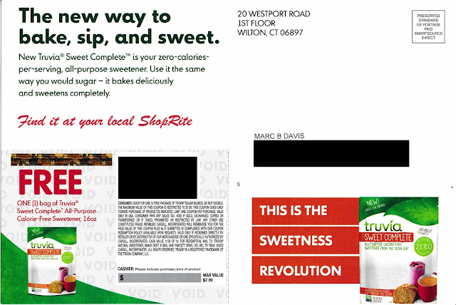
I recently received this postcard introducing me to Truvia, a zero-calorie sweetener. 

Truvia Sweet Complete
Postcard front

Visually, this postcard makes Truvia seem like a compelling alternative to sugar. The picture on the front suggests this is something I could use when baking a cake, making a smoothie, or sweetening coffee. Plus, as a potential customer, the postcard offers me the opportunity to try out one of their products for free. 

Free is a great price for a new product. It is a proven way to get a potential new customer to go outside of their comfort zone, to try something new, and to experiment a bit. It's such a common sales practice that drug dealers reputedly offer the first hit of crack cocaine for free. Customers get addicted, and they pay for more drugs. A sugar-alternative zero-calorie sweetener shouldn't be treated like crack cocaine but, hey, the makers of Truvia certainly want me to be hooked. 

Truvia Sweet Complete Free Offer
Postcard address side

The address side of the postcard includes supporting copy: a well-written product explanation, a benefit statement, an explanation of how to use the product, and a coupon for a free 16-ounce bag. I'd say that's sweet (pun intended). 

The Call to Action is simply "Find it at your local ShopRite." Therein lies the rub (or, should we go with the pun, the 'topping'). From where I live in Queens, the nearest ShopRite is typically a 25 minute drive in traffic -- under 10 miles as the crow flies, but that crow doesn't have to worry about Big Apple traffic. So, no disrespect to ShopRite, but I won't shop there when there are 3 supermarkets and a Target within walking distance. 

So, would I give this call to action a Fail for Targeting? Not really. Presuming this was a national campaign, I can't fault the marketing manager for including someone located several miles from an eligible supermarket. It's pretty complex to design targeting criteria based on travel time to a supermarket chain.

However, I could give the call to action a Fail for Creative. The coupon is valid at any retail location that carries the product. It turns out that, according to the Where to Buy link on the Truvia web site, the advertised product is available at a nearby Foodtown. Rather than mentioning only ShopRite, the postcard should have mentioned their "Where to Buy" website, e.g. 

Visit www.truvia.com/where-to-buy for a store location near you
or
Use your free coupon at ShopRite,
or visit www.truvia.com/where-to-buy for other nearby locations

When a prospective customer can try your product for free with few hassles, that is like zero-calorie icing on the cake.

Lesson: 
Make coupon redemption easy for your customer by offering relevant redemption options.

10/27/2020

PayPal: Selling Honey Without the Other Ingredient

A couple weeks ago I wrote about an email from PayPal selling Honey without communicating a value proposition. Over the weekend, I received this email:

PayPal Honey Value Prop email

PayPal explains Honey in one sentence, "Install Honey in just two clicks so when you shop online you can automatically get some of the best prices from over 30,000 online retailers." That is a well-worded product value proposition. 

Where the prior email encouraged immediacy but lacked a value proposition, this email includes a value proposition does did not encourage immediacy in the call to action. As I draft this post, the $5 bonus offer appears to still be active. Perhaps they have not reached the limit of 40,000 new customers eligible for the offer they mentioned in their first email.

Here's an idea: Combine the value proposition and encourage immediacy in a single communication by explaining the product then closing with a $5 bonus offer. The email could be summed up in a few sentences:

"Install Honey in just two clicks so when you shop online you can automatically get some of the best prices from over 30,000 online retailers. Hurry -- the first 40,000 people to install Honey and make a purchase of $10 or more will receive a $5 bonus."

Will you get that $5 bonus in addition to shopping online with Honey? I don't know, but you should make sure your email isn't a Fail. Act now!

Lesson:

Communicating a value proposition is important, but so is giving the customer a reason to take action now.

10/25/2020

Caviar: What Is It?

Two postcards arrived within a day of each other. One includes elements that can make direct mail successful; the other Fails in multiple ways.

freshdirect new customer offer

freshdirect new customer offer

This postcard from freshdirect reflects smart use of these elements, specifically:

  • Targeting: No one at the targeted home has purchased from freshdirect. The targeted home is in a freshdirect delivery area and in a zip code where overall use of grocery delivery has increased.

  • Offer: There is a new customer incentive of $25 off the new customer's first purchase, -- a good reason to to give freshdirect a try. Plus, the offer is valid for about three weeks from the postcard's in-home date, motivating that customer to take action right away.

  • Creative: The 5 1/2" x 10 1/2" postcard clearly communicates its sales proposition both visually and in prose. One side of the postcard succinctly communicates the service provided, and even includes a tag line to reinforce the sales proposition. The address side includes the call to action and supporting benefits messages. The incentive is unambiguous -- at a glance, the reader knows what it is, the value, when to use it, and how to take advantage of it

  • Timing: Mid-October is likely the last time of year to mail and avoid the oncoming clutter associated with holiday catalogs and other gift-related mailings.

  • Execution: The postcard was printed with spot varnish to protect the pictures from appearing scuffed.

  • Tracking: The new customer incentive includes a promo code for the customer to use. This promo code facilitates the customer discount, but it also allows freshdirect to track the customer's path to becoming a customer. This means freshdirect can reasonably assume it was the postcard that motivated customer action.

Well done, freshdirect!

On The Other Hand ... 
The below 6" x 11" postcard from caviar is physically larger than the one from freshdirect, yet it communicates much less. From looking at the postcard, can you answer the question: What is caviar? 

caviar new customer offer 10/2020

caviar new customer offer 10/2020


OK, its a food delivery service -- but what kind of food delivery? Does it deliver meals and groceries like freshdirect, in-home food kits like Blue Apron, or perhaps single-person prepared meals like freshly? From the pictures of the kale salad and what I now think may be a poke bowl, I couldn't tell, but a google search revealed that caviar is a delivery service specializing in meals from high-end restaurants. So, I guess it's more like seamless.

According to their snippet on a Google search caviar offers, "Delivery & takeout from the best local restaurants. Breakfast, lunch, dinner and more, delivered safely to your door."  There you go: a brief, succinct explanation -- one that should have been included on the postcard. The snippet also mentions, "Now offering pickup & no-contact delivery.That is an important supporting message during this pandemic that should also appear on the postcard. The lack of a sales proposition and supporting messages is a Fail for Creative. The postcard has plenty of white space, so why not use it?

Also, it takes a pair of reading glasses to review the disclosure noting that this offer is good through December 7, approximately eight weeks after the postcard arrived. That response window is too long to encourage what is typically an impulse decision: namely, what to have for dinner tonight. This wide response window merits a Fail for Offer.


caviar postcard disclosure text 10/2020
The caviar introductory offer is not valid for DoorDash customers.
It expires eight weeks after arriving in home

That fine print also leads to meriting a Fail for Targeting. The recipient is a regular DoorDash customer, making that person ineligible for the discount. 

wondered why a meal delivery service would make customers of a different meal delivery service ineligible for a discount. In my research, I learned that DoorDash had bought and integrated caviar into the DoorDash network several months ago. Here in New York City, the integration did not go well

For the postcard recipient's mailing address, Caviar offers delivery from only 17 restaurants. That’s a small number compared to DoorDash’s 398 restaurants. (Furthermore, all 17 of Caviar's restaurants were inclusive to those available through DoorDash.) This lack of compelling selection might merit another Fail for Targeting.

There is no reason to expend the cost of sending mail that does not communicate a sales proposition with an invalid, non-urgent discount offer to a home that has limited purchase opportunities. If DoorDash continues to waste marketing dollars like this, caviar's days are numbered. 


Lessons:
  1. When soliciting new customers, communicate a compelling sales proposition.
  2. A response window should be long enough to give a customer time to respond, but not so long that immediacy is discouraged.
  3. Mail your offer only to customers who might be eligible to take advantage of the offer.