Showing posts sorted by date for query call to action. Sort by relevance Show all posts

5/26/2019

Santander Bank: What To Do to get $300?

As competition in retail banking increases, brick-and-mortar banks continue to offer incentives in the form of bonuses to open an account. I recently wrote about TD Bank’s self-mailers. This one from Santander Bank is a simple postcard—in fact, it’s too simple. That’s why it merits a Fail for Creative.


Santander New Customer Postcard
Postcard Front
The front of the postcard prominently messages the opportunity to get a $300 bonus for moving to Santander Bank, but does not explain what that means. The only hint of an explanation is a small message to “See reverse for important information.”


Santander Bank New Customer Offer
Postcard Back


The back of the postcard communicates some of the benefits of banking with Santander and includes a Call to Action to visit a website or visit a nearby branch with the postcard. That’s nice, but what about that $300? What does a prospective customer need to do to get the bonus? The explanation is buried in the long Disclosure. (If you can read the explanation without visual support, you don’t need glasses.) While the 17-line Disclosure is concise, it is not clear to a casual reader. That lack of clarity is a Fail, because who wants to put on reading glasses just to figure out what hoops to jump through to get the bonus?

I’m not a lawyer, so this isn’t legal advice. As a marketer, however, I think the lack of clarity may not only be bad marketing, it may also be a violation of FTC regulations. Current regulations state
“When making ‘Free’ or similar offers all the terms, conditions and obligations upon which receipt and retention of the ‘Free’ item are contingent should be set forth clearly and conspicuously at the outset of the offer so as to leave no reasonable probability that the terms of the offer might be misunderstood.” 
While the terms of the offer to get the free $300 are clear, they are not conspicuous. The offer landing page explains the terms adequately; however, it refers the customer back to the postcard.

Top of landing page

Lesson:
When presenting an offer to a prospective customer, clearly and conspicuously explain what needs to be done to obtain that offer.


2/20/2019

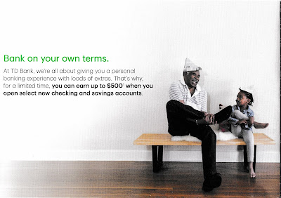
TD Bank: New Account Offer Missing Urgency

I recently wrote about an email from Vanguard that lacked a respond-by date -- and, therefore, lacked urgency. This self-mailer from TD Bank also lacks a clear respond-by date and thus merits a Fail for Creative.

TD Bank New Customer Offer

TD Bank New Customer Offer
Outside of Self-Mailer

TD Bank New Customer Offer
First fold-out panel

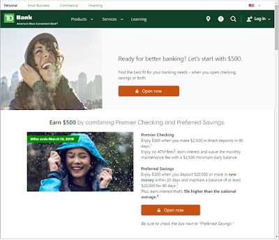
The folded self-mailer includes an offer of up to $500 if the customer opens a checking account and a savings account. The amount of free money is as low as $150 if the customer opens only one type of checking account, but that’s not chump change. The call to action is to open the banking accounts at a local banking branch, TD Store, or by visiting a special landing page. The landing page reinforces the offer with the same imagery as the self-mailer. That’s nice creative coordination.

TD Bank New Customer Offer

TD Bank New Customer Offer
Inside panels
However, the mailer buries the offer expiration date in the disclosure. The first line reads, “Offer valid from January 15, 2019, through March 13, 2019...” It is found in small, light gray type (e.g., not designed to be read). The only sense of urgency conveyed is in the call to action to “Get started today.”


TD Bank New Customer Offer
Only mention of offer expiration date
(I added the red circle)
The landing page includes mention of “Offer expires March 13, 2019” above the fold and in the pictures, making them hard to miss. That’s smart. However, the person who receives the mail needs to visit the website to be able to clearly see the offer expiration date.

TD Bank New Customer Offer
Offer landing page: td.com/Earn500

Lesson:
If you want customers to respond to your offer, include a clear, prominent respond-by date.

2/05/2019

Vanguard: Transition time is when?

This email from Vanguard merits a minor Fail for Creative.

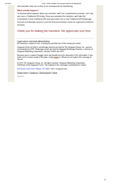
It appears that Vanguard is moving its investment platform from one system to another, and needs customers to take action to support the move. The email explains to the customer that a “3-step transition” is required, and doing so would take a “few minutes.” It includes four FAQs, but that’s all. The Call to Action is to “Transition Now” by clicking a button, which leads customers to the typical login page.

Vanguard

Vanguard
Vanguard email to customers 

This email was sent to consumers. While one can assume consumers who use Vanguard for investments have some savvy, because they avoid the high fees of other investment companies, that does not mean they are familiar or comfortable with technical terms like “transition.” The opening, in all-caps — “YOUR ACCOUNT NEEDS TO BE TRANSITIONED” — has a tonality of forcefulness that is generally not in the Vanguard communications style. To the uninformed, the fact that the account where one’s retirement savings is managed needs to be “TRANSITIONED” is scary.

There is some explanation regarding the rationale for the move, but why not position this transition as an upgrade from the onset? Sell the benefits upfront.

Furthermore, the request to the customer lacks any immediacy. The Call to Action should include a respond-by date. Internally, perhaps a decision was made not to include a date in the communication now because the IT folks have a year-long implementation plan. But even a soft request to take action by a specific date would help a customer decide to take action. Otherwise, the customer might ignore this or prioritize this task somewhere between, say, replacing the baking soda in the refrigerator and watching the last season of House of Cards.

Below is my attempt to rewrite the main message in a communications style I more typically see from Vanguard. It includes an upfront communication of customer benefit and a timely (but soft) call to action, but avoids using industry jargon and scary words.
Dear [Customer Name],
We have upgraded our platform for customers like you to make and follow your investments. This new, flexible platform will allow us to save money and make continuous service improvements, which will benefit you as we can lower our costs to serve you and improve your online experience.
Please help us move your account to the upgraded investment platform by completing 3 easy steps. It’s quick and easy—taking less than 5 minutes of your time. Just log into your account using the button below to get started.
If you could complete these 3 steps by February 28, 2019, that will help us help you. Thank you for your consideration and your time.
It would also be useful to label the FAQs below the Call to Action simply, “Frequently Asked Questions” and consider offering a separate page on the Vanguard site with additional FAQs. Doing so would boost customer confidence while reducing the expense of calls to their customer service center.

Lessons:
  1. Avoid industry jargon in customer communications.
  2. Any request for a customer to take action should include a date.

10/29/2018

Jet.com: Cool mail, but lacking strong call to action


When I moved to New York City, I joke that I learned that as a New Yorker, I was obligated to greet people by saying either “How you doing?”, or “Up yours!” I typically prefer the former. I also learned how much convenience plays into how a New Yorker chooses where to do business – where to get a haircut, where to shop, etc. In some parts of the city, there are three TDBanks within 10 blocks because, well, that’s convenient. Who wants to cross a pair of busy intersections just to get $20 from an ATM?  Not a New Yorker.

So, even though most New Yorkers live within a mile of brick-and-mortar stores that have everything they need, they are still likely to purchase dry goods online. It goes back to convenience. After all, having a box arrive at your doorstep with your laundry detergent is easier than having to lug that weight home from the supermarket.

Enter jet.com. According to Wikipedia, the company was formed three years ago. Originally, the company had branded itself as the “biggest thing in shopping since shopping.” However, about two years ago, it was purchased outright by Walmart. Based on this CNN story and other articles found online, jet is being positioned as a site for higher-income urban millennials. Here in New York City, television advertising and subway billboard ads communicate the ability to purchase curated brands and city essentials in one place. That seems convenient. This ad, showing a New Yorker being gawked at by tourists, is locally-centric. The landing page is also themed around shopping while living in The Big Apple. On my first visit to their landing page, I am greeted with a serene, winter picture of the East River. 
Jet.com's NYC Landing page
 

Scrolling down, I find the opportunity to purchase kale and an iPad.
Below the fold on landing page


Which brings us to their self-mailer.
Front
Address panel

It is the second one I have received in as many weeks. Creatively, it is on-brand and on-message. It uses the same tagline and reflects the same sales proposition around the ability to purchase brands relevant to New Yorkers who are, presumably, like myself. And, while I’m not a millennial and I don’t know what Walmart defines as high-income, this is not a Fail for Targeting because, based on my zip code, I live in an area populated with people who fit that target market. 
First fold-out panel with small call to action

The call to action is subtle. One has to unfold the self-mailer partially but not completely to find the call to action to shop at jet.com. It’s not even to make a purchase – just to shop. It appears to me that this mailer is barely above branding piece, a supplement to the mass media advertising that conveys jet.com’s image and sales proposition. 
Next fold-out panel

Final fold-out panel. No call to action

Intuitively, I would think that if the purpose of this self-mailer were to bring traffic to the site and encourage near-term purchase activity, including of an incentive specific to the mailer would be useful -- even something minor but specific that might encourage immediacy. Maybe “$5 off your first purchase by 11/30/18” or “Free shipping on any size purchase with your first order in 2018.”  These would include a personalized promo code so it is not misused by people in the public domain and sales resulting from the mailing can be tracked. Jet.com’s check-out process already includes an input field for promo codes, so the infrastructure is in place. And doing so would not jeopardize the aspiring high-end brand image – after all, even Tiffany and Lexus have promotional offers from time to time. This looks like a Fail for Offer.

Perhaps there was a conscious decision to not include an incentive with consideration of the target market. Maybe the expense for a self-mailer is categorized by Wal-mart as merely brandingThere is a school of thought in marketing that millennials are not interested in discounts (such as in this article). However, some marketers have arrived at the conclusion that finding the best deals impact millennials’ shopping decisions. One should also consider that some recipients of these self-mailers are not millennials and are watching their dollars.

Maybe Jet’s management is trying to be as unlike Walmart as feasible. That’s understandable given the investment in jet.com’s new brand positioning. Nevertheless, I would at the very least execute an A/B test of Incentive vs No Incentive and include a useful means of tracking customers against the mailing list. 

My question to jet.com marketing leaders regarding the success of these mail campaigns is the same as how I would greet them here in New York: “How you doing?”

Lessons:
1. Consider an incentive and a timely call to action to encourage immediacy of purchase activity, if that is your marketing goal.
2. Including a unique tracking code is an excellent means of tracking response. 
3. Not sure what works?  Test your hypothesis.


6/10/2018

MoMA: Failed Mail, But Is It Art?


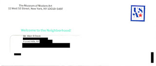
I moved to New York City last July. Last week, I received the below solicitation for membership from the Museum of Modern Art (MoMA). The Outer Envelope Teaser reads, “Welcome to the Neighborhood!” Inside is an offer of discounted membership “… available only for our new neighbors.” However, I moved to New York City last July.

Museum of Modern Art Solicitation
Inviting Outer Envelope
"Welcome to the Neighborhood!"


I can only speculate why I received a solicitation with this type of messaging after living here nearly a year. Did MoMA purchase a hot movers list that wasn’t so…hot? Did the mailer obtain my information several months ago but didn’t use it until now (e.g. a Fail for Timing)? If either of these is true, that is poor targeting (e.g., a Fail for List). Did MoMA know I moved more than 10 months ago but chose to position their solicitation as being for new residents? If so, that appears to me to be a Fail for Creative, because the messaging is not relevant.


Museum of Modern Art New York City
Front of letter

Museum of Modern Art New York City
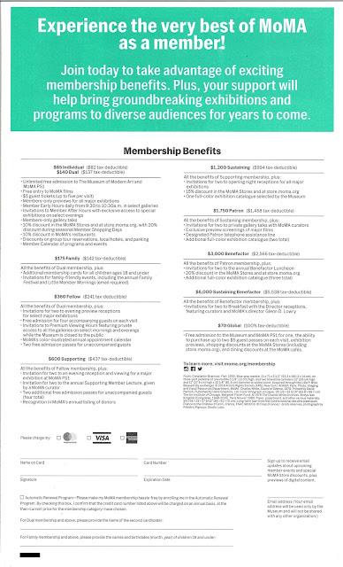
Back of letter includes many membership level options


Aside from that point, creative execution is quite good. The package includes many of the elements known to support optimizing response:
  • Outer Envelope. The outer envelope clearly identifiers the sender. It is stamped, which suggests a personal correspondence. The teaser “Welcome to the Neighborhood!” is in an inviting color.
  • Letter. In lieu of a typical Johnson Box, the letter tastefully displays what a new member might expect to enjoy at the MoMA. Displaying the organization name and return address on the side (as well as choosing a font that visually matches the MoMA brand identity) is inviting. The interior highlight colors match the outer envelope teaser. The copy describes the overall benefits of membership and is inviting. The letter is personally signed by a relevant individual, and it closes with a postscript that reinforces the offer. 
  • Buckslip. The buckslip insert clearly and simply reinforces basic membership benefits and includes a call to action.
    Museum of Modern Art Solicitation

    Museum of Modern Art Solicitation
    Buckslip insert
  • Personalized Response Form. The Membership Acceptance Statement already has the prospective member’s name and address. The form includes mention of to whom to make out a check and includes an option to pay the membership fee using a major credit card. 
  • Business Reply Envelope. The reply envelope is postage-paid, meaning the recipient won’t need to spend effort finding an envelope or a stamp. The FIM Bar and barcode will ensure smooth and fast response delivery.

Museum of Modern Art Solicitation
Standard Business Reply Envelope
Prepaid postage allows for easy return & fast delivery


This solicitation may also deserve a Fail for Offer, because there are too many and they are confusing. The front of the letter lists four membership options, while the back of the letter lists nine – with costs ranging from $70 to a whopping $6,000. If the people being solicited are new to the neighborhood, they are likely not ready to put down more than a couple hundred dollars on membership at a museum. They may also not be willing to take the time to understand the difference between the $70 “Global” membership listed on the back and the $70 “Individual” membership listed on the front. This forces the consumer to make a decision within a decision – to first make a decision whether to be a member and then to make a secondary decision regarding the type of member to be. Forcing the secondary decision risks prospective member frustration, which leads to delayed or no action on the primary decision.

It would be worthwhile to communicate only two to four entry-level options for new members, then take action to upsell them later when they call to join – or upon their first enjoyable visit to the museum.

In addition to caring for the Fails, there are a few minor optimizations I would consider with this type of solicitation:

  • Open the letter with the recipient’s name. Perhaps there wasn’t space with this design; but, if you are going to take the effort of having a personal-style letter solicitation, open with “Dear Marc Davis” – or, if the list source data allows, “Dear Marc.” 
  • Explain some elements a bit better. When communicating museum features and benefits, consider the fact that the intended recipient is new to New York City. For example, the back of the letter and the buckslip mention free admission to “MoMA PS1.” A new neighbor might confuse that with something related to a SonyPlayStation
  • Reinforce the promo code. To get the discount, the new member has to enter a promo code mentioned in the body of the letter. Someone simply scanning the letter, however, would be hard pressed to find it. It should be listed in the Acceptance Statement in #1 under “Four easy ways to join” and it could be reinforced in the postscript. 
  • Create a matching landing page. The current call to action mentions moma.org/join, which appears to be the standard page for new member enrollment. Unfortunately, that page has even more options than the letter – creating even more potential for confusing prospective members – and the page also doesn’t reference the new member discount. This means the recipient of the letter couldn’t use it to get the targeted discount. A matching landing page can have an inviting URL (i.e., moma.org/newneighbor), visually match the solicitation, and show only simplified, relevant membership levels at the offered price without forcing the new member to enter a promo code. In addition, quantifying page visits can support gauging overall prospective membership interest resulting from the solicitation. 
  • Avoid the zip+4 on the outer envelope return address. This bit of technical accuracy doesn’t help optimize mailing the package and detracts from the light, personal feeling of the solicitation. 
One needs creative skills to design the right type of communication for the target audience to mail at the best time. But is it art? Well, maybe – but the actions of measuring, testing, learning, and optimizing mean it is also math.

Maybe, one day, MoMA will have an exhibit featuring creative elements of successful direct mail, perhaps next to a Swatch Jellyfish watch or Macintosh classic desktop computer


Lessons:
  1. When choosing to communicate to prospective customers around life events, make sure your list source is accurate – and mail on a timely basis.
     
  2. When soliciting new customers to your program, offer few and simple options.

(Edited to correct hyperlinks.)

4/26/2018

Celebrity Cruises: My Ship Comes in Again… and Again… and Again…


In my previous post, I mentioned that I had planned to cruise on Celebrity Cruise Lines. At some point, when booking excursions, I must have opted in for marketing communications. I know this because, in addition to communications regarding the cruise, I received emails with limited-time deals for upcoming cruises. Many, many emails. In the month after the last day of my cruise, I received 37 emails from Celebrity. (That was yesterday.  As I post this blog, the count it now 39.)  That’s more than an email per day with a marketing offer to make the major travel purchase of a cruise.

In digging through these emails, however, I did receive two that addressed my recent cruise. One was a polite thanks for our sailing. It arrived five days after we disembarked. That’s timely. 

The next relevant email arrived two days later with the subject line of, “Marc, Thank you for sailing with us.” As a quick proofreading note: I would not have capitalized “Thank you” when preceded by a comma, but at least the messaging was relevant to my experience – with a timely call to action to book another cruise. Disney is effective using similar techniques when reaching out to their customers after a trip to The Magic Kingdom.

What Disney may not do is spam the crap out of their customers. I have too many emails to display here, with subject lines like, “Last Day – Do NOT miss these low fares to Alaska.” (March 26); “Now ending: Savings for all, plus TWO free perks” (April 2); “Exciting Deals is coming to an end. Last day tomorrow.” (April 8) “Just arrived! Just arrived! New offer to Alaska gets 50% off.” (April 9). I received two emails on the same day: “Marc, it’s Funday Sunday, perfect for booking an Exciting Deals getaway.” (April 22, 10:15 am) and “Traveler, it’s Funday Sunday, perfect for booking an Exciting Deals getaway. (April 22, 10:27 am).

It appears to me that Celebrity’s Marketing Department uses the criteria to send promotional emails only on days ending in “y” – and that’s a Fail for Timing for sending too many emails too often. They become meaningless in the continued clutter of communications. It may also be that there are several marketing lists floating inside the Celebrity organization and they don’t relate them to the customer experience. If that is the case, and they are using a Spray and Pray method of marketing, that’s a Fail for List.


Lesson:
Know your customers. Communicate to them sparingly and with relevance – addressing them in the context of your customer relationship.


11/28/2017

Get your customers’ attention now

This article in the Wall Street Journal reviews mistakes that retailers are making in reaching out to customers via email during the holidays.  The article mentions that emails often fail to offer products relevant to their customers’ interests or are outdated upon arrival.

What the article doesn’t mention is that retailers often fail to make their case for immediate purchase upfront.  At this time of year with the gifting holiday imminent, retailers should put their purchasing sales proposition in the Subject Line and reinforce them at the opening of the body of the emails.  Inappropriate subject lines I’ve seen include:

“Cyber Monday Deals from Project Fi” (Google)
“We're Extending Cyber Monday to TUESDAY!” (Resorts World Bimini)
“SAVINGS. GALORE.  All day!” (Hampton Inn)

Better subject lines would be:

“Free $100 Fi Credit with phone purchase – until midnight tonight”
“2-night stay + Island Transfer = only $199. Must book by 4 pm”
“10% off 2-night stay if you book tonight”


These may not be the best subject lines under normal circumstances, but on Cyber Monday they are.  Customers are at best scanning retailers' emails to find the best deals for them.  Retailers need to get past the clutter of other opt-in email communications and get their message across right away.  When you can, include a deadline upfront.

Lesson: 
On Cyber Monday and during peak shopping seasons, use an immediate call to action.

1/23/2016

Wright Veterinary: Typo Leads to Very Early Reminders

I received this postcard on January 15 from the veterinarian for my dog, Buddy. The vet sends these courtesy postcards if I have missed my dog’s immunization dates, reminding me to keep my dog vaccinated.

Although one would like to believe that the neighborhood vet who cares about each four-legged and two-legged friend individually is a from a mom-and-pop shop, it is nonetheless a business complete with business processes, a database, and a lettershop. The reminder postcard I received for my vet in Bethlehem, Pennsylvania, had been mailed from such a lettershop in Oshkosh, Wisconsin. 

The postcard reminded me about treatments due in December 2016 -- 11 months from now. This merits a Fail for List. As I understand from a phone call to the WrightVeterinary Medical Center, one of the employees had incorrectly entered the month and year of due vaccinations for the mailing list. This typo had resulted in many reminder postcards being sent in error -- and many pet owners calling in to verify they had received the postcard in error.

Wright Veterinary Reminder CardThe message is attempting to be a bit cute -- referring to the pet and suggesting the owner bring the pet in for immunizations, but the message was a bit confusing. However, I wouldn’t call the message a Fail for Creative. Still, there are some typos as well as multiple instances of confusion between singular and plural nouns, so the copy could be cleaned up a bit. Here is an attempt to streamline the content while maintaining the same message.

We missed seeing your pet for at least one important vaccination.

Maintaining your pet’s immunity to diseases is a vital part of its total health care program. So, we wanted to remind you of the vaccinations and dates due for each pet. They are listed on this postcard.

Please be sure to order preventative medications and make an appointment for preventative treatments now, because further delay could be harmful to your pet. Call us at Wright Veterinary Medical Center today at 610-865-2611, because a healthy pet is a happy pet.


I would also suggest writing a cleaner call to action. Just ask the pet owner to call in to discuss how to ensure the pet can get its required vaccinations. By having one call to action and maintaining a consultative tone, a pet owner can call with adequate peace of mind.


If I am going to write about my dog, I can’t help myself but include a picture of Buddy. He is such a cute, friendly dog!
Buddy!

Lessons:
  1. What goes out on your mailing list is based on what you put in as your list criteria, so be sure your mailing list accurately reflects your intentions.
  2. Keep your call to action clean and simple whenever possible.

11/29/2015

Just Energy: Limited Offer for Unlimited Electricity with Failed Mail Limitations

Just Energy Unlimited electricity offer envelope
Outer Envelope with 'Limited Time' mention in the teaser
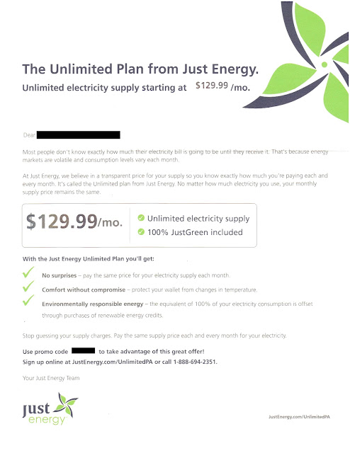
Sometimes brilliant ideas fail on execution. That might be the case with this solo letter package from Just Energy. Their offer of unlimited electricity is innovative and potentially compelling. For one price, you can get all you can eat, er, consume.  

Just Energy Unlimited PA landing page
404 error message on landing page /UnlimitedPA
But this direct mail marketing campaign merits some Fails for Creative. The largest Fail is for a non-functional landing page. As I write this, the website listed at the bottom of the letter has a 404 error message. A customer cannot sign up.

On the letter itself:
  • Just Energy overuses branding. The company name is mentioned several times, filling up the page when critical space could be used to message benefits and reinforce the call to action, which is hard to find at the bottom of the page.
  • Variable content is misaligned. The price, the green checkmarks, and the promo code all appear to be a bit higher on the page than they should be. This gives the appearance of a shoddy form letter, which makes the company seem less trustworthy. 
  • Much of the focus is on features but there is little focus on benefits.  
  • The box in the middle of the page mentions “JustGreen,” but there is no payoff of the term. I presume that JustGreen is a trade name or product name for renewable energy sourcing; however, this is not explained to the reader.
Just Energy Unlimited Electricity Offer Letter
Offer Letter Front
  • Some of the language is a bit heavy on industry jargon. For example, residential consumers understand energy “usage” but might not understand what “consumption” means.
  • Another product name, “Unlimited Plan,” is capitalized inconsistently. In the Johnson Box (and later in the letter) the term is proper-capped; however, in the second paragraph, only the word “Unlimited” is capitalized. 
  • The signatory is generic. Rather than closing with “Your Just Energy Team,” why not close with a signature from the CEO or Vice President of Customer Service? That would make the letter appear to be more sincere.
  • It is missing a respond-by date. The outer envelope headline asserts that this is a limited-time offer, but there is no mention of time-based limitations in the letter. From a direct marketing perspective, a respond-by date gives urgency to a marketing communication and therefore supports immediate consumer action. In the electricity supply industry, it also protects the seller. What if the cost of electricity shoots up and the monthly price of $129.99 cannot be supported? Someone responding to this mailer a month after receipt would be upset when told that the price is now $159.99 per month. 

Below the summary of lessons is how I would rewrite the letter, encompassing the given product with a focus on benefit statements while leveraging proven direct mail marketing elements. This copy would be reformatted and integrated with corporate branding elements for a smooth but not overwhelming balance of color.

Lessons: 
  1. Ensure that all back-end processes are in place supporting your campaign, especially your phone number and landing page.
  2. Make your offer letter look presentable.
  3. Use consumer-facing language.
  4. Focus on benefits.
  5. Include a respond-by date.
  6. Proofread.
-----------------

Offer Letter Rewrite


Enjoy unlimited electricity supply with a simple price
Sign up by xx/xx/xx to lock in your monthly bill for this winter
  • Unlimited Electricity Supply
  • 100% environmentally responsible
  • All for only $129.99 / month
  • Easy sign-up at JustEnergy.com/UnlimitedPA
Dear xx, 

Most people don’t know how big their electricity bill is going to be until they receive it.  That’s because energy costs and electricity usage change each month.  But you can stop worrying about that.

At Just Energy, we believe in being clear and straightforward. That’s why we created the Unlimited Plan. No matter how much electricity you use, your monthly supply price remains the same so you can have peace of mind knowing how much you pay each and every month.

With the Unlimited Plan from Just Energy you’ll enjoy:
 No Cost Surprises – Pay the same amount for your electricity supply each month.
 Comfort without Compromise – Turn up the electric heat because your wallet is protected from changes in temperature.
 Environmental Responsibility – We purchase renewable energy credits to offset 100% of your electricity usage.

Stop guessing about how much you’ll pay and breathe easy this winter.  Take advantage of this offer by xx/xx/xx.  Sign up at JustEnergy.com/UnlimitedPA.  Be sure to use promo code xxxx to benefit from this low fixed price! We look forward to having you as a customer.

Sincerely,
[signature]
Deborah Merril
Chief Executive Officer, Just Energy

P.S. Still unsure?  Call one of our friendly energy specialists at xxx-xxx-xxxx and mention promo code xxxx. They will be happy to answer your questions and help you sign up.


10/19/2015

GSN Games: Where Do I Put My Quarter?

This letter was sent by “Lindsey” – a manager at GSN Cash Games – to someone who played their games for a while. GSN offers versions of “Wheel of Fortune,” “The Price is Right,” and “Bejeweled Blitz” where players pay an entry fee to compete against other people and win cash prizes. The letter’s recipient played some games, but stopped over a year ago. 

GSN Cash Games sent the recipient periodic emails offering promotional bonuses for playing games again. He opened and read a few, but – after a while – he ignored the emails and condemned them to his Spam folder. With that in mind, a sincere “we missed you” letter of this type sent via snail mail makes sense. 

The letter from Lindsey is an attempt to win back a customer. It offers the reader an opportunity to reengage with their site and play some games. There is an offer of game credits, email addresses to write to with feedback, and even an easy way to restore a forgotten password. So, from a marketing standpoint, the List,Offer, and Timing make sense. 

While the creative tone appears to be appropriate to the target audience, this is still a Fail for Creative because the letter is missing a clear call to action. The reader is asked to “come back and play some games,” but the letter does not identify the Web site. The recipient had not visited the site in over a year and may not remember the URL. It could have been included in a few places in the letter while maintaining a sincere tone. Some examples:

“… it’s been a while since you visited www.xxxx.com and played a game with us.”

“Please come back to www.xxxx.com and play some games with us.”

“Log in at www.xxxx.com by midnight ET on …”


Lesson: Be sure your call to action is communicated clearly.

10/06/2015

TurboTax: Tax Time Starts Very, Very Early

I received a solo letter package from TurboTax on September 30 – a time when Halloween candy is on the shelves at the supermarket. This appears to me to be very early. I have yet to think about what I’m getting my wife for the holidays much less filing my 2015 taxes, but I’m only a focus group of one. On an overall marketing basis, is this a Fail for Timing or is this a smart way for Intuit to get ahead of the volume of holiday catalogs in the mail to reach out to and insulate customers for repeat purchase history?  

Envelope Front
Envelope Back
Creatively, the solo mail package is clean. On the front envelope teaser, there is a clear call to action. The rear teaser has a reinforcement message with an implied savings offer. The inside letter communicates the TurboTax value proposition using several direct mail best practices: Johnson Box, bulleted clear call-outs of features and benefits, and a reinforced call to action. The accompanying brochure breaks down the products – differentiating them in a clear manner while reinforcing the overall and individual product propositions.

Em dashes are used in a few places in headline and body copy. These are often interruptive and can be a good replacement for a comma. But utilizing a triple-dash style with no space often gives the reader the feel of there being two sentences rather than a single broken sentence. Take this line adapted from the outer envelope rear teaser:
Get your biggest refund – guaranteed! 
The use of the shorter en dash with spaces before and after creates a better visual flow compared to:
Get your biggest refund—guaranteed! 
The latter may be closer to grammatical correctness, but this isn’t a college essay – it is a marketing communication. 

Letter front
It is odd that the first solicitation for the next tax year would be via snail mail, where there is a hard cost of printing and postage. Why not at least start with an email? Intuit has my email address, and it costs nearly nothing to send me a customized email noting my product choice from last year and offering an opportunity to get the same product this year.

The offer is nothing special. There is a vague “SAVE $10*” message in several places. The disclosure on the back of the brochure reads “* Savings and price comparison based on anticipated price increase 3/18/16.” That is not quite a compelling reason to make a purchase now, especially considering the fact that the money-back guarantee applies only within 60 days of purchase. If I make a purchase now, I will still be eating leftover Thanksgiving turkey when the guarantee expires. Not even Ned Flanders gets started on his taxes before the end of the yearThe lack of a bona fide customer value for immediate action merits this a Fail for Offer

Perhaps Intuit was trying to standardize the mailer and purchase process, but, in doing so, may have missed personalization opportunities. For example, I have used the Premier version of TurboTax every year for at least a decade. That would suggest that I have no interest in the Deluxe version this year, so about a quarter of the brochure’s content is irrelevant to me. Rather than explain a likely irrelevant lower tier product, perhaps the focus could have been on resale and upsale.
Back of letter


If you are going through the effort and expense to send a personalized solo mail package, consider having a personalized offer with personalized tracking such as a unique offer code or personalized URL, product recommendations based on prior purchases, and an offer that expires soon. This could allow the customer to not have to complete a long form when repurchasing your product online. Not only will this address the customer based on his/her purchase history and information, you have the opportunity to fully track customer interactions.

Lessons:

  1. Consider the Timing of your marketing communication relative to seasonal level of consumer interest as well as macro-marketing conditions.
  2. Direct mail may not be the best method to reach out to your existing customer base when there are lower-cost methods available.
  3. Consider how you use dashes in every sentence.
  4. Have an offer that compels immediate action.
  5. Use your database to personalize your marketing communications and customer interactions.
Brochure Cover

Brochure Back

Brochure interior
Brochure interior