Showing posts with label A/B test. Show all posts

3/01/2020

American Red Cross: No longer blind


A little over two months ago, I wrote about receiving a solicitation from the Red Cross in a blind envelope right in the middle of the traditional giving season. Last week, I received a similar solicitation but with a corporate envelope.

Where the envelope in December had no hint of branding, this envelope is unmistakably from the American Red Cross. The teaser message reminds me that my donation helps the Red Cross respond to more than 60,000 disasters a year.
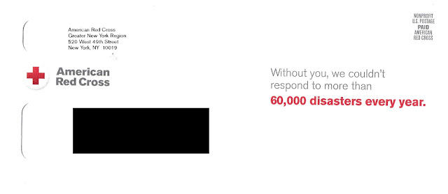
American Red Cross
Red Cross Solicitation:
Fully Branded Outer Envelope
The letter inside is exactly the same as the December letter. The only update is the mailing date.

Red Cross Charity Solicitation Letter
Donation Solicitation Letter front
multichannel engagement
Donation Solicitation Letter back
Request for email address circled

As a direct marketing professional, my gut tells me that the blind envelope was part of an A/B Test and this is the Control, but that is just a hunch. Perhaps the plan was for the holiday solicitation to be blind to differentiate it from the multitude of charity mailers that typically arrive in December. The mailbox is not as busy in February, the thinking would go, so now is time to show that logo again.

I wonder if it is also time for increased multichannel engagement. This is a direct mail letter requesting a mailed-back, completed response form. There is also an online donation option; however, the mention of that is in small type.

No one wants to mess with a successful Control package (if this is it); however, it may be time to consider that the internet is useful for many things, including donor engagement. Buried on the back of the form  below the input field for credit card information  is a request for email address. Instead, why not, on the front of the form, ask all donors for their email address to share stories of the Red Cross coming to the aid of disaster survivors? Rather than treating this solicitation as solo mail in a vacuum, include a link to the American Red Cross YouTube channel or the local Red Cross as a means of encouraging engagement?

Business Reply Envelope

Perhaps that could be their next A/B Test.


Lessons:

1.      Test your most successful direct mail packages. Let new presumptions challenge your assumptions.
2.      We live in an omnichannel world. Don’t use direct mail in a vacuum – integrate it with your other engagement channels.
12/18/2019

American Red Cross: Is a Blind Envelope Prudent?

You are one of the largest charities in the United States, with over $3 billion in annual expenses. According to Charity Navigator, only one other charity is followed more. When there is a natural disaster, you are there. Your logo is considered one of the most recognizable, one of the best in the world. So why are you hiding your logo?


Blind Outer Envelope
Red Cross Solicitation:
Front of Outer Envelope

That’s what I’m asking myself after receiving this charity solicitation from the American Red Cross. Every other charity solicitation I have received this holiday season included a message on the envelope -- what is known in industry jargon as a teaser. However, this Red Cross solicitation not only did not include a teaser, the envelope was completely blind. There is no indication that this is from the Red Cross, not even a return address.
Back of Outer Envelope
Is this a Fail for Creative? I don’t know. Intuitively, I think so. But I can’t be a focus group of one because I'm so enthusiastic about direct mail marketing, I open and read everything I receive (besides, the concept of being a focus group of one is dangerous). 

There are several schools of thought on whether teasers make sense. Some POVs from people with non-profit direct mail experience include this blog post suggesting that, because most teasers are simply not very good, a non-profit is better off without one. A similar POV from Mary Chalane suggests that, if a non-profit uses a teaser, it needs to be worthwhile. 
Donation Solicitation Letter front

Donation Solicitation Letter back
I agree with these opinions conceptually -- a bad teaser is worse than no teaser -- but couldn’t Red Cross creatively develop a good teaser? If not, shouldn’t Red Cross at least include its well-known, appreciated logo in the outer envelope return address area? 


BRE
Front of Business Reply Envelope
includes branding in color


Back of Business Reply Envelope

Perhaps Red Cross A/B tested the blind envelope against one with a teaser. Perhaps it tested against several teasers and an envelope displaying only their logo, and the blind envelope kept winning. If the test took place in the summer, perhaps it should try testing against a holiday-themed envelope in December when consumers’ hearts and checkbooks are more likely to be open.

My creative intuition could be right, or it could be wrong. The only way to know for sure is to test. Happy holidays.


Lessons:

  1. Know your strength of your brand.
  2. Maintain a Control package, but test against it at times relevant to your audience.

10/15/2019

Vanguard: Beefing Up Security, Beefing Up Customer Emails

Earlier this year, I wrote about an email from Vanguard to customers that included a few Creative Fails. It described some type of transition. This email is an improvement. It applies some best practices to motivate the reader to take action to motivate the reader to take action to set up 2FA, also known as two-factor authentication.


2-factor authentication
Vanguard Security Update email

The email opens in an emphatic tone. It speaks like a communication from Vanguard; that is, the tone fits their their brand identity of taking a stand for investors and treating them fairly.

The second paragraph contains the call to action. It cites a shared responsibility. It explains what is being requested and why.

The third paragraph includes a time-specific call to action. The response window is four weeks -- a bit long in internet time, but fair considering the actions involved.


The fourth paragraph explains (in plain English) what the reader needs to do. Although the call to action is to do something after logging into the Vanguard web site, there is no hyperlink to the login. We may reflexively consider this an error, but it is actually an email security best practice that guards against phishing attacks. 

Finally, there is a polite close reinforcing the cooperative nature of the call to action. 

There are a couple potential minor improvement opportunities. I would consider adding a valediction, along the lines of "Sincerely, Vanguard Customer Service" or perhaps a couple FAQs. But these are based on my intuition and outside understanding of the target market. In the best possible world, if timing allows, an A/B test could be executed to see which edits would result in improved response.

Lessons:
  1. When communicating with customers, your communications style should be aligned with your brand.
  2. Requests to your customers should be date specific.
  3. A/B test every communication as feasible.