Showing posts sorted by relevance for query disclosure. Sort by date Show all posts

4/15/2021

Norton Lifelock: Renewal Email Reminds Me of Penn & Teller

Penn & Teller had a show that ran for eight seasons: “Penn & Teller: Bulls---!” According to Penn Jillette

If we said it was all scams we could also be in trouble, but 'bulls---,' oddly, is safe. So forgive all the 'bulls--- language', but we're trying to talk about the truth without spending the rest of our lives in court."

This leads to a recent email I received from Norton. IMHO, it goes beyond merely a Fail for Creative

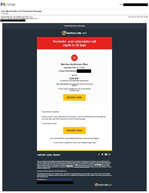
Norton Antivirus Renewal Notice

The email offers the customer an opportunity to review their virus protection for $39.99, with an asterisk mentioning that this is the price for just the first year. That asterisk references a Disclosure rendering in 4.5-point font size:

I'll enlarge the fine print to a readable font size:

You are enrolling in an automatically renewing subscription that begins when your purchase is completed online (or otherwise, when your offline payment is received). Please download and install on each device, up to the specified number of devices, to get protection. Price shown is valid for the first term only. After that, your subscription will renew each year at the applicable annual renewal price here. You can cancel your subscription at my.norton.com or by contacting Member Services & Support. For more details, please visit the Refund Policy. Your subscription includes product, service and/or protection updates and new features as available during the subscription term, subject to acceptance of the License and Services Agreement. Features may be added, modified or removed during the subscription term.


So, to find out what the second-year price might be, I have to search through literal mouseprint to find the correct link to learn that the actual long-term price is currently expected to be* 50% greater than the advertised price.

Why isn’t Norton upfront about this in the email? Is it perhaps that Norton believes customers will not look for it now and just accept the higher price in a year?

I understand the subscription business model. Norton is offering me software as a service. So does Microsoft, but they don’t obfuscate the fact that I pay $70 a year to use Microsoft Office. Other companies offer introductory prices, but I rarely see the long-term subscription price this hidden.

An honest yet persuasive approach would be to explain the subscription option and offer $20 savings off the first year. The people at Norton know this -- they use this approach as landing pages from PPC ads.

When companies hide relevant information from customers, they might get sales but they’ll also earn distrust. If I can’t trust Norton to be forthcoming about its subscription price, can I trust it to protect my computer? That's why I believe Norton's approach to disclosing prices to customers like this is bulls---.

Lesson: Your relationship with your customers goes beyond one transaction. Honesty is the best policy for long-term customer retention.


* The header of the pricing landing page reads: "Our renewal prices for standalone and add-on subscriptions are listed below. They may change, but we will always send you a notification email prior to billing." In other words, the actual second year price in 12 months could be substantially greater than the price shown today. 
5/02/2021

Freshly: How Do I Share My Code?

This email from Freshly merits a Fail for Creative.

Freshly referral / share email
Freshly email to customers inviting them to share


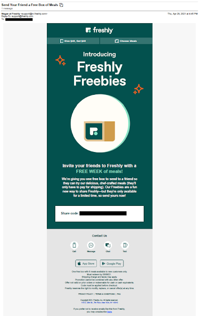
Freshly is a meal subscription service. It offers reasonably healthy, pretty fresh refridgerated meals that can be prepared in the microwave in about three minutes. Personally, during the pandemic lockdown, it helped me have several quick, tasty lunches between Zoom meetings. They've offered a referral program since as long as I've been a customer (at least I think so -- during the lockdown, one business day sometimes faded into the next). 

This offer is a bit different. The email recipient, a current customer, is given a "share code" to send a Freshly Freebie to someone who can get a free week of meals. Nice; however, there is no explanation of how to share. The email lacks an explanation of what I or that special someone needs to do to use that share code and enjoy that free food. This lack of explanation puts traction in the customer process of sharing, which reduces the likelihood of customer action.

The offer was sent on April 29 and expires May 6. This means the offer expires only a week after sending. The offer window is appropriately sized for an emailed offer; however, because the expiration date is mentioned only in the disclosure, the attribute of immediacy in the Call to Action is lost. The expiration date should be communicated in body copy, e.g. "Your share code is valid only through May 6, 2021, so be sure to share your Freebie today!"

Lessons:

  1. Your Call to Action should clearly describe the steps required for the customer to take advantage of your offer.
  2. Do not bury your offer expiration date in your fine print. 


10/06/2015

TurboTax: Tax Time Starts Very, Very Early

I received a solo letter package from TurboTax on September 30 – a time when Halloween candy is on the shelves at the supermarket. This appears to me to be very early. I have yet to think about what I’m getting my wife for the holidays much less filing my 2015 taxes, but I’m only a focus group of one. On an overall marketing basis, is this a Fail for Timing or is this a smart way for Intuit to get ahead of the volume of holiday catalogs in the mail to reach out to and insulate customers for repeat purchase history?  

Envelope Front
Envelope Back
Creatively, the solo mail package is clean. On the front envelope teaser, there is a clear call to action. The rear teaser has a reinforcement message with an implied savings offer. The inside letter communicates the TurboTax value proposition using several direct mail best practices: Johnson Box, bulleted clear call-outs of features and benefits, and a reinforced call to action. The accompanying brochure breaks down the products – differentiating them in a clear manner while reinforcing the overall and individual product propositions.

Em dashes are used in a few places in headline and body copy. These are often interruptive and can be a good replacement for a comma. But utilizing a triple-dash style with no space often gives the reader the feel of there being two sentences rather than a single broken sentence. Take this line adapted from the outer envelope rear teaser:
Get your biggest refund – guaranteed! 
The use of the shorter en dash with spaces before and after creates a better visual flow compared to:
Get your biggest refund—guaranteed! 
The latter may be closer to grammatical correctness, but this isn’t a college essay – it is a marketing communication. 

Letter front
It is odd that the first solicitation for the next tax year would be via snail mail, where there is a hard cost of printing and postage. Why not at least start with an email? Intuit has my email address, and it costs nearly nothing to send me a customized email noting my product choice from last year and offering an opportunity to get the same product this year.

The offer is nothing special. There is a vague “SAVE $10*” message in several places. The disclosure on the back of the brochure reads “* Savings and price comparison based on anticipated price increase 3/18/16.” That is not quite a compelling reason to make a purchase now, especially considering the fact that the money-back guarantee applies only within 60 days of purchase. If I make a purchase now, I will still be eating leftover Thanksgiving turkey when the guarantee expires. Not even Ned Flanders gets started on his taxes before the end of the yearThe lack of a bona fide customer value for immediate action merits this a Fail for Offer

Perhaps Intuit was trying to standardize the mailer and purchase process, but, in doing so, may have missed personalization opportunities. For example, I have used the Premier version of TurboTax every year for at least a decade. That would suggest that I have no interest in the Deluxe version this year, so about a quarter of the brochure’s content is irrelevant to me. Rather than explain a likely irrelevant lower tier product, perhaps the focus could have been on resale and upsale.
Back of letter


If you are going through the effort and expense to send a personalized solo mail package, consider having a personalized offer with personalized tracking such as a unique offer code or personalized URL, product recommendations based on prior purchases, and an offer that expires soon. This could allow the customer to not have to complete a long form when repurchasing your product online. Not only will this address the customer based on his/her purchase history and information, you have the opportunity to fully track customer interactions.

Lessons:

  1. Consider the Timing of your marketing communication relative to seasonal level of consumer interest as well as macro-marketing conditions.
  2. Direct mail may not be the best method to reach out to your existing customer base when there are lower-cost methods available.
  3. Consider how you use dashes in every sentence.
  4. Have an offer that compels immediate action.
  5. Use your database to personalize your marketing communications and customer interactions.
Brochure Cover

Brochure Back

Brochure interior
Brochure interior

2/22/2019

Uber: Too Little Urgency, Yet Too Little Time to Save

I recently wrote about an offer from TD Bank that lacked urgency because of a hard-to-find offer expiration date. This targeted offer I received yesterday from Uber also merits a Fail for Creative for missing the mark regarding urgency. It may also merit a Fail for Offer.


Uber sends an offer with a compressed, hidden response window
Email from Uber 2/21/19


The Subject Line is smartly personalized with my first name with an offer to “enjoy 50% off.” There appears at first glance to be a significant discount opportunity. The body of the email is also prominent in messaging 50% off not just my first ride, but my next 10 rides with Uber. However, down in the Disclosure, one would learn that the offer expires 2/25/19 at exactly 6:00:00 am. The email was sent on 2/21/19 at 6:54 am local time, which means that I, as a customer, have fewer than 96 hours to take advantage of this offer. (Or maybe I have 99 hours. Perhaps the offer expires 6:00:00 am Pacific Time while I live in the Eastern Time Zone.)


Let’s assume the offer is targeted based on my customer history with Uber. I used Uber’s service only twice in the past 18 months. So, perhaps this offer was targeted at me to encourage me to be a more active customer. If true, I don’t understand why Uber would target a basically inactive customer with an offer that would apply to as many as 10 rides in as few as 4 days. Is Uber expecting me to say, “Wow! Uber is cheap now! I’m going to skip the faster subway or not use my own car for four days?” It doesn’t make sense. If Uber wants me to try out their service again more than once or to prioritize it above Lyft or other services, why not expand the offer applicability window to at least a week?

If I were to write this, I would start with an upfront, clear, honest message with an adequate opportunity for customers to hail an Uber.  It would open with:

“Thank you for being an Uber customer. 

Enjoy 50% off your next 10 rides in the next 10 days.”  


Lessons:
  1. Include a clear, prominent respond-by date.
  2. Allow customers an adequate opportunity to respond to your offer.
  3. If your offer is specific to time of day, specify the applicable time zone.

2/20/2019

TD Bank: New Account Offer Missing Urgency

I recently wrote about an email from Vanguard that lacked a respond-by date -- and, therefore, lacked urgency. This self-mailer from TD Bank also lacks a clear respond-by date and thus merits a Fail for Creative.

TD Bank New Customer Offer

TD Bank New Customer Offer
Outside of Self-Mailer

TD Bank New Customer Offer
First fold-out panel

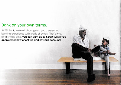
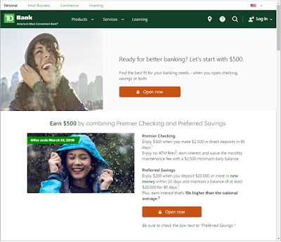
The folded self-mailer includes an offer of up to $500 if the customer opens a checking account and a savings account. The amount of free money is as low as $150 if the customer opens only one type of checking account, but that’s not chump change. The call to action is to open the banking accounts at a local banking branch, TD Store, or by visiting a special landing page. The landing page reinforces the offer with the same imagery as the self-mailer. That’s nice creative coordination.

TD Bank New Customer Offer

TD Bank New Customer Offer
Inside panels
However, the mailer buries the offer expiration date in the disclosure. The first line reads, “Offer valid from January 15, 2019, through March 13, 2019...” It is found in small, light gray type (e.g., not designed to be read). The only sense of urgency conveyed is in the call to action to “Get started today.”


TD Bank New Customer Offer
Only mention of offer expiration date
(I added the red circle)
The landing page includes mention of “Offer expires March 13, 2019” above the fold and in the pictures, making them hard to miss. That’s smart. However, the person who receives the mail needs to visit the website to be able to clearly see the offer expiration date.

TD Bank New Customer Offer
Offer landing page: td.com/Earn500

Lesson:
If you want customers to respond to your offer, include a clear, prominent respond-by date.

7/06/2020

PenFed Credit Union: Not Military Precision

I recently received this solicitation from PenFed Credit Union, whose formal name (according to Wikipedia) is Pentagon Federal Credit Union -- a name that aligns with the company’s pentagon-shaped logo

The solicitation letter is pretty typical for mid-tier credit card providers: window envelope with teaser; letter with Johnson Box; clear Call to Action; Schumer Box; buckslip insert reinforcing benefits and the call to action; and required credit prescreen opt-out notice.


PenFed Federal Credit Union


The first line of the disclosure on the front of the letter reads, “To receive any advertised product, you must become a member of the PenFed Credit Union.” I originally thought this might be a Fail for Targeting since I have never worked in the military services or at the Pentagon and thus, I thought, would not be eligible for membership. The letter itself does not mention membership criteria, and I also could not find a mention on the main pages of their website or their sitemap. I did, however, find some information about membership eligibility from third-party websites such as on WalletHub; from there, I returned to a page that listed Affinity Partners

On affinity partner pages such as this one related to the American Red Cross, there is some copy that reads:

"Congratulations! As an employee, retiree, or volunteer of the American Red Cross you are eligible for PenFed membership! How does PenFed define volunteer? A volunteer is anyone who provides time, talent, or treasure. Time is the hours volunteering for the organization, talent is the unique skills a volunteer brings to the organization, and treasure is both financial and blood donations."

Aha! I am eligible for PenFed Credit Union membership because I supported the American Red Cross. Perhaps the Red Cross shared my contact information with PenFed in hopes that I would become a member and the Red Cross would receive some benefit for the referral. If I am correct -- and, perhaps even if I'm not -- the letter merits a Fail for Creative because the letter lacks an explanation of membership eligibility. 

The letter should explain membership eligibility and how broadly they define it. Even a couple lines along the lines of "We support people who serve the military but also offer membership benefits to tens of thousands of other people who support the military or one of our affinity partners." Or, if I received this offer because of my history of American Red Cross support, why not call that out? Touting affinity relationships helped make MBNA America successful -- perhaps that approach could work for the credit union.

At the very least, PenFed should add a page on its website explaining membership criteria -- a page that is indexed by Google, easy to find and easy to understand. This easy-to-find page on Affinity Federal Credit Union's website is a good template.

Also, is this offer a Fail for Timing? According to CNBC and other news sources, many banks are cutting back on balance transfer offers during these extraordinary times. Perhaps the credit union has a contrary view of where the economy is headed. Or, maybe it has reviewed its current membership pool and credit prescreen criteria and has taken a different view of credit default risk. Or, maybe the credit union had planned this campaign long in advance, and just decided to move forward.

Lessons:
  1. If soliciting members for your credit union's credit card, include language that suggests the person is not only eligible for the credit card, but also eligible to join the credit union.
  2. Membership eligibility for a credit union should be easy to find.
  3. Consider whether a pandemic is a good time to offer 0% balance transfers.

6/09/2013

Not So Free Parking at Newark Airport


Solicitation email

This email offering a free day of parking is a Fail for Creative

The email subject line reads “Get 1 Day Free at EWR & JFK”. The content of the email also touts enjoying “1 day of free parking at Newark Liberty & JFK airports!” It is not until the reader prints the coupon that he or she discovers that the free day has strings attached. The customer must park at the airport for 3 or 5 days to obtain the benefit of the free day.

Coupons with conditions
Ideally, the headline of the email should include the contingency of the offer, i.e., “Get 1 Day Free at EWR & JFK when you park 5 days.” If not, then the body of the email should include an adequate disclosure or at least reference the contingency of the offer, i.e., “See coupon for details and conditions,” “Minimum parking stay required,” or a similar message. But, even in the fine print, this email does not include a mention of the minimum parking requirement.

When a business sends offers where the conditions are not clearly communicated, it not only degrades customer trust and brand equity, it is often a violation of Federal Trade Commission rules.

Lesson: When presenting an offer, communicate the requirements for your customers to benefit from the offer upfront and clearly.

Fine print - no mention of minimum parking requirement


4/25/2015

TruGreen: Is the Past the Future?


I currently live in a townhome in a managed community, which would make this solicitation from TruGreen an easy Fail for List. But the creative has some interesting elements.

Front of letter
On the front of the letter, the Johnson Box appears to have a general introduction sales message. If you read only that, you know the offer and the call to action. However, that darn asterisk suggests that there may be more to the offer than advertised. Looking on the back of the letter, we find in the disclosure: “Special price of $29.95 is for the first application only, for new residential EasyPay or PrePay customers only,” and so on. OK, fair enough. But I would not necessarily be a “new” customer. I am a prior customer — albeit at a prior address where I owned a house with a Texas-sized lawn

In fact, the first subhead and footer both ask that I “Come back to TruGreen now …” Perhaps I was targeted for this solicitation because of my prior customer status, which would make this mailing a win-back effort. Setting aside the fact that this is still a Fail for List — because I cannot purchase TruGreen’s services for my townhome — the offer is confusing. If I am a prior customer (e.g., not really “new”), am I still eligible?

Back of letter
I get the sense that the win-back messages were wedged into a new customer solicitation mailing. While there are two headline-level messages suggesting I “Come Back,” the body copy and outer envelope teaser suggest that I have never been a customer and am unfamiliar with the product. Perhaps this was a multi-cell mailing and the variable copy is in the spaces with the green background.

Aside from that, there are some creatively strong elements to the mailing. TruGreen’s message of “153 of your neighbors have TruGreen lawns” lends legitimacy to the product proposition (but, again, seems irrelevant to a former customer). Core messages are conveyed multiple times in the Johnson Box, side bar, sub-heads and the back of the letter. The use of color with emphasis on green and complementary lifestyle photos results in a pleasant resonance.
Outer Envelope


Lessons:
  1. Target customers who can purchase your product or service.
  2. When messaging a customer based on knowledge you have, ensure your messaging is consistent.


10/23/2011

PayPal: Great for payments, Fail for mail

Blind envelopes sometimes offset lack of known brand to improve open rate
I recently received a letter in a blind outer envelope. The only hint of the mailer is the postage indicia from "LFS, Inc." The inside of the letter describes my opportunity to pay for some purchases over time with Bill Me Later® because I am a "Continental" customer. 

This letter has several Fails for Creative:
  • Copy is full-justified, making it difficult to read.
  • All copy is the same font size, including the 9-line disclosure. The only use of boldface is for required legal copy. This makes the letter impossible for a customer to scan.
  • The entire letter is one color, with a logo that appears to be produced on a dot matrix printer.
  • The call to action is difficult to comprehend. Is it to request an account as mentioned in the first paragraph, place an order with a merchant as mentioned in the third paragraph, or go to their website?
  • The word "on-line" is hyphenated. While this is grammatically acceptable, it isn’t a stylistically common usage in consumer communications, potentially distracting readers.
  • The offer is good through "December 05, 202011." A date before the 10th of a month should not have a zero in it, and "202011" is not a real year. Proofread your materials!
  • Every mention of Bill Me Later® includes a registered trademark in superscript. Legally, the registered trademark is required only in a company's first mention in body copy. Also, superscripted text interrupts eye flow and should generally be avoided.
  • Some of the copy is pedestrian. For example, in the third paragraph the customer is asked to place an order for "an amount not exceeding your pre-approved amount." Huh?
  • The letter has a signatory but no signature. This further suggests that it is an impersonal form letter and the company is not caring of the customer.
Hard to scan + Hard to read + Hard to understand = Hard to believe
On the whole, a letter like this will fail to inspire consumer confidence or interest in Bill Me Later. It is a challenge to believe that something is "convenient and safe!" when the sales letter is poorly written and has errors.  Even letters from the federal government look better than this.

PayPal could improve a one-page solicitation letter in many ways, including:
  • Adding color to the package.
  • Positively branding the envelope as from PayPal, a trusted brand, with the PayPal logo.
  • Using balanced and varied typeface sizes.
  • Adding a Johnson Box.
  • Including subheads before paragraphs.
  • Italicizing relevant URLs.
  • Not going into detail about why I was preselected, or at least being correct about the company name.
  • Using full dollar amounts and avoid decimals, e.g. "$5,000" rather than "$5,000.00".
  • Including a signature with the signatory.
  • Proofreading lettershop samples and verifying data field formats.

Lesson: There is so much wrong with this solo letter package that the lesson here is simple. Don't waste a valuable brand to send poor mail like PayPal did.