Showing posts with label Landing Page. Show all posts

3/06/2022

BCHP: A hard-to-find doctor for my non-existent child

When someone asks me if I have children, I sometimes joke, "None to my knowledge." In that context, when I receive a postcard asking me, "Looking for a pediatrician or pediatric specialist?" I have to wonder if someone knows something I don't.

Maybe I do have a child. Maybe my wife has a bun in the oven. Or maybe the reason I received this postcard is less dramatic  that the postcard from Boston Children's Health Physicians (BCHP) merits a Fail for Targeting.

Let's set aside for the moment the fact that I do not have any offspring and break down the postcard's content.

Boston Children's Heath Physicians
Mommy is happy with her healthy baby.

The front of the postcard simply suggests that I choose Bost Children's Health Physicians. It doesn't suggest why I choose one of their doctors. What makes their physicians desirable? To put it in marketing terms, what is BCHP's unique selling proposition?
BCHP Boston Children's Health Physicians
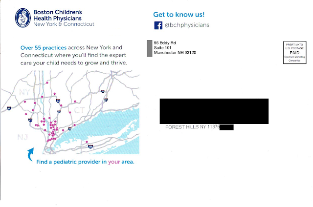
Where is Forest Hills, Queens?
Not in the area shown on the postcard.

The address side of the postcard includes a minor sales message that supports the Call to Action – to “find the expert care your child needs to grow and thrive.” And the postcard displays a map that appears to show the locations of doctors. There is an arrow pointing to the map, reading, “Find a pediatric provider in your area” with emphasis on “your.” Quick takeaway: most of New York City doesn’t even appear on the map.

Maybe there is a provider near me, but how would I know? Rather than communicating how to find the provider – and placing it next to the Call to Action to do so – there is a bunch of white space below the map. The response method is on the other side of the postcard…well, sort of.

Buried on the bottom right corner of the picture of mom and her smiling baby is a URL leading to the Boston Children’s Health Physicians home page. Somewhere on that home page is information that supports the postcard’s messaging, but it isn’t easy to find. The QR code doesn’t lead to the same page as the URL; it leads directly to the practice locator page. And the placement of the QR code (within an image on the opposite side) is a Fail for Creative.
BCHP Boston Children's Health Physicians
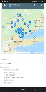
BCHP locations not quite near Queens
Let’s get back to finding a provider in my area. I tried the QR code on my smartphone. It indicated that the nearest practice was in Bardonia, NY.

As the crow flies, the distance from Forest Hills, Queens, NY to Bardonia is about 27 miles. As the parent drives in traffic, however, it is two toll bridges and typically an hour drive or longer with a sick or tired child in the back seat. (That assumes the parent has a car. After all, this is New York City.) This long distance to a physician confirms that the postcard was poorly targeted geographically – another Fail for Targeting.

Returning to the caption below the map, what is a “pediatric provider?” Why use that kind of industry jargon when the front of the postcard uses “pediatrician” and “pediatric specialist” while the address side of the postcard cites having 55 “practices”? Why throw yet another term out there? I realize I’m not a parent but, if I were, wouldn’t I want to find a “doctor” for my child?

IMHO, this postcard does not really support Boston Children’s Health Physicians. It is poorly designed, written, and targeted.
 
Finally, unless there is a back-end method in place for tracking response to the individuals being mailed, this isn’t direct marketing – it’s mailed advertising.


Lessons:

  1. Vet your data sources to target matching demographics.
  2. Just being available is not enough. Even a medical practice needs a differentiator.
  3. The means of following through on a Call to Action should be located close to the Call to Action, and easy to find.
  4. Vet your physical targeting to people who can easily get to your physical business or medical practice.
  5. If your Call to Action includes a web site, don’t just list a home page. Use a direct URL that aligns with the Call to Action.
  6. Apply jargon consistently using terms your customers understand.
  7. Even a postcard for a medical practice should include some method of tracking results.


Edit 2/11/23: Removed reference to company that sent the mail per request of a person working at that company. 

11/30/2021

PayPal: Venmo $10 Giveaway Email Lacks Explanation or Focused Targeting

This recent email from PayPal trying to cross-sell Venmo merits Fails for Creative and Targeting.

PayPal Venmo $10 Offer
Enrollment offer email, sent to long-term
Venmo customer

The email offers me a straight cash bribe (or, as we say in marketing, an incentive) to sign up for Venmo. The Call to Action is to click on the “Claim Your $10” link that will bring me to the below landing page.

Venmo $10 Offer Landing Page
Landing page
lacks explanation of Venmo product features or customer benefits

The landing page reinforces the incentive and discloses information about fees -- and allows me to sign up for Venmo and verify my phone number.

But what is Venmo? Neither the email nor landing page include a product explanation. Simply put: If someone hasn’t used Venmo -- which is, after all, the kind of person the email is targeting -- they would have no idea what it is or why they should provide their mobile number to get $10. Both the email and landing page should include benefit statements or at least some brief sales messages.

Now, in fact, I know all about Venmo. I’ve been using it for a long time, long enough for Venmo’s parent PayPal to know that I am an active customer. That is why I give this a Fail for Targeting. There is no value in sending a new customer acquisition offer to a long-term active customer like myself. Communications like this can make customers question the strength of a brand.

Speaking of brand, why doesn’t PayPal put its name behind Venmo -- at least on this marketing email? For customers who haven’t heard of or used Venmo (like the ones targeted by the offer), including phrasing such as “backed by PayPal” or “a PayPal service” would at least lend some credibility to the product.

This isn’t the first time PayPal has offered me an incentive for something without explanation. Last year, PayPal sent me an offer for Honey that lacked a product value proposition. Nor is this the first time that PayPal has demeaned its brand with shoddy marketing communications. These communications can implicitly send a message to customers that PayPal doesn’t have its act together, which could lead to decreased trust and decreased use. Is this a company to trust with cryptocurrency purchases?

Sometimes marketing managers are so obsessed with their products, they forget the basics. That’s why they need to take a step back, review lessons like the below, and avoid sending Mail That Fails.

Lessons:

  1. Explain what it is you are selling and why it is beneficial.
  2. Extend your new customer offer only to potential new customers.
  3. If selling an affiliate service, consider explaining the relationship with the affiliate.

9/24/2019

Simplisafe: The Story Is About Apartments. The Mail Is Not.

Many companies have a story connected to their foundation — often explaining what inspired the CEO to create the company. And, no, the inspiration is not, "To make a boatload of money." At SimpliSafe, the story begins with a robbery:
After his friends were robbed, Chad Laurans discovered a serious problem in the home security industry. No one was protecting renters. Alarm systems needed a ton of hardwiring and came with pricey long-term contracts that couldn’t be canceled. So Chad built something new.
This story about Chad Laurans's inspiration is quoted from SimpliSafe's page focused on apartments, located here. The same page includes a sales message referencing apartment protection:
Now SimpliSafe is the fastest growing home security company in the nation. SimpliSafe won’t lock you in a long-term contract and 24/7 professional monitoring is only $14.99 a month. Protect your apartment—the smart way.
So it would appear that Mr. Laurans understands the needs of people who live in apartments for adequate security.  That brings us to a postcard mailed to apartment homes and what I believe is a Fail for Targeting and Creative.


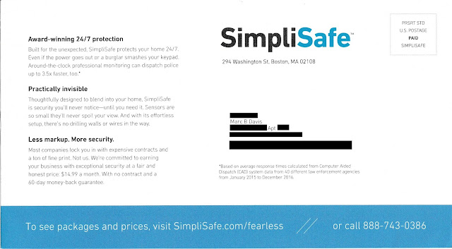
SimpliSafe Solicitation - Sales Side
Lead Generation Postcard

I live in a co-op apartment building, which typically consists of units that resemble apartments. Although they are cooperatively owned (rather than rented out) by their residents, these are very similar to rental apartment units in that they are underserved by the legacy home security companies.

SimpliSafe Solicitation - Address Side
Lead Generation Postcard - Address Side


On their website, if one clicks on "Shop Now" either from the home page or the /fearless landing page mentioned on the postcard, the lead product is the most expensive one. Even the "Shop Now" link found on the apartment-focused page leads to several product bundles starting with The Haven for $489 that includes 14 pieces of security equipment including a freeze sensor.

Presuming this postcard is part of a national campaign, a version should have been created specifically for people living in apartments.* The apartment-versioned postcard could support Mr. Laurans’s story by mentioning the need for even small apartments to have physical protection. In addition to communicating a low monthly price, the postcard could focus its limited space to communicating safety, peace of mind, renters insurance discounts, and effortless set-up. The Call to Action would be to a visit a landing page that reinforces service benefits while leading with a product package best suited for apartments. This could be The FoundationThe Essentials, or a similar lower-priced package. After all, many renters don't need water or freeze sensors.

Apartment-centric page - mobile view

SimpliSafe may also want to consider the entire prospect user experience that results from using the postcard as a lead generation device. Above, for example is the Apartment-centric page as viewed on a Pixel 3a XL. Much of the type is too small to read on a mobile device. Other pages in the domain require a reader to scroll left and right — cumbersome on a laptop and an outright hassle on a mobile phone. Mobile use as a percentage of internet traffic continues to increase, even for people in their homes, and especially for young renters. SimpliSafe should consider creating mobile-friendly versions of their site or fully embrace responsive design.

If SimpliSafe's communications are optimized for target market relevancy, this company's story could have a happy ending. To paraphrase a SimpliSafe tagline, that would be "Direct Marketing. Done Right."

Retargeting. Done right.
SimpliSafe Retargeting Ad - laptop view 


Lessons:
  1. When your product has multiple target markets, segment your list selection and messaging to appeal to those target markets.
  2. Maintain messaging consistency and product recommendations relevant to your target market segment all the way through an online sale.
  3. Consider how your content appears on mobile devices.

*It could be that SimpliSafe is segmenting rental-style apartments in their list selection, and I received a piece designed for single-family homes because I live in an owner-occupied unit. Nonetheless, the presence of an apartment number in my address should have been a flag for list scrubbing, segmentation, or at least understanding the nature of co-op apartments.