Can you tell from reading this email what the offer is for? Neither can I. That's why this email from JetBlue merits a Fail for Content.


Lesson: Touting an incentive is inadequate if you don't explain your product or service.
Can you tell from reading this email what the offer is for? Neither can I. That's why this email from JetBlue merits a Fail for Content.
Lesson: Touting an incentive is inadequate if you don't explain your product or service.
This self-mailer I received in early August from CookUnity reminds me of Season 12, Episode 17 of The Simpsons. Homer finds an old box of animal crackers that includes a “golden animal” prize: a trip to Africa. He tries to claim the prize -- even though the contest had been over for more than 30 years. Hilarity ensues.
Back in 2001, when I first watched the episode, I wondered: If the company had simply added a promotion expiration date to the box of animal crackers, would that have prevented all that hilarity? Can anything stop Homer Simpson?
The same question came to me this month when I received the CookUnity
self-mailer. Here, CookUnity is offering me 50% off my first week + 20% off the
next three weeks. However, nowhere in the mailer is a mention of a respond-by
date. That’s a classic Fail
for Content and a potentially Simpsons-esque Fail for Offer.
 |
| Self-mailer Address panel and front cover touting promotional offer. Turn up the 50HEAT! |
Why a Fail for Content? Because every direct marketing
communication should have a respond-by date. Without one, the customer has no
immediate motivation to act, and they might put it aside and forget about it
completely. If you don’t know your offer end date, consider messaging using a
soft approach: “Please reply by xx/xx/xx” or “Please reply in the next 30 days
to claim your savings.”
 |
| Self-mailer interior |
Why a Fail for Offer? Because, if you don’t communicate an
offer end date, someone might try to claim it later. If you’re in a situation
where don’t have a firm “offer end” date, at least consider a disclosure
reading, “Offer subject to change without notice.” Otherwise, Homer Simpson
might come knocking at your door when you least expect it. Doh!
Lesson: Your call to action should include a reason to take action now with an offer expiration date.
This small postcard from rest.com merits a Fail for Content and Offer.
 |
| Can you find the call to action in 3 seconds? |
It's said that the eyes convey emotion, tug at hearts and show joy. So why does the front of this small postcard have a picture of a man with no eyes and the top of his head cut off? I guess Rest decided they couldn't fit the most important part of the human face on their postcard.
The call to action (CTA) is in knock-out white text over a light-colored comforter, making it hard to see. It is in the bottom left corner, which is that the last corner a reader scans. The "HSA/FSA Eligible" message jumps, but the website name does not.
 |
| Small postcard with unreadable copy |
On the address side, we see the eyeless guy with an eyeless woman. (At least the woman is conveying some emotion with her smile.) Some sales messages are rendered in a font size legally too small for financial service disclosures, yet Rest mistakenly thinks it is large enough for a consumer to read with interest.
Below the marketing messages are some logos. The middle one is a Good Housekeeping symbol. I tried reading the others using my phone at 4x view. I think the one on the left is about health, but I don't know. Do you think a consumer would know or care?
The CTA is lost at the bottom in small type. The retail partners are listed in small knock-out white type over a mostly dark background. Five points to anyone who can name the retailer on upper right, because I can't.
The USPS allows for a postcard to as large as 6" x 9" to qualify for the standard postcard rate. Rest chose to make it only 4" x 6". Why? The only reason I can think of is to save a few bucks on paper for an otherwise expensive direct mail campaign. This approach is penny wise and pound foolish. Most of the visual problems could be solved with adequate space for content. Plus, a postcard this small gets lost in physical clutter.
Speaking of clutter: That's part of the problem with the postcard. There are too many messages. Rest is stuffing mention of 5,000 5-star reviews and a Good Housekeeping seal and two other logos I can't identify and something about being HSA/FSA eligible and retailers other than their website and one random testimonial. The core sales proposition is lost.
Going back to that CTA: It's simply to visit the website. There is mention of a potential 35% discount, but it is too hard to find, too hard to read and too far from the CTA. If I were to work on this postcard, I would advise Rest to include some kind of offer or value proposition next to a prominent CTA. "Enjoy up to 35% off through [date] at rest[dot]com/xxxx." The xxxx could be a URL developed specifically for this postcard, so you can at least gauge resulting traffic. But, of course, you need space to utilize this best practice.
Lessons:
This postcard from a duo of real estate brokers is a creative idea but it misses the mark in execution. Is it Mail That Fails, or just a bit too heavy on the cheese?

The front of the postcard touts "Free Pizza!*" There are over 1,800 pizzerias in New York City, because we love our pizza. I mean, if that picture isn't causing you to have a Pavlovian response, then you're not a New Yorker.

So who doesn't want free pizza, right? Yup, the postcard can be redeemed for a free Margherita pizza at Salsa Napoletana & Street Food.
That apparently no-strings-attached free pizza is a way of introducing the Volpe | Kelly Real Estate Team from Brooklyn to Queens. See, the real estate team got its start in Brooklyn and is now covering Forest Hills. Salsa Napoletana got started in Brooklyn and recently opened a shop in the area, so why not team up, right?
(Side note: Salsa Napoletana isn't really in Forest Hills. Their location is in nearby Rego Park. But, hey, it is in Queens, so that's close enough for the metaphor to work, I guess.)
The copy on the postcard makes the Brooklyn / Forest Hills connection:
Headline:
Salsa Pizzeria came from Brooklyn. So Did I. Your Home's Buyer May Too!
Copy:
In the last decade, sales of homes like yours have increased by nearly $400,000 [sic]. It's no surprise buyers from Brooklyn are craving to live in Forest Hills. As a longtime Brooklyn real estate expert and resident of Forest Hills, I'm excited to team up with Salsa Pizzeria - a beloved Brooklyn pie shop now open on Woodhaven Blvd.
Whether you're hungry for a new home or a classic slice, we've got you covered. Call today to discuss your options.
For those of you who don't know New York City, we have five boroughs, and there are reasons people choose to live in the borough of Queens. Generally speaking, Brooklyn is artsy, urban, hipster and expensive, while Queens is diverse, multicultural, family-friendly and (slightly) more affordable. Folks in Forest Hills don't want the Brooklyn lifestyle and they may not want to relate to people who tout that Brooklyn lifestyle. So, I'm not sure I'd want to tout the Brooklyn connection too much as a RTB (reason to believe) Mr. Volpe is the right broker for Forest Hills. On the other hand, Brooklyn and pizza does make for an interesting message hook.
The postcard's messaging and call to action could be strengthened. The broker could communicate not just location, but success. Potential rewrite:
Headline:
Salsa Pizzeria is successful in Brooklyn. So am I. See what we can do for you in Forest Hills.
Copy:
When Salsa Pizzeria opened in Brooklyn, it was the talk of the neighborhood. Their Neapolitan pizza was created with passion and flavor that brings people back for more. Now, their pizza is available near your home.
When I got my professional start in Brooklyn, I brought that same passion to real estate, helping connect sellers and buyers with homes they'll live in and love.
I live in Forest Hills, so whether you're hungry for a new home or a classic slice, I've got you covered. Call me today at xxx-xxx-xxxx to discuss how I can help you.
What's behind the edits:
Lessons:
The first direct mail campaign I managed was an offer for The Practical Blue Hen, an informal guidebook I wrote for new students at the University of Delaware. At the time, I was a student there and partnered with a student organization to obtain a list incoming freshmen. I composed a solicitation letter, had a local printer print it, and offered pizza to anyone in the dorm who would help me stuff them in envelopes printed with the University of Delaware and Resident Student Association logos. I figured that every incoming freshman and their parent would open mail when their college is in the return address, and many of them would buy the guidebook.
I was right -- the mailing had a 40% response rate!
 |
| WorryFree Example |
Someone at American Water Resources (AWR) also learned that lesson. They partnered with the New York City water board to sell water and sewer line protection services. That partnership allows them to use the NYC Department of Environmental Protection (NYC DEP) logo -- familiar familiar to New Yorkers. NYC DEP collects trash and recyclables, manages some of the local utilities, and bills homes for water use. Someone who gets a letter from the NYC DEP is going to at least pay attention to it.
Sometimes their mailers include logos from both AWR and NYC DEP, and sometimes only NYC DEP.
 |
 |
Recently, I recently received a solicitation from HomeServe that tries to copy the AWR approach but merits Fails for Targeting and Content. The return address leverages a logo from PSEG, a utility that most New Yorkers would not know. PSEG serves New Jersey, not New York. In some parts of Long Island and a small part of Queens, they operate under the name of PSEG Long Island. But PSEG by itself -- nah, in mainland Queens, we haven't heard of them. The cobranding effort is wasted.
In contrast, AWR mailers effectively leverage their partnership by giving a a bit of an official feeling to the envelopes. They include a call to action with a respond-by date, giving some urgency. They also include mention of an incentive right on the envelope. Smart -- who doesn't want a $50 credit? But WorryFree doesn't do that. Their lead-in is, "A message from PSEG," which seems pretty soft. No color, no message, no urgency. I'd love to run an A/B test comparing AWR's envelope style to WorryFree's, but if I couldn't, I'd go with AWR's. It motivates action.
Lessons:
My mother meant well. When I was a college freshman, she meant to send me a care package. But life was so busy for Mom, working full time while taking care of two younger children. No worries for me, though -- if I wanted snacks, my dorm was just a short walk from 7-11.
When I was a sophomore, then a junior, still no care
packages. Somehow, I got by on healthy cafeteria food.
Then, senior year -- the day before final exams -- a
small box showed up at my apartment door. It was filled with assorted snacks
and a note from my mother. I called her up to thank her and asked why she’d
sent it during my last week of my last year of school. She replied, “I didn’t
want you to say I never sent you a care package.” Aw, Mom, so sweet -- but a
bit late.
Did you know that April was Financial Literacy Month? Even
though it’s been recognized in the United States for over 20 years, apparently
Venmo remembered it just in the nick of time: It was the
theme of an email they sent me 40 minutes before the end of the month.


I suppose they didn't want me to think they'd forgotten to share some financial money tips during Financial Literacy Month. Or maybe the content managers had planned to send this content earlier in the month but were too busy? Fail for Timing.
Lesson:
Be relevant early, not late.
Four years ago, I shared a recommendation that Merrell include a clearly communicated offer expiration date on their postcards.
In October, I received this postcard.


 |
| Disclosure with Expiration Date (Enlarged for readability) |
So, what happened? I thought about buying my wife a new pair of hiking shoes for Christmas. I set aside the postcard, and came back to it after Thanksgiving. I tried to make a purchase using the promo code on the postcard; however, alas, the offer had expired. This is Merrell's Fail for Content.
An expiration date motivates action. Action means response. Response means sales. The lack of an expiration means fewer sales for Merrell.
So why not put some urgency around the offer? Merrell could simply add, "Use your coupon code by November 16, 2024, to enjoy your discount" in a readable font size -- like you know, 12 or 14 point. Without increasing production costs, the message could appear in the white space below the picture of those cool Wrapt hybrid shoes or on the address panel above the name.
Lesson -- same as four years ago:
Your call to action should include a clearly communicated, definitive offer expiration date.
* Many people mistakenly refer to small print associated with marketing communications as a disclaimer, when in fact it is a disclosure. According to dictionary.com, a ‘disclaimer’ is “the act of disclaiming; the renouncing, repudiating, or denying of a claim; disavowal” while a ‘disclosure’ is “the act or an instance of disclosing; exposure; revelation.” ‘Disclose’ is defined as “to make known; reveal or uncover” From a Marketing standpoint, a disclaimer is an admission that the headline is false – otherwise why renounce it? However, a disclosure provides secondary but relevant facts of an offer. So the only reason an offer or marketing communication would require a disclaimer is if it was misleading from the onset.
When I started this blog 15 years ago, my intent was to share direct marketing lessons using real-world communications as examples. While I have been able to focus on my professional passion by writing these posts, I also hope you enjoyed reading and learning from them.
My goal of this blog hasn't changed over a decade and a half, but direct marketing jargon has -- so I'm updating the categories I use to classify Mail That Fails.

The terms may have changed, but these basic principles applied 15 years ago -- and they're still important for both physical mail and email.
Email deployment tools are continuing to be more sophisticated and more complex. Marketers need to start with the basics such as target audience and desired outcome to drive their messaging approach. We need to stay relevant by executing cleanly and on a timely basis.
Sometimes there are circumstances beyond a marketer's control, so not every campaign can be successful. But by keeping core marketing principles in mind, we can avoid producing Mail That Fails.
I recently received an email from Discover Bank (probably) about adding a layer of security to my account -- and about some other basic ways to keep my account secure.


 |
| Email from Discover Bank (probably) |
The email itself is informative enough. The subject line reads, "Marc, do you know how to keep your account safe?" The subhead reads, "Learn how to spot bad actors before they spot you." And the body of the email includes all the typically scary Be-Careful-And-Don't-Trust-Anyone-Else language.
But...
The footer includes a reminder to "Add DiscoverBank@bank.em.discover.com to your address book to ensure delivery of these emails."
The email was not sent from that email address or even from the discover.com domain. The sender is dfscorpor-Unbranded2 <dfscorpor@dfscorpor-2.rsys5.com>. Now, maybe that is a legitimate email address managed by Discover, but it seems like one of those scammer email addresses your father warned you about -- and that undermines their intended message of trust.
So, maybe if you're trying to create trust with your customers, you don't start by making them paranoid.
Lesson:
Consider what you are using as your send email address, especially when sending emails about account security.
I recently received a postcard from GE that merits several Fails for Content.


On the address side is a picture of two laundry machines -- presumably run by an app. There is very little copy on this side, only, "Wash + Dry with the UltraFast Combo," with a Call to Action to visit a specific appliance store.
As executed, this postcard has multiple Fails. Let's break down why it was a waste of money.
The front of the postcard shows someone in a combination utility room and expensive closet, with more athletic shoes than you can count. The room looks pretty expensive, like it is in the house of a one-percenter. It certainly doesn't look like this is a typical person using a typical machine. So a typical consumer might look at the person and room and think they couldn't afford whatever the postcard is advertising.
The address side shows not one, but two machines, visually suggesting that this is a washer-and-dryer combination set. It isn't, through, the picture is actually of two of the same one-piece washer/dryer appliances -- one has a stand. A typical consumer would have to look and think hard to recognize this, but they wouldn't bother. They'd likely look at the postcard for about three seconds, then toss it.
The communicated benefits appear to be the ability to wash and dry by using an app. Maybe that's enough to motivate a consumer to visit a website in the comfort of their own home, but it is not compelling enough to get a consumer to schlep to a store. After all, this is a low-interest category for a major purchase. Why not include an offer, such as $100 rebate for this $2,899 machine if the consumer brings in the postcard within 30 days? Even a modest incentive with a reasonable offer expiration date supports some action.
Finally, this postcard gets the store location wrong. The Hoing's Appliance location near me is in Forest Hills, not the Bronx physical address shown on the postcard. In fact, the web address on the postcard is for Forest Hills location, while the Bronx location has a different URL.
Last Wednesday, I received this email from 7-Eleven touting “Wing Wednesday” with an
offer for cheap wings. Is this Mail That Fails?
With a subject line of “It is Wings Day, my Dudes,” it seems
like there is a special price on wings that particular day. That impression is
bolstered by text saying, “Celebrate with some wings for less.”
 |
 |
| Wing Wednesday email |
Plus, the picture prominently displays, “WING WEDNESDAY” in
the background and body copy touting, “You made it mid-week!” These both suggest
that the 5/$5 Bone-in Wings is available only on, well, Wednesday.
But the email was sent to me at 10:25 pm on Wednesday, and
no matter how much I might love wings, that seems a bit late in the day to be prompted
for a mid-week wing order. So is this a Fail for
Timing?
Maybe not. Down in the Disclosures, we learn that the wings
offer is valid “thru” 1/9/24. So, it appears that I could enjoy these 5/$5
wings on a Thursday or on any other day over the next few months. Perhaps this
is a bit of a Fail for
Creative because it might mislead readers into thinking the offer is valid
only on Wednesday -- putting a damper on responsiveness.
Finally, is 7-Eleven using “thru” rather than
“through” to be informal and relatable? I don’t know.
Lessons:
I recently received a B2B email announcing “exciting news,” and it piqued my interest in all the wrong ways -- meriting a Fail for Content and perhaps even for Targeting.
First of
all, the email is from someone at Numerix I
don’t know and who I’ve never met, contacted, or connected with, and at a
company I’ve never heard of. Yet this person sends me an email that opens with “Exciting
News.”
Then, the email
uses so much financial jargon that even I can’t figure out what it means -- and
I work in the financial industry. What does Numerix do? What can it do for me
or my employer? I don’t know, but I guess the acquisition helps them address a
bunch of stuff I don’t care about.
I guess
this is exciting for Numerix but, without any value proposition, this is simply
a press release with several typos.
Lessons:
I recently received this email from Abbott, the makers of NAVICA. It merits a Fail for Content.

The email explains that it has been almost a year since I
logged into NAVICA, and my data will be deleted after a year of inactivity.
What it doesn't explain is what NAVICA is or why I may have had an account. I mean, if I haven't logged in for a year, would I remember what it is?
I'm glad that my data won't be lingering around Abbott's database
forever; however, it would have been useful to explain why the information will
be deleted.
Here is a potential opening paragraph rewrite:
Hello,
It
has been almost a year since you last logged in to NAVICA, the leading digital
platform for supporting COVID-19 testing.
To
ensure data privacy, we have a policy of deleting customer data after one year
of inactivity. This means that, if you do not log in to your account by
<date>, your account will be deleted.
Dunkin' recently overhauled their Dunkin' Rewards loyalty program. Some regular customers are not pleased. Coffee rewards that used to be available after spending $40 on coffee now require at least $50 in spend. The program has also become more complex, with a different points earning formula, monthly boosters and a greater emphasis on food. With greater complexity comes greater risk of error.
I would describe myself as an occasional coffee achiever. I might stop for coffee early in the morning when walking the dog, but not that often. I currently have 257 points according to my app -- not enough for one free coffee.
 |
| Screenshot showing I have 257 points |
So, imagine my surprise when I received this email.
 |
| Points amount email 34,438 points = almost 69 free coffees! |
The points value in the email is not only incorrect, it is outrageously wrong. Why would anyone hold on to 34,000 points?
In a prior role, I worked on a loyalty program mailing that included a mention of a customer's point balance. Here are some of the quality control steps I took:
Lesson:
When sending personalized information, verify the accuracy of all variable data including outliers.
Since last July, the value of PayPal stock has fallen by about 75%. While many analysts are discussing the company's "fundamentals" and suggesting at what price to purchase the stock, I'm staying away for a different reason -- because they often produce Mail That Fails.
My first post about PayPal's several Fails was in 2011 when they mailed me a shoddy credit offer. There are a few more, including a recent one about a confusing and poorly targeted Venmo offer. Now, add to my list of PayPal Fails this offer of "$1 cash back for every $20 spent at restaurants."


 |
| PayPal Cash Card Restaurant Rebate Offer Received May 9, 2022 |
Scanning the headline might make you think that going out to lunch four times -- spending $25 each time with your GooglePay app to use your PayPal balance for those lunches -- would earn you $5 cash back ($100 divided by $20 equals $5). But you'd be wrong…twice. The offer requires me to first request a PayPal Cash Card, then receive it in the mail and use it at a restaurant. All within 5 weeks of first receiving the offer – some of which is spent waiting for PayPal to process my request for the card. That's a lot of effort and a short window of opportunity for a small benefit, e.g. a Fail for Offer.
PayPal could have easily avoided this by using a rolling offer expiration date. For example, PayPal could require the customer to request the card by a specific date, but then give the customer a reasonable amount of time to use the card after activation, say, 60 days. That would be clear to explain and fair to the customer -- unless, of course, the intent is to make imply the offer is more generous then it actually is.
Which leads me to the actual offer value. I read through the disclosure text a few times, and I'm pretty sure that cash back offer is on a per-transaction basis. So, while each purchase of $25 would be worth $1 cash back and a $100 dinner might net $5 cash back, four lunches adding up to $100 would be worth only $4 cash back. If I'm right, this is a Fail for Offer and Content for being misleading. If I'm wrong, it is a Fail for Content for lack of clarity.
Another Fail for Content lies in the disclosures. It appears this disclosure was rushed and not proofread. Take this paragraph, for example:
"Eligible Purchase(s)": Eligible Purchase is defined as every $20.00 USD spent in-store or onlineusing the Card and finalized by the merchant during the Offer Period (defined below) in thefollowing category: restaurants (according to the Merchant Category Code (“MCC”) assigned byeach merchant, their processor, and the credit card networks. Only acceptable MCCs for this offerare 5812 and 5814). PayPal is not responsible for assignment of MCC codes. As a result, Reward willnot be awarded if the MCC code assigned to a particular merchant does not fall within a restaurantcategory, even if you believe that the merchant is a restaurant. Eligible Purchases do not include:(1) purchases that are marked as “pending” in your Card account as of the end of the Offer Period,(2) purchases made at eligible merchants using a third-party delivery service (3) ATM transactions,(4) gift card purchases, (5) any purchase or portion of a purchase that involves a payment methodother than the Card, or (6) in-store cash withdrawals/cash back.
Spaces are missing between words. The punctuation is inconsistent. Some numbers in parentheses have spaces before them; some do not. There’s also a missing comma after "service" in the last sentence.
There are references to "e-mail" in some paragraphs and "email" in other paragraphs. According to grammarly.com, both are correct as long as you use it consistently. PayPal is not being consistent.
These types of possibly misleading offers and unclear communications suggest to me that PayPal's leadership is spending their marketing dollars without full consideration of what they are doing and how they are doing it. As a stockholder, that would frighten me. As a customer, that also scares me a bit. If I can't expect to get a clean offer and clear communication, should I really be trusting PayPal to keep my personal information secure?
Lessons:
 |
| Mommy is happy with her healthy baby. |
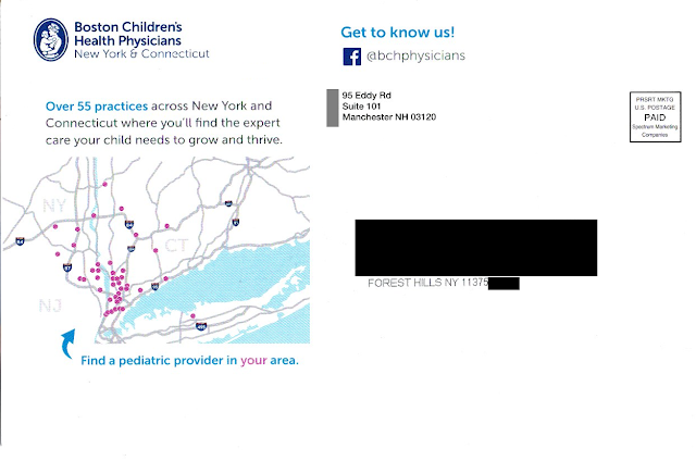 |
| Where is Forest Hills, Queens? Not in the area shown on the postcard. |
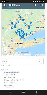 |
| BCHP locations not quite near Queens |
As the crow flies, the distance from Forest Hills, Queens, NY to Bardonia is about 27 miles. As the parent drives in traffic, however, it is two toll bridges and typically an hour drive or longer with a sick or tired child in the back seat. (That assumes the parent has a car. After all, this is New York City.) This long distance to a physician confirms that the postcard was poorly targeted geographically – another Fail for Targeting.
Returning to the caption below the map, what is a “pediatric provider?” Why use that kind of industry jargon when the front of the postcard uses “pediatrician” and “pediatric specialist” while the address side of the postcard cites having 55 “practices”? Why throw yet another term out there? I realize I’m not a parent but, if I were, wouldn’t I want to find a “doctor” for my child?
Lessons:
 |
| Email from Hard Rock Hotel & Casino Atlantic City |

