Examples of and lessons from communications that neglect basic direct marketing Best Practices.
6/10/2013
Amica, Allstate, Wal-Mart: Bad timing on car insurance mail

3/06/2022
BCHP: A hard-to-find doctor for my non-existent child
 |
| Mommy is happy with her healthy baby. |
The front of the postcard simply suggests that I choose Bost Children's Health Physicians. It doesn't suggest why I choose one of their doctors. What makes their physicians desirable? To put it in marketing terms, what is BCHP's unique selling proposition?
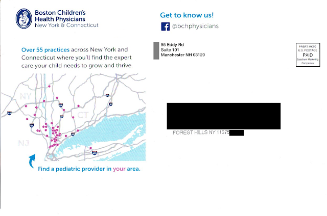 |
| Where is Forest Hills, Queens? Not in the area shown on the postcard. |
Buried on the bottom right corner of the picture of mom and her smiling baby is a URL leading to the Boston Children’s Health Physicians home page. Somewhere on that home page is information that supports the postcard’s messaging, but it isn’t easy to find. The QR code doesn’t lead to the same page as the URL; it leads directly to the practice locator page. And the placement of the QR code (within an image on the opposite side) is a Fail for Creative.
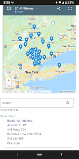 |
| BCHP locations not quite near Queens |
As the crow flies, the distance from Forest Hills, Queens, NY to Bardonia is about 27 miles. As the parent drives in traffic, however, it is two toll bridges and typically an hour drive or longer with a sick or tired child in the back seat. (That assumes the parent has a car. After all, this is New York City.) This long distance to a physician confirms that the postcard was poorly targeted geographically – another Fail for Targeting.
Returning to the caption below the map, what is a “pediatric provider?” Why use that kind of industry jargon when the front of the postcard uses “pediatrician” and “pediatric specialist” while the address side of the postcard cites having 55 “practices”? Why throw yet another term out there? I realize I’m not a parent but, if I were, wouldn’t I want to find a “doctor” for my child?
Finally, unless there is a back-end method in place for tracking response to the individuals being mailed, this isn’t direct marketing – it’s mailed advertising.
Lessons:
- Vet your data sources to target matching demographics.
- Just being available is not enough. Even a medical practice needs a differentiator.
- The means of following through on a Call to Action should be located close to the Call to Action, and easy to find.
- Vet your physical targeting to people who can easily get to your physical business or medical practice.
- If your Call to Action includes a web site, don’t just list a home page. Use a direct URL that aligns with the Call to Action.
- Apply jargon consistently using terms your customers understand.
- Even a postcard for a medical practice should include some method of tracking results.
10/29/2018
Jet.com: Cool mail, but lacking strong call to action
 |
| Jet.com's NYC Landing page |
Scrolling down, I find the opportunity to purchase kale and an iPad.
 |
| Below the fold on landing page |
 |
| Front |
 |
| Address panel |
 |
| First fold-out panel with small call to action |
2/05/2019
Vanguard: Transition time is when?
It appears that Vanguard is moving its investment platform from one system to another, and needs customers to take action to support the move. The email explains to the customer that a “3-step transition” is required, and doing so would take a “few minutes.” It includes four FAQs, but that’s all. The Call to Action is to “Transition Now” by clicking a button, which leads customers to the typical login page.
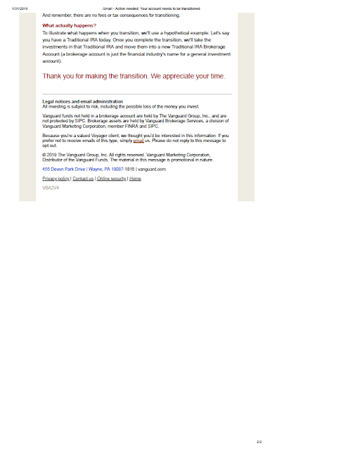 |
| Vanguard email to customers |
Furthermore, the request to the customer lacks any immediacy. The Call to Action should include a respond-by date. Internally, perhaps a decision was made not to include a date in the communication now because the IT folks have a year-long implementation plan. But even a soft request to take action by a specific date would help a customer decide to take action. Otherwise, the customer might ignore this or prioritize this task somewhere between, say, replacing the baking soda in the refrigerator and watching the last season of House of Cards.
Dear [Customer Name],
We have upgraded our platform for customers like you to make and follow your investments. This new, flexible platform will allow us to save money and make continuous service improvements, which will benefit you as we can lower our costs to serve you and improve your online experience.
Please help us move your account to the upgraded investment platform by completing 3 easy steps. It’s quick and easy—taking less than 5 minutes of your time. Just log into your account using the button below to get started.
If you could complete these 3 steps by February 28, 2019, that will help us help you. Thank you for your consideration and your time.
Lessons:
- Avoid industry jargon in customer communications.
- Any request for a customer to take action should include a date.
3/05/2015
Mytireshop.com: Online Company, Offline Fail
 |
| For me |
 |
| Not for me |
- There is not a specific Call to Action. It appears the objective of the postcard is to motivate people to visit www.mytireshop.com. However, the message about the website is that it is “your Fast, Local Tire Source.” The call to action should be specific, i.e., “Shop Tires Online at mytireshop.com”, with supporting features and benefits messaging.
- The URL is lost in the copy. It is the same weight as the rest of the copy, without a “www” preceding it, making it easy to get lost. It should have some distinction — at minimum an underline, different color, or italics. Having a “www” in front makes it clear that it is a website. Granted, the concept of having to explain that something is on the World Wide Web is a bit passé, but, perhaps, that is why there is a “www” in front of the same piece’s mention of www.generaltire.com. Which leads to …
- There are multiple possible actions from the communication. If a customer visits the General Tire website, they receive general information about the brand, but not about mytireshop.com. So why have multiple URLs on the same communication? Here’s my speculation: General Tire was willing to co-fund the postcard to promote their brand. That’s fine, but the postcard suggests that mytireshop.com sells only General Tires. It would have been better for mytireshop.com — and the potential customer — for the postcard to explain that “mytireshop.com sells General Tires and other fine brands” or have a similar headline-level message.
- Benefitmessages are missing. The features messaged here are specific to the tire, the ability to install the same or next day, and that it is a “Faster, Local Tire Source.” (How is a company with a foreign-seeming toll-free phone number local?) The benefits that could be messaged but are not are Peace of Mind, Ease of Use, Joy, and so on. For example, “Install the same or next day” could be “Relax. Visit www.mytireshop.com today and enjoy your new tires tomorrow.”
- There is no method of tracking success. Customers go through a sales funnel: Awareness, Interest, Consideration, Desire, Action. The business behind mytireshop.com could easily learn how many customers move from Awareness (receiving the postcard) to Interest (visiting their website) by using a personalized URL that tracks who visited the website — or, at the very least, a vanity landing page specific to the mailing to count site visits. Once online, both methods can be used, along with Google Analytics, to see how many people complete the sale process — and how.
- The phone number is not mentioned as toll-free. While most people know that “800”, “888”, and “877” are toll-free phone numbers, many consumers do not yet recognize that “866”, “855” and “844” are also toll-free. Some people might counter this by explaining that most people use mobile phones with unlimited voice usage or pay regardless of the phone number; however, there are still people that call from landline phones. For those who prefer to call from home rather than visit the website, this piece should help get them from Awareness to Interest by reminding them that the call is free.
 |
| Postcard front - heavy on GT |
- When mailing to homes by address, dedup your list by address.
- Have a clear call to action that stands out.
- Include only one call to action and one URL on a communication.
- Communicate benefits.
- Establish and utilize a results tracking method.
- If your phone number is toll-free, message it as such.
7/16/2021
Mr. Cooper Renovates His Mail
 |
| Mr. Cooper Invitation to Apply letter |
- Have a clear Call to Action and offer. Communicate it multiple times to encourage action.
- Proofread your communications for language and grammar.
11/09/2025
Corcoran: Moving In With Free Pizza
This postcard from a duo of real estate brokers is a creative idea but it misses the mark in execution. Is it Mail That Fails, or just a bit too heavy on the cheese?
The front of the postcard touts "Free Pizza!*" There are over 1,800 pizzerias in New York City, because we love our pizza. I mean, if that picture isn't causing you to have a Pavlovian response, then you're not a New Yorker.
So who doesn't want free pizza, right? Yup, the postcard can be redeemed for a free Margherita pizza at Salsa Napoletana & Street Food.
That apparently no-strings-attached free pizza is a way of introducing the Volpe | Kelly Real Estate Team from Brooklyn to Queens. See, the real estate team got its start in Brooklyn and is now covering Forest Hills. Salsa Napoletana got started in Brooklyn and recently opened a shop in the area, so why not team up, right?
(Side note: Salsa Napoletana isn't really in Forest Hills. Their location is in nearby Rego Park. But, hey, it is in Queens, so that's close enough for the metaphor to work, I guess.)
The copy on the postcard makes the Brooklyn / Forest Hills connection:
Headline:
Salsa Pizzeria came from Brooklyn. So Did I. Your Home's Buyer May Too!
Copy:
In the last decade, sales of homes like yours have increased by nearly $400,000 [sic]. It's no surprise buyers from Brooklyn are craving to live in Forest Hills. As a longtime Brooklyn real estate expert and resident of Forest Hills, I'm excited to team up with Salsa Pizzeria - a beloved Brooklyn pie shop now open on Woodhaven Blvd.
Whether you're hungry for a new home or a classic slice, we've got you covered. Call today to discuss your options.
For those of you who don't know New York City, we have five boroughs, and there are reasons people choose to live in the borough of Queens. Generally speaking, Brooklyn is artsy, urban, hipster and expensive, while Queens is diverse, multicultural, family-friendly and (slightly) more affordable. Folks in Forest Hills don't want the Brooklyn lifestyle and they may not want to relate to people who tout that Brooklyn lifestyle. So, I'm not sure I'd want to tout the Brooklyn connection too much as a RTB (reason to believe) Mr. Volpe is the right broker for Forest Hills. On the other hand, Brooklyn and pizza does make for an interesting message hook.
The postcard's messaging and call to action could be strengthened. The broker could communicate not just location, but success. Potential rewrite:
Headline:
Salsa Pizzeria is successful in Brooklyn. So am I. See what we can do for you in Forest Hills.
Copy:
When Salsa Pizzeria opened in Brooklyn, it was the talk of the neighborhood. Their Neapolitan pizza was created with passion and flavor that brings people back for more. Now, their pizza is available near your home.
When I got my professional start in Brooklyn, I brought that same passion to real estate, helping connect sellers and buyers with homes they'll live in and love.
I live in Forest Hills, so whether you're hungry for a new home or a classic slice, I've got you covered. Call me today at xxx-xxx-xxxx to discuss how I can help you.
What's behind the edits:
- Credibility Build. Expertise may be nice, but a broker with passion is someone people want to interact with.
- Avoiding Misguided Quantification. The original copy confused sales with value, and offered a figure that would align with actual home value increases only coincidentally.
- Including the phone number in the call to action. If someone is interested in calling you, don't make them hunt for a means to reach you.
- Personalizing the call to action. By asking someone to "call me", the experience of expressing interest is personalized, which reduces tension.
- Adding a bit more urgency on the pizza offer. "While supplies last" is good, but perhaps consider, "Limited to 100 pies" and/or "Available only through xx/xx/xx" to motivate people to get that pizza.
- Making the QR code jump out. In only black and tan, it gets lost in the current location and it looks like the outline of a pizza. Add some contrasting spot color or render the call to action in boldface.
- If not already done, ensure that that the pizzeria has brochures and other information about the real estate firm. Get a pizza, get a handout, call Mr. Volpe. Everyone wins.
- Consider who this postcard is from. It isn't fully clear if this postcard is about Eric Volpe, about the Volpe | Kelly Team, or about The Corcoran Group. While The Corcoran Group has a positive brand identity in the Big Apple, Volpe | Kelly is what is touted on the pizza side of the postcard. And, who is that woman next to Eric's name on the bottom of the address side? Is she Kelly?
Lessons:
- When engaging in local messaging, be sure you're appealing to the local audience with local flavor.
- Give customers a reason to believe in you.
- Don't let your call to action get lost.
- Be consistent in self-identification.
- It's hard to go wrong with pizza in New York City.
11/17/2025
Rest.com: Cramped Postcard Is Mostly Unreadable
This small postcard from rest.com merits a Fail for Content and Offer.
 |
| Can you find the call to action in 3 seconds? |
It's said that the eyes convey emotion, tug at hearts and show joy. So why does the front of this small postcard have a picture of a man with no eyes and the top of his head cut off? I guess Rest decided they couldn't fit the most important part of the human face on their postcard.
The call to action (CTA) is in knock-out white text over a light-colored comforter, making it hard to see. It is in the bottom left corner, which is that the last corner a reader scans. The "HSA/FSA Eligible" message jumps, but the website name does not.
 |
| Small postcard with unreadable copy |
On the address side, we see the eyeless guy with an eyeless woman. (At least the woman is conveying some emotion with her smile.) Some sales messages are rendered in a font size legally too small for financial service disclosures, yet Rest mistakenly thinks it is large enough for a consumer to read with interest.
Below the marketing messages are some logos. The middle one is a Good Housekeeping symbol. I tried reading the others using my phone at 4x view. I think the one on the left is about health, but I don't know. Do you think a consumer would know or care?
The CTA is lost at the bottom in small type. The retail partners are listed in small knock-out white type over a mostly dark background. Five points to anyone who can name the retailer on upper right, because I can't.
The USPS allows for a postcard to as large as 6" x 9" to qualify for the standard postcard rate. Rest chose to make it only 4" x 6". Why? The only reason I can think of is to save a few bucks on paper for an otherwise expensive direct mail campaign. This approach is penny wise and pound foolish. Most of the visual problems could be solved with adequate space for content. Plus, a postcard this small gets lost in physical clutter.
Speaking of clutter: That's part of the problem with the postcard. There are too many messages. Rest is stuffing mention of 5,000 5-star reviews and a Good Housekeeping seal and two other logos I can't identify and something about being HSA/FSA eligible and retailers other than their website and one random testimonial. The core sales proposition is lost.
Going back to that CTA: It's simply to visit the website. There is mention of a potential 35% discount, but it is too hard to find, too hard to read and too far from the CTA. If I were to work on this postcard, I would advise Rest to include some kind of offer or value proposition next to a prominent CTA. "Enjoy up to 35% off through [date] at rest[dot]com/xxxx." The xxxx could be a URL developed specifically for this postcard, so you can at least gauge resulting traffic. But, of course, you need space to utilize this best practice.
Lessons:
- When mailing a postcard, take advantage of the largest size available at postcard rate.
- Avoid content with inadequate background color contrast.
- All your sales copy should be large enough for a typical consumer to be able to and want to read.
- Avoid overloading your mail with too many messages.
- Your call to action should be easy to find.
- Your call to action should include a reason to take action now.
- Include a means of tracking your mail's performance.
- Depicting people without eyes is creepy.
10/15/2019
Vanguard: Beefing Up Security, Beefing Up Customer Emails
 |
| Vanguard Security Update email |
The email opens in an emphatic tone. It speaks like a communication from Vanguard; that is, the tone fits their their brand identity of taking a stand for investors and treating them fairly.
The second paragraph contains the call to action. It cites a shared responsibility. It explains what is being requested and why.
The third paragraph includes a time-specific call to action. The response window is four weeks -- a bit long in internet time, but fair considering the actions involved.
Finally, there is a polite close reinforcing the cooperative nature of the call to action.
There are a couple potential minor improvement opportunities. I would consider adding a valediction, along the lines of "Sincerely, Vanguard Customer Service" or perhaps a couple FAQs. But these are based on my intuition and outside understanding of the target market. In the best possible world, if timing allows, an A/B test could be executed to see which edits would result in improved response.
Lessons:
- When communicating with customers, your communications style should be aligned with your brand.
- Requests to your customers should be date specific.
- A/B test every communication as feasible.
10/02/2020
PayPal: Selling Honey Requires a Key Ingredient
This recent email from PayPal merits a couple Fails for Creative.
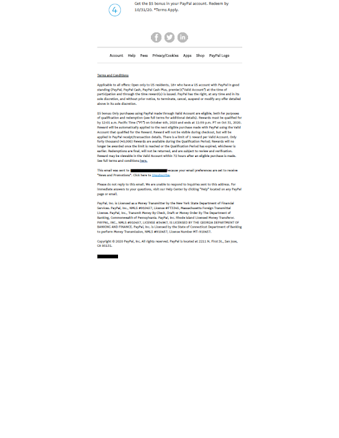
There is a clear Call to Action and an incentive for the customer to take action now. The email was sent on September 25 with an offer expiration date of October 4, so immediacy is encouraged.
But, what is Honey? Why would I add it to my browser? How do honey members save money, and compared to what? None of these questions are addressed in the email.
The other Fail is less important, but worth mentioning. According to the disclosure and the detailed Terms & Conditions found on Honey's site, only 40,000 customers are eligible for the award. Once that limit is reached -- even if before offer the expiration date -- the reward will no longer be available. This type of restriction is fairly common in direct-to-consumer marketing. I've included number-of-customer limitations in several campaigns to ensure the product is not oversold or to cap potential incentive liability. When I did, I would use this clause to my advantage by communicating it in the body of the email. PayPal could do this by including above the Call to Action a message along the lines of...
Be one of the 40,000 people to get your $5 bonus by October 4th. Bonus must be used by October 31st.*
or ...
This exclusive bonus offer is limited to the first 40,000 people to take action by October 4th. Bonus must be used by October 31st.*
- It is not enough to have a call to action and encourage immediacy in your direct-to-consumer emails. They should always include a value proposition.
- If your offer is limited to a specific number of customers, do not bury that restriction -- use it to your sales advantage.
10/20/2009
Buy This! No, get that! Maybe this and that -- if you can find them.
As a longtime customer of AT&T, it’s good to know that the company does not take my business for granted. This simple communication is respectful of that. It arrived in a plain window envelope, which is sure to get a high open rate among existing customers. After all, the recipient does not know if it is a bill, Change in Terms Notice, cross-sell, or perhaps a refund check. The body of the communication is simple and straightforward and avoids footnote overkill, saving the required fine print for disclosures. Nevertheless, the creative merits a Fail because:
• The call to action and response methods are buried in the body of the letter, making them hard to find.
• There is a description of features, but minimal focus on benefits of the bundled services.
• The close does not incite action or reinforce the call to action. Granted, this concept is designed as a soft up-sell, but the last paragraph or the P.S. could be used to remind the customer of the specific phone number or to visit the specific URL before the offer expiration date or at least “soon”.
• The P.S. does not tie to the body of the letter and has no call to action. Consumers who open mail typically read the P.S. first, before the body of the letter. But the P.S. does not mention the $67.99 telecom bundle – it mentions DIRECTV. A basic direct mail rule of thumb is that you cannot sell two things at once. Richard V Benson wrote this on page 2 of “Secrets of Direct Mail” more than 20 years ago, and he likely was not the first. But this letter tries to sell both a telecom bundle and a non-bundled TV service.
• The response channel is not aligned with the solicitation. The letter communicates a $67.99 per month package, but that is not the first thing found at the letter-specific URL. Also, there is no mention at all of DIRECTV on the landing page. (The phone number for DIRECTV service is in very small print on the back of the letter.)
Learnings: Make your call to action easy to find. Optimize use of your P.S. Do not sell more than one product or bundle in one letter. If you sell something in direct mail, ensure that your response channels are fully in sync with your solicitation to sell that product first before attempting to up-sell.
The letter also has an odd use of punctuation. For example, there are no periods at the end of the bulleted sentences, but there are periods separating the digits in the phone number 1.800.695.8242. This is the first I have seen this approach used in DM the United States -- and it is not used on any other communication from AT&T or even on the back of the letter. The en-dash is used a couple times to break a thought in a sentence, however there is no space before or after the dash. (However there is space around the dashes when listing call center availability times.)
1/23/2016
Wright Veterinary: Typo Leads to Very Early Reminders
 I received this
postcard on January 15 from the veterinarian for my dog, Buddy. The vet sends
these courtesy postcards if I have missed my dog’s immunization dates,
reminding me to keep my dog vaccinated.
 The message is
attempting to be a bit cute -- referring to the pet and suggesting the owner
bring the pet in for immunizations, but the message was a bit confusing.
However, I wouldn’t call the message a Fail for Creative. Still, there are some
typos as well as multiple instances of confusion between singular and plural
nouns, so the copy could be cleaned up a bit. Here is an attempt to streamline
the content while maintaining the same message.
We missed seeing
your pet for at least one important vaccination.
Maintaining your
pet’s immunity to diseases is a vital part of its total health care program.
So, we wanted to remind you of the vaccinations and dates due for each pet.
They are listed on this postcard.
Please be sure to
order preventative medications and make an appointment for preventative
treatments now, because further delay could be harmful to your pet. Call us at
Wright Veterinary Medical Center today at 610-865-2611, because a healthy pet
is a happy pet.
 |
| Buddy! |
- What goes out on your mailing list is based on what you put in as your list criteria, so be sure your mailing list accurately reflects your intentions.
- Keep your call to action clean and simple whenever possible.
3/11/2010
A letter from the Central Bureaucracy!
 In the animated series Futurama, there is a funny bit where a bureaucrat receives a letter from the Central Bureaucracy reading, “Attention, Hermes Conrad. You are about to receive a letter from the Central Bureaucracy." Three seconds later, a second letter arrives. The bureaucrat is shocked and exclaims, “Oh, my God! It's from the Central Bureaucracy!”
 The call to action is to complete a Census form. The reason to take action is to receive government money for programs I and my neighbors need. The reason to take action now is… well, we can’t take action now. Immediacy is lost. From a marketing standpoint, that makes this a Fail.
Presumably, the purpose of the advance letter is to improve the response rate of the upcoming Census mailing. However, someone who would not open the Census mailing envelope to come would also not open the envelope for this advance mailing. In other words, the advance letter is not worth the cost. If an advance mailing is necessary, use a postcard. It has a greater likelihood of being read by potential non-responders.
 The personal feel of the letter being signed by the director is positive, as is the closing postscript repeated in several languages prominent to the area. Given the information on the landing page, though, the call to action in the postscript should read, “Go to 2010census.gov for more information” rather than, “...for help completing the form when it arrives.” As of March 11, it is unclear on the Census landing page where to find help to complete the form. (However, it is clear where to find Dora the Explorer.) Thus, a second Fail. Perhaps the link will gain more prominence when the forms actually mail – if the Census team has made a plan to do so.


