Showing posts with label direct mail. Show all posts

10/12/2020

Merrell: Well-timed offer lacks expiration clarity

A recent conversation at home went like this:

Me: "Hey, honey, did you say you needed new hiking shoes?"

Wife: "Eventually. Mine are starting to wear. Why?"

Me: "We got an offer in the mail from Merrell for 25% off footwear."

Merrell One Year Discount Offer

Merrell One Year Discount Offer - 25% Off

Wife: "Well, I do like Merrell, but I don't plan to use hiking shoes in the next few weeks. Maybe I should get replacements now with the discount. When does the coupon expire?"

Me: "It doesn't say."

Wife: "Really?"

Me: "I'll look closer." (Puts on reading glasses.) "It says it expires '30 days from postmark.'"

Wife: "When is that?"

Me: "I don't know. It's not postmarked."

Wife: "Well, whatever, I don't need new hiking shoes right away and I'm pretty busy right now."

This conversation outlines why the postcard merits a Fail for Creative

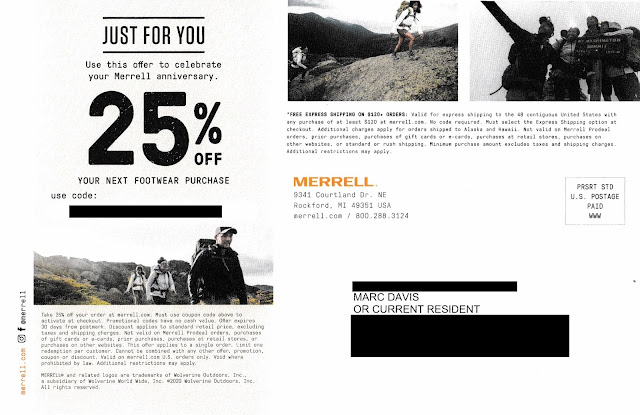
On September 13, 2019, I purchased a pair of Merrell Moab 2 hiking shoes. They are perfect for that outdoor hike around the lake, through a park or in the snow. The postcard arrived October 2, 2020, just a little over a year after I started wearing my previous purchase. So, the timing and messaging around my "Merrell anniversary" are spot on. Kudos to Merrell for Timing.

The postcard included a personalized coupon code for 25% savings; however, there is no mention in the headline regarding when the coupon code expires. I found some information in the disclosure.*

Merrell One Year Discount Offer - 25% Off
Postcard disclosure text

As I wrote in prior blog posts such as this one and this one, a Call to Action should include a clearly communicated offer expiration date. This is important: The right response window encourages immediacy of customer action; one that's faulty or unclearly defined, however, only encourages inertia.

With the Merrell postcard, the coupon code's expiration date is not only buried in the disclosure, it also references expiring "30 days from postmark"; however, there is no postmark. Postcards mailed Standard Rate are not postmarked by the USPS. So, how do customers know when the coupon code expires? They don't.

There are several ways to care for expiration date communication without jeopardizing the integrity of the message, diluting Merrell's branding or adding production costs. Here is one: Include an offer expiration date in the address section of the postcard. 

Merrell postcard mock-up, modified to add expiration date
Mock-up. I added the expiration date in the address panel

In the above mock-up, the coupon code expiration date is clearly communicated. The date is specific and reasonably prominent. The messaging complements the headline and supports immediate action. It can be inkjet- or laser-personalized using the same variable data method as the producing the coupon code and customer name and address. Depending on the postcard's production method, it could appear in spot color without incremental print expenses.

If Merrell adapts this approach, the only incremental edit would be to rephrase the disclosure to reference the expiration date in the address panel.

Lessons:

  1. Your call to action should include a clearly communicated, definitive offer expiration date.
  2. Postcards mailed Standard Rate are not postmarked.


* Many people mistakenly refer to small print associated with marketing communications as a disclaimer, when in fact it is a disclosure. According to dictionary.com, a ‘disclaimer’ is “the act of disclaiming; the renouncing, repudiating, or denying of a claim; disavowal” while a ‘disclosure’ is “the act or an instance of disclosing; exposure; revelation.” ‘Disclose’ is defined as “to make known; reveal or uncover” From a Marketing standpoint, a disclaimer is an admission that the headline is false – otherwise why renounce it? However, a disclosure provides secondary but relevant facts of an offer. So the only reason an offer or marketing communication would require a disclaimer is if it was misleading from the onset.


10/02/2020

PayPal: Selling Honey Requires a Key Ingredient

   This recent email from PayPal merits a couple Fails for Creative

PayPal Honey Offer. What is Honey?
PayPal Honey Offer. What is Honey? 

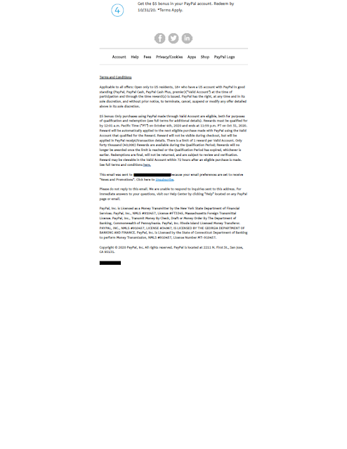
The email includes a Subject Line of "Get a $5 bonus for shopping smart with Honey." The headline reads "Give Honey a try. Spend $10, Get $5." Below that is a gif of a small box parachuting into a celebration, followed by a message reading, "When you add Honey to your browser for the first time, create an account, and spend $10 or more with PayPal, you'll get a $5 bonus. That's just the start of the savings. Honey members save over $126 annually." Below that are step-by-step instructions about how to install and use Honey, and a disclosure.

There is a clear Call to Action and an incentive for the customer to take action now. The email was sent on September 25 with an offer expiration date of October 4, so immediacy is encouraged. 

But, what is HoneyWhy would I add it to my browser? How do honey members save money, and compared to what? None of these questions are addressed in the email.

Based only on the email, one might guess that Honey is a rebate program or online savings account. In actuality, though, it is an online coupon provider. According to their home page, "Honey helps you find some of the best coupon codes on 30,000+ sites." That is Honey's value proposition, and it is missing from this email.

The other Fail is less important, but worth mentioning.  According to the disclosure and the detailed Terms & Conditions found on Honey's site, only 40,000 customers are eligible for the award. Once that limit is reached -- even if before offer the expiration date -- the reward will no longer be available. This type of restriction is fairly common in direct-to-consumer marketing. I've included number-of-customer limitations in several campaigns to ensure the product is not oversold or to cap potential incentive liability. When I did, I would use this clause to my advantage by communicating it in the body of the email. PayPal could do this by including above the Call to Action a message along the lines of...

Be one of the 40,000 people to get your $5 bonus by October 4th. Bonus must be used by October 31st.* 

or ... 


This exclusive bonus offer is limited to the first 40,000 people to take action by October 4th. Bonus must be used by October 31st.* 

This type of messaging approach not only makes the in-house lawyers happy by clearly communicating an offer restriction; it also communicates scarcity, which is a known factor to drive immediate action and increase response -- and that makes your manager happy.


Lessons:
  1. It is not enough to have a call to action and encourage immediacy in your direct-to-consumer emails. They should always include a value proposition.

  2. If your offer is limited to a specific number of customers, do not bury that restriction -- use it to your sales advantage.

8/30/2020

Mr. Cooper: Sloppy letter

This letter from home loan provider Mr. Cooper merits multiple Fails for Creative.

Mr. Cooper home loan offer letter
"Pre-Approval" Letter


The letter opens with a headline reading "You're Pre-Approved* for a New Home Loan." Then, the first sentence after the salutation reads, "Whether you're bying a home or refinancing ...Those two bits of copy don't align, which can be confusing. If Mr. Cooper is offering a new home loan (as stated in the salutation), then why the quick change to refinancing in the sentence immediately following? If Mr. Cooper is offering pre-approval for a home refinancing, why not have a headline reading "You're Pre-Approved for a Home Loan" without suggesting the pre-approval is restricted to the purchase of a new home?

The letter's Call to Action is to contact Mr. Cooper's call center. These days, many call centers are open 24/7. Mr. Cooper's hours, however, are limited to 9-14 hours a day, Monday - Saturday. Fair enough. Home loan purchasing is not like auto insurance, where you might want Jake from State Farm to take care of you in the middle of the night. However, the call center hours are hard to find on the letter. They are located under the company's address, when they would be more appropriately positioned near the phone number the reader would call.

The letter contains several grammatical and formatting errors. Some examples:
  • There are three problems in this one sentence: "Call today to see if your could lower your monthly payment, payoff your home faster, pay less interest or other loan benefits.
    • The diction is incorrect in that a person does not place a phone call to "see" something. A person places a phone call to "hear" or "learn" something.(Had there not been other errors in the same sentence, I might have passed this off as a copywriter's creative style.)
    • The sentence lacks parallel structure in that the reference to "other loan benefits" lacks a verb.
    • The word "payoff" is improperly applied. As written, "payoff" refers to bribing someone. The sentence should have used the term "pay off," written out as two words.

  • In the line listing call center hours, there is an extraneous space at the front of the line.

  • For readability, that same line should include commas after the days of the week, e.g., "Mon - Thu, 7 am - 9 pm CT..."

  • In the opt-out box at the bottom of the letter, the word "pre-screen" is treated inconsistently -- once with a hyphen and twice without.
If potential customers see so many errors in a business's one-page letter, why would they believe the business is capable of properly handing a mortgage application or that the business could accurately prepare required documents for a home sale closing?

In other words, Mr. Cooper needs to clean up his act.

Lessons:
  1. The body copy of a marketing communication should support the headline.
  2. Include your call center hours in context.
  3. Proofread your communications for language and grammar. 
  4. Ensure your formatting is consistent and your letter is visually clean.

7/06/2020

PenFed Credit Union: Not Military Precision

I recently received this solicitation from PenFed Credit Union, whose formal name (according to Wikipedia) is Pentagon Federal Credit Union -- a name that aligns with the company’s pentagon-shaped logo

The solicitation letter is pretty typical for mid-tier credit card providers: window envelope with teaser; letter with Johnson Box; clear Call to Action; Schumer Box; buckslip insert reinforcing benefits and the call to action; and required credit prescreen opt-out notice.


PenFed Federal Credit Union


The first line of the disclosure on the front of the letter reads, “To receive any advertised product, you must become a member of the PenFed Credit Union.” I originally thought this might be a Fail for Targeting since I have never worked in the military services or at the Pentagon and thus, I thought, would not be eligible for membership. The letter itself does not mention membership criteria, and I also could not find a mention on the main pages of their website or their sitemap. I did, however, find some information about membership eligibility from third-party websites such as on WalletHub; from there, I returned to a page that listed Affinity Partners

On affinity partner pages such as this one related to the American Red Cross, there is some copy that reads:

"Congratulations! As an employee, retiree, or volunteer of the American Red Cross you are eligible for PenFed membership! How does PenFed define volunteer? A volunteer is anyone who provides time, talent, or treasure. Time is the hours volunteering for the organization, talent is the unique skills a volunteer brings to the organization, and treasure is both financial and blood donations."

Aha! I am eligible for PenFed Credit Union membership because I supported the American Red Cross. Perhaps the Red Cross shared my contact information with PenFed in hopes that I would become a member and the Red Cross would receive some benefit for the referral. If I am correct -- and, perhaps even if I'm not -- the letter merits a Fail for Creative because the letter lacks an explanation of membership eligibility. 

The letter should explain membership eligibility and how broadly they define it. Even a couple lines along the lines of "We support people who serve the military but also offer membership benefits to tens of thousands of other people who support the military or one of our affinity partners." Or, if I received this offer because of my history of American Red Cross support, why not call that out? Touting affinity relationships helped make MBNA America successful -- perhaps that approach could work for the credit union.

At the very least, PenFed should add a page on its website explaining membership criteria -- a page that is indexed by Google, easy to find and easy to understand. This easy-to-find page on Affinity Federal Credit Union's website is a good template.

Also, is this offer a Fail for Timing? According to CNBC and other news sources, many banks are cutting back on balance transfer offers during these extraordinary times. Perhaps the credit union has a contrary view of where the economy is headed. Or, maybe it has reviewed its current membership pool and credit prescreen criteria and has taken a different view of credit default risk. Or, maybe the credit union had planned this campaign long in advance, and just decided to move forward.

Lessons:
  1. If soliciting members for your credit union's credit card, include language that suggests the person is not only eligible for the credit card, but also eligible to join the credit union.
  2. Membership eligibility for a credit union should be easy to find.
  3. Consider whether a pandemic is a good time to offer 0% balance transfers.

4/05/2020

Santander Bank: Creative Improvements, Lousy Timing


Last May, I wrote about a postcard I received from Santander Bank that merited a Fail forCreative because it promoted an incentive but lacked a conspicuous explanation of how to earn the incentive.

Santander Bank self-mailer
Cover panel
Santander Bank self-mailer
Address panel


Santander’s small roll-fold self-mailer that I received on April 2 here in New York City, however, includes elements lacking in last year’s postcard.

Santander Bank self-mailer
Offer Panels


This recent self-mailer includes a clear call to action. In fact, performing the desired action comes across as easy as 1, 2, 3.  The self-mailer includes a conspicuous explanation of what is required to enjoy the $300 incentive, with supplemental information in the disclosure. There is adequate space for benefits messaging, an easy-to-read Promotion Code, and the location of the nearest branch.

Santander Bank self-mailer
Promotion Code and Bank Branch Location


However, as I write this, the nearest branch listed on the postcard has been closed for two weeks because of the COVID-19 pandemic. More than two thousand people in New York City have succumbed to the virus. The Big Apple is in lockdown. Is this really when a consumer might consider switching the bank where their paycheck is deposited? Many consumers around here won’t even have a paycheck in a couple weeks; many others will be deceased.

So, this self-mailer is a Fail For Timing. At the very least, it can come across as callous. But should one blame Santander? It could be that the self-mailer was mailed before things got bad. When mailing Standard Rate, there is a lag time between maildrop and in-home date – sometimes a few business days, sometimes a few weeks. As we’ve seen, the world can change a lot in that short time.

Several years ago, I launched a direct mail campaign offering prospective customers around Philadelphia savings on their electricity supply costs. Unfortunately, Hurricane Sandy started up the East Coast after the maildrop. The mail reached the target market while the hurricane was disrupting power to many homes. Who knew?

Santander Bank self-mailer disclosure panel
Disclosures updated as of 2/29/20

The disclosure includes an as-of date of February 29, which suggests the self-mailer was printed in early March. If it was mailed prior to March 10, I would say"Who knew?" 

Or maybe the mail dropped closer to March 20, which means the bank knew about the pandemic hitting the United States but decided to mail anyway. If so, a decision should have been made to pull the mail rather than commit an unforced error because – even though the mail had been printed and personalized – the campaign could have been halted. Doing so would have meant postage money could be saved for a better timed mailing, and would have prevented bad optics.

Lessons:
  1. Your Call to Action should be conspicuous and easy to understand.
  2. Sometimes planned marketing efforts can be impacted by unforeseen events.
  3. There are occasions when you may need to pull mail at the last minute. Maintain the decision-making capability and flexibility to do so.


3/01/2020

American Red Cross: No longer blind


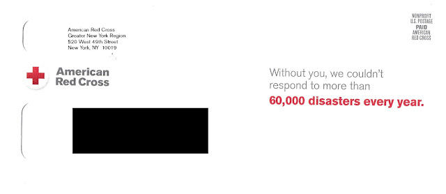
A little over two months ago, I wrote about receiving a solicitation from the Red Cross in a blind envelope right in the middle of the traditional giving season. Last week, I received a similar solicitation but with a corporate envelope.

Where the envelope in December had no hint of branding, this envelope is unmistakably from the American Red Cross. The teaser message reminds me that my donation helps the Red Cross respond to more than 60,000 disasters a year.

American Red Cross
Red Cross Solicitation:
Fully Branded Outer Envelope
The letter inside is exactly the same as the December letter. The only update is the mailing date.

Red Cross Charity Solicitation Letter
Donation Solicitation Letter front
multichannel engagement
Donation Solicitation Letter back
Request for email address circled

As a direct marketing professional, my gut tells me that the blind envelope was part of an A/B Test and this is the Control, but that is just a hunch. Perhaps the plan was for the holiday solicitation to be blind to differentiate it from the multitude of charity mailers that typically arrive in December. The mailbox is not as busy in February, the thinking would go, so now is time to show that logo again.

I wonder if it is also time for increased multichannel engagement. This is a direct mail letter requesting a mailed-back, completed response form. There is also an online donation option; however, the mention of that is in small type.

No one wants to mess with a successful Control package (if this is it); however, it may be time to consider that the internet is useful for many things, including donor engagement. Buried on the back of the form  below the input field for credit card information  is a request for email address. Instead, why not, on the front of the form, ask all donors for their email address to share stories of the Red Cross coming to the aid of disaster survivors? Rather than treating this solicitation as solo mail in a vacuum, include a link to the American Red Cross YouTube channel or the local Red Cross as a means of encouraging engagement?

Business Reply Envelope

Perhaps that could be their next A/B Test.


Lessons:

1.      Test your most successful direct mail packages. Let new presumptions challenge your assumptions.
2.      We live in an omnichannel world. Don’t use direct mail in a vacuum – integrate it with your other engagement channels.

10/25/2019

Fiddler on the Roof: Don’t Fall – Dedup Your List


Selling tickets for an off-Broadway show is challenging. That’s why someone in charge of marketing and advertising a show often uses a mix of communication channels — television advertising, spot radio, ticket outlets like TKTS and TodayTix, and handing out flyers around Times Square.
Plus, direct mail. Why the multi-channel mix? One word: Tradition!
Self-Mailer front
Which brings me to this Fail for Targeting. A neighbor received two identical self-mailers for the new off-Broadway Yiddish production of Fiddler on the Roof on the same day. One self-mailer included her full name, including middle name, while the other included only her first and last name. However, both self-mailers have the same last name, apartment number, street address, and complete zip+4.
Inside panels
In the past, when the recipient had purchased Broadway tickets, she typically used her full name. Sometimes, however, she used only her first and last name. That’s probably why she received these two mailers—the marketing people for Fiddler on the Roof had rented different lists of people who are likely to purchase show tickets, merged them, and targeted them for a bulk mailing. The mistake here is in list hygiene — specifically, making sure your mailing list is clean but not duplicative.
Address side
Perhaps the mailing list manager had made a decision to allow for multiple people in the same home to receive the same mailer. Typically, that’s a cost-inefficient approach; however, the manager may have assumed that, if one person in the home turns out to be uninterested in the show, the other person might be. Even if that were the case, though, the first and last names on these mailers were identical. That indicates that both names are of the same person.
2 self-mailers to the same name & address
Executing a successful direct mail campaign as part of an omnichannel marketing mix involves understanding the dynamics of the channel. It is a balance of Targeting, Offer, Creative, and Timing. Having the right balance isn’t easy — but, then again, neither is being a Fiddler on the Roof.


Lesson: Practice proper list hygiene by removing duplicate names from your mailing and limiting your targeting to one mailer per address.

6/06/2010

Was this the first failed mail?


I recently visited the National Postal Museum in Washington DC.  It includes some interesting history of the US Postal Service and a statue of Ben Franklin.  The architecture of the building is much like that of Union Station next door.  

Included was a small exhibit about the Dead Letter Office.  Many people from Europe would write to their relatives that immigrated to the USA with only city name in the address.  They didn’t realize how large the cities were, and that without a proper address, the postal service could not deliver.

Nearly a century later, the post office now requires more than address to deliver mail in a reasonable time frame.  First they required a zip code, then a zip+4, and now zip+4+2.

Learning: Whether it is for personal or marketing correspondence, know your recipient and completely address the envelope.

4/22/2010

Failed Mail Can Lead to a Failed Wedding

Even in the age of Evite, the formal mailed wedding invitation remains the favored method to announce an upcoming marriage and encourage others to join in the celebration.  If you think about it from a marketing standpoint, it is one of the most expensive direct mail solicitation packages targeting consumers.  The happy couple and their parents want people to open the expensive mail, read it, and respond with an RSVP, and usually arrive wearing proper attire.

Which brings me to how it can Fail:  Addressing the invitations.  Too often, people neglect to double-check addresses.  If you haven’t communicated in three years with that second cousin, she might have moved.

Another more common Fail with fancy invitations is legibility.  I recently received an invitation addressed to someone else because the calligrapher got so fancy, the postal service couldn’t figure out the address.  There was confusion between “I” and “7” , “S” and “5”, as well as “4” and “9”.  I tried bringing it to a local post office.  A clerk attempted to identify the correct address, but he eventually gave up and he marked it “Return to Sender”.  If the sender had used a zip+4 with readable numbers, the invitation might have arrived at the correct address.  Instead, someone will not receive their invitation – and anyone who ever got married knows the kind of problems that result from that.

Lesson: Maintain your address list even for personal contacts, and include the zip+4.  Be sure your addresses are readable by Postal Service automated systems, or at least by a human being.

4/04/2010

Mixing politics and phone sex is a classic Fail

According to this article at politico.com, a political fundraising letter mistakenly listed a phone number for a phone sex line.  In the article, the RNC blames a vendor.  However, it should blame it's own people for not reviewing the letter and affirmately verifying the phone number on the letter.  This is a classic and embarassing Fail for poor Creative.

The RNC is not the only national organizaton to have a typo lead people to a phone sex line. Another infamous example: AT&T several years ago sent a letter to 175,000 loyal customers with an incorrect phone number. Instead of hearing “Thank you for calling AT&T True Rewards”, recipients who dailed the number on the letter heard “Are you ready to get naked?”

Learning: Always proof every word and every numerical statement in every stage of production. Always verify every phone number included in your mail and be sure it is correct. Don’t just ask someone if a phone number is correct – call it yourself.

3/31/2010

Comcast: Sending the same Failed Mail – it’s Comcastic!

This letter from Comcast arrived today. If it looks familiar, it is because it is almost exactly the same failed mail I covered earlier this month. The outer envelope is exactly the same as the first mailing – e.g. semi-blind outer envelope addressed to me “or Current Resident” – so I did not bother scanning it. The letter shown here has the same offer, layout, and body copy as the original letter. The only changes are the respond-by date and response phone number.

This suggests that the original letter was deceptive. The original letter stated … this special offer is only available until March 31, 2010.” However, it now appears to be widely available for at least another half month. There is nothing wrong with creating urgency by including a specific respond-by date, but stating that an offer expires by that date when in fact it does not is misleading when you plan a second mailing of the same offer. It erodes trust with your customer. An appropriate approach in the original letter would be “Please respond to this special offer by March 31, 2010.” or “To take advantage of this special offer, call 1-xxx-xxx-xxxx by March 31, 2010”.

It is generally not misleading to have a grace period after a respond-by date. For example, if want people to respond by March 31, you could accept responses until say, April 7, because some people read their mail late, don’t get around to calling, or delivery is delayed. What is misleading is when your urgency level suggests the offer is final but you send the same offer with a later offer expiration date.

Let’s assume for the moment that the offer in fact expires April 16 and assume that the rest of the letter is final. Even if the offer is available only for existing customers, including the word “customer” in the close is superfluous. The limitation of “only” does not apply to the availability but to the timeframe. An improved means of closing the letter would be “Hurry! This special offer is available only until April 16, 2010. Call 1-xxx-xxx-xxxx today.” If your manager or legal reviewer is directing you to emphasize that the offer is available only to customers despite having a disclosure, then replace “special” with “exclusive”.

Another Fail for Creative applies for the extra space in the closer between “until” and “April 16, 2010.” Someone did not check the spacing.

Of course, a basic Fail applies for repeating use of the same envelope and letter without material modifications. As explained here, if a recipient does not open or respond to the first letter, there should not be an expectation that the recipient responds to the second one using the exact same approach.

On a positive note, Comcast intelligently used a different phone number in the second mailing. This will enable adequate tracking of raw call counts for each of the two letters.

Learnings:  While it is productive to maintain a sense of urgency, do not mislead customers about when an offer expires. Proofread your grammar and every line in your communication. When resending the same offer, modify the creative from the original version. Track distinctly responses from each sales communication.

3/30/2010

Improved communication to friends

Follow-up to my prior posting ... here is an improved version of the letter from Seven Acres I am sharing with the fundraising co-chairs. 

There are different directions the letter can go.  I took the approach this morning of maintaining the core messages from the original letter, adding some urgency to the need, and streamlining the text overall to render it visually palatable.  Specific changes include:
• Paragraphs are shorter, with text being left-justified.
• There is additional quantification, i.e. specific number of years and number of people supported over the years.
• Used a serif font, also to improve readability.
• Names of streets are removed to focus on the benefits Seven Acres delivers.
• The need for a friend is called out clearly with text underlining.
• The page specific for donations is mentioned specifically with a suffix of /friend. This way, people can go directly to the donation page and not get lost on the home page trying to find it. Seven Acres will need to work with it's internet support to set this up, but it should be easy for them.
• There is a time-based call to action rather than date on the letter. This provides some urgency to the request.
• Added a postscript.  This is a typical direct mail technique that has proven results. I reinforced the concept of Seven Acres, a way to learn more about it, and repeated the call to action to be a Friend.  I do not know if they offer tours, but it would certainly be a way to increase engagement among potential supporters.

The above represents text and layout.  Of course, the actual letter should be produced on Seven Acres letterhead.

3/29/2010

Letters to friends should be easy to read

This solicitation for donations from Seven Acres is basically typical. It includes a branded outer envelope, request for money, simple response form and business reply envelope (not scanned).  The text of the letter talks to the history of the assisted living residence, the reason it is important to the community, and why the recipient should donate.

There are different ways to improve the content of the letter to improve persuasiveness, however I find myself motivated to write about simply the layout of the letter. The creative Fail is that the letter is hard to read. Simply put, it is not scanable.


• If you glance at the letter quickly, you will see two phrases: “Friends Campaign” and “Friends”. These are the words that are in boldface italics buried in the body copy. These are key words, but not the only ones a reader should take away from a request for money.

• The paragraphs are full justified. This makes the text difficult to read. Only newspapers and legal documents should be full justified. A successful direct mail letter will have text that is flush to the left column, e.g. left justified.

• The paragraphs are too long, especially the opening paragraph. (Long-form paragraphs can be successfully used in letters, but not one-page letters.) Lacking a Johnson Box or some other attention grabber to open the letter, the opening paragraph should be no longer than 2 sentences or 2 lines. It could be as simple as “Your support is desperately needed to help the elderly here in Houston.” Or consider leveraging the friends theme: “Houston area elderly citizens need a friend. Will you please help?”

The issue of timing is minor but also relevant. The letter is dated “February 2010” however it arrived in home in mid-March. The date on this type of letter does not add value under normal circumstances, and loses value when it arrives much later than dated.

My recommendation to the generous Friends Co-chairs at Seven Acres is to pick up a copy of Breakthrough Fundraising Letters by Alan Sharpe.

Learning: Your letter should be easily scanable so the reader can quickly ascertain the purpose. When using a typical letter format, always left-justify body copy. Don’t overload paragraph length on a short letter.