Showing posts sorted by date for query call to action. Sort by relevance Show all posts

11/17/2025

Rest.com: Cramped Postcard Is Mostly Unreadable

This small postcard from rest.com merits a Fail for Content and Offer.

rest.com postcard
Can you find the call to action in 3 seconds?

It's said that the eyes convey emotion, tug at hearts and show joy. So why does the front of this small postcard have a picture of a man with no eyes and the top of his head cut off? I guess Rest decided they couldn't fit the most important part of the human face on their postcard.

The call to action (CTA) is in knock-out white text over a light-colored comforter, making it hard to see. It is in the bottom left corner, which is that the last corner a reader scans. The "HSA/FSA Eligible" message jumps, but the website name does not.

rest.com unreadable postcard
Small postcard with unreadable copy

On the address side, we see the eyeless guy with an eyeless woman. (At least the woman is conveying some emotion with her smile.) Some sales messages are rendered in a font size legally too small for financial service disclosures, yet Rest mistakenly thinks it is large enough for a consumer to read with interest. 

Below the marketing messages are some logos. The middle one is a Good Housekeeping symbol. I tried reading the others using my phone at 4x view. I think the one on the left is about health, but I don't know. Do you think a consumer would know or care?

The CTA is lost at the bottom in small type. The retail partners are listed in small knock-out white type over a mostly dark background. Five points to anyone who can name the retailer on upper right, because I can't. 

The USPS allows for a postcard to as large as 6" x 9" to qualify for the standard postcard rate. Rest chose to make it only 4" x 6". Why? The only reason I can think of is to save a few bucks on paper for an otherwise expensive direct mail campaign. This approach is penny wise and pound foolish. Most of the visual problems could be solved with adequate space for content. Plus, a postcard this small gets lost in physical clutter.

Speaking of clutter: That's part of the problem with the postcard. There are too many messages. Rest is stuffing mention of 5,000 5-star reviews and a Good Housekeeping seal and two other logos I can't identify and something about being HSA/FSA eligible and retailers other than their website and one random testimonial. The core sales proposition is lost. 

Going back to that CTA: It's simply to visit the website. There is mention of a potential 35% discount, but it is too hard to find, too hard to read and too far from the CTA. If I were to work on this postcard, I would advise Rest to include some kind of offer or value proposition next to a prominent CTA. "Enjoy up to 35% off through [date] at rest[dot]com/xxxx." The xxxx could be a URL developed specifically for this postcard, so you can at least gauge resulting traffic. But, of course, you need space to utilize this best practice.

Lessons:

  1. When mailing a postcard, take advantage of the largest size available at postcard rate.
  2. Avoid content with inadequate background color contrast. 
  3. All your sales copy should be large enough for a typical consumer to be able to and want to read.
  4. Avoid overloading your mail with too many messages.
  5. Your call to action should be easy to find.
  6. Your call to action should include a reason to take action now.
  7. Include a means of tracking your mail's performance.
  8. Depicting people without eyes is creepy.

11/09/2025

Corcoran: Moving In With Free Pizza

This postcard from a duo of real estate brokers is a creative idea but it misses the mark in execution. Is it Mail That Fails, or just a bit too heavy on the cheese?

Corcoran Free Pizza Postcard

The front of the postcard touts "Free Pizza!*" There are over 1,800 pizzerias in New York City, because we love our pizza. I mean, if that picture isn't causing you to have a Pavlovian response, then you're not a New Yorker. 

Eric Volpe free pizza offer

So who doesn't want free pizza, right? Yup, the postcard can be redeemed for a free Margherita pizza at Salsa Napoletana & Street Food.

That apparently no-strings-attached free pizza is a way of introducing the Volpe | Kelly Real Estate Team from Brooklyn to Queens. See, the real estate team got its start in Brooklyn and is now covering Forest Hills. Salsa Napoletana got started in Brooklyn and recently opened a shop in the area, so why not team up, right?

(Side note: Salsa Napoletana isn't really in Forest Hills. Their location is in nearby Rego Park. But, hey, it is in Queens, so that's close enough for the metaphor to work, I guess.)

The copy on the postcard makes the Brooklyn / Forest Hills connection:

Headline:

Salsa Pizzeria came from Brooklyn. So Did I. Your Home's Buyer May Too!

Copy:

In the last decade, sales of homes like yours have increased by nearly $400,000 [sic]. It's no surprise buyers from Brooklyn are craving to live in Forest Hills. As a longtime Brooklyn real estate expert and resident of Forest Hills, I'm excited to team up with Salsa Pizzeria - a beloved Brooklyn pie shop now open on Woodhaven Blvd.

Whether you're hungry for a new home or a classic slice, we've got you covered. Call today to discuss your options.

For those of you who don't know New York City, we have five boroughs, and there are reasons people choose to live in the borough of Queens. Generally speaking, Brooklyn is artsy, urban, hipster and expensive, while Queens is diverse, multicultural, family-friendly and (slightly) more affordable. Folks in Forest Hills don't want the Brooklyn lifestyle and they may not want to relate to people who tout that Brooklyn lifestyle. So, I'm not sure I'd want to tout the Brooklyn connection too much as a RTB (reason to believe) Mr. Volpe is the right broker for Forest Hills. On the other hand, Brooklyn and pizza does make for an interesting message hook.

The postcard's messaging and call to action could be strengthened. The broker could communicate not just location, but success. Potential rewrite:

Headline:

Salsa Pizzeria is successful in Brooklyn. So am I. See what we can do for you in Forest Hills.

Copy:

When Salsa Pizzeria opened in Brooklyn, it was the talk of the neighborhood. Their Neapolitan pizza was created with passion and flavor that brings people back for more. Now, their pizza is available near your home. 

When I got my professional start in Brooklyn, I brought that same passion to real estate, helping connect sellers and buyers with homes they'll live in and love. 

I live in Forest Hills, so whether you're hungry for a new home or a classic slice, I've got you covered. Call me today at xxx-xxx-xxxx to discuss how I can help you. 

 What's behind the edits:

  • Credibility Build. Expertise may be nice, but a broker with passion is someone people want to interact with.
  • Avoiding Misguided Quantification. The original copy confused sales with value, and offered a figure that would align with actual home value increases only coincidentally.
  • Including the phone number in the call to action. If someone is interested in calling you, don't make them hunt for a means to reach you. 
  • Personalizing the call to action. By asking someone to "call me", the experience of expressing interest is personalized, which reduces tension.
I'd also suggest:
  • Adding a bit more urgency on the pizza offer. "While supplies last" is good, but perhaps consider, "Limited to 100 pies" and/or "Available only through xx/xx/xx" to motivate people to get that pizza.
  • Making the QR code jump out. In only black and tan, it gets lost in the current location and it looks like the outline of a pizza. Add some contrasting spot color or render the call to action in boldface.
  • If not already done, ensure that that the pizzeria has brochures and other information about the real estate firm. Get a pizza, get a handout, call Mr. Volpe. Everyone wins.
  • Consider who this postcard is from. It isn't fully clear if this postcard is about Eric Volpe, about the Volpe | Kelly Team, or about The Corcoran Group. While The Corcoran Group has a positive brand identity in the Big Apple, Volpe | Kelly is what is touted on the pizza side of the postcard. And, who is that woman next to Eric's name on the bottom of the address side? Is she Kelly?
So, is this Mail That Fails? Not quite, but Content could be improved.

Lessons:

  1. When engaging in local messaging, be sure you're appealing to the local audience with local flavor.
  2. Give customers a reason to believe in you.
  3. Don't let your call to action get lost.
  4. Be consistent in self-identification.
  5. It's hard to go wrong with pizza in New York City.

10/19/2025

HomeServe: Needs Better Cobranding

The first direct mail campaign I managed was an offer for The Practical Blue Hen, an informal guidebook I wrote for new students at the University of Delaware. At the time, I was a student there and partnered with a student organization to obtain a list incoming freshmen. I composed a solicitation letter, had a local printer print it, and offered pizza to anyone in the dorm who would help me stuff them in envelopes printed with the University of Delaware and Resident Student Association logos. I figured that every incoming freshman and their parent would open mail when their college is in the return address, and many of them would buy the guidebook. 

I was right -- the mailing had a 40% response rate! 

WorryFree
WorryFree Example

That entrepreneurial experience taught me more lessons than any college course. One of those lessons: Never underestimate the value of cobranding.

Someone at American Water Resources (AWR) also learned that lesson. They partnered with the New York City water board to sell water and sewer line protection services. That partnership allows them to use the NYC Department of Environmental Protection (NYC DEP) logo -- familiar familiar to New Yorkers. NYC DEP collects trash and recyclables, manages some of the local utilities, and bills homes for water use. Someone who gets a letter from the NYC DEP is going to at least pay attention to it.

Sometimes their mailers include logos from both AWR and NYC DEP, and sometimes only NYC DEP. 

American Water Resources
AWR Examples


Recently, I recently received a solicitation from HomeServe that tries to copy the AWR approach but merits Fails for Targeting and Content. The return address leverages a logo from PSEG, a utility that most New Yorkers would not know. PSEG serves New Jersey, not New York. In some parts of Long Island and a small part of Queens, they operate under the name of PSEG Long Island. But PSEG by itself -- nah, in mainland Queens, we haven't heard of them. The cobranding effort is wasted.

In contrast, AWR mailers effectively leverage their partnership by giving a a bit of an official feeling to the envelopes. They include a call to action with a respond-by date, giving some urgency. They also include mention of an incentive right on the envelope. Smart -- who doesn't want a $50 credit? But WorryFree doesn't do that. Their lead-in is, "A message from PSEG," which seems pretty soft. No color, no message, no urgency. I'd love to run an A/B test comparing AWR's envelope style to WorryFree's, but if I couldn't, I'd go with AWR's. It motivates action.

Lessons:

  1. Cobranding can be highly effective when the cobrand is relevant to your target audience.
  2. Cobranding and compelling messages on an envelope can get past mailbox clutter and motivate action.

12/14/2024

Merrell: Oops, They Did It Again

Four years ago, I shared a recommendation that Merrell include a clearly communicated offer expiration date on their postcards

In October, I received this postcard. 

Merrell Discount Postcard, Fall 2024

Merrell Discount Postcard Address Panel, Fall 2024


Their offer of $25 off a $100 purchase was good through 11/16/24; however, you need to point a magnifying glass at the very small disclosure* to discover that: 

Disclosure with Expiration Date
(Enlarged for readability)

So, what happened? I thought about buying my wife a new pair of hiking shoes for Christmas. I set aside the postcard, and came back to it after Thanksgiving. I tried to make a purchase using the promo code on the postcard; however, alas, the offer had expired. This is Merrell's Fail for Content.

An expiration date motivates action. Action means response. Response means sales. The lack of an expiration means fewer sales for Merrell. 

So why not put some urgency around the offer? Merrell could simply add, "Use your coupon code by November 16, 2024, to enjoy your discount" in a readable font size -- like you know, 12 or 14 point. Without increasing production costs, the message could appear in the white space below the picture of those cool Wrapt hybrid shoes or on the address panel above the name.

Lesson -- same as four years ago:
Your call to action should include a clearly communicated, definitive offer expiration date.


* Many people mistakenly refer to small print associated with marketing communications as a disclaimer, when in fact it is a disclosure. According to dictionary.coma ‘disclaimer’ is “the act of disclaiming; the renouncing, repudiating, or denying of a claim; disavowal” while a ‘disclosure’ is “the act or an instance of disclosing; exposure; revelation.” ‘Disclose’ is defined as “to make known; reveal or uncover” From a Marketing standpoint, a disclaimer is an admission that the headline is false – otherwise why renounce it? However, a disclosure provides secondary but relevant facts of an offer. So the only reason an offer or marketing communication would require a disclaimer is if it was misleading from the onset.


12/04/2023

GE: UltraFast Postcard Fail

I recently received a postcard from GE that merits several Fails for Content. 

GE One And Done

The front shows an androgynous person in a high-end walk-in closet doing laundry. She is smirking at her laundry machine while either preparing to put towels in or recently having removed them. "This is not just laundry," cries the headline, "This is One & Done."

GE One & Done Wash & Dry

On the address side is a picture of two laundry machines -- presumably run by an app. There is very little copy on this side, only, "Wash + Dry with the UltraFast Combo," with a Call to Action to visit a specific appliance store.

As executed, this postcard has multiple Fails. Let's break down why it was a waste of money.

Confusing Audience

The front of the postcard shows someone in a combination utility room and expensive closet, with more athletic shoes than you can count. The room looks pretty expensive, like it is in the house of a one-percenter. It certainly doesn't look like this is a typical person using a typical machine. So a typical consumer might look at the person and room and think they couldn't afford whatever the postcard is advertising.

Misleading Product

The address side shows not one, but two machines, visually suggesting that this is a washer-and-dryer combination set. It isn't, through, the picture is actually of two of the same one-piece washer/dryer appliances -- one has a stand. A typical consumer would have to look and think hard to recognize this, but they wouldn't bother. They'd likely look at the postcard for about three seconds, then toss it.

Uncompelling Benefits, No Urgency

The communicated benefits appear to be the ability to wash and dry by using an app. Maybe that's enough to motivate a consumer to visit a website in the comfort of their own home, but it is not compelling enough to get a consumer to schlep to a store. After all, this is a low-interest category for a major purchase. Why not include an offer, such as $100 rebate for this $2,899 machine if the consumer brings in the postcard within 30 days? Even a modest incentive with a reasonable offer expiration date supports some action.

Incorrect Location

Finally, this postcard gets the store location wrong. The Hoing's Appliance location near me is in Forest Hills, not the Bronx physical address shown on the postcard. In fact, the web address on the postcard is for Forest Hills location, while the Bronx location has a different URL.


Lessons:
  1. Explain your product. Clearly communicate its benefits.
  2. Support your mail with online content to explain your product benefits.
  3. Give the customer a reason to take action soon.
  4. When directing a customer to a physical location, share the nearest location.
  5. Check every URL listed in your mail.

10/10/2022

PenFed Credit Union: What's the Point(s)?

 A couple years ago, I wrote about a credit card solicitation I received from PenFed Credit Union. It took some serious sleuthing to understand why I would be eligible for membership. Since then, I've received a few others from PenFed, including this one for a PenFed Platinum Rewards Visa Signature Card.

I received this mailing as someone who isn't a PenFed member, isn't a member of the armed forces, and is someone who knows about PenFed only because of writing this blog. The letter includes a paragraph explaining that I need to become a member to get the credit card. So, it's probably safe to conclude that the mailer's target audience includes people who don't know much about PenFed.

Their recent solicitation is again pretty typical for a mid-tier credit card provider: window envelope; letter with Johnson Box; clear Call to Action; Schumer Box; brochure insert; and required credit prescreen opt-out notice. Let's break it down.

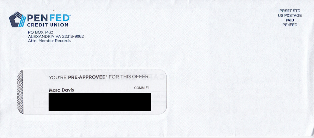
The window envelope is clearly branded. Unlike the one from two years ago, this one does not have a teaser

PenFed Credit Union Credit Card Offer Envelope

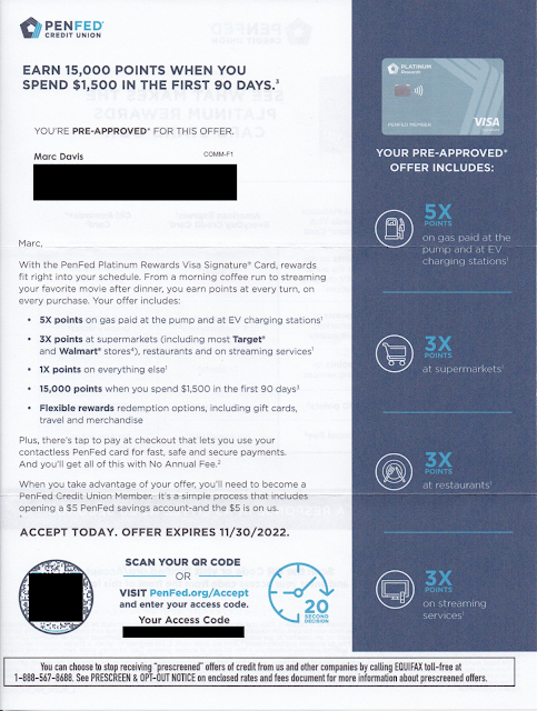
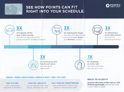
The personalized letter opens with a straightforward Johnson Box message: Earn 15,000 points when you spend $1,500 in the first 90 days. Nice. The letter opens by communicating a benefit that the rewards card works with my lifestyle. I can earn bonus points by doing what I do. I can get 5x points for filling my car's tank -- or even charging my EV, so forward-thinking! -- 3x points for food shopping or eating and doing other everyday stuff, and everyday 1x points for all those other purchases. The points accrual rates are reinforced in the right margin. 

PenFed Credit Union Credit Card Offer Letter

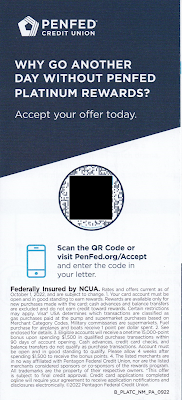
The letter closes with an explanation that I need to become a PenFed Credit Union member to get the credit card. It's a simple process, so all I need to do is scan the QR code or go to their website to get started.

The back of the letter reinforces points accrual and compares it to other credit card providers that offer points, then reinforces the Call to Action. 

PenFed Credit Union Credit Card Offer Letter

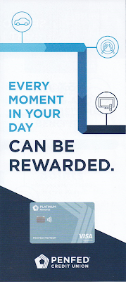
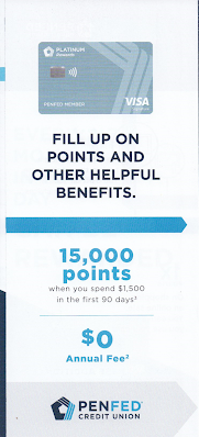
The points proposition is reinforced with a tri-fold brochure reinforcing points accrual rates. It also communicates some secondary perks such as Tap to Pay and Fraud Monitoring, but mainly it's about how all those points can really add up -- and the Call to Action is reinforced yet again.

Brochure Cover


Brochure inset

Brochure inside

Brochure back

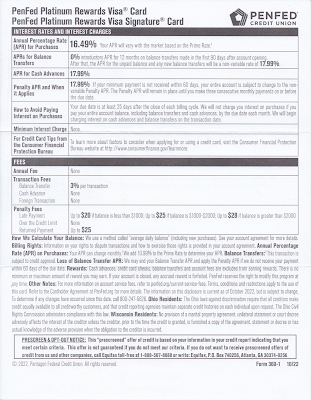
The letter package also includes the legally required Schumer Box and accompanying language disclosing the card product's terms.

Credit disclosures, including Schumer Box

 The back of the disclosures page is blank.
Back of credit disclosures page (blank page)

This isn't a quite a Fail for Creative; however, there are some improvement opportunities: 

  • Consider an enticement for the prospective customer to open the envelope. There should be an envelope teaser that would motivate the recipient to open the envelope. Given that the target audience is non-members (e.g. do not have a relationship with PenFed) this is more important than usual. (The "You're Pre-Approved" message in the standard size window is easily missed.)

  • Since the audience includes non-members who don't know them, PenFed should introduce itself. Maybe PenFed has strong brand recognition within the military community; but, since I also received it, they are presumably also soliciting new customers who haven't served. Consider using the Who We Are content from the website and include it on the back of the required disclosures sheet, or squeeze a message in the letter or the brochure. 

  • Share the value of points. There is plenty of space allotted to points accrual, but nothing about how the points can be used. Explain if points can be used for travel, cash back, donations to the USO, or something I might enjoy. Also, the lack of quantification of value can be suspicious. Perhaps that 15,000-point intro bonus is worth less than the 10,000-point bonus with the compared-to American Express EveryDay Credit Card -- or perhaps it takes 20,000 points to get a shiny nickel. 

Lessons:

  1. Think about your target audience. If they are not current customers, help them get to know you.
  2. When soliciting prospective customers, include a conspicuous teaser message to give them a reason to open your envelope.
  3. Communicate benefits. Points are not a benefit. They are a vehicle of earnings toward a benefit. 
  4. Paper is expensive. Don't waste any. Leverage blank space to sell some more.

3/06/2022

BCHP: A hard-to-find doctor for my non-existent child

When someone asks me if I have children, I sometimes joke, "None to my knowledge." In that context, when I receive a postcard asking me, "Looking for a pediatrician or pediatric specialist?" I have to wonder if someone knows something I don't.

Maybe I do have a child. Maybe my wife has a bun in the oven. Or maybe the reason I received this postcard is less dramatic  that the postcard from Boston Children's Health Physicians (BCHP) merits a Fail for Targeting.

Let's set aside for the moment the fact that I do not have any offspring and break down the postcard's content.

Boston Children's Heath Physicians
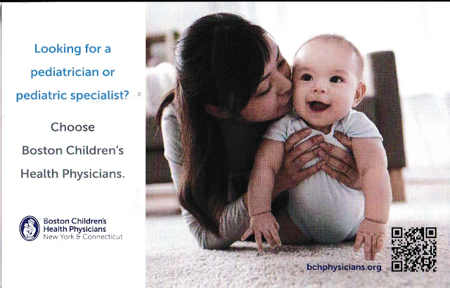
Mommy is happy with her healthy baby.

The front of the postcard simply suggests that I choose Bost Children's Health Physicians. It doesn't suggest why I choose one of their doctors. What makes their physicians desirable? To put it in marketing terms, what is BCHP's unique selling proposition?

BCHP Boston Children's Health Physicians
Where is Forest Hills, Queens?
Not in the area shown on the postcard.

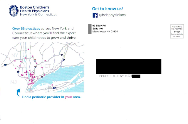
The address side of the postcard includes a minor sales message that supports the Call to Action – to “find the expert care your child needs to grow and thrive.” And the postcard displays a map that appears to show the locations of doctors. There is an arrow pointing to the map, reading, “Find a pediatric provider in your area” with emphasis on “your.” Quick takeaway: most of New York City doesn’t even appear on the map.

Maybe there is a provider near me, but how would I know? Rather than communicating how to find the provider – and placing it next to the Call to Action to do so – there is a bunch of white space below the map. The response method is on the other side of the postcard…well, sort of.

Buried on the bottom right corner of the picture of mom and her smiling baby is a URL leading to the Boston Children’s Health Physicians home page. Somewhere on that home page is information that supports the postcard’s messaging, but it isn’t easy to find. The QR code doesn’t lead to the same page as the URL; it leads directly to the practice locator page. And the placement of the QR code (within an image on the opposite side) is a Fail for Creative.

BCHP Boston Children's Health Physicians
BCHP locations not quite near Queens
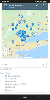
Let’s get back to finding a provider in my area. I tried the QR code on my smartphone. It indicated that the nearest practice was in Bardonia, NY.

As the crow flies, the distance from Forest Hills, Queens, NY to Bardonia is about 27 miles. As the parent drives in traffic, however, it is two toll bridges and typically an hour drive or longer with a sick or tired child in the back seat. (That assumes the parent has a car. After all, this is New York City.) This long distance to a physician confirms that the postcard was poorly targeted geographically – another Fail for Targeting.

Returning to the caption below the map, what is a “pediatric provider?” Why use that kind of industry jargon when the front of the postcard uses “pediatrician” and “pediatric specialist” while the address side of the postcard cites having 55 “practices”? Why throw yet another term out there? I realize I’m not a parent but, if I were, wouldn’t I want to find a “doctor” for my child?

IMHO, this postcard does not really support Boston Children’s Health Physicians. It is poorly designed, written, and targeted.
 
Finally, unless there is a back-end method in place for tracking response to the individuals being mailed, this isn’t direct marketing – it’s mailed advertising.


Lessons:

  1. Vet your data sources to target matching demographics.
  2. Just being available is not enough. Even a medical practice needs a differentiator.
  3. The means of following through on a Call to Action should be located close to the Call to Action, and easy to find.
  4. Vet your physical targeting to people who can easily get to your physical business or medical practice.
  5. If your Call to Action includes a web site, don’t just list a home page. Use a direct URL that aligns with the Call to Action.
  6. Apply jargon consistently using terms your customers understand.
  7. Even a postcard for a medical practice should include some method of tracking results.


Edit 2/11/23: Removed reference to company that sent the mail per request of a person working at that company. 

12/16/2021

Athletic Greens: Landing page does not work out

For more than a decade, I've written about the four pillars of a successful direct marketing campaign: Targeting, Offer, Creative and Timing (TOCT). But there is something that binds these pillar together: Execution.

If you properly thought through your TOCT and planned your work, execution is working the plan. To execute successful, everything should work the way it should.

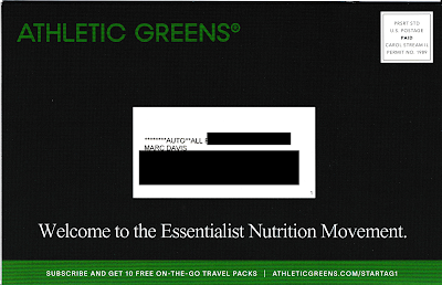
Which brings us to Athletic Greens. I recently received this self-mailer:
Athletic Greens
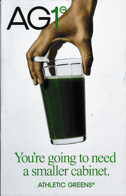
Cover panel

Athletic Greens
Address panel, with offer URL


Athletic Greens
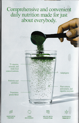
Inside panel


Athletic Greens
Sales panels
Athletic Greens


Creatively, this is quite a good piece for the category. The paper stock is thick, making it stand out in the clutter of mail. The message are simple and straightforward. The Call to Action is to subscribe to receive dietary supplements by visiting www.athleticgreens.com/startag1 and taking advantage of an offer for new customers. When I tried it, the URL did not work. 
Athletic Greens
Non-functional landing page


Because the landing page was non-functional, this otherwise compelling self-mailer merits a Fail for Execution. If customers can't get the offer they were promised, why would they trust the product?

And it's not like a prospective customer can easily call to take advantage of the offer. The self-mailer lacks a phone number. Sure, there is one on a page buried in the web site (888-390-4029), but that is listed as "Customer Service." Are there no salespeople available? I believe this approach of mailing an offer without a phone number as a secondary call to action is pennywise and pound foolish. It may merit a Fail for Creative.

I received the self-mailer 10 days before Christmas, a time when people are thinking about indulging for the holidays, visiting family and friends, and end-of-year financial activities. A typical mailbox is full of charity solicitations, catalogs and holiday cards. Is this really a time to mail an offer related to personal self-improvement that attempts to motivate people to change their dietary habits? I think no, and that this could be a Fail for Timing

If I planned this campaign, I would have timed the maildrop with an in-home date three weeks later, e.g., the first week of January. I would have also tested the landing page before mailing.

Lessons:
  1. When you include a web address on your solicitation, make sure it works.
  2. When using snail mail to sell your product, don't assume people will go online to response. Include a phone number in your Call to Action.
  3. Carefully consider the impact of seasonality when timing your mailing.


11/30/2021

PayPal: Venmo $10 Giveaway Email Lacks Explanation or Focused Targeting

This recent email from PayPal trying to cross-sell Venmo merits Fails for Creative and Targeting.

PayPal Venmo $10 Offer
Enrollment offer email, sent to long-term
Venmo customer

The email offers me a straight cash bribe (or, as we say in marketing, an incentive) to sign up for Venmo. The Call to Action is to click on the “Claim Your $10” link that will bring me to the below landing page.

Venmo $10 Offer Landing Page
Landing page
lacks explanation of Venmo product features or customer benefits

The landing page reinforces the incentive and discloses information about fees -- and allows me to sign up for Venmo and verify my phone number.

But what is Venmo? Neither the email nor landing page include a product explanation. Simply put: If someone hasn’t used Venmo -- which is, after all, the kind of person the email is targeting -- they would have no idea what it is or why they should provide their mobile number to get $10. Both the email and landing page should include benefit statements or at least some brief sales messages.

Now, in fact, I know all about Venmo. I’ve been using it for a long time, long enough for Venmo’s parent PayPal to know that I am an active customer. That is why I give this a Fail for Targeting. There is no value in sending a new customer acquisition offer to a long-term active customer like myself. Communications like this can make customers question the strength of a brand.

Speaking of brand, why doesn’t PayPal put its name behind Venmo -- at least on this marketing email? For customers who haven’t heard of or used Venmo (like the ones targeted by the offer), including phrasing such as “backed by PayPal” or “a PayPal service” would at least lend some credibility to the product.

This isn’t the first time PayPal has offered me an incentive for something without explanation. Last year, PayPal sent me an offer for Honey that lacked a product value proposition. Nor is this the first time that PayPal has demeaned its brand with shoddy marketing communications. These communications can implicitly send a message to customers that PayPal doesn’t have its act together, which could lead to decreased trust and decreased use. Is this a company to trust with cryptocurrency purchases?

Sometimes marketing managers are so obsessed with their products, they forget the basics. That’s why they need to take a step back, review lessons like the below, and avoid sending Mail That Fails.

Lessons:

  1. Explain what it is you are selling and why it is beneficial.
  2. Extend your new customer offer only to potential new customers.
  3. If selling an affiliate service, consider explaining the relationship with the affiliate.

8/14/2021

Freshly: Referral Offer Freshens Up

 A couple months ago I wrote about a referral offer from Freshly that merited a Fail for Creative. Last week, the company sent me a similar offer and, from a creative and user experience standpoint, it is an improvement. 

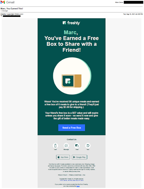
Freshly Referral Offer
Freshly email

This email is personalized, addressing me by name. Although it positions the referral offer as something I had "earned" (which feels a bit gimmicky), the email does recognize both my purchase history and enthusiasm for the product. 

Rather than the previous mailing -- which provided a code to share but without adequate instructions about how to use it -- this email offers a simple link with a Call to Action to "Send a Free Box." That seems easy, and needs no special codes. 

The landing page includes a 3-step, easy-to-understand process for the customer to follow to give a friend a free week of Freshly. 

Freshly Freebie Box Landing Page
Referral offer landing page

The input fields are clear. The email message and subject lines include stock language with an opportunity to personalize. That's almost as flexible as switching next week's meal from the Cauliflower Shell Beef Bolognese to the Indian-Spiced Chickpea Curry Bowl.

One element included in the May email that is lacking here, however, is an expiration date. Instead, the email body copy mentions "... and will expire unless you share it soon ...", while the disclosure reads, "Freshly reserves the right to modify, replace, or cancel offer(s) at any time" -- a statement that lacks a sense of immediacy. This is not a Fail for Creative but is an improvement opportunity. Even if this referral offer is intended to be evergreen, I would include a soft expiration date using language such as "... so send a Freebie Box in the next 7 days and give the gift of better meals made easy!"

Referral offer Thank You page

Lessons:
  1. Referral programs are a useful approach to allowing your customers to be your advocates.
  2. When you want your customers to do something, take all the traction out of the process.
  3. If your offer does not have a expiration date, at least suggest a timeframe for the customer to take action.

7/16/2021

Mr. Cooper Renovates His Mail

Last year, I wrote about a direct mail letter from Mr. Cooper offering a home mortgage. It was a Fail for Creative for several reasons. This letter avoids those mistakes and, in fact, applies some smart direct mail marketing tactics.

Mr. Cooper Mortgage Offer
Mr. Cooper
Invitation to Apply letter


The Johnson Box describes the sales proposition and includes a clear Call to Action. Below it, the headline "Buying a Home Soon? Here Are 3 Reasons to Prequalify with Mr. Cooper" supports the Johnson Box and teases a reason to take action. The body copy supports the headlines by communicating those three reasons to take action. 

The letter goes on to make reference to Mr. Cooper Real Estate Rewards and offers a brief statement that explains the benefit. It closes with a Call to Action to "Call today to prequalify," with an attempt to overcome inertia by explaining that it is fast, simple and totally free.

After the close, there is a modern twist on the classic P.S. with yet another Call to Action. It reiterates the action requested of the reader -- prequalify for a mortgage -- and how to do it -- call a phone number or visit a specific website. 

In the consumer financial industry, this type of letter is an "Invitation to Apply" for credit, while the letter I reviewed last year is considered an "Presentation of a Prequalified Offer." The later requires many disclosures such as a big box on the bottom of the front page with opt-out language. the result is that it is easier for an Invitation to Apply letter to appear clean. Still, that doesn't excuse the mistakes in Mr. Cooper's letter from last year.

Lessons:
  1. Have a clear Call to Action and offer. Communicate it multiple times to encourage action.
  2. Proofread your communications for language and grammar. 

5/09/2021

GetRiver.com & Colibri: Less is Less

This recent email for river by Colibri IO is a textbook Fail for Creative.

GetRiver.com sales email
Email with Call to Action to buy something now


Lesson: Include in your marketing emails elements missing here:

  1. Explanation of the product or service
  2. Explanation of what the reader is supposed to buy
  3. Offer expiration date -- specifically, when does the coupon code expire
  4. At least some information about the cost
  5. A live Facebook presence when including a link to a Facebook page
  6. Content on your Twitter page from less than three years ago when including a link to Twitter.

5/02/2021

Freshly: How Do I Share My Code?

This email from Freshly merits a Fail for Creative.

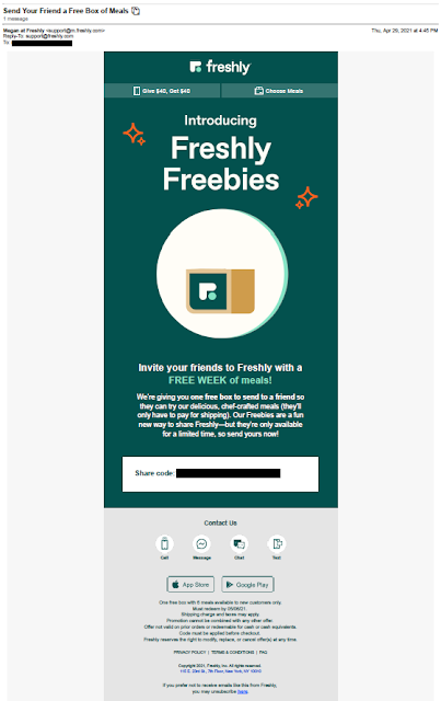
Freshly referral / share email
Freshly email to customers inviting them to share


Freshly is a meal subscription service. It offers reasonably healthy, pretty fresh refridgerated meals that can be prepared in the microwave in about three minutes. Personally, during the pandemic lockdown, it helped me have several quick, tasty lunches between Zoom meetings. They've offered a referral program since as long as I've been a customer (at least I think so -- during the lockdown, one business day sometimes faded into the next). 

This offer is a bit different. The email recipient, a current customer, is given a "share code" to send a Freshly Freebie to someone who can get a free week of meals. Nice; however, there is no explanation of how to share. The email lacks an explanation of what I or that special someone needs to do to use that share code and enjoy that free food. This lack of explanation puts traction in the customer process of sharing, which reduces the likelihood of customer action.

The offer was sent on April 29 and expires May 6. This means the offer expires only a week after sending. The offer window is appropriately sized for an emailed offer; however, because the expiration date is mentioned only in the disclosure, the attribute of immediacy in the Call to Action is lost. The expiration date should be communicated in body copy, e.g. "Your share code is valid only through May 6, 2021, so be sure to share your Freebie today!"

Lessons:

  1. Your Call to Action should clearly describe the steps required for the customer to take advantage of your offer.
  2. Do not bury your offer expiration date in your fine print. 


2/06/2021

SpotHunter: How to Hunt for Customers

Last week, I received this flyer:

SpotHunter flyer
SpotHunter flyer
1-sided. Copy appears at a bit of a slant

It arrived in a blind envelope addressed to the impersonal "Current Resident." It is obviously marketing mail. IMHO, it has all the makings of low-end j--- mail. (I'm not writing out the word because I avoid inappropriate 4-letter words on this blog.) The envelope appears impersonal, it has no return address, and it includes a spotty-looking postage permit stamp. 

SpotHunter Outer Envelope
Simple Blind Outer Envelope.
No return address.

I opened it because, well, I love direct mail marketing. But would a typical consumer open it? I don't think so. I noticed several of the same pieces -- addressed to "Current Resident" at other units in my building -- placed in a well-named trash receptacle located in the mailroom.

Mailroom Trash Receptacle
(Inappropriate 4-letter word blacked out)

Inside, there is an impersonal flyer for an app called SpotHunter. The headline reads "Have Trouble Finding Open Street-Parking? Let Us Help." In this context, the hyphen between "Street" and "Parking" is improperly placed. Plus, there's no period at the end of the headline's second sentence. These types of errors may appear minor; however, this type of errors often subconsciously distracts readers from the content and reduces confidence in the product itself. That is a minor Fail for Creative.

Overall, the flyer appears to clearly convey a message: Use this app to find parking and help other people find parking spots. 

Is this really going to work? I don't know. What I do know is that in most of New York City, open parking spots are hard to find and disappear quickly. New Yorkers get into fist fights over parking spots. Even if an app yells "There is an open parking spot 3 blocks away!", the spot may not be open when the driver arrives there two minutes later. And let's not forget that touching your mobile phone while driving is illegal in New York. So, if one cannot utilize the app while driving and a driver cannot expect that a spot appearing on the app is truly available, how useful is it? I guess the app needs scale to be useful; however, the more people that use the app to find parking, the more people are going to go after that precious parking spot a few blocks away.

Well, I can't try out the app -- for me, it is currently useless. It is available only on iPhones, and my phone uses the Android operating system. In fact, about half of the mobile phones in use today are using the Android operating system. So, upfront, half the people who received the mail cannot use the product. That's a Fail for Targeting.  

Given that it appears  everyone in my Queens building received the flyer, I assume SpotHunter carpet-bombed the neighborhood. That's another mistake, because many people in Queens do not have cars. They use mass transit to get around. According to NYCEDC, 62% of Queens residents have cars. In my neighborhood, that percentage is closer to 40%. So that means about half of the 40% people receiving the mail cannot use the product, e.g. 80% of the mail is truly j---,  furthering the Fail for Targeting.

If I were responsible for a marketing campaign for SpotHunter, I would first suggest not using direct mail. Consider perhaps a guerrilla marketing campaign such as placing flyers on cars parked in the neighborhood. Annoying, yes, but at least you are reaching people who have cars to park. A highly geotargeted online effort could also be a good use of limited spend. Some social media platforms allow you to target people who self-identify as having cars. Or consider targeting based on attributes likely to be associated with car use. Then segment down to the type of operating system being used. 

If I were required to utilize direct mail without targeting, I would:

  • Create a simple postcard that conveys the sales proposition. One side would include the headline benefit statement with a visual supporting message, while the address side would include supporting benefit statements and the call to action to Download the app for free.
  • Or, create a flat and geographically target homes with residents likely to benefit from the app using the USPS Every Door Direct Mail tool.
  • Drop mail as soon as the app is available for Android.

Lessons:

  1. Make sure your content is free of grammatical errors.
  2. If your app is available only on an iPhone, you are missing half the market.
  3. If your mail has a simple message, consider a postcard rather than a flyer in an envelope.
  4. If you are targeting geographically rather than individually, consider using the Every Door Direct Mail service from the US Postal Service.