Showing posts sorted by date for query call to action. Sort by relevance Show all posts

10/25/2020

Caviar: What Is It?

Two postcards arrived within a day of each other. One includes elements that can make direct mail successful; the other Fails in multiple ways.

freshdirect new customer offer

freshdirect new customer offer

This postcard from freshdirect reflects smart use of these elements, specifically:

  • Targeting: No one at the targeted home has purchased from freshdirect. The targeted home is in a freshdirect delivery area and in a zip code where overall use of grocery delivery has increased.

  • Offer: There is a new customer incentive of $25 off the new customer's first purchase, -- a good reason to to give freshdirect a try. Plus, the offer is valid for about three weeks from the postcard's in-home date, motivating that customer to take action right away.

  • Creative: The 5 1/2" x 10 1/2" postcard clearly communicates its sales proposition both visually and in prose. One side of the postcard succinctly communicates the service provided, and even includes a tag line to reinforce the sales proposition. The address side includes the call to action and supporting benefits messages. The incentive is unambiguous -- at a glance, the reader knows what it is, the value, when to use it, and how to take advantage of it

  • Timing: Mid-October is likely the last time of year to mail and avoid the oncoming clutter associated with holiday catalogs and other gift-related mailings.

  • Execution: The postcard was printed with spot varnish to protect the pictures from appearing scuffed.

  • Tracking: The new customer incentive includes a promo code for the customer to use. This promo code facilitates the customer discount, but it also allows freshdirect to track the customer's path to becoming a customer. This means freshdirect can reasonably assume it was the postcard that motivated customer action.

Well done, freshdirect!

On The Other Hand ... 
The below 6" x 11" postcard from caviar is physically larger than the one from freshdirect, yet it communicates much less. From looking at the postcard, can you answer the question: What is caviar? 

caviar new customer offer 10/2020

caviar new customer offer 10/2020


OK, its a food delivery service -- but what kind of food delivery? Does it deliver meals and groceries like freshdirect, in-home food kits like Blue Apron, or perhaps single-person prepared meals like freshly? From the pictures of the kale salad and what I now think may be a poke bowl, I couldn't tell, but a google search revealed that caviar is a delivery service specializing in meals from high-end restaurants. So, I guess it's more like seamless.

According to their snippet on a Google search caviar offers, "Delivery & takeout from the best local restaurants. Breakfast, lunch, dinner and more, delivered safely to your door."  There you go: a brief, succinct explanation -- one that should have been included on the postcard. The snippet also mentions, "Now offering pickup & no-contact delivery.That is an important supporting message during this pandemic that should also appear on the postcard. The lack of a sales proposition and supporting messages is a Fail for Creative. The postcard has plenty of white space, so why not use it?

Also, it takes a pair of reading glasses to review the disclosure noting that this offer is good through December 7, approximately eight weeks after the postcard arrived. That response window is too long to encourage what is typically an impulse decision: namely, what to have for dinner tonight. This wide response window merits a Fail for Offer.


caviar postcard disclosure text 10/2020
The caviar introductory offer is not valid for DoorDash customers.
It expires eight weeks after arriving in home

That fine print also leads to meriting a Fail for Targeting. The recipient is a regular DoorDash customer, making that person ineligible for the discount. 

wondered why a meal delivery service would make customers of a different meal delivery service ineligible for a discount. In my research, I learned that DoorDash had bought and integrated caviar into the DoorDash network several months ago. Here in New York City, the integration did not go well

For the postcard recipient's mailing address, Caviar offers delivery from only 17 restaurants. That’s a small number compared to DoorDash’s 398 restaurants. (Furthermore, all 17 of Caviar's restaurants were inclusive to those available through DoorDash.) This lack of compelling selection might merit another Fail for Targeting.

There is no reason to expend the cost of sending mail that does not communicate a sales proposition with an invalid, non-urgent discount offer to a home that has limited purchase opportunities. If DoorDash continues to waste marketing dollars like this, caviar's days are numbered. 


Lessons:
  1. When soliciting new customers, communicate a compelling sales proposition.
  2. A response window should be long enough to give a customer time to respond, but not so long that immediacy is discouraged.
  3. Mail your offer only to customers who might be eligible to take advantage of the offer.

10/12/2020

Merrell: Well-timed offer lacks expiration clarity

A recent conversation at home went like this:

Me: "Hey, honey, did you say you needed new hiking shoes?"

Wife: "Eventually. Mine are starting to wear. Why?"

Me: "We got an offer in the mail from Merrell for 25% off footwear."

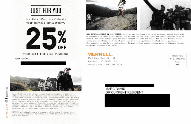
Merrell One Year Discount Offer

Merrell One Year Discount Offer - 25% Off

Wife: "Well, I do like Merrell, but I don't plan to use hiking shoes in the next few weeks. Maybe I should get replacements now with the discount. When does the coupon expire?"

Me: "It doesn't say."

Wife: "Really?"

Me: "I'll look closer." (Puts on reading glasses.) "It says it expires '30 days from postmark.'"

Wife: "When is that?"

Me: "I don't know. It's not postmarked."

Wife: "Well, whatever, I don't need new hiking shoes right away and I'm pretty busy right now."

This conversation outlines why the postcard merits a Fail for Creative

On September 13, 2019, I purchased a pair of Merrell Moab 2 hiking shoes. They are perfect for that outdoor hike around the lake, through a park or in the snow. The postcard arrived October 2, 2020, just a little over a year after I started wearing my previous purchase. So, the timing and messaging around my "Merrell anniversary" are spot on. Kudos to Merrell for Timing.

The postcard included a personalized coupon code for 25% savings; however, there is no mention in the headline regarding when the coupon code expires. I found some information in the disclosure.*

Merrell One Year Discount Offer - 25% Off
Postcard disclosure text

As I wrote in prior blog posts such as this one and this one, a Call to Action should include a clearly communicated offer expiration date. This is important: The right response window encourages immediacy of customer action; one that's faulty or unclearly defined, however, only encourages inertia.

With the Merrell postcard, the coupon code's expiration date is not only buried in the disclosure, it also references expiring "30 days from postmark"; however, there is no postmark. Postcards mailed Standard Rate are not postmarked by the USPS. So, how do customers know when the coupon code expires? They don't.

There are several ways to care for expiration date communication without jeopardizing the integrity of the message, diluting Merrell's branding or adding production costs. Here is one: Include an offer expiration date in the address section of the postcard. 

Merrell postcard mock-up, modified to add expiration date
Mock-up. I added the expiration date in the address panel

In the above mock-up, the coupon code expiration date is clearly communicated. The date is specific and reasonably prominent. The messaging complements the headline and supports immediate action. It can be inkjet- or laser-personalized using the same variable data method as the producing the coupon code and customer name and address. Depending on the postcard's production method, it could appear in spot color without incremental print expenses.

If Merrell adapts this approach, the only incremental edit would be to rephrase the disclosure to reference the expiration date in the address panel.

Lessons:

  1. Your call to action should include a clearly communicated, definitive offer expiration date.
  2. Postcards mailed Standard Rate are not postmarked.


* Many people mistakenly refer to small print associated with marketing communications as a disclaimer, when in fact it is a disclosure. According to dictionary.com, a ‘disclaimer’ is “the act of disclaiming; the renouncing, repudiating, or denying of a claim; disavowal” while a ‘disclosure’ is “the act or an instance of disclosing; exposure; revelation.” ‘Disclose’ is defined as “to make known; reveal or uncover” From a Marketing standpoint, a disclaimer is an admission that the headline is false – otherwise why renounce it? However, a disclosure provides secondary but relevant facts of an offer. So the only reason an offer or marketing communication would require a disclaimer is if it was misleading from the onset.


10/02/2020

PayPal: Selling Honey Requires a Key Ingredient

   This recent email from PayPal merits a couple Fails for Creative

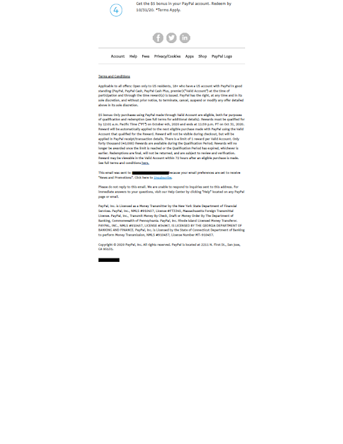
PayPal Honey Offer. What is Honey?
PayPal Honey Offer. What is Honey? 

The email includes a Subject Line of "Get a $5 bonus for shopping smart with Honey." The headline reads "Give Honey a try. Spend $10, Get $5." Below that is a gif of a small box parachuting into a celebration, followed by a message reading, "When you add Honey to your browser for the first time, create an account, and spend $10 or more with PayPal, you'll get a $5 bonus. That's just the start of the savings. Honey members save over $126 annually." Below that are step-by-step instructions about how to install and use Honey, and a disclosure.

There is a clear Call to Action and an incentive for the customer to take action now. The email was sent on September 25 with an offer expiration date of October 4, so immediacy is encouraged. 

But, what is HoneyWhy would I add it to my browser? How do honey members save money, and compared to what? None of these questions are addressed in the email.

Based only on the email, one might guess that Honey is a rebate program or online savings account. In actuality, though, it is an online coupon provider. According to their home page, "Honey helps you find some of the best coupon codes on 30,000+ sites." That is Honey's value proposition, and it is missing from this email.
The other Fail is less important, but worth mentioning.  According to the disclosure and the detailed Terms & Conditions found on Honey's site, only 40,000 customers are eligible for the award. Once that limit is reached -- even if before offer the expiration date -- the reward will no longer be available. This type of restriction is fairly common in direct-to-consumer marketing. I've included number-of-customer limitations in several campaigns to ensure the product is not oversold or to cap potential incentive liability. When I did, I would use this clause to my advantage by communicating it in the body of the email. PayPal could do this by including above the Call to Action a message along the lines of...

Be one of the 40,000 people to get your $5 bonus by October 4th. Bonus must be used by October 31st.* 

or ... 


This exclusive bonus offer is limited to the first 40,000 people to take action by October 4th. Bonus must be used by October 31st.* 

This type of messaging approach not only makes the in-house lawyers happy by clearly communicating an offer restriction; it also communicates scarcity, which is a known factor to drive immediate action and increase response -- and that makes your manager happy.


Lessons:
  1. It is not enough to have a call to action and encourage immediacy in your direct-to-consumer emails. They should always include a value proposition.

  2. If your offer is limited to a specific number of customers, do not bury that restriction -- use it to your sales advantage.

9/16/2020

Upstep: Labor Day Sale Ending, Then Starting

Last year, I wrote about Upstep's 9/11 "Patriot Day" sale on custom orthotic insoles. This year, Upstep had a Labor Day sale. While not as distasteful sale as last year's, their recent series of emails merits Fails for Creative and Timing.

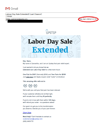
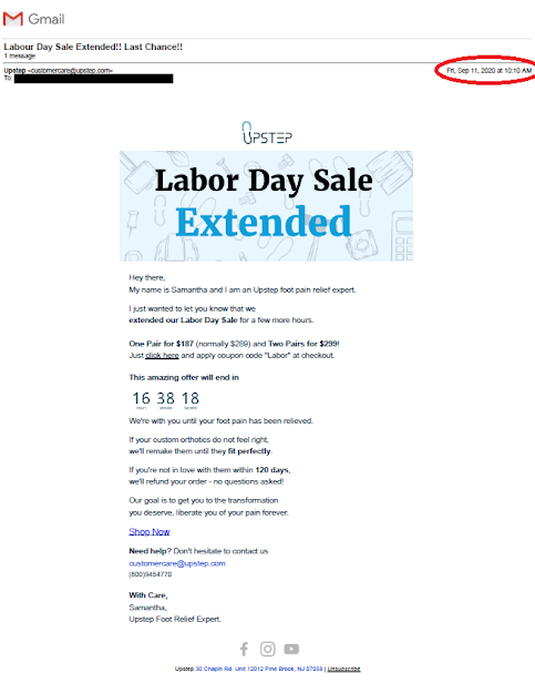
The first email arrived Wednesday, September 2, with the Subject Line "Labour Day Sale Extended!! Last Chance!!"
Upstep Labor Day Email 1

Not only did it arrive a few days prior to Labor Day, the header opens with "Labour". While that is not necessarily a misspelling, it is rarely spelled as such in the United States (where this reader and presumably the company is located). However, the body of the email spells the word as "Labor". So, the spelling is even consistent within the same communication. 

The phone number appears in the style of (xxx) xxxxxxx. It is missing a dash after the third digit. That does not align with the style recommend by google and elsewhere for U.S. phone numbers.

Furthermore, the email communicates a Labor sale being extended prior to there being an email communicating that the sale was starting.

Upstep's second Labor Day email arrived Saturday, September 5:
Upstep: Labor Day email

The timing is on point. However, the graphics (which appear better aligned with Independence Day) do not seem to match the timing. Perhaps a picture of a family picnic or a person standing in front of a barbecue grill would be more relevant -- and the representation of a person standing up in comfortable shoes would tie to the product proposition.

The phone number in this email appears in the style of xxx.xxxx.xxx. While I've often seen phone numbers with the format of xxx.xxx.xxxx, I've not seen one where the second dot is after the seventh digit.

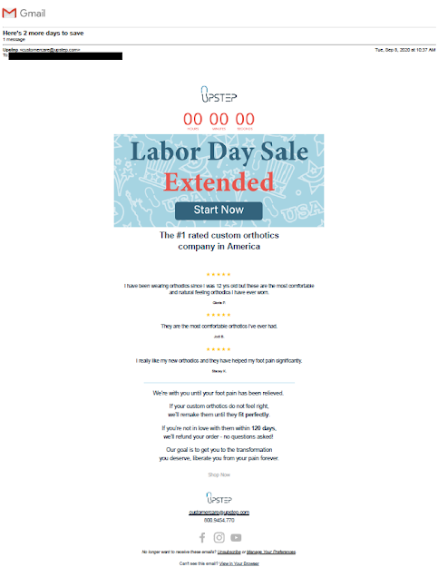
The third Labor Day Sale email arrived the day after Labor Day, Tuesday, September 8:
Upstep: Labor Day Sale extended

The Subject Line is "Here's 2 more days to save". OK, grammatically off a bit, but not a bad use of immediacy and scarcity of time when offering savings.  The Call to Action of "Start Now" is odd, thought, because there the body of the email lacks supporting copy to explain what a customer might be starting.

Again, the phone number is in the unusual style of xxx.xxxx.xxx. 

The fourth Labour, er, Labor Day Sale email arrived Friday, September 11:
Upstep: Labor Day Sale email #4


This appears to be almost identical as the first email on September 2. The Subject Line, copy, and even the phone number style are the same. 

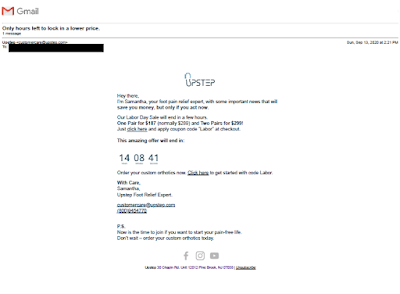
Upstep's fifth Labor Day Sale email arrived Saturday, September 13:
Upstep: Labor Day email #5

The phone number appears in the style of (xxx) xxxxxxx. Dashes, anyone?

Only the fourth and fifth emails provide a street address for Upstep -- 30 Chapman Road in Pine Brook, NJ. I looked it up on Google Maps, and it appears to be a light industrial complex. There is no mention of Upstep (or an agency acting on behalf of Upstep) being located here. This seeming lack of transparency might give pause to potential customers who are researching the company

In countries other than the United States, Labor Day takes place on different dates. Did Upstep get confused about when it happens in the U.S.? Is "Samantha," the person mentioned in some of the emails, a real person not originally from the States? I can only speculate about whether the writing style is international or just sloppy. Recipients might ask themselves those questions and hesitate to purchase from the company.

Is this nitpicky? Perhaps. But, when timing details are missed and unfamiliar communication styles are used, a reader is less likely to trust the content of the marketing communication and make a purchase.

Lessons:
  1. When having a holiday sale, time your emails appropriate to the holiday and use imagery appropriate to the holiday. 

  2. Your writing nomenclature, including phone numbers, should be appropriate to the local market.

8/30/2020

Mr. Cooper: Sloppy letter

This letter from home loan provider Mr. Cooper merits multiple Fails for Creative.

Mr. Cooper home loan offer letter
"Pre-Approval" Letter


The letter opens with a headline reading "You're Pre-Approved* for a New Home Loan." Then, the first sentence after the salutation reads, "Whether you're bying a home or refinancing ...Those two bits of copy don't align, which can be confusing. If Mr. Cooper is offering a new home loan (as stated in the salutation), then why the quick change to refinancing in the sentence immediately following? If Mr. Cooper is offering pre-approval for a home refinancing, why not have a headline reading "You're Pre-Approved for a Home Loan" without suggesting the pre-approval is restricted to the purchase of a new home?

The letter's Call to Action is to contact Mr. Cooper's call center. These days, many call centers are open 24/7. Mr. Cooper's hours, however, are limited to 9-14 hours a day, Monday - Saturday. Fair enough. Home loan purchasing is not like auto insurance, where you might want Jake from State Farm to take care of you in the middle of the night. However, the call center hours are hard to find on the letter. They are located under the company's address, when they would be more appropriately positioned near the phone number the reader would call.

The letter contains several grammatical and formatting errors. Some examples:
  • There are three problems in this one sentence: "Call today to see if your could lower your monthly payment, payoff your home faster, pay less interest or other loan benefits.
    • The diction is incorrect in that a person does not place a phone call to "see" something. A person places a phone call to "hear" or "learn" something.(Had there not been other errors in the same sentence, I might have passed this off as a copywriter's creative style.)
    • The sentence lacks parallel structure in that the reference to "other loan benefits" lacks a verb.
    • The word "payoff" is improperly applied. As written, "payoff" refers to bribing someone. The sentence should have used the term "pay off," written out as two words.

  • In the line listing call center hours, there is an extraneous space at the front of the line.

  • For readability, that same line should include commas after the days of the week, e.g., "Mon - Thu, 7 am - 9 pm CT..."

  • In the opt-out box at the bottom of the letter, the word "pre-screen" is treated inconsistently -- once with a hyphen and twice without.
If potential customers see so many errors in a business's one-page letter, why would they believe the business is capable of properly handing a mortgage application or that the business could accurately prepare required documents for a home sale closing?

In other words, Mr. Cooper needs to clean up his act.

Lessons:
  1. The body copy of a marketing communication should support the headline.
  2. Include your call center hours in context.
  3. Proofread your communications for language and grammar. 
  4. Ensure your formatting is consistent and your letter is visually clean.

7/06/2020

PenFed Credit Union: Not Military Precision

I recently received this solicitation from PenFed Credit Union, whose formal name (according to Wikipedia) is Pentagon Federal Credit Union -- a name that aligns with the company’s pentagon-shaped logo

The solicitation letter is pretty typical for mid-tier credit card providers: window envelope with teaser; letter with Johnson Box; clear Call to Action; Schumer Box; buckslip insert reinforcing benefits and the call to action; and required credit prescreen opt-out notice.


PenFed Federal Credit Union


The first line of the disclosure on the front of the letter reads, “To receive any advertised product, you must become a member of the PenFed Credit Union.” I originally thought this might be a Fail for Targeting since I have never worked in the military services or at the Pentagon and thus, I thought, would not be eligible for membership. The letter itself does not mention membership criteria, and I also could not find a mention on the main pages of their website or their sitemap. I did, however, find some information about membership eligibility from third-party websites such as on WalletHub; from there, I returned to a page that listed Affinity Partners

On affinity partner pages such as this one related to the American Red Cross, there is some copy that reads:

"Congratulations! As an employee, retiree, or volunteer of the American Red Cross you are eligible for PenFed membership! How does PenFed define volunteer? A volunteer is anyone who provides time, talent, or treasure. Time is the hours volunteering for the organization, talent is the unique skills a volunteer brings to the organization, and treasure is both financial and blood donations."

Aha! I am eligible for PenFed Credit Union membership because I supported the American Red Cross. Perhaps the Red Cross shared my contact information with PenFed in hopes that I would become a member and the Red Cross would receive some benefit for the referral. If I am correct -- and, perhaps even if I'm not -- the letter merits a Fail for Creative because the letter lacks an explanation of membership eligibility. 

The letter should explain membership eligibility and how broadly they define it. Even a couple lines along the lines of "We support people who serve the military but also offer membership benefits to tens of thousands of other people who support the military or one of our affinity partners." Or, if I received this offer because of my history of American Red Cross support, why not call that out? Touting affinity relationships helped make MBNA America successful -- perhaps that approach could work for the credit union.

At the very least, PenFed should add a page on its website explaining membership criteria -- a page that is indexed by Google, easy to find and easy to understand. This easy-to-find page on Affinity Federal Credit Union's website is a good template.

Also, is this offer a Fail for Timing? According to CNBC and other news sources, many banks are cutting back on balance transfer offers during these extraordinary times. Perhaps the credit union has a contrary view of where the economy is headed. Or, maybe it has reviewed its current membership pool and credit prescreen criteria and has taken a different view of credit default risk. Or, maybe the credit union had planned this campaign long in advance, and just decided to move forward.

Lessons:
  1. If soliciting members for your credit union's credit card, include language that suggests the person is not only eligible for the credit card, but also eligible to join the credit union.
  2. Membership eligibility for a credit union should be easy to find.
  3. Consider whether a pandemic is a good time to offer 0% balance transfers.

6/06/2020

Affinity Federal Credit Union: Visa Email Not the Best Fit

When you join a credit union, you can remain a member regardless of what happens to your original qualifications. That is the case with me. My first job out of college was at AT&T. I used my first paycheck to become a member of the AT&T Employee Federal Credit Union at their on-site branch. A month later, I applied for and received their Visa credit card.

I left AT&T but remained a member of its credit union. A few years later, the credit union expanded its membership criteria and rebranded as Affinity Federal Credit Union (AFCU). I have watched over the decades as the credit union’s marketing communications evolved from simple and homely to complicated and flashy. Sometimes, their complex messaging leads to ambiguity and confusion.

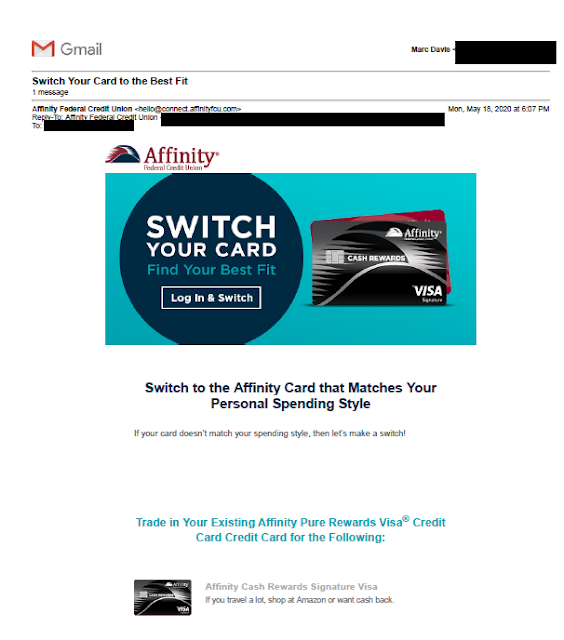
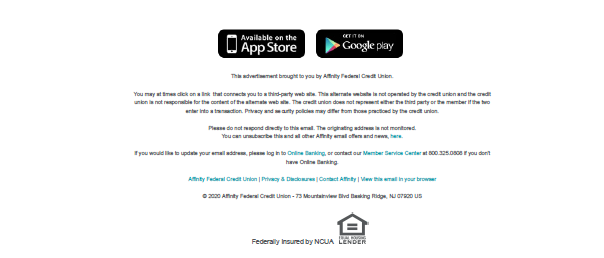
For example, I recently received this email selling a change from my current Affinity Pure Rewards Visa Credit Card to an AffinityCash Rewards Visa Signature Credit Card. My current Visa card offers the equivalent of 1% cash back on all purchases, plus up to an additional 5% on purchases made through their online portal. The Signature Card earns – well, based on the email – something that matches my personal spending style. Huh?
Affinity Federal Credit Union


The Subject Line reads, “Switch Your Card to the Best Fit.” The headline in the email reads “SWITCH YOUR CARD / Find Your Best Fit” – suggesting I might be able to compare cards. The first Fail for Creative is the contradiction between the Subject Line and email content. The Subject Line implies that the Visa Signature Card would be my best fit; the Headline implies that I need to find the card that is my fit; then, the Subhead suggests that the Visa Signature card is meant for me. The card should either be good for me or not – pick one.

It turns out that I have to find the card and work hard to find the link to make the switch.

The email’s links to “Log In & Switch” do not lead to a comparison page. They lead to the credit union’s general customer login page. From there, I have to log in; scroll past my account balances, my pre-approved auto loan offers, a solicitation to consolidate outside accounts, an offer to track all my purchases by category, and a review of my rewards points balances and rewards available; and find a link in 12-point font reading, “Switch My Credit Card.”

This is a Fail because the offer requires substantial customer effort to respond. Granted, the email explains part of this process, but that only partially mitigates the friction present in the transaction. Furthermore, there is not an easy way for me to compare my current card to this new one. Which benefits are the same? Which ones are different? What benefit might the customer lose by making the switch? 

If I haven’t given up and I manage to click on the “Switch My Credit Card” link, this confirmation screen appears:

Affinity Federal Credit Union

This confirmation screen is the first point in the customer experience that mentions specific product benefits. The product description reads:

Unlimited cash back with no annual fee. Earn up to 5% cash back on all purchases, including bookstores like Amazon.com, access 24/7 Visa Signature Concierge, cell phone protection, travel benefits and more.

This sales message is another Fail for Creative. Overall, the sales message is fairly incoherent, with a confusing string of dependent clauses.

It is sparse and written poorly. Let’s break it down:

  • “Earn up to 5% cash back on all purchases”: What does “up to” mean? Do I have to meet a purchase threshold to earn 5%? Does 5% apply only to purchases up to a threshold amount? Or is some other dynamic in play?
  • “…including bookstores like Amazon.com”: Amazon is not a bookstore. It is a shopping site that sells just about everything you can have shipped to you, digital services, even house cleaning. Does this phrasing mean I would earn up to 5% cash back only on books? Or on anything purchased on Amazon.com? The Amazon app is not a dot-com. Are those purchases eligible? What are “bookstores like Amazon.com”? Does that include books on barnesandnoble.com? What about jigsaw puzzles on barnesandnoble.com? Does it include my local brick-and-mortarbookstore? What about books on target.com?
  • “Cell phone protection”: What does that mean?
Another Fail for Creative is the lack of information in the customer email. With some active research, I was able to learn that the card offers 5% cash back at “all bookstores, including Amazon.com” (whatever that means); 2% cash back at restaurants, gas stations, and supermarkets; and 1% on other purchases. These are substantial features that should be included in the email to help explain why the card fits my lifestyle. 


I was able to find more information on this product sales page. It appears to have some explanation of what “bookstores, including Amazon.com” means. If I understand the footnote…
2 Cardholders will earn 5% cash back (which is equivalent to 5 points for every $1 spent) for purchases made at Bookstores, which also include purchases made at Amazon.com on up to $3,500 per month in purchases, excluding gift cards. Please note that these bonus categories are categorized by specific Merchant Category Codes. Not all merchants may use the specific qualified transactions codes. The additional points may not be issued, if the merchant does not use a qualified Merchant Category Code.
…a customer earns 5% cash back at Amazon.com and at all bookstores. If so, why not state that outright? Or perhaps simplify the offering and make it applicable to only Amazon.com, as Discover Card does in its quarterly calendar?


The same page mentions the feature of cell phone protection as an exclusive “card-holder” benefit:
Affinity Federal Credit Union

There are two Fails here. The first is grammatical: “card-holder” is not hyphenated. The second is that there is no explanation of features related to this benefit. What does "cell phone protection" mean? How is a cell phone protected? Are there incremental requirements to get this protection? My supposition is that AFCU’s protection is similar to Wells Fargo’s cellular telephone protection; however, this is merely a guess. I cannot find details anywhere on the ACFU website. While I’m not a fan of having numerous disclosures in a marketing communication, an explanation and details should be available to the customer.

Lessons:
  1. The content of a marketing email should complement the Subject Line.
  2. Marketing communications should explain at least some product features to support benefits messaging.
  3. Marketing emails should have a simple call to action.
  4. A customer's online sales journey should start with supporting the email sales message, then quickly and easily bring the customer through the sale.
  5. Amazon is not a bookstore.
  6. Proofread your content.
  7. If you message a product feature, make available a clearly communicated explanation of what it means.

4/05/2020

Santander Bank: Creative Improvements, Lousy Timing


Last May, I wrote about a postcard I received from Santander Bank that merited a Fail forCreative because it promoted an incentive but lacked a conspicuous explanation of how to earn the incentive.

Santander Bank self-mailer
Cover panel
Santander Bank self-mailer
Address panel


Santander’s small roll-fold self-mailer that I received on April 2 here in New York City, however, includes elements lacking in last year’s postcard.

Santander Bank self-mailer
Offer Panels


This recent self-mailer includes a clear call to action. In fact, performing the desired action comes across as easy as 1, 2, 3.  The self-mailer includes a conspicuous explanation of what is required to enjoy the $300 incentive, with supplemental information in the disclosure. There is adequate space for benefits messaging, an easy-to-read Promotion Code, and the location of the nearest branch.

Santander Bank self-mailer
Promotion Code and Bank Branch Location


However, as I write this, the nearest branch listed on the postcard has been closed for two weeks because of the COVID-19 pandemic. More than two thousand people in New York City have succumbed to the virus. The Big Apple is in lockdown. Is this really when a consumer might consider switching the bank where their paycheck is deposited? Many consumers around here won’t even have a paycheck in a couple weeks; many others will be deceased.

So, this self-mailer is a Fail For Timing. At the very least, it can come across as callous. But should one blame Santander? It could be that the self-mailer was mailed before things got bad. When mailing Standard Rate, there is a lag time between maildrop and in-home date – sometimes a few business days, sometimes a few weeks. As we’ve seen, the world can change a lot in that short time.

Several years ago, I launched a direct mail campaign offering prospective customers around Philadelphia savings on their electricity supply costs. Unfortunately, Hurricane Sandy started up the East Coast after the maildrop. The mail reached the target market while the hurricane was disrupting power to many homes. Who knew?

Santander Bank self-mailer disclosure panel
Disclosures updated as of 2/29/20

The disclosure includes an as-of date of February 29, which suggests the self-mailer was printed in early March. If it was mailed prior to March 10, I would say"Who knew?" 

Or maybe the mail dropped closer to March 20, which means the bank knew about the pandemic hitting the United States but decided to mail anyway. If so, a decision should have been made to pull the mail rather than commit an unforced error because – even though the mail had been printed and personalized – the campaign could have been halted. Doing so would have meant postage money could be saved for a better timed mailing, and would have prevented bad optics.

Lessons:
  1. Your Call to Action should be conspicuous and easy to understand.
  2. Sometimes planned marketing efforts can be impacted by unforeseen events.
  3. There are occasions when you may need to pull mail at the last minute. Maintain the decision-making capability and flexibility to do so.


3/31/2020

Coronavirus Guidelines for America: Late and Hard to Read

I received a postcard with “PRESIDENT TRUMP’S CORONAVIRUS GUIDELINES FOR AMERICA.” It was dated March 16 and arrived in my New York City mailbox on March 28.

COVID-19
Coronavirus Guidelines
Mailed Standard Rate
Let’s look at this postcard from a direct mail marketing perspective. The primary objective of the postcard is to motivate people to take action to prevent getting the virus that causes COVID-19, while the secondary objective is to motivate readers to visit coronavirus.gov for more information. It merits a Fail for Creative for a few reasons.
  • White text on a black background is neither easy to print nor read, especially in italics at 9-point font size. 

COVID-10
If you can read the good hygiene tips, you don't need glasses.

  • The Call to Action to visit coronavirus.gov is visually lost.
    • On the address side, below a couple graphical icons, the website is suggested as a place to go for more information
    • On the copy side, it sits in the corner without a description of the site or a reason to visit it. It is in a good location relative to the layout of the postcard—and bold compared to most of the other content; however, the line starting “EVEN IF YOU ARE YOUNG,” with a blue background, is what draws a reader.

Perhaps the small postcard is trying to accomplish too much in too little space.

Lessons:
  1. If your copy is small, make sure you have proper color contrast.
  2. Make your call to action prominent.


[Edit: Removed commontary about postal rate used, as this was mailed EDDM.]

10/15/2019

Vanguard: Beefing Up Security, Beefing Up Customer Emails

Earlier this year, I wrote about an email from Vanguard to customers that included a few Creative Fails. It described some type of transition. This email is an improvement. It applies some best practices to motivate the reader to take action to motivate the reader to take action to set up 2FA, also known as two-factor authentication.


2-factor authentication
Vanguard Security Update email

The email opens in an emphatic tone. It speaks like a communication from Vanguard; that is, the tone fits their their brand identity of taking a stand for investors and treating them fairly.

The second paragraph contains the call to action. It cites a shared responsibility. It explains what is being requested and why.

The third paragraph includes a time-specific call to action. The response window is four weeks -- a bit long in internet time, but fair considering the actions involved.


The fourth paragraph explains (in plain English) what the reader needs to do. Although the call to action is to do something after logging into the Vanguard web site, there is no hyperlink to the login. We may reflexively consider this an error, but it is actually an email security best practice that guards against phishing attacks. 

Finally, there is a polite close reinforcing the cooperative nature of the call to action. 

There are a couple potential minor improvement opportunities. I would consider adding a valediction, along the lines of "Sincerely, Vanguard Customer Service" or perhaps a couple FAQs. But these are based on my intuition and outside understanding of the target market. In the best possible world, if timing allows, an A/B test could be executed to see which edits would result in improved response.

Lessons:
  1. When communicating with customers, your communications style should be aligned with your brand.
  2. Requests to your customers should be date specific.
  3. A/B test every communication as feasible.


9/24/2019

Simplisafe: The Story Is About Apartments. The Mail Is Not.

Many companies have a story connected to their foundation — often explaining what inspired the CEO to create the company. And, no, the inspiration is not, "To make a boatload of money." At SimpliSafe, the story begins with a robbery:
After his friends were robbed, Chad Laurans discovered a serious problem in the home security industry. No one was protecting renters. Alarm systems needed a ton of hardwiring and came with pricey long-term contracts that couldn’t be canceled. So Chad built something new.
This story about Chad Laurans's inspiration is quoted from SimpliSafe's page focused on apartments, located here. The same page includes a sales message referencing apartment protection:
Now SimpliSafe is the fastest growing home security company in the nation. SimpliSafe won’t lock you in a long-term contract and 24/7 professional monitoring is only $14.99 a month. Protect your apartment—the smart way.
So it would appear that Mr. Laurans understands the needs of people who live in apartments for adequate security.  That brings us to a postcard mailed to apartment homes and what I believe is a Fail for Targeting and Creative.


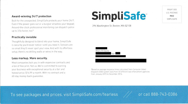
SimpliSafe Solicitation - Sales Side
Lead Generation Postcard

I live in a co-op apartment building, which typically consists of units that resemble apartments. Although they are cooperatively owned (rather than rented out) by their residents, these are very similar to rental apartment units in that they are underserved by the legacy home security companies.

SimpliSafe Solicitation - Address Side
Lead Generation Postcard - Address Side


On their website, if one clicks on "Shop Now" either from the home page or the /fearless landing page mentioned on the postcard, the lead product is the most expensive one. Even the "Shop Now" link found on the apartment-focused page leads to several product bundles starting with The Haven for $489 that includes 14 pieces of security equipment including a freeze sensor.

Presuming this postcard is part of a national campaign, a version should have been created specifically for people living in apartments.* The apartment-versioned postcard could support Mr. Laurans’s story by mentioning the need for even small apartments to have physical protection. In addition to communicating a low monthly price, the postcard could focus its limited space to communicating safety, peace of mind, renters insurance discounts, and effortless set-up. The Call to Action would be to a visit a landing page that reinforces service benefits while leading with a product package best suited for apartments. This could be The FoundationThe Essentials, or a similar lower-priced package. After all, many renters don't need water or freeze sensors.

Apartment-centric page - mobile view

SimpliSafe may also want to consider the entire prospect user experience that results from using the postcard as a lead generation device. Above, for example is the Apartment-centric page as viewed on a Pixel 3a XL. Much of the type is too small to read on a mobile device. Other pages in the domain require a reader to scroll left and right — cumbersome on a laptop and an outright hassle on a mobile phone. Mobile use as a percentage of internet traffic continues to increase, even for people in their homes, and especially for young renters. SimpliSafe should consider creating mobile-friendly versions of their site or fully embrace responsive design.

If SimpliSafe's communications are optimized for target market relevancy, this company's story could have a happy ending. To paraphrase a SimpliSafe tagline, that would be "Direct Marketing. Done Right."

Retargeting. Done right.
SimpliSafe Retargeting Ad - laptop view 


Lessons:
  1. When your product has multiple target markets, segment your list selection and messaging to appeal to those target markets.
  2. Maintain messaging consistency and product recommendations relevant to your target market segment all the way through an online sale.
  3. Consider how your content appears on mobile devices.

*It could be that SimpliSafe is segmenting rental-style apartments in their list selection, and I received a piece designed for single-family homes because I live in an owner-occupied unit. Nonetheless, the presence of an apartment number in my address should have been a flag for list scrubbing, segmentation, or at least understanding the nature of co-op apartments.