12/04/2023

GE: UltraFast Postcard Fail

I recently received a postcard from GE that merits several Fails for Content. 

GE One And Done

The front shows an androgynous person in a high-end walk-in closet doing laundry. She is smirking at her laundry machine while either preparing to put towels in or recently having removed them. "This is not just laundry," cries the headline, "This is One & Done."

GE One & Done Wash & Dry

On the address side is a picture of two laundry machines -- presumably run by an app. There is very little copy on this side, only, "Wash + Dry with the UltraFast Combo," with a Call to Action to visit a specific appliance store.

As executed, this postcard has multiple Fails. Let's break down why it was a waste of money.

Confusing Audience

The front of the postcard shows someone in a combination utility room and expensive closet, with more athletic shoes than you can count. The room looks pretty expensive, like it is in the house of a one-percenter. It certainly doesn't look like this is a typical personal using a typical machine. So a typical consumer might look at the person and room and think they couldn't afford whatever the postcard is advertising.

Misleading Product

The address side shows not one, but two machines, visually suggesting that this is a washer-and-dryer combination set. It isn't, through, the picture is actually of two of the same one-piece washer/dryer appliances -- one has a stand. A typical consumer would have to look and think hard to recognize this, but they wouldn't bother. They'd likely look at the postcard fore about three seconds, then toss it.

Uncompelling Benefits, No Urgency

The communicated benefits appear to be the ability to wash and dry by using an app. Maybe that's enough to motivate a consumer to visit a website in the comfort of their own home, but it is not compelling enough to get a consumer to schlep to a store. After all, this is a low-interest category for a major purchase. Why not include an offer, such as $100 rebate for this $2,899 machine if the consumer brings in the postcard within 30 days? Even a modest incentive with a reasonable offer expiration date supports some action.

Incorrect Location

Finally, this postcard gets the store location wrong. The Hoing's Appliance location near me is in Forest Hills, not the Bronx physical address shown on the postcard. In fact, the web address on the postcard is for Forest Hills location, while the Bronx location has a different web address.


Lessons:
  1. Explain your product. Clearly communicate its benefits.
  2. Support your mail with online content to explain your product benefits.
  3. Give the customer a reason to take action soon.
  4. When directing a customer to a physical location, share the nearest location.
  5. Check every URL listed in your mail.
9/29/2023

7-Eleven: Wing Wednesday After Dark

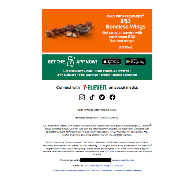
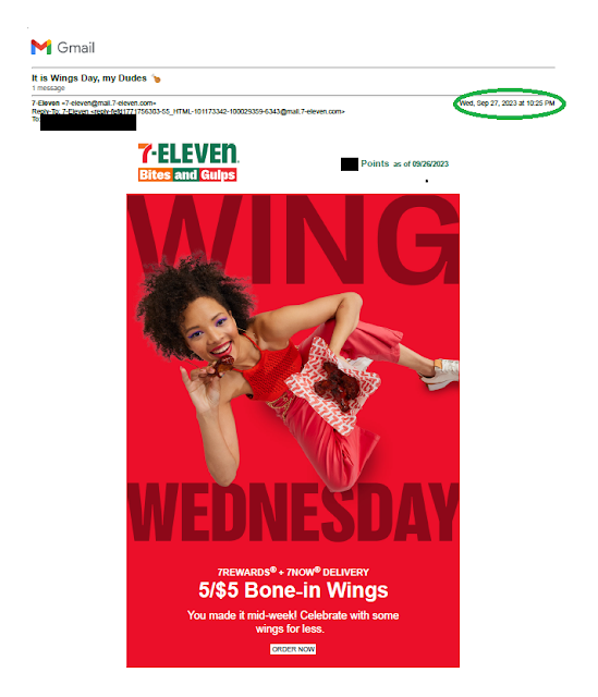
Last Wednesday, I received this email from 7-Eleven touting “Wing Wednesday” with an offer for cheap wings. Is this Mail That Fails?

With a subject line of “It is Wings Day, my Dudes,” it seems like there is a special price on wings that particular day. That impression is bolstered by text saying, “Celebrate with some wings for less.”

7-Eleven Wing Wednesday

7-Eleven Wing Wedensday
Wing Wednesday email

Plus, the picture prominently displays, “WING WEDNESDAY” in the background and body copy touting, “You made it mid-week!” These both suggest that the 5/$5 Bone-in Wings is available only on, well, Wednesday.

But the email was sent to me at 10:25 pm on Wednesday, and no matter how much I might love wings, that seems a bit late in the day to be prompted for a mid-week wing order. So is this a Fail for Timing?

Maybe not. Down in the Disclosures, we learn that the wings offer is valid “thru” 1/9/24. So, it appears that I could enjoy these 5/$5 wings on a Thursday or on any other day over the next few months. Perhaps this is a bit of a Fail for Creative because it might mislead readers into thinking the offer is valid only on Wednesday -- putting a damper on responsiveness.

Finally, is 7-Eleven using “thru” rather than “through” to be informal and relatable? I don’t know.

Lessons:

  1. Align the timing of your emails to your message.
  2. Consider when and where it is appropriate to use informal language.


8/30/2023

Numerix: Your Excitement Is My Boredom

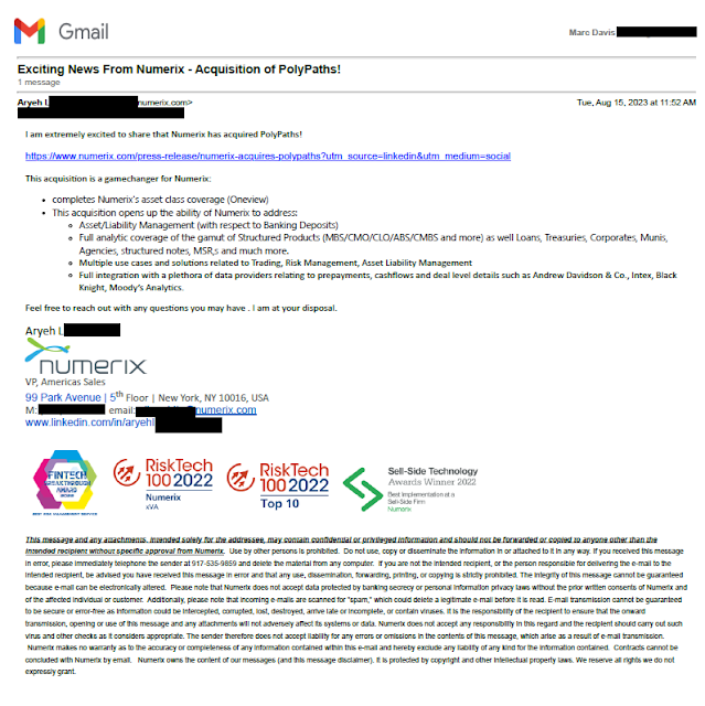
I recently received a B2B email announcing “exciting news,” and it piqued my interest in all the wrong ways -- meriting a Fail for Content and perhaps even for Targeting.

Numerix PolyPaths Announcement

First of all, the email is from someone at Numerix I don’t know and who I’ve never met, contacted, or connected with, and at a company I’ve never heard of. Yet this person sends me an email that opens with “Exciting News.”

Then, the email uses so much financial jargon that even I can’t figure out what it means -- and I work in the financial industry. What does Numerix do? What can it do for me or my employer? I don’t know, but I guess the acquisition helps them address a bunch of stuff I don’t care about.

I guess this is exciting for Numerix but, without any value proposition, this is simply a press release with several typos.

Lessons:

  1. Do not assume your reader knows your company.
  2. Do not assume your customer understands your jargon.
  3. Avoid acronyms.
  4. Use every sales and promotional contact to reinforce your value proposition.
  5. Proofread your communications.

6/05/2023

Hey Abbott! I Wish I Knew Why You Missed Me

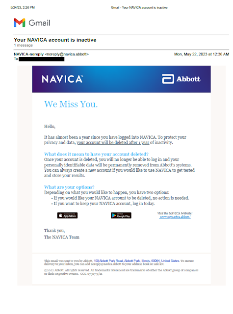
I recently received this email from Abbott, the makers of NAVICA. It merits a Fail for Content.

The email explains that it has been almost a year since I logged into NAVICA, and my data will be deleted after a year of inactivity. What it doesn't explain is what NAVICA is or why I may have had an account. I mean, if I haven't logged in for a year, would I remember what it is?

I'm glad that my data won't be lingering around Abbott's database forever; however, it would have been useful to explain why the information will be deleted.

Here is a potential opening paragraph rewrite:

Hello,

It has been almost a year since you last logged in to NAVICA, the leading digital platform for supporting COVID-19 testing.

To ensure data privacy, we have a policy of deleting customer data after one year of inactivity. This means that, if you do not log in to your account by <date>, your account will be deleted.


Lesson:
Explain your product in every communication, even a customer service communication.


5/25/2023

Chart House: Mom doesn't like it when you're late

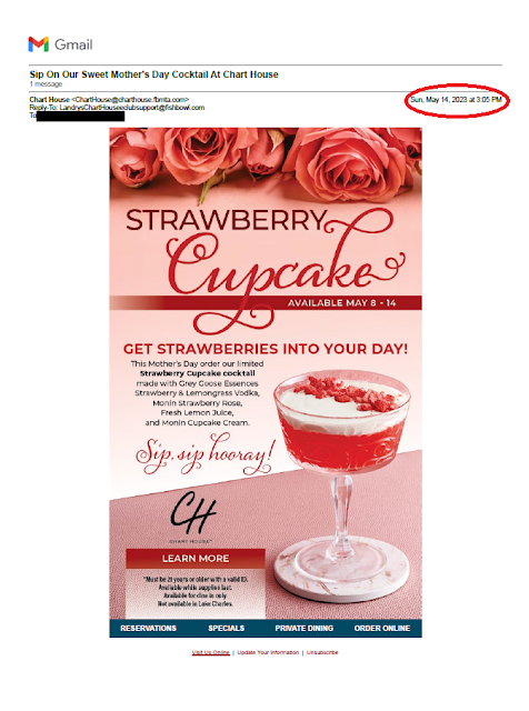
This email from Chart House restaurant merits a Fail for Timing.

Offer for May 8 - 14
Sent May 14, 3:05 pm

If someone takes their mother out to dinner, they plan ahead. It is not a spur of the moment decision. The email should have been sent on May 7 or 8.


Lesson:
An offer for Mother's Day should be sent days prior to Mother's Day, not on Mother's Day afternoon.


3/07/2023

Celebrity Cruises: Too Many Emails!

I've written a few times about Celebrity Cruises' spray & pray approach to email. In 2018, during the weeks leading to a cruise, I was bombarded with emails selling future cruises. The following month, I shared how they had emailed me again and again. Later in the year, I counted more than 200 marketing emails from them.

Celebrity Cruises
So many Celebrity Cruises emails,
so little time to read them

I thought this type of bombardment was a Fail for Targeting. Maybe I was wrong, because they still appear to be taking the approach -- hitting me with 19 emails within a week.

Between March 1 and March 3, Celebrity sent me 10 emails. Eight of them were upsells for my upcoming cruise -- drink package, specialty dining, professional photos, WiFi, etc. Perhaps they could have spaced these out at bit? Maybe? Please? One of the 10 emails was for a semi-annual sale; the other was for cruises to Alaska. If that isn't spammy, I don't know what is. 

None of these emails conveys emotion. How about at least one email that might convey excitement? Maybe open with, "We are very excited to have you abord the Celebrity XXX on XXX. Here are some things to know as you prepare to check in." Perhaps give a reminder to, you know, not forget your bathing suit. 

I can't simply ignore all these emails. One of them is germane to understanding what I need to do to check in and ensure a smooth embarkation process. So, that's one functional email and 200+ that are not useful. (There might be a second important email in the bunch, but I can't find it.) It's like that Beastie Boys song: They can't, they won't, and they don't stop

Maybe when it comes to future sales marketing and upsell, less isn't more in the cruise industry? I don't know! I do know that, by the time I arrive to check in for my Celebrity sea cruise, I'll already feel salty.

Lesson:
Direct marketing isn't only transactional. It's about building a relationship that improves the customer experience. 


AAA: You're in the Driver's Seat

This recent email from AAA Northeast merits a quick Fail for Content

The Subject Line opens with "You're Cash Back is waiting for you." It should open with "Your Cash Back is waiting for you."

Your email starts with "You're"


Lesson:
Proofread every aspect of your marketing communications including the Subject Line.

11/10/2022

Dunkin' Rewards: America Runs on Loyalty Programs With Correct Information

Dunkin' recently overhauled their Dunkin' Rewards loyalty program. Some regular customers are not pleased. Coffee rewards that used to be available after spending $40 on coffee now require at least $50 in spend. The program has also become more complex, with a different points earning formula, monthly boosters and a greater emphasis on food. With greater complexity comes greater risk of error.

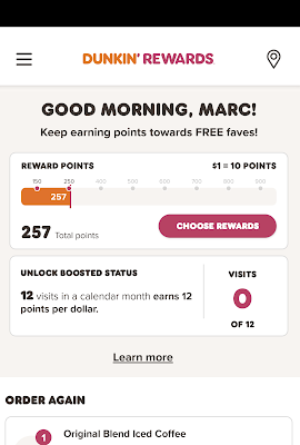
I would describe myself as an occasional coffee achiever. I might stop for coffee early in the morning when walking the dog, but not that often. I currently have 257 points according to my app -- not enough for one free coffee.

Screenshot showing I have 257 points

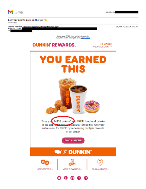
So, imagine my surprise when I received this email. 

Dunkin' Rewards Loyalty Email
Points amount email
34,438 points = almost 69 free coffees!

The points value in the email is not only incorrect, it is outrageously wrong. Why would anyone hold on to 34,000 points?

In a prior role, I worked on a loyalty program mailing that included a mention of a customer's point balance. Here are some of the quality control steps I took:

  1. Verified output data against source data
  2. Verified lettershop proofs against both source data and output data
  3. Requested manual review of customers with points balance more than two standard deviations above the mean against source data. 
Perhaps Dunkin' skipped step 3 above. What they could have done is ask themselves something along the lines of, "Who in the email communication appears to have enough points for more than 10 of the top points item? Should that really be the case?"

Lesson: 

When sending personalized information, verify the accuracy of all variable data including outliers.

10/10/2022

PenFed Credit Union: What's the Point(s)?

 A couple years ago, I wrote about a credit card solicitation I received from PenFed Credit Union. It took some serious sleuthing to understand why I would be eligible for membership. Since then, I've received a few others from PenFed, including this one for a PenFed Platinum Rewards Visa Signature Card.

I received this mailing as someone who isn't a PenFed member, isn't a member of the armed forces, and is someone who knows about PenFed only because of writing this blog. The letter includes a paragraph explaining that I need to become a member to get the credit card. So, it's probably safe to conclude that the mailer's target audience is who don't know much about PenFed.

Their recent solicitation is again pretty typical for a mid-tier credit card provider: window envelope; letter with Johnson Box; clear Call to Action; Schumer Box; brochure insert; and required credit prescreen opt-out notice. Let's break it down.

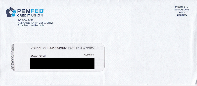
The window envelope is clearly branded. Unlike the one from two years ago, this one does not have a teaser

PenFed Credit Union Credit Card Offer Envelope

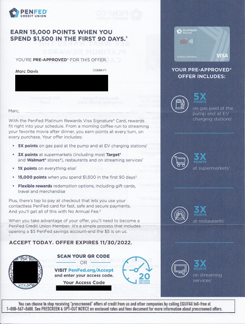
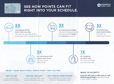
The personalized letter opens with a straightforward Johnson Box message: Earn 15,000 points when you spend $1,500 in the first 90 days. Nice. The letter opens by communicating a benefit that the rewards card works with my lifestyle. I can earn bonus points by doing what I do. I can get 5x points for filling my car's tank -- or even charging my EV, so forward-thinking! -- 3x points for food shopping or eating and doing other everyday stuff, and everyday 1x points for all those other purchases. The points accrual rates are reinforced in the right margin. 

PenFed Credit Union Credit Card Offer Letter

The letter closes with an explanation that I need to become a PenFed Credit Union member to get the credit card. It's a simple process, so all I need to do is scan the QR code or go to their website to get started.

The back of the letter reinforces points accrual and compares it to other credit card providers that offer points, then reinforces the Call to Action. 

PenFed Credit Union Credit Card Offer Letter

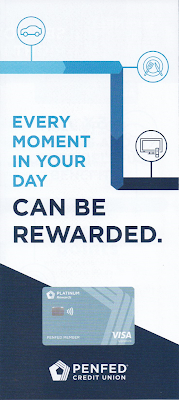
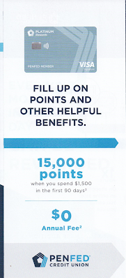
The points proposition is reinforced with a tri-fold brochure reinforcing points accrual rates. It also communicates some secondary perks such as Tap to Pay and Fraud Monitoring, but mainly it's about how all those points can really add up -- and the Call to Action is reinforced yet again.

Brochure Cover


Brochure inset

Brochure inside

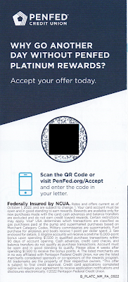
Brochure back

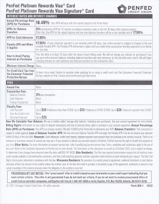
The letter package also includes the legally required Schumer Box and accompanying language disclosing the card product's terms.

Credit disclosures, including Schumer Box

 The back of the disclosures page is blank.
Back of credit disclosures page (blank page)

This isn't a quite a Fail for Creative; however, there are some improvement opportunities: 

  • Consider an enticement for the prospective customer to open the envelope. There should be an envelope teaser that would motivate the recipient to open the envelope. Given that the target audience is non-members (e.g. do not have a relationship with PenFed) this is more important than usual. (The "You're Pre-Approved" message in the standard size window is easily missed.)

  • Since the audience is non-member who don't know them, PenFed should introduce itself. Maybe PenFed has strong brand recognition within the military community; but, since I also received it, they are presumably also soliciting new customers who haven't served. Consider using the Who We Are content from the website and include it on the back of the required disclosures sheet, or squeeze a message in the letter or the brochure. 

  • Share the value of points. There is plenty of space allotted to points accrual, but nothing about how the points can be used. Explain if points can be used for travel, cash back, donations to the USO, or something I might enjoy. Also, the lack of quantification of value can be suspicious. Perhaps that 15,000-point intro bonus is worth less than the 10,000-point bonus with the compared-to American Express EveryDay Credit Card -- or perhaps it takes 20,000 points to get a shiny nickel. 

Lessons:

  1. Think about your target audience. If they are not current customers, help them get to know you.
  2. When soliciting prospective customers, include a conspicuous teaser message to give them a reason to open your envelope.
  3. Communicate benefits. Points are not a benefit. They are a vehicle of earnings toward a benefit. 
  4. Paper is expensive. Don't waste any. Leverage blank space to sell some more.

7/23/2022

Jockey: Late Recognition Of Getting In My Pants

After months of COVID lockdown and isolation, I was finally going to set foot outside of Queens. My wife and I arranged for a weekend getaway upstate at a bed-and-breakfast with plenty of ventilation, air filtration and outdoor seating. It was our anniversary and, pandemic or not, we wanted to make it special. 

We brought masks, gloves, sanitizer, and more sanitizer. I packed a rag and Lysol disinfectant just to give our room a once-over when we arrived. We brought packaged food in case the nearby restaurants were too busy. After confirming all the details and driving north for a few hours, I realized had I forgotten my mother's advice: Always pack clean underwear. Sorry, Mom!

I discovered a Jockey outlet store near our B&B. It had reopened from COVID lockdown the day before our trip. So, on our anniversary, we stopped at the store for a couple pairs of jockeys. The store manager, also wearing a mask and plastic gloves, understood that I wasn't familiar with the brand and helped me pick out something comfortable in my size. 

The manager apologized that not all price tags were up to date as the store was shorthanded and had just reopened. No worries, I said; just ring me up. She asked to put me on the email list with an offer of an instant discount on my in-store purchase. I agreed, providing my email address.

That was two years ago. I haven't purchased anything from Jockey since then. (The underwear is fine; I simply don't need any more.)

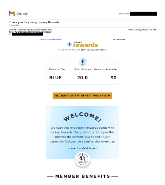
In May of this year, I received an email with a Subject Line of "Thank you for joining Jockey Rewards!

New Jockey Rewards

New Jockey Rewards

New Jockey Rewards
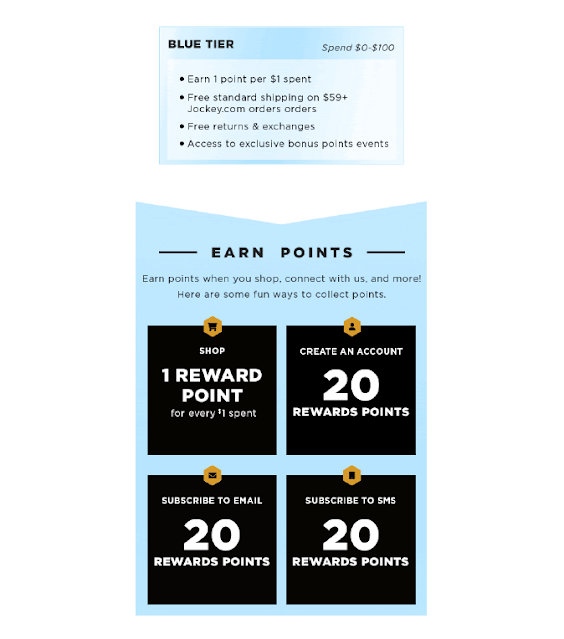
Jockey Rewards Introduction Email, May, 2022

The wording of that subject line makes it seem like I recently joined the Jockey Rewards program, which is not the case. Perhaps giving the manager my email address in that outlet store two years ago had enrolled me in an older version of the program and I had now been auto-enrolled in the current program. This supposition is based on the answer on the Jockey's reward program FAQ:

Jockey Rewards FAQ
First FAQ at jockey.com/rewards mentioning "new and improved rewards program"

So, the program is "new and improved." OK. Perhaps. But since I hadn't just joined the program, better subject lines would include:

Welcome to the new Jockey Rewards!

We've improved Jockey Rewards!

Other than the confusing subject line, the email is nicely done: on brand, communicative, friendly and persuasive. Overall, the email doesn't deserve a Fail for Creative. Perhaps it merits a C+.

Lesson:
Your subject line should be relevant to your customer.


5/25/2022

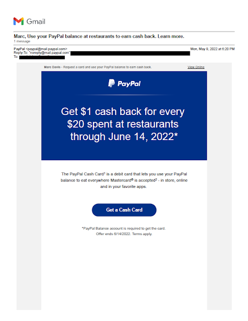
PayPal: Where $1 Cash Back For Every $20 Spent Is Less Than 5%

Since last July, the value of PayPal stock has fallen by about 75%. While many analysts are discussing the company's "fundamentals" and suggesting at what price to purchase the stock, I'm staying away for a different reason -- because they often produce Mail That Fails. 

My first post about PayPal's several Fails was in 2011 when they mailed me a shoddy credit offer. There are a few more, including a recent one about a confusing and poorly targeted Venmo offer. Now, add to my list of PayPal Fails this offer of "$1 cash back for every $20 spent at restaurants." 

PayPal Restaurant Rebate Offer - May, 2022

PayPal Restaurant Cash Card Offer - May, 2022

PayPal Restaurant Rebate Offer - Disclosures

PayPal Restaurant Rebate Offer - More Disclosures
PayPal Cash Card Restaurant Rebate Offer
Received May 9, 2022

Scanning the headline might make you think that going out to lunch four times -- spending $25 each time with your GooglePay app to use your PayPal balance for those lunches -- would earn you $5 cash back ($100 divided by $20 equals $5). But you'd be wrong…twice. The offer requires me to first request a PayPal Cash Card, then receive it in the mail and use it at a restaurant. All within 5 weeks of first receiving the offer – some of which is spent waiting for PayPal to process my request for the card. That's a lot of effort and a short window of opportunity for a small benefit, e.g. a Fail for Offer

PayPal could have easily avoided this by using a rolling offer expiration date. For example, PayPal could require the customer to request the card by a specific date, but then give the customer a reasonable amount of time to use the card after activation, say, 60 days. That would be clear to explain and fair to the customer -- unless, of course, the intent is to make imply the offer is more generous then it actually is.

Which leads me to the actual offer value. I read through the disclosure text a few times, and I'm pretty sure that cash back offer is on a per-transaction basis. So, while each purchase of $25 would be worth $1 cash back and a $100 dinner might net $5 cash back, four lunches adding up to $100 would be worth only $4 cash back. If I'm right, this is a Fail for Offer and Content for being misleading. If I'm wrong, it is a Fail for Content for lack of clarity.

Another Fail for Content lies in the disclosures. It appears this disclosure was rushed and not proofread. Take this paragraph, for example:

"Eligible Purchase(s)": Eligible Purchase is defined as every $20.00 USD spent in-store or onlineusing the Card and finalized by the merchant during the Offer Period (defined below) in thefollowing category: restaurants (according to the Merchant Category Code (“MCC”) assigned byeach merchant, their processor, and the credit card networks. Only acceptable MCCs for this offerare 5812 and 5814). PayPal is not responsible for assignment of MCC codes. As a result, Reward willnot be awarded if the MCC code assigned to a particular merchant does not fall within a restaurantcategory, even if you believe that the merchant is a restaurant. Eligible Purchases do not include:(1) purchases that are marked as “pending” in your Card account as of the end of the Offer Period,(2) purchases made at eligible merchants using a third-party delivery service (3) ATM transactions,(4) gift card purchases, (5) any purchase or portion of a purchase that involves a payment methodother than the Card, or (6) in-store cash withdrawals/cash back. 

Spaces are missing between words. The punctuation is inconsistent. Some numbers in parentheses have spaces before them; some do not. There’s also a missing comma after "service" in the last sentence. 

There are references to "e-mail" in some paragraphs and "email" in other paragraphs. According to grammarly.com, both are correct as long as you use it consistently. PayPal is not being consistent.

These types of possibly misleading offers and unclear communications suggest to me that PayPal's leadership is spending their marketing dollars without full consideration of what they are doing and how they are doing it. As a stockholder, that would frighten me. As a customer, that also scares me a bit. If I can't expect to get a clean offer and clear communication, should I really be trusting PayPal to keep my personal information secure?

Lessons:

  1. Clearly communicate your offer.
  2. Allow your customers adequate time to respond to your offer and benefit from it's value.
  3. Proofread your entire communication, including your disclosures.
  4. Your customers' trust is potentially built or destroyed by every communication.
  5. The debate between "e-mail" and "email" isn't over, but at least pick a side.

5/15/2022

Pacific Magazine Billing: Even a Scam Can Be Mail That Fails

Remember the good ol' days when penny candy was only $5 a pound? Back then Entertainment Weekly actually published an issue every week. 

Those good ol' days lasted until about three years ago. In August 2019, Entertainment Weekly went monthly -- lasting only until the April 2022 issue before ceasing print publication for good. Ah, well, I used to enjoy reading their "Must List" on the subway.

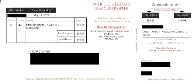
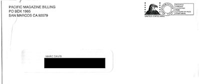
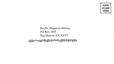
About six weeks after EW's last issue, I received this envelope package from Pacific Magazine Billing. (Normally, when I first mention a company, I include a hyperlink to the company's website; however, there is no website to be found.) 

Pacific Magazine Billing not-a-bill for Entertainment Weekly

Pacific Magazine Billing not-a-bill - EW Back
Not-A-Bill for cancelled publication

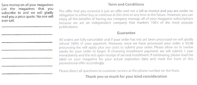
The "NOTICE OF RENEWAL / NEW ORDER OFFER" was for two years of Entertainment Weekly for the low, low price of only $99.95. The Terms and Conditions call out that this is "just an offer and not a bill ..." but it sure looks like a bill. 

Outer Envelope

Pretty Simple Reply Envelope

A lot of sites declare Pacific Magazine Billing to be a scam such as here, here, here, here, here and -- well, you get the idea. Sometimes a scam is a scam but might still be legal. I don't know; I'm not a lawyer. I do know that a scam mail package is naturally a Fail for Creative. But this package isn't only an apparent scam; it is Fail for Timing. I mean, it is pushing for a subscription renewal for a defunct publication. 

Alas, I "Must Not."

Lesson:
If you are going to scam, scam smartly. 


5/04/2022

Fidelity Rewards Visa: Bonus Offer Improvement

I recently wrote about a confusing email offer from Fidelity Rewards Visa with a complex bonus statement credit for a specific category of purchases and a failure to reinforce it's basic product benefits. It merited a Fail for Creative and potential Fail for Offer. 

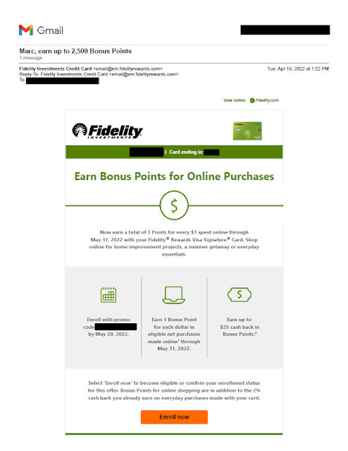
About six weeks later, Fidelity sent a new and better executed offer to the same person.

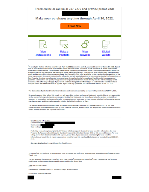
Fidelity Rewards Visa Bonus Offer

Fidelity Rewards Visa Bonus Offer

The offer is straightforward and simple enough to explain to my mother: Earn 3 points, rather than 2, for every dollar spent online through May 31, 2022. Unlike with the previous email, there's no minimum spend level, and the email clearly explains the $25 incremental rebate cap using icons and simple language to support communication clarity. Below the three icons, the email reinforces the basic product benefit, specifically that the bonus is in addition to the 2% cash back already available for all credit card purchases.

On the other hand, the email still has one issue. To enroll in the offer, the recipient has to click on the "Enroll now" link in the email then enter a promo code (which may be unique to the recipience, so it's blacked out here as potential PII). The code is 13 digits, which is a lot to enter. In user experience jargon, the need for a customer to enter a long code adds traction to the enrollment process.

So, how could Fidelity Rewards improve this email even more? If the promo code is unique to the customer, perhaps Fidelity could offer1-click enrollment, as other companies do. If it is not unique, why make the promo code so complex? Fidelity could go with something easy to transpose, such as "OnlineBonus22."

Lessons:
  1. Your offer should be simple to explain.
  2. Don't forget to reinforce your basic product benefits.
  3. Take as much traction as you can out of customer enrollment -- the easier for customers, the better.


4/04/2022

Fidelity Rewards Visa: Offering Nothing for Something, or simply unclear?

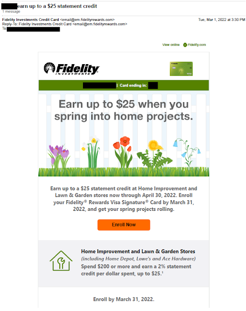
The Fidelity Rewards Visa Signature Card offers a 2% rebate on purchases. Their product home page touts, "Earn unlimited 2% cash back on everyday spending." So, why are they are sending emails to  existing credit card customers offering a "2% statement credit, up to $25?" To me, that sounds like a limit.

Fidelity Rewards email with Home Improvement Offer


Fidelity Rewards Card Email with Rebate Offer


The email headline reads, "Earn up to a $25 statement credit." The offer appears to be an opportunity to earn a 2% statement credit if a customer spends at least $200 at a Home Improvement or Lawn & Garden store, with a maximum statement credit of $25. Huh? So, if a customer spends $180 at Lowe's, the customer gets nothing? And if the customer spends $2,500 at Home Depot, they get effectively a 1% rebate? This seems like eating a doughnut hole. Spend too little and there is no benefit; spend too much and the benefit is diluted. Is this a Fail for Offer, or just strange?

But what about that 2% rebate that is supposed to be available for everyday spending on that very same card? The email doesn't speak to that at all. This merits a Fail for Creative because the email does not explain that the statement credit opportunity is incremental to the 2% rebate. The headline could have read, "Earn up to $25 more when you spring into home products." Or the body copy could have read, "In addition to the rewards you already earn, enjoy an additional statement credit up to $25 when you ..." Then there could be an implication that the effective customer rebate could be as high as 4%.

Lessons:
  1. Your offer should be simple to explain and allow customers to easily benefit.
  2. Don't forget to reinforce your basic product benefits.


Updated 4/7 to remove additional PII from email.

3/06/2022

BCHP: A hard-to-find doctor for my non-existent child

When someone asks me if I have children, I sometimes joke, "None to my knowledge." In that context, when I receive a postcard asking me, "Looking for a pediatrician or pediatric specialist?" I have to wonder if someone knows something I don't.

Maybe I do have a child. Maybe my wife has a bun in the oven. Or maybe the reason I received this postcard is less dramatic  that the postcard from Boston Children's Health Physicians (BCHP) merits a Fail for Targeting.

Let's set aside for the moment the fact that I do not have any offspring and break down the postcard's content.

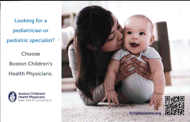
Boston Children's Heath Physicians
Mommy is happy with her healthy baby.

The front of the postcard simply suggests that I choose Bost Children's Health Physicians. It doesn't suggest why I choose one of their doctors. What makes their physicians desirable? To put it in marketing terms, what is BCHP's unique selling proposition?

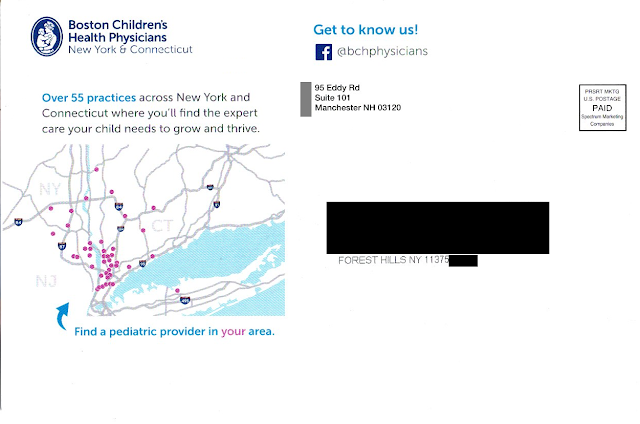
BCHP Boston Children's Health Physicians
Where is Forest Hills, Queens?
Not in the area shown on the postcard.

The address side of the postcard includes a minor sales message that supports the Call to Action – to “find the expert care your child needs to grow and thrive.” And the postcard displays a map that appears to show the locations of doctors. There is an arrow pointing to the map, reading, “Find a pediatric provider in your area” with emphasis on “your.” Quick takeaway: most of New York City doesn’t even appear on the map.

Maybe there is a provider near me, but how would I know? Rather than communicating how to find the provider – and placing it next to the Call to Action to do so – there is a bunch of white space below the map. The response method is on the other side of the postcard…well, sort of.

Buried on the bottom right corner of the picture of mom and her smiling baby is a URL leading to the Boston Children’s Health Physicians home page. Somewhere on that home page is information that supports the postcard’s messaging, but it isn’t easy to find. The QR code doesn’t lead to the same page as the URL; it leads directly to the practice locator page. And the placement of the QR code (within an image on the opposite side) is a Fail for Creative.

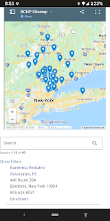
BCHP Boston Children's Health Physicians
BCHP locations not quite near Queens
Let’s get back to finding a provider in my area. I tried the QR code on my smartphone. It indicated that the nearest practice was in Bardonia, NY.

As the crow flies, the distance from Forest Hills, Queens, NY to Bardonia is about 27 miles. As the parent drives in traffic, however, it is two toll bridges and typically an hour drive or longer with a sick or tired child in the back seat. (That assumes the parent has a car. After all, this is New York City.) This long distance to a physician confirms that the postcard was poorly targeted geographically – another Fail for Targeting.

Returning to the caption below the map, what is a “pediatric provider?” Why use that kind of industry jargon when the front of the postcard uses “pediatrician” and “pediatric specialist” while the address side of the postcard cites having 55 “practices”? Why throw yet another term out there? I realize I’m not a parent but, if I were, wouldn’t I want to find a “doctor” for my child?

IMHO, this postcard does not really support Boston Children’s Health Physicians. It is poorly designed, written, and targeted.
 
Finally, unless there is a back-end method in place for tracking response to the individuals being mailed, this isn’t direct marketing – it’s mailed advertising.


Lessons:

  1. Vet your data sources to target matching demographics.
  2. Just being available is not enough. Even a medical practice needs a differentiator.
  3. The means of following through on a Call to Action should be located close to the Call to Action, and easy to find.
  4. Vet your physical targeting to people who can easily get to your physical business or medical practice.
  5. If your Call to Action includes a web site, don’t just list a home page. Use a direct URL that aligns with the Call to Action.
  6. Apply jargon consistently using terms your customers understand.
  7. Even a postcard for a medical practice should include some method of tracking results.


Edit 2/11/23: Removed reference to company that sent the mail per request of a person working at that company.